Mobile messages let you create Push Notifications and In-app Messages. While setting the properties of the notification, a preview of the push banner and in-app notification is presented.
Push messages are sent to devices that have opted in to receive these messages. These messages are displayed on the lock screen of the device. The user does not have to be in the app to see the message.
In-app messages are sent to the Inbox and the user needs to be in the app to see the message. The user does not have to opt-in to receive these messages.
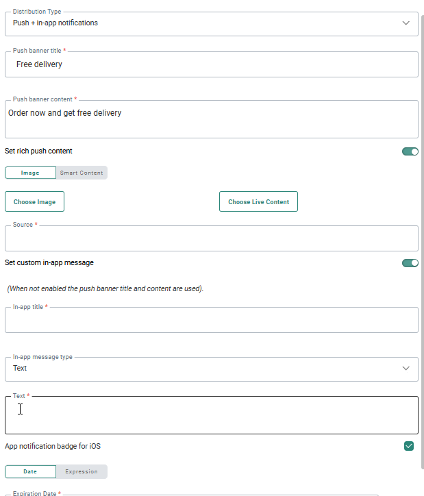
You can choose to send a Push Notification and when Push Notifications are not available (user has not opted in for Push Notifications) an In-app Message can be sent instead. Or send only an In-app Message. Or only push messages. Or both. The choice is made in the Distribution type field. Following options are available:
- Push
- Push + In-app Notification
- In-app Notification only
- In-app Notification when no Push is available.
Define the content
The following properties need to be defined for the push message:
Push Banner title — This banner pops up on the mobile lock screen or in the notification center. The user does not need to be connected to the app to see this banner. When the user taps the message, the app is opened and the actual message is displayed.
Note: The maximum length of the banner title is set to 250.
On smaller devices not the whole text will be displayed. After 35 characters the message is interrupted and followed by ...
On larger screens the message is interrupted after 45 characters and then followed by ...
Push Banner content — This is the actual content of the notification available from the notification center.
Note: The maximum length of the banner content is set to 250.
On smaller devices not the whole text will be displayed. After 148 characters the message is interrupted and followed by ...
On larger screens the message is interrupted after 154 characters and then followed by ...
Note: The Banner title and content can be filled with AI generated content. Click the icon Generate messages using Selligent AI in the toolbar of the field to open the AI conversation dialog. You can enter your question or keyword and use the generated content in your message: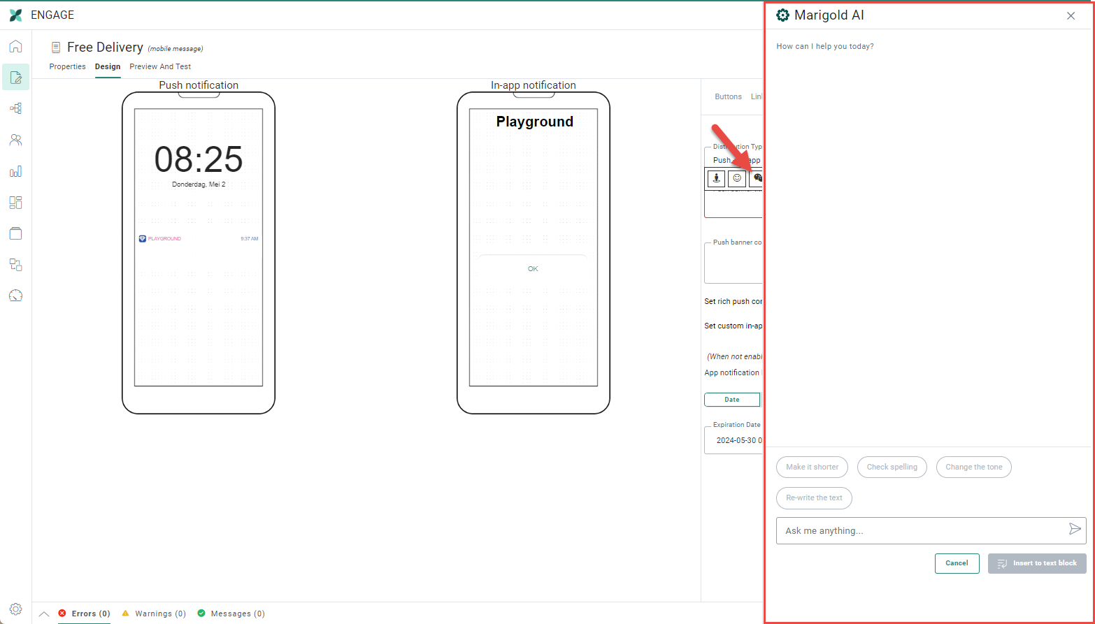
Note: If you select the existing text in your message first and then click the AI icon, the selected text is used as the question in your dialog and the AI generated text will overwrite the selected text in your message if you agree to use it.
Additional options are available to make the selected text shorter, check the spelling, change the tone or completely rewrite the text.
Set rich push content — Select the option to add rich content to the push message. When the option is activated, additional fields are displayed to add the rich content. This can be an image or a Smart Content.
- Image
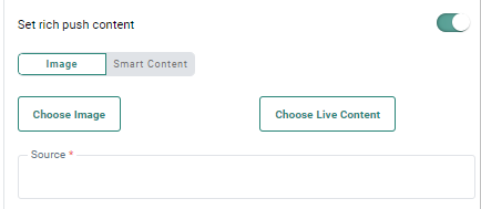
Press Choose image to access
the Library, navigate the folders and select an Image. The URL is automatically
added to the Source field.
Note: Check out the section on Library for more details on how to manage Images. Personalization fields can be used to complete the path to an Image in the library.
When Live Content is used in the template, click the Choose Live Content button to select an existing Image or create a new one. The Source field is automatically filled out with the selected Image. For more details on all the options available for Live Content, click this topic.
Example:
[%livecontent('530506b4-99fe-4957-af16-3424a668805a')%])
Note: To make sure that images appear correctly when expanding a push notification, it's advised to use images with a 2:1 aspect ratio, and a maximum width of 2000 pixels.
Commonly used sizes are 512*256px and 1440*720px.
- Smart Content
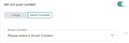
When selecting this option you can choose from a drop-down list of predefined Smart Content. Smart Content is used to add dynamic and intelligent recommended items to a message. The content of the Smart Content is based on algorithms that analyze the behavior of other visitors on the website. For example, present your contacts with trending items that are currently a lot looked at. Or when buying a product and sending a confirmation email, present your contact with products that are often bought together. For more details on Smart Content, please check this section.
Set custom In-app Message — This option is only displayed for distribution types that include the In-app Notification. Activate this if you need to send a custom In-app Messages. When activated, you need to fill out the details for the In-app Notification. If this option is not checked, the In-app Notification will contain the same information as the Push Notification.
When In-app Notifications are activated, the following properties need to be set:
- in-app title — This is the title that will be displayed for the message in the apps message center.
- in-app content — The content of the message. You can choose between the following types:
- URL — This type of notification embeds the content of the specifiedURL in the notification window and the contact can browse the website
- Text — Plain text can be enriched with personalization fields and emojis
- Image — This type of message requires the URL of the image. An image can be uploaded from the Library, which gives access to the images in Selligent by Zeta. Or you can enter the URL of the image. Or, you can use Live Content images. When an image notification is sent, the URL of the image is sent and the image is rendered when the notification is displayed.
- Smart Content — When selecting this option you can choose from a drop-down list of predefined Smart Content. Smart Content is used to add dynamic and intelligent recommended items to a message. The content of the Smart Content is based on algorithms that analyze the behavior of other visitors on the website. For example, present your contacts with trending items that are currently a lot looked at. Or when buying a product and sending a confirmation email, present your contact with products that are often bought together. For more details on Smart Content, please check this section.
- Journey — This type of content lets the user set a destination by selecting a journey and Input Component to which the contact is redirected. If the Input Component has parameters defined, you can enter the values here.
The option 'Redirect anonymously' allows to send the contact to the page as an anonymous user. - Page — This type of content lets the user set a page as the content for the in-app message. An Asset selector is displayed from which a page can be selected
Note: The Banner title and content of type text can be filled with AI generated content. Click the icon Generate content with AI in the toolbar of the field to open the AI conversation dialog. You can enter your question or keyword and use the generated content in your message:
- App notification badge for iOS — This option can be enabled to add an app notification badge for iOS devices.
That way, marketers can ensure that users who may have disabled push notifications on their iOS device or missed an initial push notification, still get notified and are thus encouraged to open their mobile app (which might also boost the app’s open rate).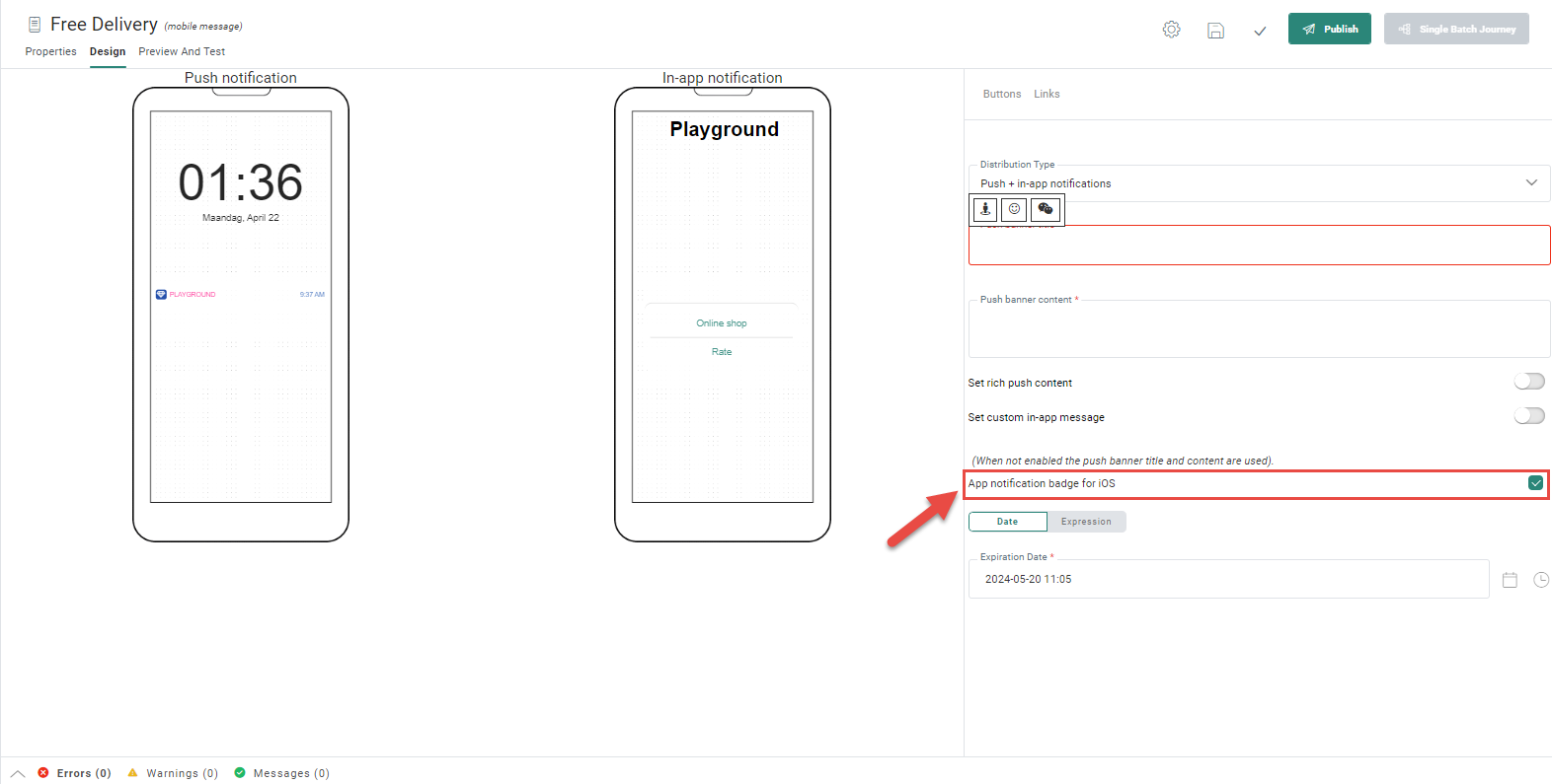
Note: This option is available for distribution types Mobile push, Push + in-app notification and In-app when no push notification is available. It's not available for In-app notification only.
If a mobile push message is sent with the app notification badge for iOS setting enabled, the following occurs for the iOS contact receiving the message:
1) The contact receives the push notification on their device.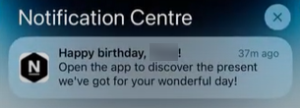
2) If the contact ignores the push notification, an app notification badge will be visible as a red dot containing the number 1.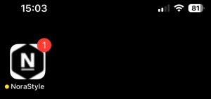
(On Android devices, app notification badges already appear automatically, as red dots without numbers.)
3) If the contact opens the app through the push notification on their iOS home screen, the notification badge on the app disappears.
(If the contact opens the app through the push notification on their iOS lock screen, no notification badge is displayed at all.)Important:
If the contact ignores the push notification, and opens the app, the notification badge remains visible.
In this case it's not up to Selligent by Zeta, but to the app builder to manage the behavior of notification badges of the app.
Before starting to use the 'app notification badge for iOS' setting, it's always best to check and test the app you're using to see if it behaves properly.Note: When a new push notification is sent from Selligent and the app already has a notification badge (regardless the number in it), it gets overwritten with a new notification badge with the number 1.
- Expiration date — An In-app Notification does not need to stay indefinitely in the Inbox. Use the expiration date to indicate until when the In-app Notification should remain available. If the user doesn't read the message before the expiration date, the message is removed from the Inbox.
Note: Depending on the operating system used, the following behavior occurs. In iOS, the expiration date is not limited, while in Android, the maximum allowed expiration time is 4 weeks. The expiration date is unique for a message, which means that any expiration date set above 4 weeks will automatically be limited for android to 4 weeks.
All fields can contain personalization fields. These personalization fields depend on the selected Audience list.
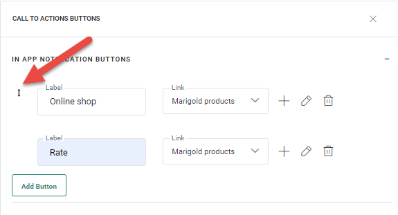
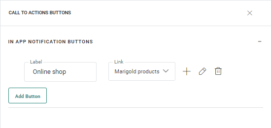
Define the in-app notification buttons
If an action or interaction on the In-app Notification is required, links can be used and added to the In-app Notification. You can add up to three buttons to an In-app Notification.
Note that if no link is added to the message, automatically an OK button is added so that the pop-up message can be closed. However if the user adds a link to the message, they must add a second link to close the message dialog.
1. To create a button, click the Buttons link in the toolbar.
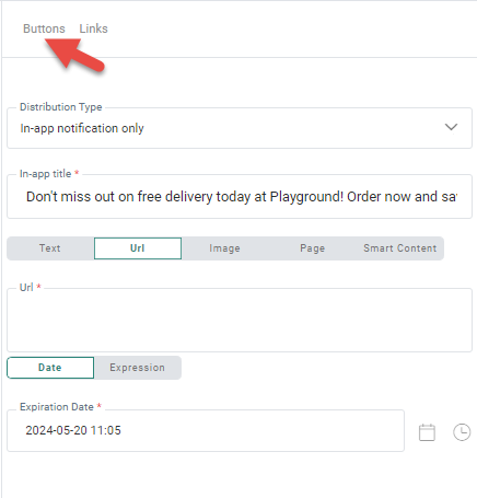
2. The following panel is displayed from where buttons are created:
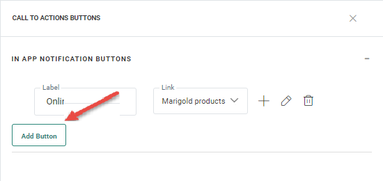
3. Click the Add Button button.
A new line is added where you can enter the button label and the actual link. You can choose an existing link from the drop-down list, or you can create a new link.
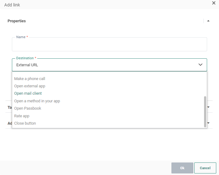
4. For each link a Name, Destination type and actual destination can be defined. Following button types are available:
Define reaction in the journey — What happens when this link is clicked is defined in the journey itself: redirect to another journey, send an email, etc. Clicking the link in the notification will close the notification.
Note: When using this link, the mobile push component is followed by a Page component.
Telephone — Makes a phone call to the defined phone number (for example 3228888888)
SMS/MMS/RCS — Opens the default SMS/MMS/RCS application to send an SMS/MMS/RCS text to the indicated number (for example 32499525252)
Email — Opens the default email application to send an email to the indicated email address (for example you@company.com)
External URL — Opens the default browser on a defined URL (for example http://www.selligent.com)
Open App — Opens a defined application such as Facebook, 'X' (formerly Twitter), etc (e.g., fb:// on iOS ; com.twitter.android on Android)
Note: The syntax of the target differs depending on the platform. At the moment no automatic conversion is made to the correct syntax for iOS or Android. It is recommended to create 2 separate push components dedicated to a platform.
Open a method in your app — For instance open a chapter in the app. (for example MethodName. The same methodname should be used on app Android and iOS).
Experience from Grow — Opens a Grow experience for the contact to fill out.
Passbook — Opens the passbook file at the given URL (e.g., airline boarding pass, movie tickets, etc). The passbook file must already exist. Selligent only provides the possibility to open it. When the button is clicked the notification is closed and the passbook is opened.
Note: Depending on
the selected Passbook provider personalization fields can be added. The
field values are sent via a dynamic URL.
Note 2: Passbook formats are different depending on the OS. Make sure to
target the right devices when sending a passbook.
Note: Links added to the push message behave like sensors in the message that send the contact to an external location. They can be used as events in a journey to push the contact further.
When multiple buttons are configured, they can be repositioned by drag and drop. Changing the order here, will change the order in which they are displayed in the message: