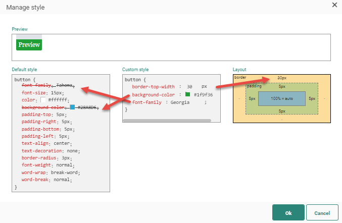
You can edit the style of a content section using the Style Editor.
- Preview — Shows what the current defined style looks like.
- Default style — Shows how the current style has been defined.
- Custom style — Lets the user edit the code to modify the style. An auto-complete function is available to help the user with the syntax of the different styles. The custom style can be applied for background color, fonts, borders, display, padding, text alignment, word wrap, max width and height, vertical alignment, line height and more.
- Layout — Allows adding a border around the content, and you can specify how much padding space, in pixels, around the objects in the box. The custom style is modified accordingly.
Note: Longhand styling is supported in the style editor.
Shorthand styling (grouping the definition of common properties acting on the same theme) is not supported.
Example 1 :
Correct usage — supported longhand styling :
border-color: red;
border-style: solid;
border-width: 5px;
Incorrect usage — not-supported shorthand styling :
border: 5px solid red;
Example 2 :
Correct usage — supported longhand styling :
font-style: italic;
font-weight: bold;
font-size: 12px;
line-height: 10px;
font-family: Arial;
Incorrect usage — not-supported shorthand styling :
font: italic bold 12px/10px Arial;
Whenever you change something in the custom style box that was already defined in the default style, the default style is stricken through to indicate that this default setting is no longer applied.
Example: Defining
a new background color and font in the custom style section:
When defining a custom style, an auto-complete function will help you through the configuration. At the same time, the layout properties proposed are limited to those allowed by Selligent.
Note: It is possible to use variables in the styling editor. Check out this topic on how to do that.
