Build and edit worksheets in Business Intelligence.
Building reports is available for users with Explorer access.
Data Sources
BI gives you access to nine data sources. For information on the data points available in each source, see the BI Data Sources documentation. You may see data sources other than those listed in the following table. Any source not listed has been deprecated and should not be used.| Data Sources | Tables with each Data Source | Description |
| Email and List Stats | email_stats_by_day_list_templatelist_stats | Used to segment metrics for Campaigns and Triggered Messages by Lists and/or Template Name. Used to segment campaign and/or trigger performance by list |
| Campaign Stats by Domain and Engagement | campaign_stats_by_domaincampaign_stats_by_engagement | Filter campaign performance by domains, by segmenting campaign metrics by specific email domains that were sent to or all customer-specific reports by user domains. Used to segment campaign metrics by engagement level. |
| Campaign Stats by Signup Month | campaign_stats_by_signup_month | Used to segment campaign metrics by when a user origianlly signed up. |
| Campaign Stats by Device | campaign_stats_by_device | Filter campaign performace by device, by slicing reporting by a specific device associated with activity. |
| Campaign Stats | campaign_stats_blast_list | Used to segment Campaign performance by List, Campaign Name, Campaign Subject |
| Campaign Stats by URL | campaign_stats_by_url | Filter campaign performance by url/links included in campaigns |
| Campaign Label Stats | campaign_stats_blast_labelcampaign_stats_by_domain_label | Used to segment Campaign performance by List, Campaign Name, Campaign Subject and LabelsFilter campaign performance by domains and labels, by segmenting campaign metrics by specific email domains that were sent to or all customer-specific reports by user domains by label. |
| Purchase | purchase_stats_by_hour first_purchasepurchases_per_product_day | Segments total number of purchases generated by an email campaign by hourSegments purchase data by the first purchase made by a userSegments purchases by product generated by an email campaign |
| Profile Stats | profile_stats_by_signup_day | Used to segment profile data by a specific user attribute such as when they became a buyer, signed up, opted out etc. |
Build a New Workbook
Create a new workbook from the Home, Personal Space, or Explore screens.Create a Workbook and Connect to a Data Source
- Select New from the Home, Personal Space, or Explore screens.
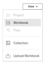
- From the New menu, select Workbook.
- Select a data source from the Connect to Data Source modal and select Connect. Make sure that the data source is one of the ones listed in Data Sources. The New Workbook editor opens.
- From the top icon menu, select Pause Auto Updates
 . This allows you to build a report without waiting for each data point to update when you make changes.
 - Select a data point from the Data panel.
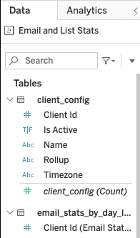
Drag the data point to either the Row or Column area.

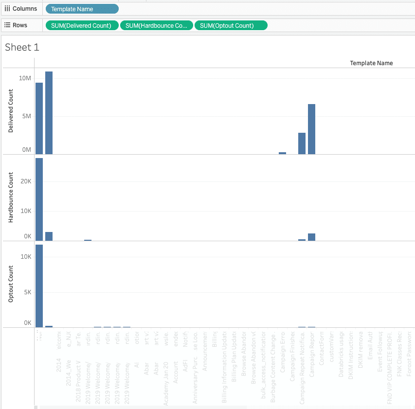
In this example, we're using the Email and List Stats data source. The Template Name is the column data, and the Delivered, Optout, and Hardbounce counts are shown in rows.
Customize Chart Data
By default, data will be shown in the format Business Intelligence selects when you add data points to your report. Initially, each data point you add is represented in one chart.
Customize the format and appearance of your report from the Marks panel. When you change the chart type, select Allow Auto Updates  from the icon menu. This allows your chart to change.
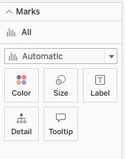
You can adjust all your data points at once or select each one individually. The available data visualizations include:
- Automatic (will automatically select the appropriate visualization for your data set)
- Bar
- Line
- Area
- Square
- Circle
- Shape
- Text
- Map
- Pie
- Gantt Bar
- Polygon
- Density
Filters
Apply filters to your data before you publish your Workbook to show manageable data sets. Data sources contain many data points, which can be difficult to parse if everything is in one report with no filters applied. Notes:- If you're filtering data by time period, a week is defined as Sunday to Saturday.
- If you wish to see only campaign messages or only triggered messages, drag Email Type to the Filters. Select the type of message from the modal to filter out data you don't wish to see.
- Select one of the data points from the list, drag it to the Filters box, and drop it.

- A modal opens with filtering options, depending on the type of data point selected. There may be further filtering options available once you make an initial selection in the modal.For this example, we're using Event Date and setting it to filter by Year.
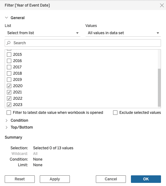
The preceding image is the secondary modal that opens after filtering by year. - Select any further filters and then select Okay. The filters are applied to your data.
Dual Axis
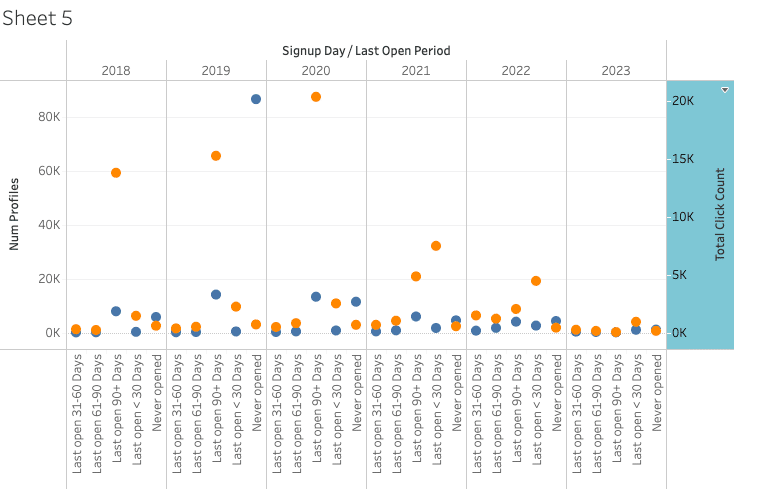
To compare two metrics in one chart, select the Dual Axis option.- After you have two stats available in one worksheet, right-click the lower chart's title and select Dual Axis from the menu.
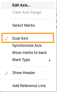
- The charts will combine automatically as in the following image, with an axis on either side of the chart.
Edit Display Names
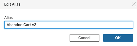
To edit metric display names, right-click the name. Select Edit Alias from the menu and enter a new name.
Multiple Data Sources
Once you've created a new Workbook, you can connect multiple data sources. Select New Data Source  from the icon menu to connect another data source to your Workbook.
You can only use one data source per worksheet (chart/report).
Multiple Client IDs
Drill down into the data for one or more Client IDs. This is only available if your account contains more than one Client ID.- Select Client ID from the Client Config Table options.

- Drag and drop Client ID into the Filters area.
- From the modal, select the ID or IDs you wish to see.
- Select OK to show only data from your selected ID.
Build a Dashboard
Worksheets are the building blocks for your dashboards. Once you have worksheets built with your visualizations, you can start building a dashboard. To see a simple dashboard being built, see the Creating a Dashboard video.- From the bottom of your worksheet, select the New Dashboard
 button. Your available worksheets will appear under Sheets in the sidebar.
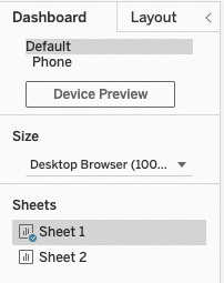
You can also customize the dashboard preview device and the dashboard size. - Drag and drop one of your sheets onto the dashboard canvas.
- Add elements from the Objects panel. You may wish to add containers or a text element.

- Once you have data laid out in your dashboard you can customize your dashboard layout in the Layout tab.
- Select one of the items in the Item Hierarchy panel.
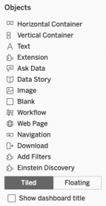
- Once you select an item, you can customize borders, backgrounds, and padding.
- Save your work.


