Overlays Visual Composer
Build Overlays with a drag-and-drop visual composer.
How it works: an overview
Use drag-and-drop content elements and formatted rows to build your overlay from scratch. To build a new overlay: create a new Visual overlay, configure the global settings, and then add content blocks and rows.
Create a visual overlay
- From the Messaging menu, select Onsite. Select Overlays from the flyout menu.
- Hover over the New Overlaybutton and select Visual Editor from the drop down menu.
- The visual editor will load . By default, the visual editor loads with a classic overlay centered on the page.
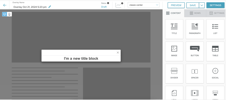
- Drag and drop structural elements (Rows) and content elements onto the overlay.
The overlay builder
The visual overlay builder is made of three elements: the top bar, the side bar, and the preview window.
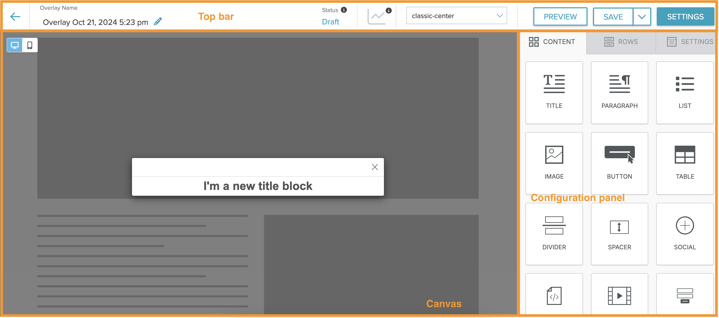
Top bar
The Top Bar displays the editable Overlay Name and Status (Draft, Active, or Inactive), its Last Saved Date/Time, Position, Preview, Settings, and a Save button to commit your changes. Pre-click and Post-click options are also available. Post-click shows your selected Display Message. The overlay will not be displayed to any visitors when set to Inactive or Draft.
Settings
The Settings menu is also available in the top bar. Select your Setup settings and your Targeting settings.
Setup
Set the background preview URL, Overlay position,Overlay Title Theme, Overlay Background Image and Overlay dismissal options. See the Setup section for a full explanation of all the options.
Targeting
Select which pages, users, or user activity should launch the overlay, with optional frequency, time period, and priority settings. For more information, see the Targeting section.
Configuration panel
The configuration panel contains all of the drag-and-drop structure and content options. See the Structures and Blocks section for a full explanation of all the options.
Canvas
Build your overlay on the canvas.
Overlay settings
Select the Settings button to select setup rules and targeting options.
Setup
Until you add a form to capture user sign-ups, only the background URL, Overlay position, and dismissal options are available.
| Setting | Options |
| Change Background URL | Enter the URL for your selected background. |
| Overlay Title Theme |
|
| Overlay Background Image | Link to an image to go underneath the other elements of your overlay. To unset the image |
| Overlay Position |
Select the position of your overlay:
|
| List to add subscribers to | The lists to which the user should be added.
Note: Only Natural Lists are supported in User Sign-Up Overlays. Smart Lists are not available for selection. |
| Source to attribute to each subscribers' profile | Enter a source var which will be added to each subscriber's profile. |
| Confirm subscription via email | If enabled, the selected Confirmed Opt-In template is sent and the user is not added to the list until they click the link you have provided in the email. If disabled, the user is added to the Destination Lists immediately upon their submission of their email address, and the sailthru_hid cookie is set to identify the user for current and future browsing sessions. Using confirmed opt-in can cut down on the number of bot sign-ups. |
| Overlay cannot be dismissed | When selected, the Overlay cannot be dismissed. |
| Target Channels | Select the channels you wish to target |
| Click outside overlay to dismiss | Enable dismissal by clicking anywhere outside the overlay. This is good usability practice for basic overlays but we recommend not enabling this option with forms. Accidental clicks/taps can result in frustration for the user. |
Targeting
Do Not Track behavior
When trigger = Pageviews, only the following frequency capping options work for Do Not Track users:
- Once per visit
- Every pageview.
Configurations that rely on cross‑session persistence (e.g. once per X days across visits) do not function in Do Not Track by design.
| Setting | Options |
| Where |
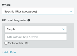
You can display the overlay sitewide or select specific pages where it will appear. You can also exclude specific URLs by selecting the Exclude URLs checkbox when you display an overlay on specific pages. When you select "Specific Page(s)", additional options are displayed for selecting those pages: Click "Add URL" to add at least one URL or URL pattern. A field for the URL/pattern is displayed, and it will be treated based on your chosen type of matching below: Simple, Exact, or Contains. (See URL Targeting Details.) If you add multiple URLs/patterns, they are treated with 'OR' logic-the URL must match only one of your entries in order for the overlay to be displayed.
|
| Who |
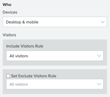
The Who section allows you to select which visitors see or do not see your overlay based on device or profile. The options are:
Devices:
|
| When: Trigger |
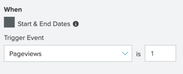
A user's session is considered to have ended 30 minutes after the user's last pageview.
|
| How Often: Frequency Capping | Limit the number of times that the Overlay may be displayed for the user:
|
| When: Start and End Dates |
|
| When: Priority | Available Priority options include High, Medium, and Default. By default, all Overlays have a priority rating of Default. The Priority options dictate which overlay will be shown on a single page visit for a given trigger event (the When entry in this table). More than one overlay may show on the page if different overlays are targeted under different trigger events. Overlays are prioritized according to the following rules:
|
URL Targeting Details
URL Targeting allows you to specify which of your site's URLs will display the overlay. There are four types of URL targeting available. The URL targeting results will be different depending on whether or not you choose to exclude a URL.
When the Exclude this URL checkbox is not selected
Simple
Enter a URL and the system will disregard any query string and protocol, matching only those URLs that contain the same domain and path or file extension.
| Example URL | Overlay shown | Overlay not shown |
| http://example.org/jsp/overlay.html |
https://example.org/jsp/overlay.html https://www.example.org/jsp/overlay.html |
https://test.example.org/jsp/overlay.html https://example.org/jsp/overlay2.html https://shop.category.site/ |
Exact
Matches the entered URL exactly. Trailing slashes will be ignored.
| Example URL | Overlay shown | Overlay not shown |
|
https://www.example.org/jsp/overlay.html |
https://example.org/jsp/overlay.html https://www.example.org/jsp/overlay.html https://test.example.org/jsp/overlay.html |
https://shop.category.site/ https://example.org/jsp/overlay2.html |
Contains
Matches only URLs that contain or exactly match the entered text
| Example URL | Overlay shown | Overlay not shown |
|
overlay.html |
https://example.org/jsp/overlay.html https://www.example.org/jsp/overlay.html https://test.example.org/jsp/overlay.html |
https://example.org/jsp/overlay2.html https://example.org/jsp/overlay2.html https://example.org/jsp/overlay2.html https://shop.category.site/ |
Pattern
Matches only URLs that contain specified "regular expression" pattern within them.
| Example URL | Overlay shown | Overlay not shown |
|
^https://example.org|^https://www.example.org |
https://example.org/ https://www.example.org/ |
https://connect.example.org/ |
When the Exclude this URL checkbox is selected:
Simple
Enter a URL and the system will disregard any query string and protocol, matching only those URLs that contain the same domain and path or file extension.
| Example URL | Overlay shown | Overlay not shown |
|
http://example.org/jsp/overlay.html |
https://test.example.org/jsp/overlay.html https://example.org/jsp/overlay2.html https://shop.category.site/ |
https://example.org/jsp/overlay.html https://www.example.org/jsp/overlay.html |
Exact
Matches the entered URL exactly. Trailing slashes will be ignored.
| Example URL | Overlay shown | Overlay not shown |
|
https://www.example.org/jsp/overlay.html |
https://shop.category.site/ https://example.org/jsp/overlay2.html |
https://example.org/jsp/overlay.html https://www.example.org/jsp/overlay.html https://test.example.org/jsp/overlay.html |
Contains
Matches only URLs that contain or exactly match the entered text
| Example URL | Overlay shown | Overlay not shown |
|
https://www.example.org/jsp/overlay.html |
https://example.org/jsp/overlay2.html https://example.org/jsp/overlay2.html https://example.org/jsp/overlay2.html https://shop.category.site/ |
https://example.org/jsp/overlay.html https://www.example.org/jsp/overlay.html https://test.example.org/jsp/overlay.html |
Pattern
Matches only URLs that contain specified "regular expression" pattern within them.
| Example URL | Overlay shown | Overlay not shown |
|
https://www.example.org/jsp/overlay.html |
https://connect.example.org/ |
https://example.org/ https://www.example.org/ |
URL Fragment Targeting
When you want to display an overlay based on a website path that contains a #, use URL fragment targeting.
This option involves adding code to the Sailthru JS on your website. You may need developer resources to activate fragment targeting.
- Alter the Sailthru JS init block to include the 'fragmentEnabled' flag.
Copy
//Customers must set this flag to enable fragment targeting.
//This is not a breaking change for customers who decide not to use this feature.
//In cases where this flag is not enabled, then targeting will operate such that the fragment character and trailing values are ignored.

<span class="mc-variable MyVariables.Sailthru variable">Sailthru</span>.init({
customerId:,
fragmentEnabled: true
}); - Push the change and verify that the new init block is in place on the website.
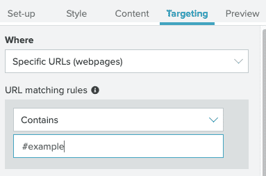
- Create an overlay's targeting, in the 'Targeting' portion of the Editor, either with or without the '#' character as you require. Your URL matching rules may resemble the following image:
Preview Your Overlay On-Site
You can use a special query parameter in your site's URLs to preview any overlay to see how your overlay design and website CSS will interact, regardless of its status (active or inactive) and targeting rules. Stats are not counted for this feature. Simply append the following to your URL:
#STpreview=<overlayID>&STshowOverlay=1To obtain the overlayID, open the overlay's configuration page within My Sailthru. The ID is the portion of the URL after the last slash. For example: https://my.sailthru.com/spm/overlays#/0c4ed9e1-32ba-4124-94b9-d0ea7909cb01
Saved Rows
Saved rows help you streamline your Overlay creation process. Create a universal title or form row and save it to use across your overlays. Either process - saving or using a saved row - requires only a few steps to complete.
Notes:
- It is not currently possible to rename Saved Rows.
- Your Saved Rows appear in the order you created them, starting with the most recent.
- If you can't find your row, use quotation marks around the name when searching. This returns an exact value.
- There is a maximum of 30 saved rows that can be displayed.
Create a saved row
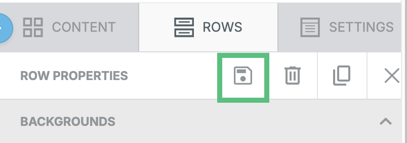
- Select the row you would like to save.

- Select the save icon from either the row itself or the row properties menu.
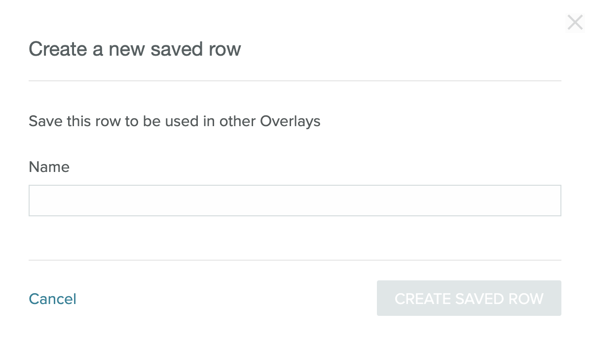
- Give your row a name and select Create Saved Row. Your saved row will be available.
Use a saved row
When you're using a Saved Row, you can edit the row within a template. The edits you make will only affect the template, not the Saved Row itself.
- Select the drop down menu under Rows.
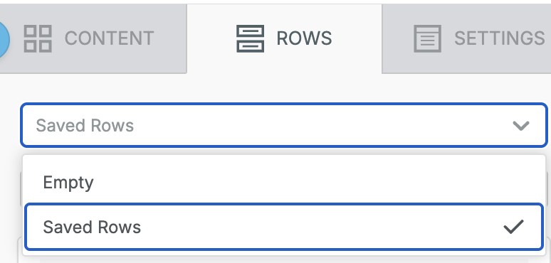
- Select Saved Rows from the menu.
- Search for or scroll to the saved row you would like to use. Drag the saved row to your template as you would with any other row.
Delete a Saved Row
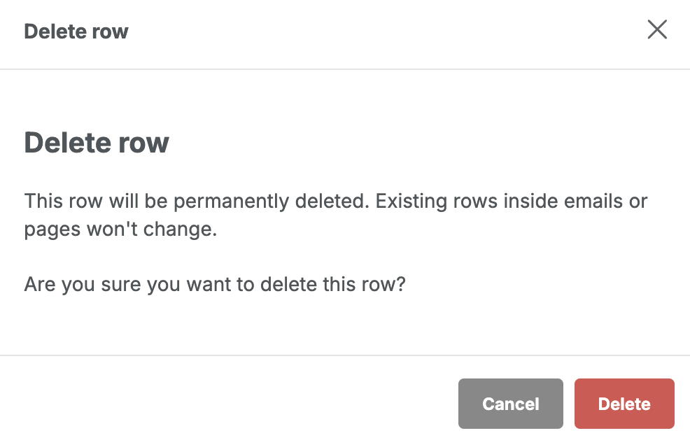
- After searching for the row you'd like to delete, click on the three dot menu on the lower right side of the saved row and select Delete.
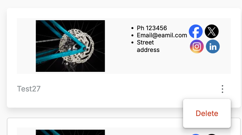
- Click the "Delete" button.
- To confirm you'd like to delete the row, select the "Delete row" button in the modal.
Structures and Blocks
Create overlays from pre-built content elements and rows.
The configuration panel has three tabs to help control the appearance of your overlay: Content, Rows, and Settings.
Functions
After you add a content element to your overlay, certain functions will become available. You can comment on a section of an overlay, delete it, or duplicate it.

Duplicate  makes an exact copy of the content element directly below the selected one.
Delete  immediately deletes the content element.
Comments
To add a comment to an overlay section:
-
Select an overlay section and then select the comment icon
 .
. -
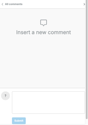
The comment window opens in the Configuration panel.
-
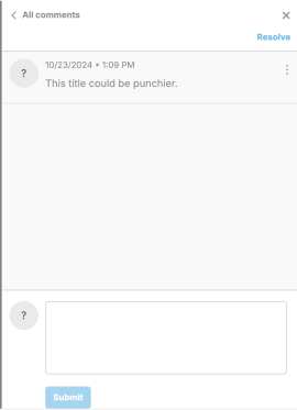
Add your comment and select Submit. The comment is submitted to the queue.
-
The content element with a comment shows a comment icon.

Content Elements
Content elements are blocks that you can drag and drop into your overlay.
When the layout of your email is in place, add visual components by dragging them from the Content tab into a row. Multiple Content blocks can be added into one row.
- Content blocks already in place can be reordered or moved to a different structure by selecting them, then clicking and holding the access arrows
 while dragging to the desired location.
 - Once you add your first content block, you'll see an Undo option
 appear in the lower left corner of your canvas. The buttons include Undo, Redo, and a History icon. Selecting the History icon shows a timeline of your last 15 edits within the current browsing session.
 - Every block's padding, or separation, can be set in its Properties panel under Block Options.
Text
To add text to an email, select the content tab and drag the Text content block into a structure. You will see the following text appear. "I'm a new Text block ready for your content." Click anywhere on that sentence to edit the text (you can triple-click the text to highlight and replace it). A number of text formatting tools is displayed:
- font family
- font size
- bold, italics, underline, and strikethrough
- text alignment
- numbered and non-numbered bullets
- text and background color
- link text
- special links are also available here for:
- User-specific unsubscribe
- View online
- Anonymized link for sharing
Collapse the floating editor using the Collapse button  .
Note that if you set the font family to Global Font, it will inherit the font family selected under the SETTINGS tab. This allows you to change the font family for multiple elements at once just by changing that property in the Settings tab.
Title
Add a title to your overlay
Custom Fonts
To add a custom font, see the Custom Font Management documentation.
Custom Font Resources
- Learn more about web-safe fonts with Mozilla's documentation.
- For more information on font-family stacks: https://www.w3schools.com/cssref/pr_font_font-family.asp
- If you use Typekit fonts: https://helpx.adobe.com/typekit/using/html-email.html#support
Paragraph
To add a paragraph of text to an email, select the content tab and drag the Paragraph block into a structure. You will see the following text appear."I'm a new paragraph block."Click anywhere on that sentence to edit the text (you can triple-click the text to highlight and replace it). A number of text formatting tools is displayed in the floating toolbar and in the Content Properties panel:
- font family
- font weight
- font size
- text color
- bold, italics, underline, and strikethrough
- text alignment
- text and background color
- link text
- special links are also available here for:
- User-specific unsubscribe
- View online
- Anonymized link for sharing
If you set the font family to Global Font, it will inherit the font family selected under the Settings tab. This allows you to change the font family for multiple elements at once just by changing that property in the Settings tab.
List
Add custom lists to your overlays. The List block supports either unordered (bulleted) lists or ordered (numbered) lists. From the Content tab, drag a List block into a row. By default, it will be a bulleted list. Use the Content Properties to customize the list. Select the type of list and the list style you prefer. Options beyond type and style are similar to the Paragraph and Text block options.
Image
The Image block comes with an image uploader to receive your images. You can either drag an image file on top of this block or click "Browse" to reuse images from your account or other services. You will have several methods for uploading images, including a file upload, upload from a URL, import from services like Instagram, as well as a free image search. By default, images will automatically be sized to fit the structure within which they are contained. This is the recommended setting to ensure images resize correctly for any screen. However, you can disable automatic sizing and set the image to be a percentage of the structure's column. Use the Properties panel to set the alternative text as well as any destination URL. If you intend on populating the image with a dynamic image like a countdown timer or an advertisement, you can select "dynamic image". This will allow you to set a dynamic image for the send while still viewing a sample image in the composer. Notes:
- When uploading an image with the same name as an existing image in Visual Composer, the image will take approximately 1 hour to propagate to any overlays using the image. Make sure to wait for the image to propagate before sending. This restriction only applies to replacing images. New images will immediately propagate.
- The maximum allowed file size is 20MB.
- Animated GIFs wider than 1920px will be resized on upload and become static images. We recommend using GIFs under 1920px in width.
- All image file types are allowed.
- Total image storage is not currently capped for the lifetime of your Saithru account.
Create Image Folders
Create custom image folders to organize your uploaded images. Before uploading images:
- Decide on a folder structure for your image gallery. You can nest folders to create a more complex structure.
- Create the folders. Images must be uploaded to a specific folder and cannot be dragged and dropped into a folder after upload.
To create folders:
- Select the Image block and drag it into your overlay.
- Select Browse to open your image gallery.
- Select the Add Folder button next to the search box.

- A new folder will show in the gallery. Give the folder a name and select the blue check.
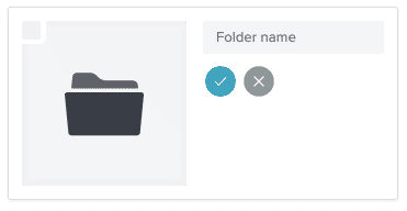
- To create sub-folders, select a folder to open it and complete steps 3 and 4 again. Folders initially appear in the order in which they're created. The newest folder appears first. Select any of the header options (Name, Date, Size, or Type) to reorganize folders.

- To upload an image, select a folder and then select Upload from the File Manager.

- Select the image or images to upload from your system's file manager. As your file uploads, you'll see a progress bar before the folder reloads and shows the image.
- View your folders. Each folder shows how many images it contains.
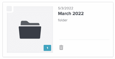
Note: A folder can't be deleted until it's empty. You can mass delete items in a folder. Select the check mark in the top left corner of the image preview for each item you wish to delete, then select Delete All.
Button
Insert a call-to-action button that can open a web page in the user's browser. Alternatively, buttons can be set to send an email, make a call, or send an SMS from the user's device to your chosen recipient. Selecting the text of the button in the canvas will provide a limited text editor. The action and destination URL are set in the Properties panel, where you can also set the button's background color and text color, border, width, and roundness.
Table
Add and format a table for your Overlay content.
Divider
A customizable horizontal rule.
Spacer
A customizable, invisible spacer block. Use this to create space between design elements.
Social
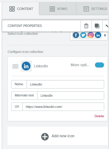
A configurable set of social network buttons. Choose a design in the Properties area, then configure which networks to include and your ID/address for each.
You can also include custom social buttons by clicking Add new icon.
HTML
Using your own code may affect how the message is rendered. Make sure to use correct and responsive HTML. Where possible, is recommended to build with the editor's options instead, to ensure code is valid and the design is responsive. To add an HTML block to your overlay in the visual editor:
- Decide on your overlay formatting. If you're using the available row structures, drag them into place on your overlay.
- Drag an HTML block from the Content Pane to your desired location in your overlay.
- Click the HTML block. The Content Properties pane opens for your HTML block.
- Add your HTML content.
- Finish editing your overlay.
Notes:
- Using includes is supported in HTML blocks, but is not a best practice. Using includes can require additional custom code to ensure it smoothly relates to a visual overlay.
Format your include to resemble the following:
{include 'include name'}. Remember to check your content width settings. - Make note of the following when using Zephyr in Text blocks and/or HTML blocks:
- The syntax Zephyr uses for conditional logic is not fully supported in Text blocks. To ensure your content will render correctly, move any Zephyr that uses any of these characters:
&,>,<,&,>,<into the setup tab. Once there, reference the Zephyr logic from inside the Text blocks using variables. - When using HTML blocks with Zephyr, we recommend disabling HTML Sanitizer. Please contact support to proceed.
- The syntax Zephyr uses for conditional logic is not fully supported in Text blocks. To ensure your content will render correctly, move any Zephyr that uses any of these characters:
- Depending on your use case, you may use Display Conditions on rows that contain HTML and/or Text blocks in place of Zephyr.
Video
Add a YouTube or Vimeo URL to automatically generate a preview image. The image will link to the provided URL in a new tab.
Form
Use the built-in Form element to automatically add a custom form to your page. Dropping the form element onto your page adds a form that collects First name, Last name, and an Email address by default. Select the form to open the Content Properties tab for the form element. As with most content elements, you can customize the width, alignment, font family, font weight, and font size.
Form Elements
Beyond the default fields, you can add and customize fields for different types of input:
- Single Choice To enter your options, select the blue Edit option under the field to open the Edit Field modal.
- Checkbox (multiselect)To enter your options, select the blue Edit option under the field to open the Edit Field modal.
- DropdownTo enter your options, select the blue Edit option under the field to open the Edit Field modal.
- Date Include a date picker in your form.
- Custom Variable #1 through #10To select the type of field and enter your options, select the blue Edit option under the field to open the Edit Field modal.
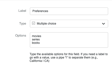
For multiple choice variables, the values will be saved as an array on the profile.
- Label #1 through #10To select the type of field and enter your options, select the blue Edit option under the field to open the Edit Field modal.
- List #1 through #20To select the type of field and enter your options, select the blue Edit option under the field to open the Edit Field modal.
By default, each field has a default variable attached. If you use a custom variable for any of these options, you can change the variable within the field from the Manage Fields section. To change the variable name:
- Enter a new placeholder name for the field or place your cursor at the end of the existing name.

- Add a pipe.

- Enter your new variable name. For example, instead of first_name, you might use FirstName.

- Save the page. When the page is saved, select the form and locate Manage Fields in the content properties panel. Your new variable should show under the field:

ListsWhen using one or more of the List fields to add users to a list, you can change both the placeholder name and the list name the same way you can change vars.
- Add one of the List options to your form fields.
- Select the placeholder text and replace it with the user-friendly name of a campaign, for example, Weekly Newsletter.
- Add a pipe and the list name. If your list is called welcome-list, then that should go after the pipe. E.g.: Weekly Newsletter | welcome-list
- Save the page. When the page is saved, the list name you entered shows below the editable field:

Pre-click/Post-click
Pre-click and Post-click options are available at the top when you add a ‘Form’. Pre-click displays a sign up form and Post-click shows your Display Message. By default the display message shows an HTML box displaying a Thank you note. This HTML box is editable. You can use this default post-click message as it is or you can add the available content blocks, use styling options as well. You can even delete the default Thank you box and add new content blocks to create your own display message.
Note: Drag and drop the content blocks in the space between the top & bottom dividers. You can not add content blocks in between the dividers which are by default present at the top & bottom. You can not delete dividers. You will see this message in such cases ‘Cannot remove dividers. Reloading’.
Icons
Create flexible, branded designs with custom icons. To add a custom icon:
- Select the Icon content block from the Content tab and drag it into position. You'll see the placeholder content.
- Select the content section to open Content Properties in the Content tab.

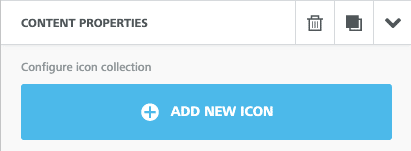
- Select Add New Icon.
- You'll see a default image (the star in the gray circle). Select Change Image to customize the icon.
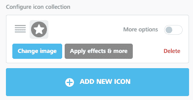
- Toggle More Options to open extended options.
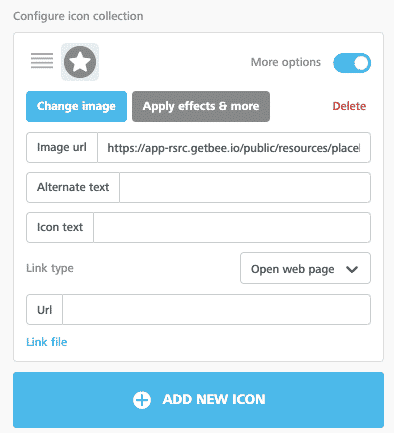
- Image URLAdd a custom image URL for any image you're not uploading.
- Alternate textAdd alternate text that describes your icon.
- Icon textThe text that appears next to your icon. If you're using a custom icon set as bullet points, add your text in the textbox. Control where your text appears with the Text position drop down.

- To add more than one icon to the same block, select Add New Icon.
- Save your design.
Menu
Add a menu element to your overlay.
- Create a new overlay or open an existing one.
- Drag a menu block into the overlay.
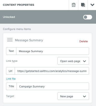
- Select the menu block in your overlay to open the Content Properties tab.
- Add and configure menu items; set the appearance properties for the menu; set options for the whole block; and choose whether or not this is a mobile menu from the Content Properties tab.
- Save your work. Preview and test your overlay to make sure your menu works as expected in a variety of environments.
Rows
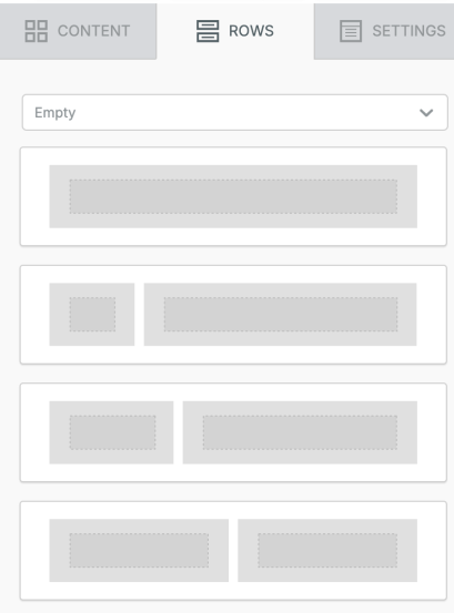
Form the structure of your overlay with pre-built rows. Rows serve as containers for your overlay content, including text and images. Select a formatted row to build your overlay from scratch. New overlays start with a single column structure in place. Multi-column rows are available.
Settings Tab
On the Settings tab, you can set global properties for your email.
- Default Font - Global font used for all text, except any text blocks where you have specified a different font.
- Link Color - Set all links, including newly created links, to a specified color.
