
Configure a LINE Campaign: Message
The Message sub-section is used to enter and preview the LINE message content.
The features and options available from the Message sub-section are described below.
Define message content
The Message section allows you to define the content of the LINE message that will be sent to your customers. This message can consist of between one and five components, each of which appears as a message "bubble" within the LINE app on the consumer's device.
 read more
-
To add a component, select the desired component type (click on an option below for more details on these types).
-
Repeat the above step as needed to add more components (up to a maximum of five).
-
If you need to delete a message component, click the X icon next to that component.
The components types are described below:
Text
To add a Text component to the LINE message:
-
Select Text from the Message Content drop-down menu.
-
Click the add button (+). A text box is added to the Message Content editor.
-
Enter your text in the text box.
-
Optionally, to add Emojis to your message, position your cursor in the text field where you want to insert the emoji.
-
In the Dynamic Panel, click on the LINE Emoji section to expand it and see a list of all of the available emojis.
-
Click on the desired emoji. The system adds the emoji Merge Code to the message (this Merge Code is a textual representation of the emoji image, such as "{%thunder%}").
Image
To add an Image component to the LINE message:
-
Select Image from the Message Content drop-down menu.
-
Click the add button (+).
-
In the Image URL field, enter the URL or filepath to the image. This image file can be on the internet, or hosted within Cheetah Digital. The image file must be in JPG format, with a maximum size of 1024 by 1024 pixels.
-
In the Preview URL field, enter the URL or filepath to the preview, or thumbnail version of the image. The Preview image must be in JPG format, with a maximum size of 240 by 240 pixels.
Sticker
To add a Sticker component to the LINE message:
-
Select Sticker from the Message Content drop-down menu.
-
Click the add button (+).
-
The Dynamic Panel on the right-hand side of the screen is populated with all of the available sticker images. Click on the desired sticker in the Dynamic Panel.
Note: A Sticker message component can contain only one image; if you click a sticker, then click a second sticker, the second sticker will replace the first one.
Video
To add a Video component to the LINE message:
-
Select Video from the Message Content drop-down menu.
-
Click the add button (+).
-
In the Video URL field, enter the URL or filepath to the video file.
-
In the Preview URL field, enter the URL or filepath to the preview, or thumbnail version of the video.
Imagemap
To add an Imagemap component to the LINE message:
Note: Imagemap components were previously known as "Rich Message" components.
-
Select Imagemap from the Message Content drop-down menu.
-
Click the add button (+).
-
Select a template (currently, Cheetah Digital supports only one Imagemap template, consisting of a single image).
-
In the Title field, enter an image title, up to a maximum of 100 characters. Optionally, you can include Personalization within the Title.
-
In the Image field, enter the URL or filepath to the image. This image file can be on the internet, or hosted within Cheetah Digital. The image file must be in JPG format, with an exact size of 1040 by 1040 pixels.
-
In the Redirect URL field, optionally enter a destination URL if the user clicks on the image. Optionally, you can include Personalization within this URL. For example:
https://www.abcd.com/billing/{(customer_id)}
Buttons
The Button Template consists of an image, a title, a short message, and between one and four buttons, each with their own resulting action.
To add a Button component to the LINE message:
-
Select Buttons from the Message Content drop-down menu.
-
Click the add button (+).
-
From the Type section, select the Buttons radio button (Buttons is currently the only supported option).
-
Optionally, in the Alternate Text field, enter the text that appears if the image fails to load.
-
Optionally, in the Thumbnail Image URL field, enter the URL to the image. This URL must start with HTTPS://. The image file must be in JPEG or PNG format, with a maximum width of 1024 pixels, and a maximum file size of one megabyte.
-
Optionally, in the Title field, enter a title for the image, up to 40 characters in length. This text string appears beneath the image, in bold. You can also add Personalization Fields to the Title field, if you wish.
-
In the Text field, enter a descriptive message, up to 160 characters (if no image or text is defined), or up to 60 characters (if an image and / or title is defined). This text string appears beneath the Title value.
-
From the Action drop-down menu, select the action that occurs when the user taps the button, then click the add button (+). The different action types are:
-
Message Action: Used to submit a pre-defined text message from the recipient back to you. In the Label field, enter the button label (up to 20 characters). In the Text field, enter the contents of the text message (up to 300 characters). You can optionally add Personalization Fields to the Text field.
-
URL Action: Used to redirect the user to a URL, or make a phone call. In the Label field, enter the button label (up to 20 characters). In the URL field, enter the destination URL or phone number. URLs must start with HTTPS://. Phone numbers must start with TEL://.
-
-
Repeat step 8 as needed to add more buttons to the Template. You can add up to four buttons, using any combination of Message Actions and URL Actions.
Carousel
The Carousel Template consists of between one and five columns that the user can cycle through by scrolling horizontally. Each column includes an image, a title, a short message, and up to three buttons.
To add a Carousel component to the LINE message:
-
Select Carousel from the Message Content drop-down menu.
-
Click the add button (+).
-
Optionally, in the Alternate Text field, enter the text that appears if an image fails to load.
-
By default, the Carousel contains two columns. To add more columns (up to a maximum of five columns), click the add button (plus-sign icon) next to the row of Column buttons. To remove a column, click the X icon within the column button.
-
Click the desired column button to configure that column.
-
Optionally, in the Thumbnail Image URL field, enter the URL to the image. This URL must start with HTTPS://. The image file must be in JPEG or PNG format, with a maximum width of 1024 pixels, and a maximum file size of one megabyte.
-
Optionally, in the Title field, enter a title for the image, up to 40 characters in length. This text string appears beneath the image, in bold. You can optionally add Personalization Fields to the Title field.
-
In the Text field, enter a descriptive message, up to 160 characters (if no image or text is defined), or up to 60 characters (if an image and / or title is defined). This text string appears beneath the Title value.
-
To add a button to this column, from the Action drop-down menu, select the action that occurs when the user taps the button, then click the add button (+). The different action types are:
-
Message Action: Used to submit a pre-defined text message from the recipient back to you. In the Label field, enter the button label (up to 20 characters). In the Text field, enter the contents of the text message (up to 300 characters). You can optionally add Personalization Fields to the Text field.
-
URL Action: Used to redirect the user to a URL, or make a phone call. In the Label field, enter the button label (up to 20 characters). In the URL field, enter the destination URL or phone number. URLs must start with HTTPS://. Phone numbers must start with TEL://.
-
-
Repeat step 9 as needed to add more buttons (up to a maximum of three buttons) to this column.
-
Repeat steps 5 through 10 as needed to configure the additional columns in your Carousel.
Add personalization fields
Personalization fields are used to populate your message with customer specific values from the database. For example, in the "Dear Customer" greeting, you could replace the word "Customer" with the customer's actual first name.
read more
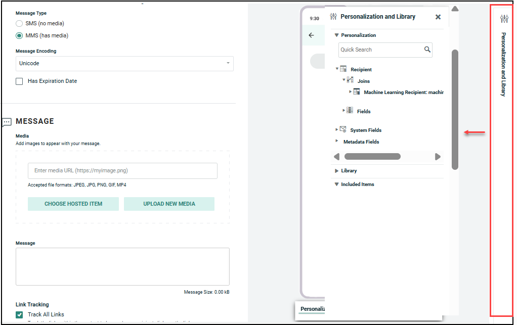
The available personalization fields are displayed within the Personalization and Library Pane on the right-hand side of the screen.
The Personalization Pane appears collapsed on the right-hand side of the screen. Within this panel, the available fields are organized into different expandable / collapsible groups. For example, you'll see a section for your Campaign source table. You may see another section called Joins if your source table is joined to another table, or a section called System Fields that contains system-generated fields, or a section called Metadata Fields that contains the Metadata fields defined in your account.
You can include various Dynamic content such as Dynamic Block, Looping Block, Content Block etc., in the message from the Library folder.
To add personalization to your message:
-
Place your cursor in the field where you want to add personalization.
-
Within the Personalization Pane, expand the desired group.
-
Double-click on the Personalization field name. Or drag the desired personalization field from the Personalization Pane, and drop it into the text field. An Insert Field Value popup dialog is displayed.
-
Optionally, enter a default value for this personalization field in the Default text box. The default value is used if their is no recorded value to personalize the message.
-
Optionally select a formatting mask from the Formatter drop-down menu. The formatting mask is used to control the appearance of the text in the personalization field. For example, you can format date fields as mm/dd/yyyy. The system includes formatting masks for currency, dates, numbers, and URLs. You can also use a formatting mask to truncate or encode the personalization field.
-
Click Ok. The system creates a new Merge Symbol for this personalization field.
Preview
The Preview window allows you to view a rendering of your message content as it will appear to your recipients. The Preview window also provides additional features as described below.
Preview message content
To see a preview of your LINE Campaign message content:
read more
-
In the Message sub-section, click Preview. The system displays a pop-up window with a simulated smartphone screen showing how your message will appear within the LINE application. Each component of the message appears as a separate bubble within the app.
-
When finished, click the X icon to close the window.