
How to Use Content Designer
Content Designer
The Content Designer provides a graphical, user-friendly interface for building email content. The Content Designer is primarily intended to be used by marketers who prefer not to work directly with HTML. The Content Designer automatically produces responsive email messages that adapt automatically to small screens, such as a smartphone.
Note: The Content Designer is an optional feature that must be enabled within your client account. Please speak to your Client Services Representative for more details.
The Content Designer is divided into two areas: the main message editing space in the center of the screen (referred to as the Workspace), and a panel on the right. The right-hand panel serves a dual purpose -- a menu of element types, and a set of properties and options available for a selected element.
In general, you drag elements from the right-hand panel, and drop them onto the Workspace in the desired location. If you then click on the element within the Workspace, the property options specific to that element type are displayed in the right-hand panel.
The right-hand panel is divided into three tabs:
- Content: Select and edit the specific content elements that make up your message, such as buttons, images, personalization, text blocks, etc.
- Rows: Select different structural elements (e.g., a single-column vs. a three-column row) to organize your content.
- Settings: Define overall settings that affect the entire message.
When you use the Content Designer, you can save the content as a repeatable asset called a "Design."
1. Access the Content Designer
1. Navigate to the Campaign screen for the desired existing Campaign, or create a new Campaign
2. Click the Content tab; the Content Designer will be displayed.
Note: If you don't have the Content Designer feature enabled in your account, the Content Editor is displayed instead of the Content Designer.
2. Select an Existing Design
When you are building the content for an Email Campaign, you can select an existing Design and use it as the basis for the Campaign.
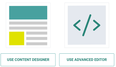
1. On the Campaign screen, click the Content tab.
2. Click Use Content Designer.
Note: that if you choose the other alternative, Use Advanced Editor, you will no longer have access to the Content Designer.
3. Your options are the Template Library, Existing Designs, and to Create Your Own design.
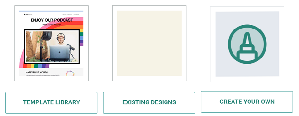
4. Select Existing Designs and choose the folder where the Design is saved.
5. Click the desired Design, then click Select.
6. The Content Designer is displayed and populated with the details of this Design.
3. Create a new Design
1. On the Campaign screen, click the Content tab.2. Click Use Content Designer.Note that if you choose the other alternative, Use Advanced Editor, you will no longer have access to the Content Designer.
3. Click Create Your Own.
4. Build the content for your new Design (see below for more details on how to edit the content and structure elements within the Design).
5. Click Save as Design. The Save as Design pop-up window is displayed.
6. In the Name field, enter the name of the new Design.
7. Select the folder where you want to save the new Design.
8. Click Save.
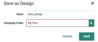
Note: To overwrite an existing Design, enter the name of the existing Design in the Name field, and select the same folder where the existing Design is saved. The platform displays a warning dialog box; click Save and Overwrite.
Content Elements
4. Add content elements to the message
1. In the right-hand panel, click the Content tab.
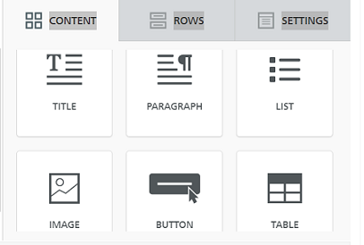
2. Drag and drop the desired content item from the right-hand panel into the desired location in the Workspace. The available content elements are as follows:
- Title: Add a Title block and configure its appearance.
- Paragraph: Add a paragraph and configure its appearance.
- List: Add a list and configure its appearance.
- Image: Add a Hosted Item, configure its appearance, and optionally add a click event to it.
- Button: Add a button, configure its appearance, and add a click event to it.
- Table: Add a table and configure its appearance.
- Divider: Add a horizontal line and configure its appearance.
- Spacer: Add a spacer and configure its appearance.
- Social: Select which "share" buttons from which social media platforms to include and configure their appearance.
- Library : Allows you to insert the following:
- Personalization Field: Insert a Personalization Field using the fields in your Campaign source table.
- Other Cheetah Digital by Zeta Asset: Add other Cheetah Digital by Zeta assets, such as Content Blocks or Opt-Out Messages.
- HTML: Add custom HTML.
- Video: Add a link to a hosted video.
- Icon: Add a series of one or more icons and optionally configure each icon as a link.
- Menu: Add a series of one or more text strings and optionally configure each Menu item as a link.
- Text: Add text and configure its appearance.
- GIFS: Add an animated GIF, and configure its appearance.
- Stickers: Add a sticker, and configure its appearance.
- Liveclicker: Add a Liveclicker item and configure its appearance.
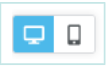
3. By default, the Workspace shows the Desktop version of the message content. Optionally, click the Mobile toggle in the top-left corner of the Workspace to see the Mobile version of the message content. To switch back to the Desktop view, click the Desktop toggle.
5. Edit Images
The Content Designer provides a built-in Image Editor for Image and Icon content items. The Image Editor allows you to apply a variety of different options and effects to an image, such as filters, stickers, and text.
1. Add an Image or Icon content item as described above, then click on it.
2. Select the image you want to use for the Image or Icon item.
3. Click Apply Effects & More. The Image Editor is displayed.
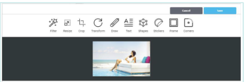
4. From the Image Editor toolbar, select the desired editing tool.
5. Using the selected tool, make any necessary changes or additions to the image.
6. Click Apply to see the changes and return to the main Image Editor toolbar.
7. Click Save to save your changes and close the Image Editor.
6. Configure content elements
Content elements contain various formatting options that control the appearance and functionality of the element. To configure a content element:
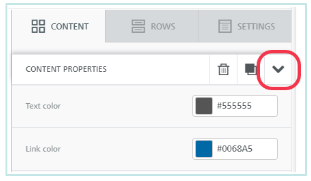
1. After adding the content element to the Workspace, click on it to select it.
2. The right-hand panel is refreshed to show the configuration options available for the selected element type, such as its width, alignment, and click action.
3. Enter or select your desired configuration options.
4. When finished, click the down-arrow icon within the right-hand panel to close the configuration options, and return to the menu of element types.
Other configuration options for the selected element include the following:
- Clone: Select the element, then click the copy button either within the Workspace, or within the right-hand panel.
- Move: Select the element, click-and-drag the handle icon, and drop the item in its desired new location.
- Delete: Select the element, then click the delete button either within the Workspace, or within the right-hand panel.
Structural Elements
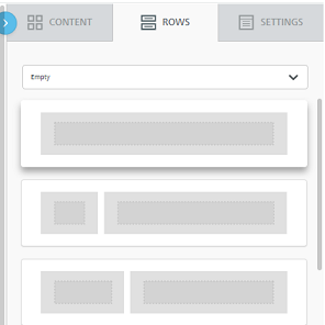
7. Add structural elements to the message
To add structural elements to your message:
1. Click Show Structure. When this feature is toggled on, the tool displays dashed lines representing the rows and columns in your Design. This view can be helpful when adding structural elements into the message.
2. In the right-hand panel, click the Rows tab.
3. Drag and drop the desired row structure from the right-hand panel, into the desired location in the Workspace. The Content Designer supports a variety of rows featuring one, two, three, or four columns.
8. Configure structural elements
Structural elements contain various formatting options that control the appearance and functionality of the row. To configure a row:
1. After adding the row to the Workspace, click on it to select it.
2. The right-hand panel is refreshed to show the configuration options available for the selected row, such as its background color or background image.
3. Enter or select your desired configuration options.
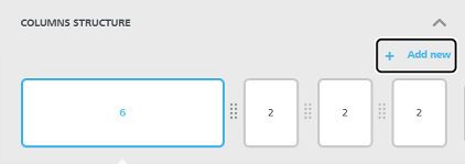
4. If the row has multiple columns, you can use the Customize Columns widget within the right-hand panel to adjust the column properties:
- Resize column widths by dragging the divider icon in between two columns to the left or right. The minimum column width is 2.
- Add a column by clicking Add new. The platform adds the new column to the far right, with a default width of 2. The maximum number of columns is six.
6. When finished, click the down-arrow icon within the right-hand panel to close the configuration options, and return to the menu of element types.
Other Features
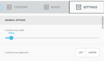
9. Configure global settings
The Content Designer supports a set of global options that apply to all elements, such as a default font and a default background color. To configure these global settings:
1. In the right-hand panel, click the Settings tab.
2. Enter or select your desired configuration options.
10. Switch to the Content Editor
As noted above, if you have the Content Designer feature enabled in your account, you'll see the Content Designer when you click the Content tab, instead of the traditional Content Editor.
If you need to view or edit the underlying HTML code, the platform allows you to switch from the Content Designer to the Content Editor. However, please note that once you switch over to the Content Editor, you can NOT then switch back to the Content Designer for this Campaign.
To switch to the Content Editor:
1. In the Campaign screen Toolbar, click the Content tab, then click Use Advanced Editor.
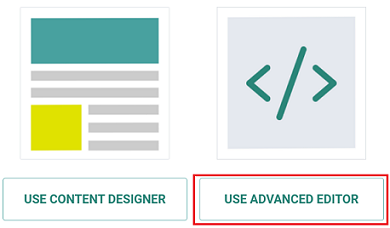
2. A confirmation dialog box is display, warning you that you won't be able to return to the Content Designer. Click Save & Confirm.
3. The Content Editor is displayed and populated with the HTML code.
11. Delete a Design
You can't delete a Design from within the Campaign screen. Instead, you must navigate to the Designs screen.
1. From the Top Navigation bar, select Assets > Content > Designs
2. Navigate to the Folder where the Design is saved.
3. Click on the Design to select it.
4. In the Tool Ribbon, click Delete. A confirmation dialog box is displayed.
5. Click Delete Item to confirm the deletion.
Note: Deleted Designs are moved to the Recycle Bin.
12. Other options
If at any point you need to roll back changes:
- To undo the last change, click the Undo button in the lower-left corner of the Workspace.
- To revert back to an earlier version, click the History button in the lower-left corner of the Workspace. The pop-up menu displays a timeline of changes including a description of the change, and a date / time stamp. Select the desired version.
To save your content, in the Campaign screen Toolbar, click Save.
Clicking Save just saves the message content for this Campaign. Optionally, if you want to save the content as a repeatable Design, click Save as Design.
Note: The Content Designer allows you to define multiple format versions for your message, like a "Mobile" or "View in Web" version. The process of defining format versions is the same as when using the traditional Content Editor.