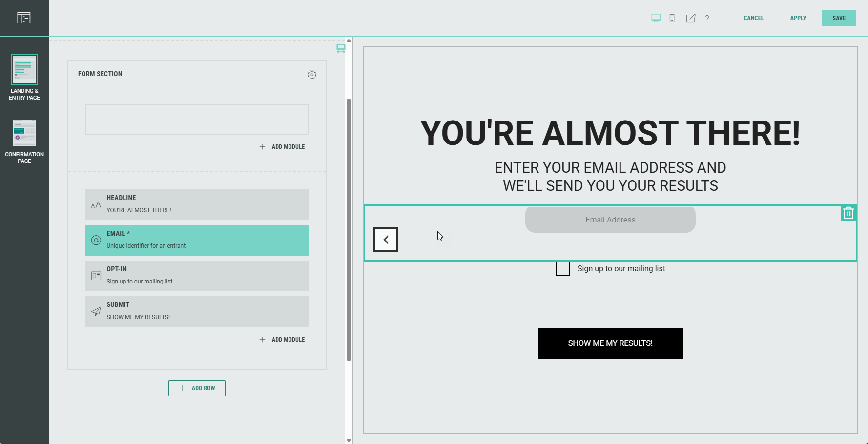
Form Section
The Form Section is used to gather data from the participant who enters the form.
It can contain text fields, input fields, radio buttons, checkboxes and many more.
Common form fields are headline, name and/or email input fields, an opt-in checkbox and a submit button to complete the form.
Depending on the type of form field, different settings can be configured.
Note: You can only use data collection modules within the Form Section.
Outside of the Form Section, only Content-type modules can be used.
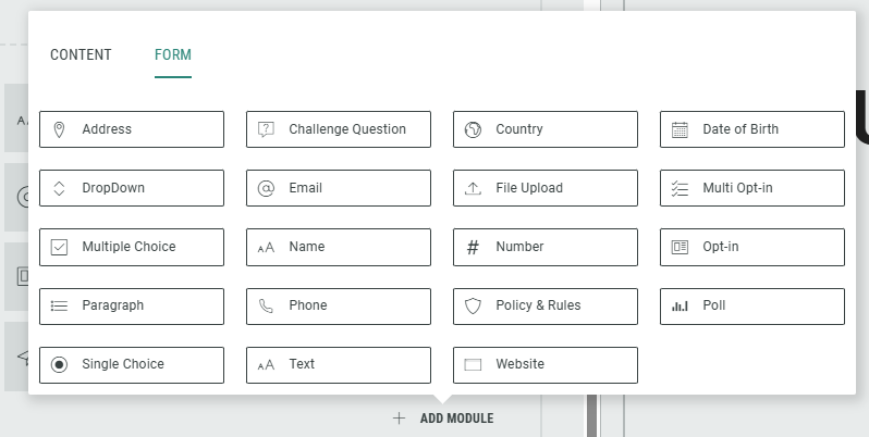
Add form fields
You can add the form fields shown in this image to each Form Section:
Edit form fields
In the Page Builder, you can edit the Form section fields by clicking each one of them, or by clicking on the Pencil icon.
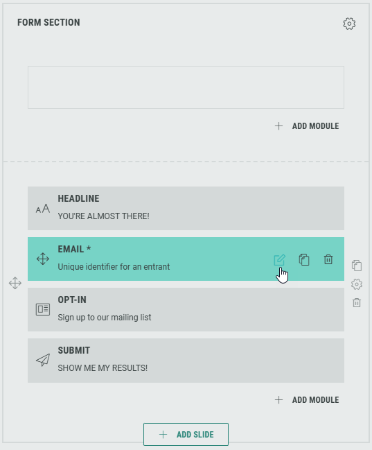
The available editable field values depend on the type of field you're editing.
Example 1:
Editing a Headline allows you to:
- edit content such as tagline and headline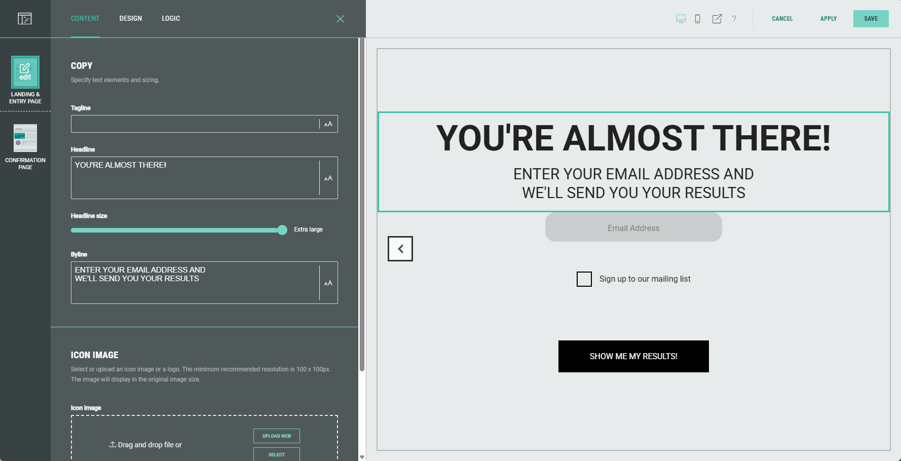
- define design settings such as background and text alignment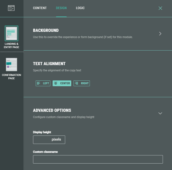
- set logic question paths for your audience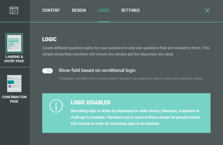
Example 2:
Editing a Submit button allows you to edit the content label and error message in case form errors occur.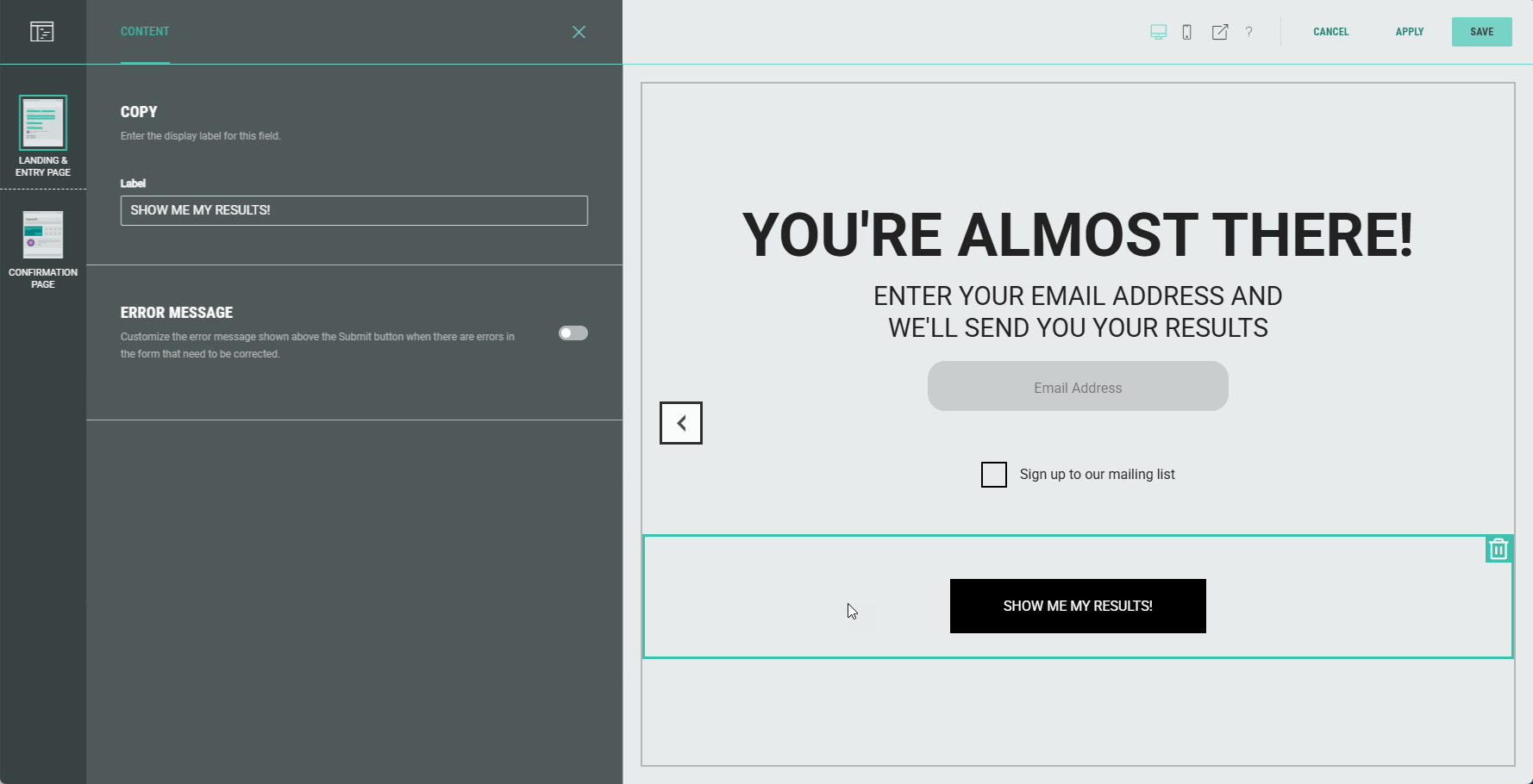
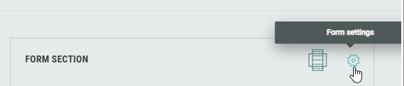
Form Settings
Within the Form Section you can click on the Gear icon to access the Form Settings.
In the Form Settings, you have the ability to customize the form such as adding a background image and color, and changing the field style.
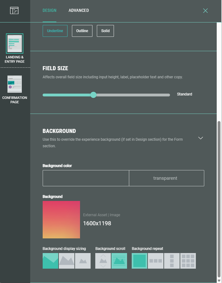
Note: On the Advanced tab in the Form Settings, you can define a Customer ID for linking data collection to the correct user profile. More info on this subject can be found here.
For NextGen experiences you can also choose the field layout; this controls the field alignment and placement of field input and copy. Choose from:
-
Left-aligned - left-aligned labels and inputs
-
Centered layout - all form elements are centered
-
Hybrid - centered fields with left-aligned labels
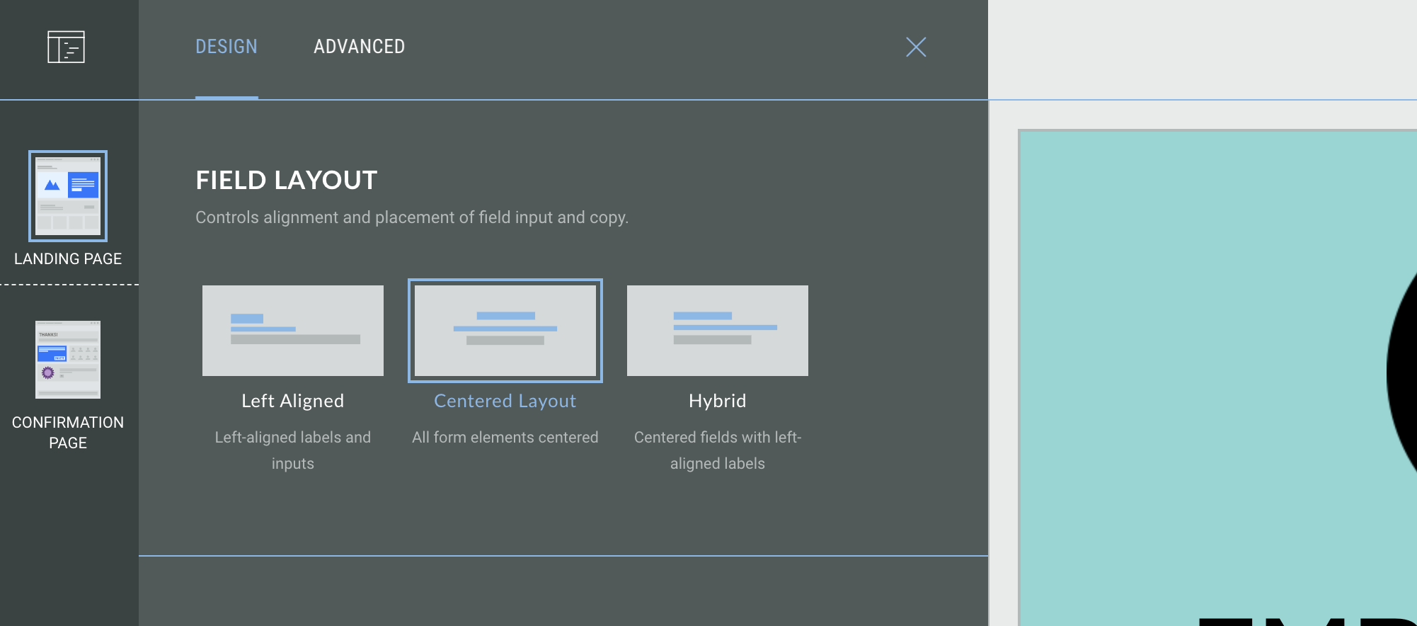
Note: Some content modules, such as Real Time Polls, will not be affected by the form alignment settings; you can use the alignment settings inside the individual module setup to define the alignment of specific modules.