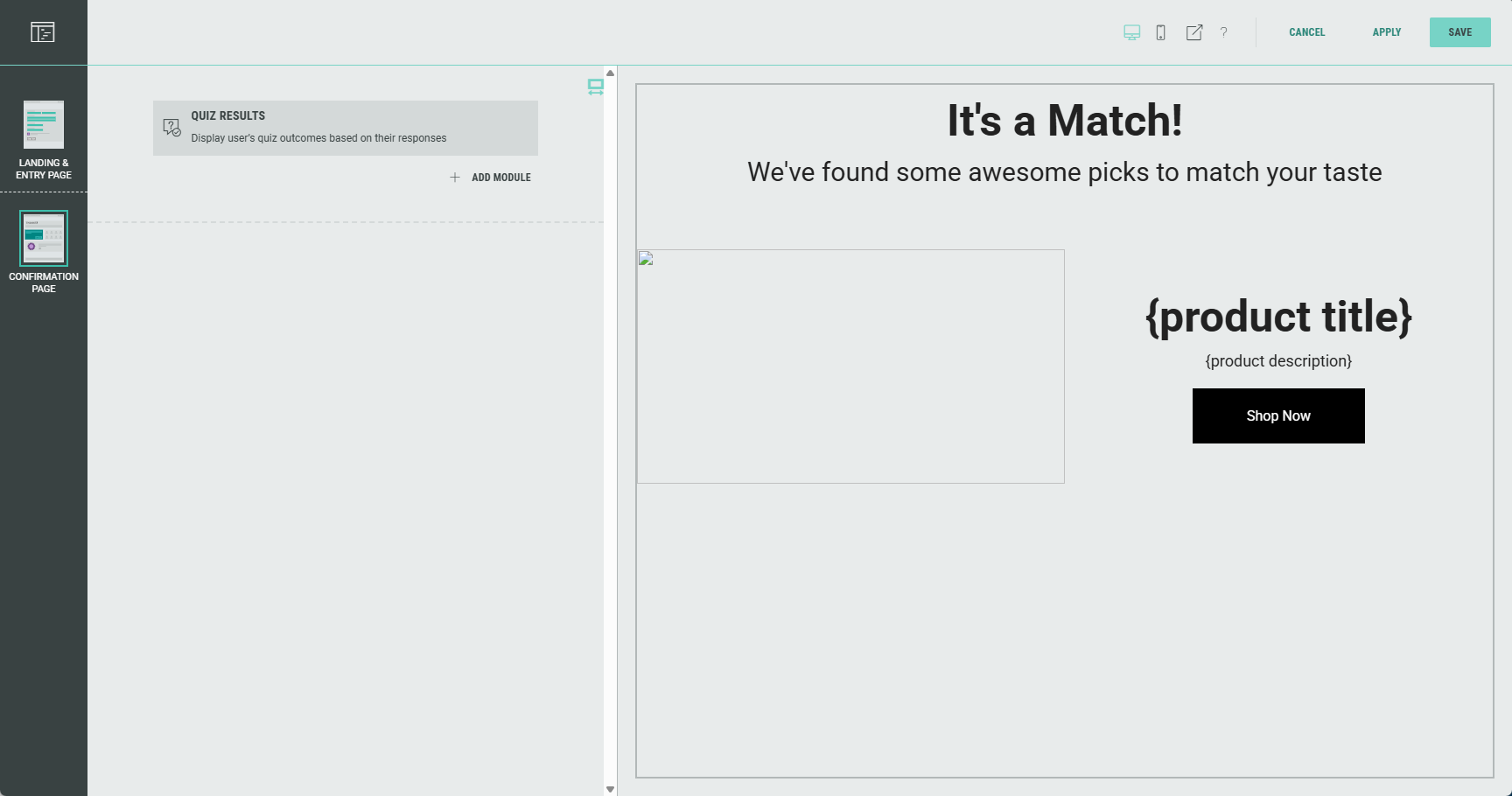
Quiz Results Module
The Quiz Results module is a participation-type module and is used to display results from a Quiz-type Experience (such as a Shopify Product Quiz) on the confirmation page of the Experience.
Note: The participant needs to have successfully completed quiz questions in the Experience to see their quiz results on the confirmation page.
You define the Results available content (in case of a product match) and No results available content (in case of no product match) that will be shown as quiz results.
Additionally, you can add some general optional text (e.g., headline, byline) and images.
The design of the module can be configured (e.g. Layout and display style).
You can edit the Quiz Results module in the Page Builder by clicking it, or by clicking on the Pencil icon.
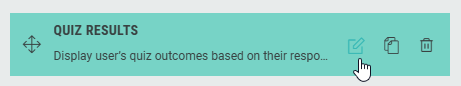
The sections mentioned below can be edited and configured to your needs (available from the tabs at the top of the Experience page builder).
Results
On the Results tab, you can map the quiz results to the participants' responses.
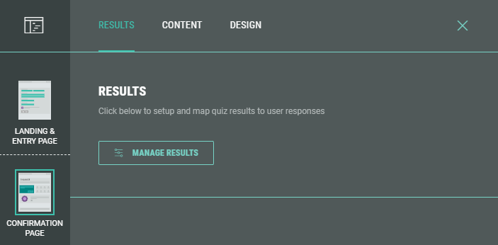
Click the Manage Results button.
Depending on if you're working with a Grow product picker (such as a Product Match Quiz) or with a Shopify or Adobe Product Quiz, the behavior is slightly different.
Manage results for Grow product pickers
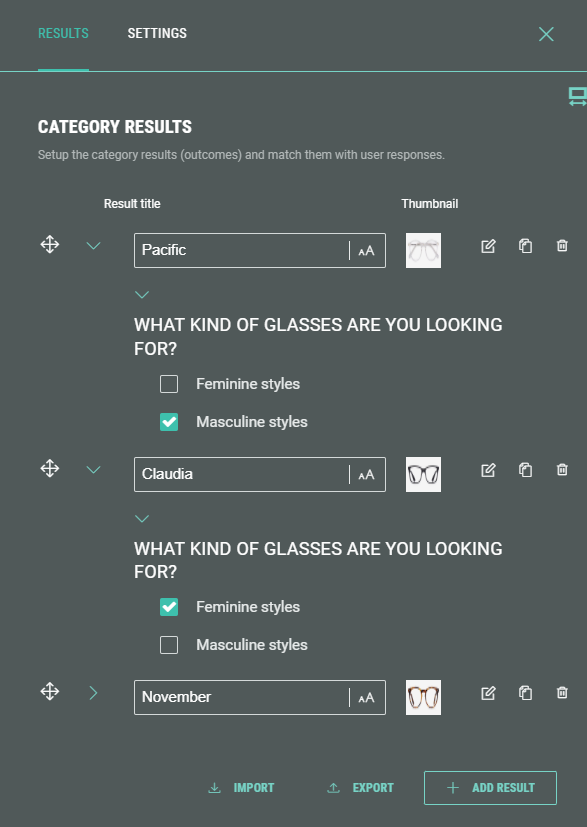
After clicking the Manage Results button, two tabs are available : Results and Settings.
Results
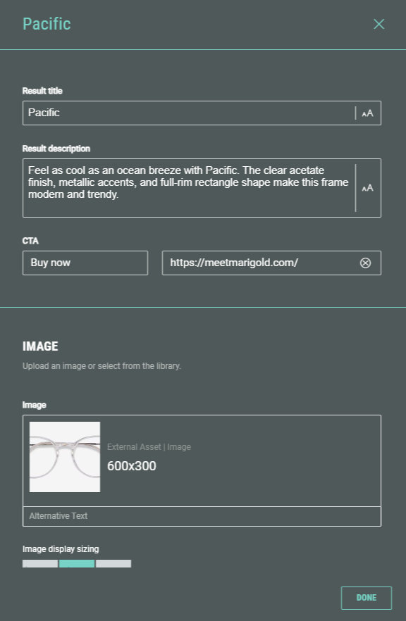
For each result, you can edit its content to be displayed, and define criteria to match participants' quiz answers to results.
Edit content
You can set a title and description to be displayed, together with a thumbnail image and a CTA (for example, to link to a product page).
Match quiz answers to results
To match participants' quiz answers to results, set the criteria for when to display each result (for example, Masculine style shows Pacific glasses, while Feminine style shows Claudia glasses).
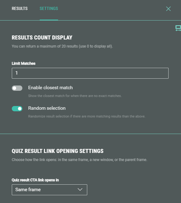
Settings
Results count display
Choose how many results to show and in what order.
-
Limit matches — Enter a value for the maximum number of matching results you want to show to the Experience participant.
-
Enable closest match — Enabling this toggle results in participants to still see a result that fits best to their answers when no exact match is found.
-
Random selection — When this toggle is enabled, it will randomize the order of results shown to the entrant, to avoid showing the same results (and the same order) every time.
Quiz result link opening settings
Configure how the CTA link, that is defined in the content settings mentioned above, will be opened upon clicking.
- Same frame — The link is opened within the specific part of the page.
- New window — Opens the link in a new browser window/tab. The current one, showing the quiz results page, remains accessible as well.
- Parent window — The opened link replaces the current quiz results page with the linked page.
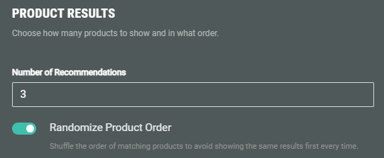
Manage results for Shopify or Adobe Product Quiz Experiences
After clicking the Manage Results button, the following screen is show, where you can choose how many product recommendations to show and in what order.
-
Number of recommendations — Enter a value here. It determines how many products you want to show to the Experience entrant.
-
Randomize product order — When the toggle is enabled, it will randomize the order of product recommendations shown to the entrant to avoid showing the same results in the same order every time.
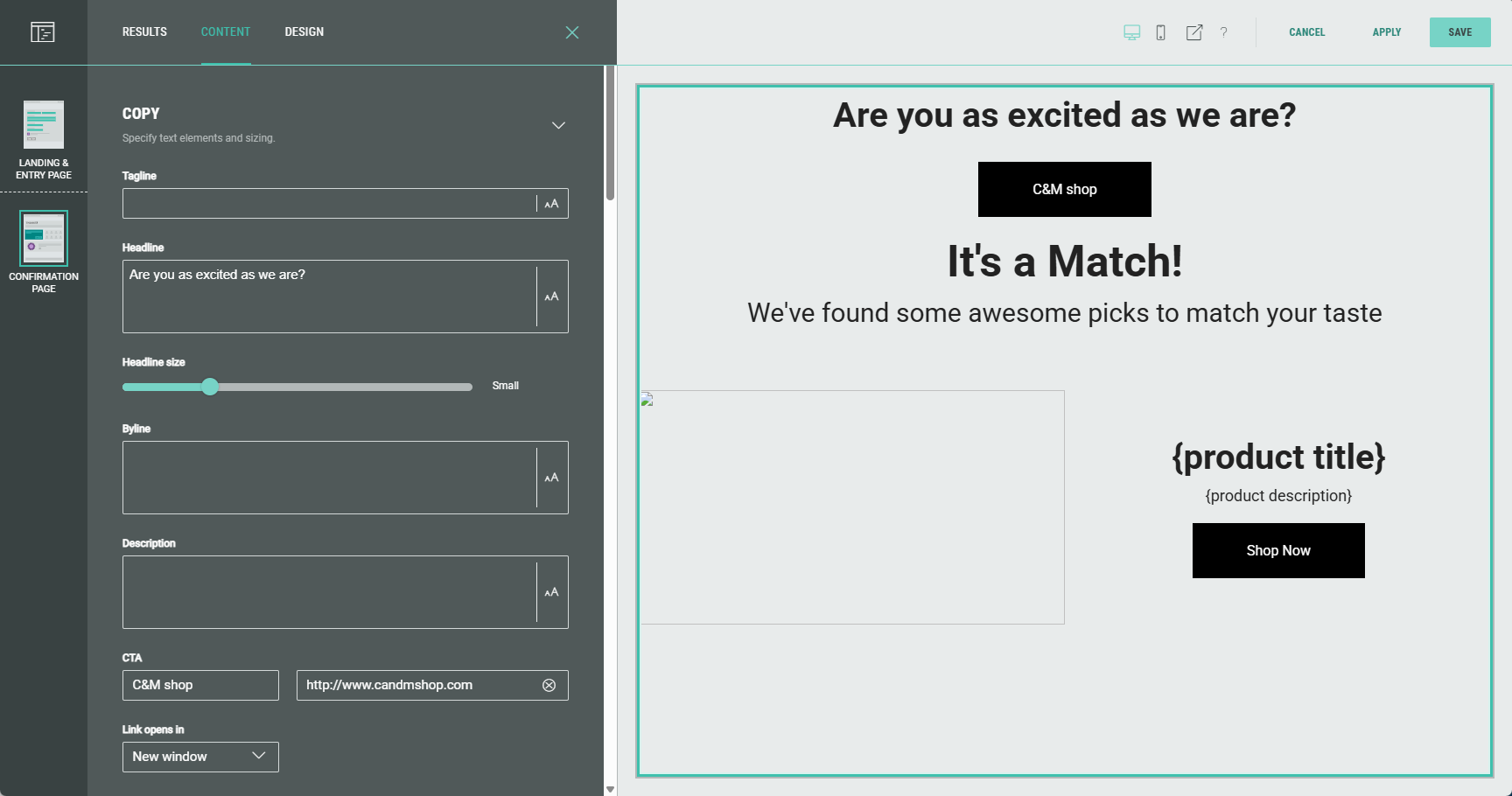
Content
- Copy (optional) — Specify text elements and sizing.
Tagline, headline, headline size, byline, description, CTA, link destination, image and icon image can be configured.
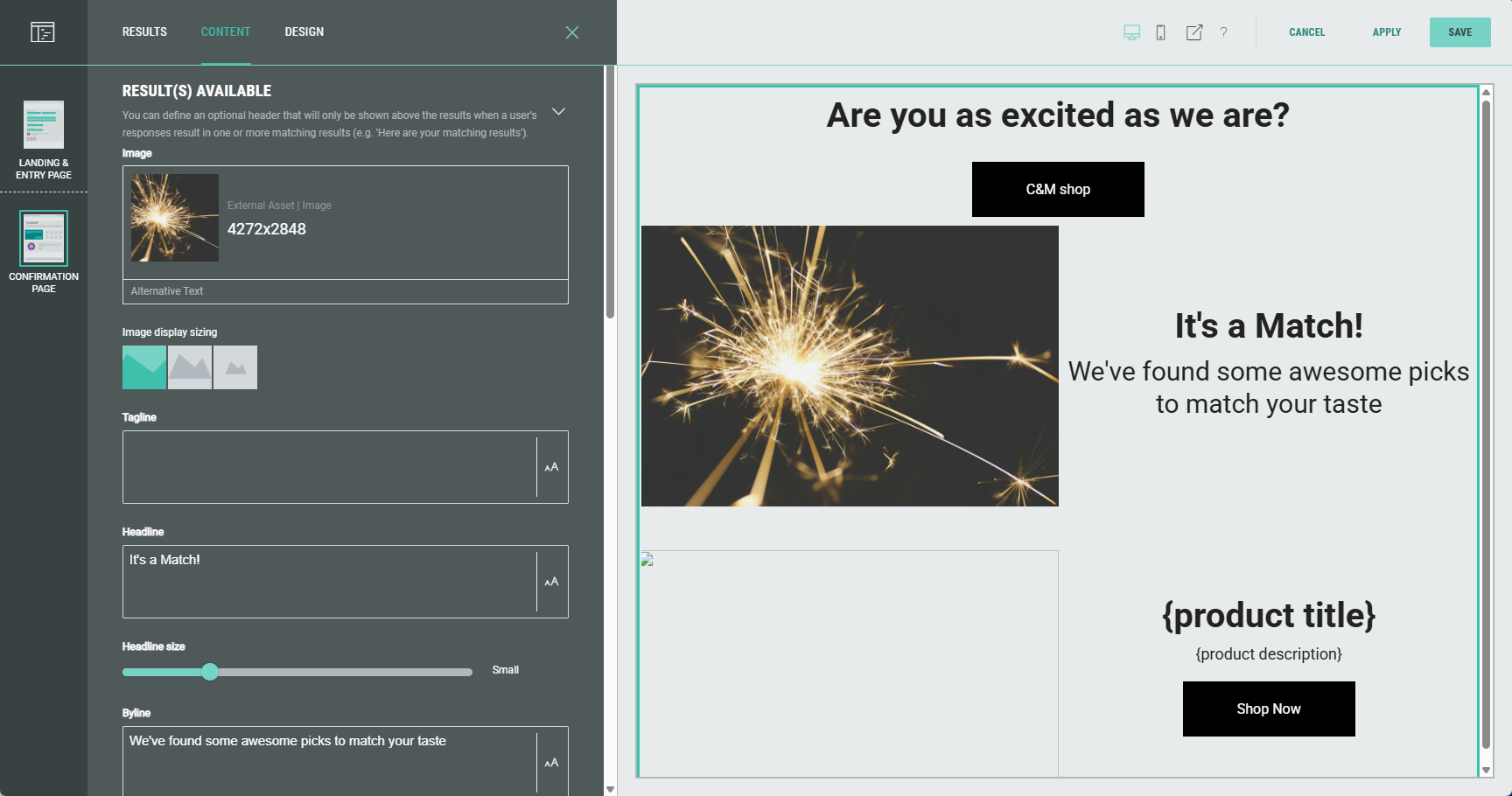
- Result(s) available — You can define text and other copy that will only be shown above the results when a participant's responses result in one or more matching results (e.g. Here are your matching results).
Image, tagline, headline, headline size, byline, description, CTA and link destination can be configured.
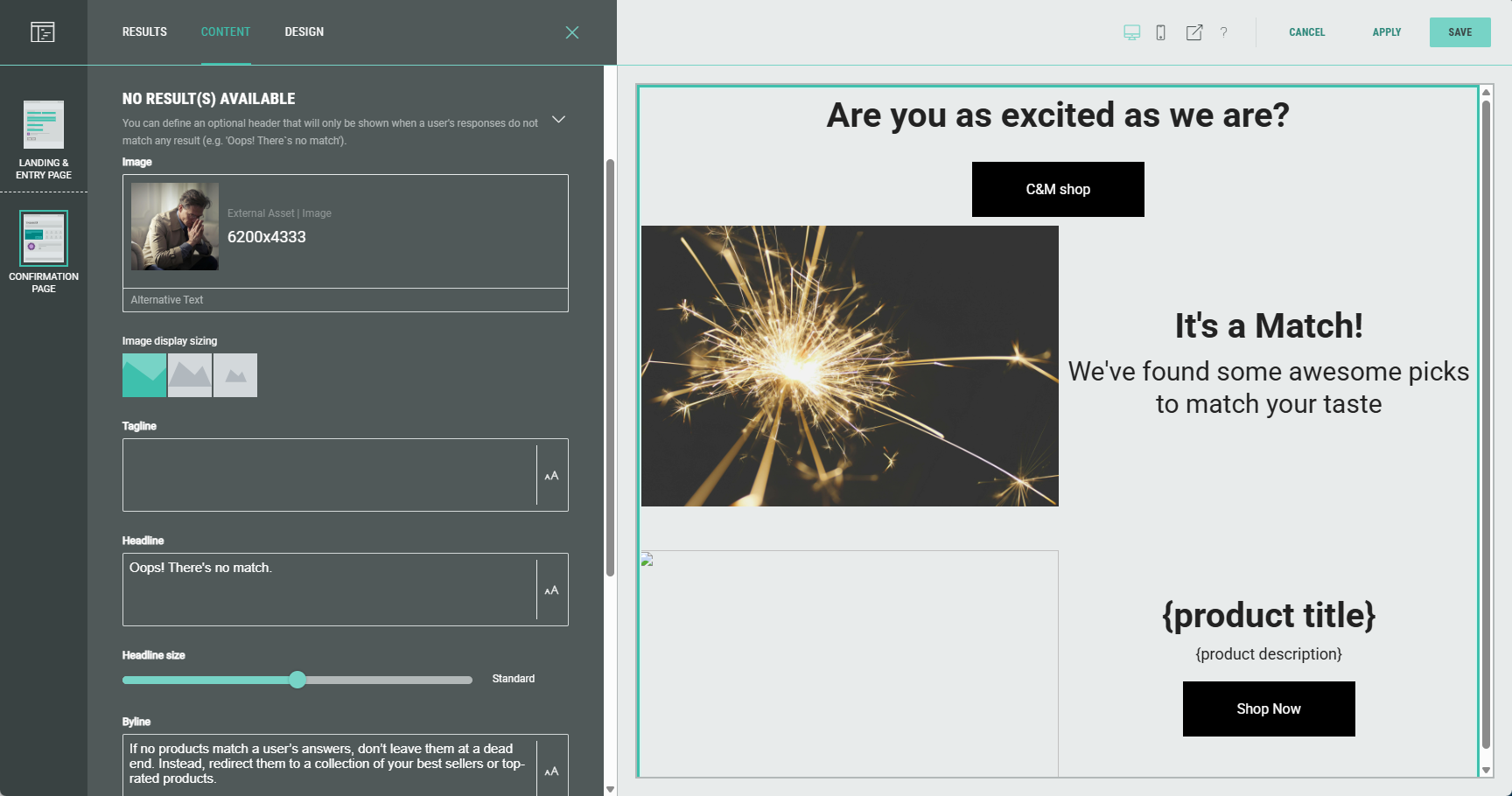
- No result(s) available — You can define text and other copy that will only be shown when a participant's responses do not match any result (e.g. Oops! There's no match).
Image, tagline, headline, headline size, byline, description, CTA and link destination can be configured.
Design
Layout
Choose a layout on how to display the Quiz Results.
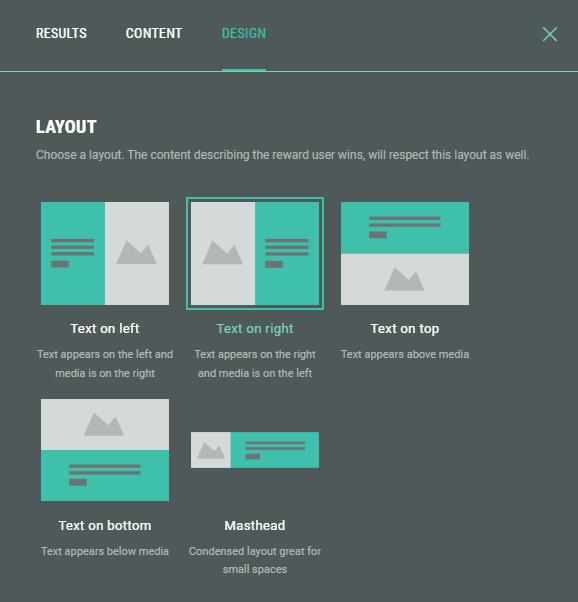
Examples:
- Text on bottom: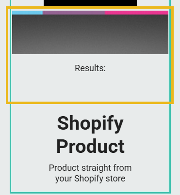
- Masthead: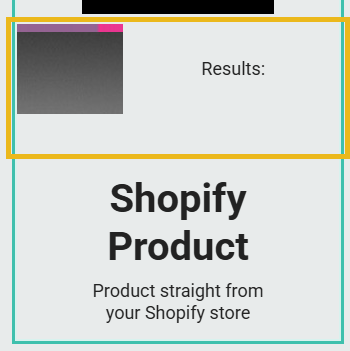
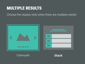
Multiple results
Choose the display style when there are multiple results.
- Carousel — Displays the results as a horizontal carousel that can be cycled through. Users can manually navigate through the results using left/right arrows or pagination dots.
- Stack — A vertically stacked layout that organizes the results in a top-to-bottom sequence.
Background
Use this to override the Experience or form background (if set) for this module.
Example: of a background image being set.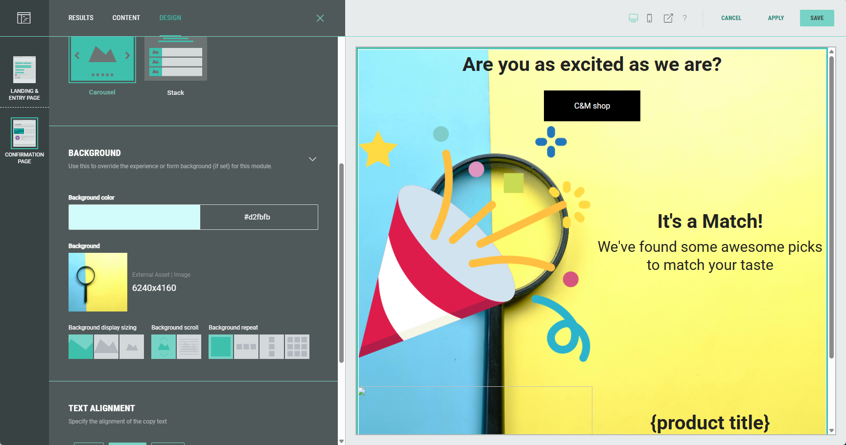
Note: More info on how to add a background to an Experience can be found in this article.
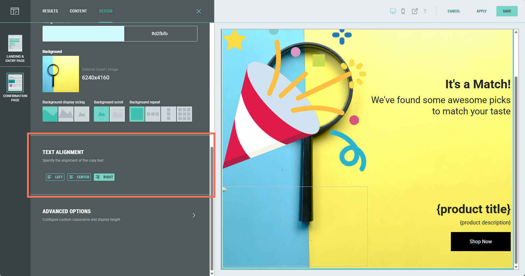
Text alignment
Specify the alignment of the text copy: Left, center or right aligned.
Advanced options
With the advanced options, you can configure the display height of the Quiz Results and set a custom class name.
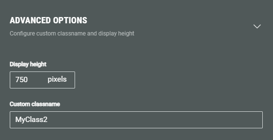
- Display height — Defines the fixed pixel height for this module.
Note: This overrides any heights set in the theme or stylesheet.
Warning: Only touch this section if you are a developer, as this may impact your Experience hugely.
- Custom classname — Will be output as xCustomModule-[Your-CSS-Classname] in the module when it is rendered on the page. Use this to give your module a unique style. You can also target CSS classes in a theme using the custom CSS classname.