Creating Accessible Web Content Using Grow
At Zeta, we’re committed to helping marketers create Experiences that everyone can use — including people with disabilities.
Accessibility is built on the POUR principles:
- Perceivable — Content must be available to all senses.
- Operable — Users can interact using keyboard or other inputs.
- Understandable — Language and functionality must be clear.
- Robust — Content should work with supportive technologies.
In this topic we explain how Grow supports accessibility — and how you can create more accessible Experiences using our platform.
Text alternatives (alt text)
Why it matters: Screen reader users rely on alt text to understand images.
What you can do in Grow:
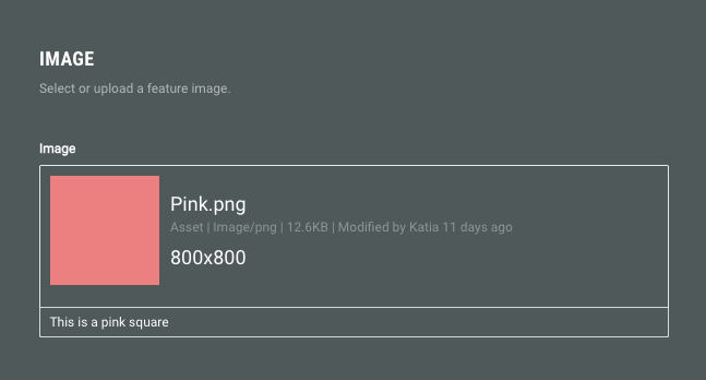
Anywhere you upload an image, you’ll see the option to add alt text.
Use it to briefly describe any non-decorative image (e.g., logos, product images).
Decorative images can be left blank or marked as decorative.
Video captions and audio descriptions
Why it matters: Captions help people who are deaf or hard of hearing. Audio descriptions help users understand visuals.
What you can do in Grow:
- Upload videos that already include captions.
- Use our video module to add a short descriptive caption.
Avoid using video content that communicates key info without a text alternative.
Clear and consistent headings
Why it matters: Proper heading structure helps screen readers and improves usability for everyone.
What you can do in Grow:
Use our built-in heading options:
- H1: Heading
- H2: Byline
- H3: Tagline
Ensure headings are nested logically and used to structure your content.
Keyboard navigation and focus indicators
Keyboard navigation
Keyboard navigation means users can move through your content and interact with elements — like buttons, links, and forms — using only their keyboard (typically with the Tab, Enter, and Arrow keys). This is essential for people who don’t use a mouse due to motor or visual impairments.
Why it matters: Some users navigate entirely by keyboard and need visual cues for where they are.
How Grow supports it:
- Grow Experiences are built to support full keyboard navigation out of the box.
- All interactive elements (like forms, buttons, and links) are reachable and operable via the keyboard.
- Tab order follows the source order in the HTML, which typically means top to bottom, and left to right within each line.
Focus indicator
A focus indicator is a visual cue that shows users which element on a webpage is currently selected. It’s often a visual change like an outline, a highlight or a change in color.
How Grow does:
- Our Canvas theme includes built-in focus indicators.
- You can customize focus styles using CSS in Scaffold.
Font and color choices
Why it matters: Poor color contrast can make text unreadable.
What you can do in Grow:
- Set font and background colors in the theme designer or form/module settings.
- Aim for strong contrast between text and background.
- Avoid relying solely on color to convey meaning.
Accessible buttons and CTAs
Why it matters: Buttons should be usable, understandable, and tappable.
What Grow does:
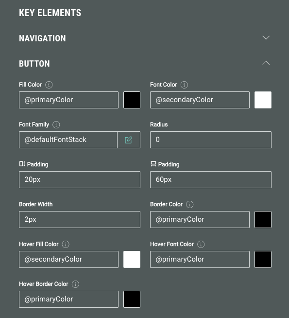
- Button styles include visible focus states by default.
- You can create buttons with sufficient size and padding.
What you can do in Grow:
- Use clear, descriptive labels (e.g., Shop our bestsellers instead of Click here).
- Ensure buttons are at least 24x24 pixels or have enough padding.
Tables
Note: Tables aren’t natively supported in Grow, but can be added using the HTML block.
What you can do in Grow:
For accessibility:
- Use proper HTML table markup.
- Avoid layout tables — use tables only for data.
What Grow does:
When using our HTML block, if the HTML is already accessible when pasted or typed into the content block, it will remain accessible when viewed in a web browser.
ARIA labels
ARIA labels are attributes defined by the Accessible Rich Internet Applications (ARIA) specification, which help make web content more accessible to people who use screen readers or other supportive technologies.
Why it matters:
They are especially useful when:
- A visual element (like a button or icon) doesn't have visible text.
- The native HTML semantics aren't clear enough for accessibility.
- Custom UI components are built with <div>s or <span>s.
What Grow does:
- ARIA labels are automatically set using form labels or placeholders.
- Advanced users can adjust ARIA labels in the JavaScript tab.
Optimization for screen readers
Grow supports tailored functionality for screen readers.
Why it matters:
Screen reader optimization ensures that all participants—including those with visual impairments—can fully interact with and understand Grow Experiences. Clear audio cues and accessible controls create an inclusive, seamless Experience for everyone.
What Grow does:
For scratch cards, when the screen reader reads the scratch card area, it announces a customizable string (you can change it in labels & translations), saying: This Image is a scratch off card. To reveal your reward, press the space bar.
That lets the participant clear the scratch card and access their reward, without actually having to scratch.
When a participant reaches a drop-down in an Experience, the screen reader announces it, and announces its state (expanded/collapsed), and what option is currently selected (if there's any selection).
When a participant expands a drop-down and switches between options via the arrows, it announces each option and its order in the list of available options.
When a participant selects an option, the screen reader mentions the selected option.
Custom HTML
If you're adding your own code:
- Make sure the HTML you paste is already accessible (e.g., use semantic tags like <button> instead of clickable <div>s).
- Accessible code will remain accessible when rendered through Grow.
Learn about the accessibility best practices when using custom HTML.
Summary
Grow helps you meet key accessibility best practices by:
-
Supporting alt text, video captions, keyboard navigation, and clear heading structure.
-
Letting you design with color contrast and size in mind.
-
Offering ARIA support and accessible HTML for advanced users.
By combining what Grow offers with a few best practices, you can build Experiences that are more inclusive and legally compliant — without needing to become an accessibility expert.


