Administrator User Guide for Analytics
The Admin Edit Mode is the professional version of the Analytics tool. Users with this access are able to customizein addition to leveraging all basic enhanced analytics features.
Out of the box, the initial set of Analytics dashboards for Loyalty includes the Member Dashboard, Sales Dashboard, Offer Dashboard, and the Program Economy Dashboard. More about these standard dashboards can be found in the Basic Viewer Mode User Guide.
This guide will detail the following:
- How to set up your console to enable Edit Mode within the Analytics platform
- How to create a new dashboard
- How to configure dashboard components in the dashboard
- Additional dashboard options
- A common use case for Admin users
Note: Editor Edit Mode has identical capabilities to Admin Edit Mode. Therefore this guide will only address Admin Edit Mode.
Setup for Enabling Edit Mode for Dashboards
The default setting for access to analytics is Basic Viewer Edit Mode (which has a value of false). This is so that the dashboard data is protected and not every user may access it. To customize dashboards, you must have the Admin Edit Mode set. As such, it is necessary for a designated Account-level Admin to complete some configuration to enable access to the Edit Mode drop-down in Loyalty to then set the Admin Edit Mode.
Caution: Once the Account-level Admin performs these steps to enable the Edit Mode drop-down, all users will be able to go in and change their edit mode.
1. Navigate to Program > Settings > Program Settings.
2. Find or search for and click on the program setting Enable Edit Mode for Dashboard.
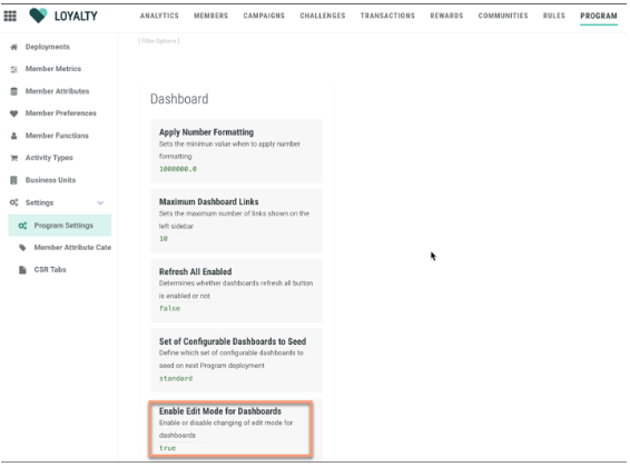
3. Set the value to true in the drop-down. The true value is necessary to allow for the Admin Edit Mode to be enabled/visible in the Analytics screen.
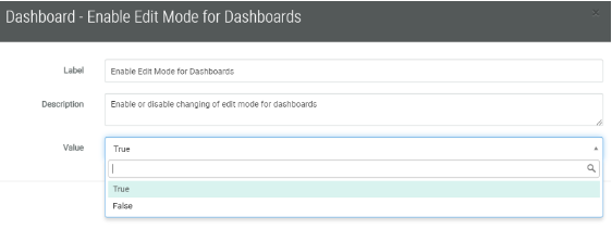
4. Click Save.
Note: After the above Program Setting has been changed to True to enable Edit Mode, any user may perform the following steps to change their access to Admin.
5. Navigate to Analytics > Actions > Edit.
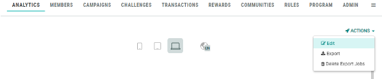
This will bring up the Edit Dashboard pop-up:
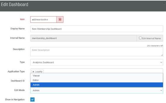
6. From the Edit Mode drop-down, select Admin.
7. Click Save.
Note: If the Program Setting was not set to true as in Step 3 by an Account-level Admin, then the Edit Mode drop-down field will not be visible, as the default mode of Basic Viewer Mode would be in effect.
Designing Dashboards
Creating a New Dashboard
Building a dashboard is about displaying the data collected over time in a structured way to allow the marketer to get founded insights into how their campaigns are performing.
As an Admin user, you can create new dashboards by dragging and dropping visual components onto the dashboard. You can also simply click on the component and it will be incorporated into your dashboard that way. You can further define the settings for these components to collect and view the metrics best suited to your needs.
1. Navigate to Analytics on the top navigation bar. Click on + New dashboard.
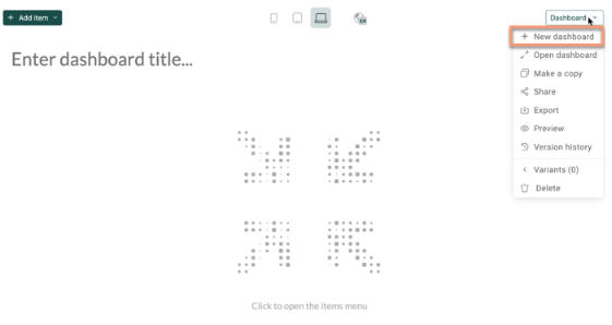
2. Enter a name for your dashboard at the top-left in “Enter dashboard title”. The name will automatically save.
3. Adding datasets: You must first select your dataset to begin building your dashboard. The Dataset is used to define the measures, categories, and grouping of the dashboard components.
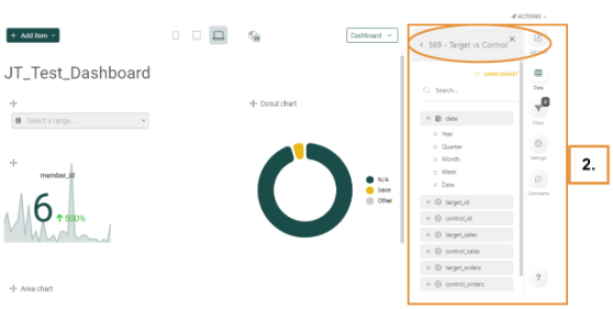
You must add a dataset to your dashboard from the Available Datasets list located to the right of the dashboard. In the example below, the Target vs Control dataset was selected.
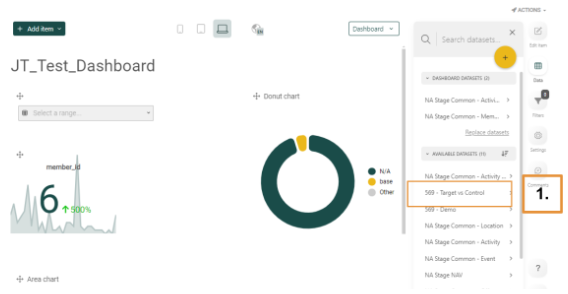
Once selected, the list of components for that dataset, Target vs Control, will be displayed underneath it, as below:
Caution: A maximum of 100 dashboards can be created by default. For performance reasons, it is recommended to not create more than 100 dashboards as anything above this amount might impact performance.
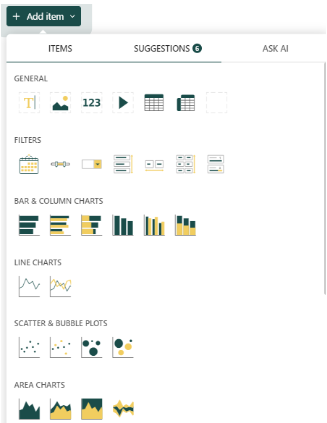
4. Add additional dashboard items that pertain to the dataset selected. At the top of your dashboard, click the + Add Item button to access the components available for use in the dashboard.
- Items: The first tab displays several components that you can add to your dashboard to display results, such as text, pivot tables, video, filters, charts (including hierarchical charts and financial charts), plots, gauges, maps, et al. If you want one or several of these elements, simply drag and drop them into your dashboard.
Note: You can arrange, move, adjust the size of these items, etc. to tailor the appearance of your dashboard.
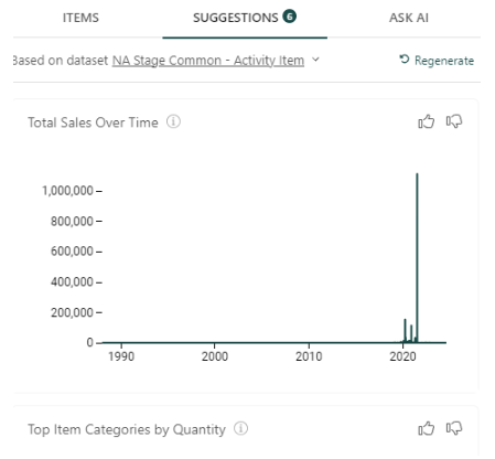
- Suggestions: This tab makes suggestions for datasets that might be useful. Some examples include Seasonal Trends in Sales, Target Sales over Time, a comparison of Target vs. Control Sales, et al. If you’d like to see additional suggestions, you can click on Regenerate, and additional suggestions will be displayed. Drag and drop any of these into your dashboard and rearrange and resize the element as desired.
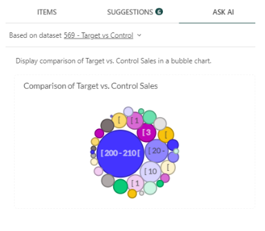
- Ask AI: This tab utilizes OpenAI to generate projected metrics based on the request you enter. Simply type in your request into the blank area, e.g., “Display the comparison of Target vs. Control Sales in a bubble chart,” then click Send. Based on the datasets given, the OpenAI API will generate your output. Note that the results may contain inaccurate information.
Device Layouts and Language Options
Device Layouts
When designing a dashboard, there are several layout options to choose from. At the top-center of the screen, note the various icons for Smartphone, Tablet, Desktop, and Large screen views. Change the layout by clicking on the layout buttons to switch from one view to another.
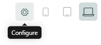
You can change layouts quickly by also clicking on the Configure/Settings icon, clicking on the screenmode option.
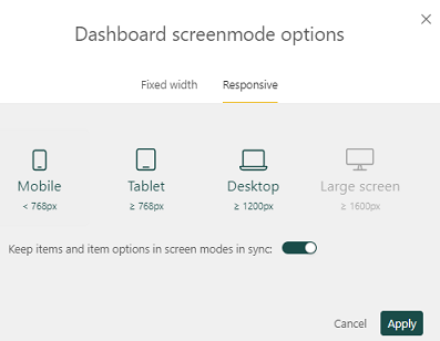
Responsive: Under this tab, you may adjust the tile display by using the various screen sizes (mobile, tablet, desktop, etc.) available. Click Apply to set this.
Toggle: The toggle to keep items and item options in screen modes in sync allows you to synchronize the settings you make for charts across all displays.
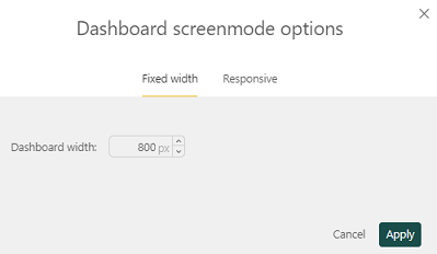
Fixed width: You may select a dashboard width that is fixed (click Apply to set this); this will remove the options for the other layout types as the width will be standardized:
Language Options
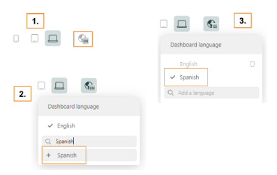
You can easily update your Dashboard language. First, click on the icon for Dashboard language. Second, search for the language, then select it when it appears as an option. Third, click on the newly added language to set the dashboard from English to the preferred language. Optionally, you may delete English or any other languages that are not needed showing as options.
Configuring Dashboard Components
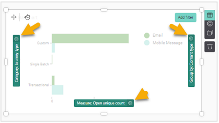
Configuring your dashboard components is done by using the dashboard menu at the upper-right of each component.
The dashboard menu is comprised of the following options:
 Data - allows drag and drop options, categories, and the creation of grouping on graphs
 Settings - allows changes to the specific settings for a component, such as title, theme, adding a legend, and more
 Clone - copies the component
 Delete - deletes the component
 Add filter - allows the addition of a filter that will only apply to this specific component. Note that the Add filter button is only displayed after clicking the Data icon.
The next section will detail the data that can be brought over into your selected components as well as what Category, Measure, and Group by mean, and how they are helpful to your setup.
Data Elements
The data in the datasets can be of 4 different types. Each type has a dedicated icon:
- Hierarchy: Describes mutually exclusive things such as gender, operating hours, country code, etc. These can be strings and numerics and can be used as categories and to group data.
- Date time: Such as year, month, week, day, hour, minute, second. These show an evolution over time and can also be used in filters.
- Measures: Numerical values used within calculations (e.g., emails sent, delivered, opened). Aggregates can be created on these measures.
- Topography: Defines a location (e.g., longitude, latitude). This is used to represent data on maps.
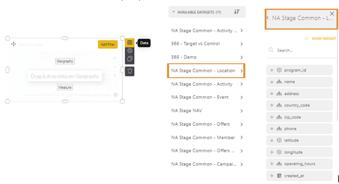
1. To access the data for a given component, click the Data icon in the component. The list of available datasets is displayed on the right. Select one to access the columns in the dataset.
In the below example, NA Stage Common - Location is selected, and the columns that are available to location open up:
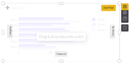
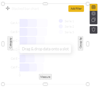
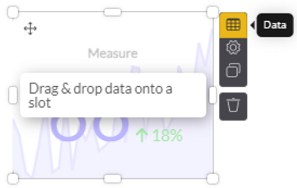
2. Click on Drag & Drop data onto a slot. Doing so brings up dashed squares (such as Category, Measure, and Group by) within the component to which you can drag and drop data fields from your dataset:
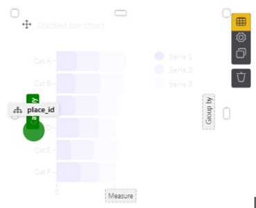
3. Proceed to drag and drop the desired data field from the column on the right and place it into the dashed squares. Note that you need to hover the selected item over the desired target until it becomes green. In the below example, place_id was selected and placed into the Category slot:
Note: When using a bar chart, a new bar will be created for every value of the hierarchy field (in the example above, the place_id). For fields with many values, the number of new bars can become excessively large. In this case, you can filter by selecting only the top/bottom x values (this is done in the settings of the element).
Category, Measure, and Group by Options
Category is collection of data that can be divided into groups. It can contain any hierarchy field or date (time) field. The label of a Category can be changed. The categories used in a component each give access to a Settings panel as well.
Measure is any numerical field or count of something. When no measure is placed, it is a count of the number of records within the dataset. The measures used in a component each give access to a Settings panel as well.
Group by is a kind of a grouping that further drills down on a category or a dimension. It will take a group of members, for example, and allow you to group them by an additional segment such as gender or age. The label of a Group by field can be changed.
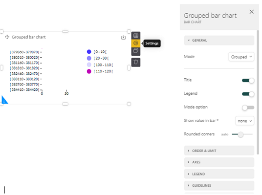
Settings
The settings of a component allow you to define the properties for the current component, such as the title, the theme, etc. The specific settings that can be defined for a component depend on the type of component.
1. Select the Settings icon; the right-hand side of the screen will display the possible settings of the selected visual component:
Caution: When there are too many values displayed in the component, the chart can become unreadable. If so, you can limit the values. For example, you can limit the number of bars displayed in a bar chart, the number of observations in a line chart, and the number of rows or columns in a pivot table.
Example
For a Bar or Column chart, you have the option to limit the values to the top or bottom x values. Under the Settings for that particular chart, click on Order & Limit in the options menu at the right. In the below example, the limit has been set to the top 10 values and ordered by Category in an ascending order.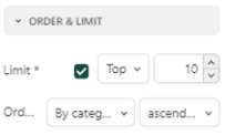
Filters
Filtering is useful to set your focus. This can be done in advance or on the fly when viewing the dashboard. There are two types of filtering:
- Static filtering: This is always applied in the background. This can be set by the creator of the dashboard at dashboard-level or at the level of a visual component. When a filter is applied on the level of a dashboard, the filter is by default applied on ALL visual components of the dashboard. When the filter is set on a specific visual component, it only applies to that component. Please see this documentation on static filtering for more information.
- Dynamic filtering: This is applied by the user while working on the dashboard. Please see this documentation on dynamic filtering for more information.
Other Dashboard Options
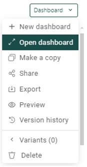
Open dashboard: You can open a previously-created dashboard by clicking on Open Dashboard and selecting from existing dashboards.
Make a copy: You can duplicate an existing dashboard.
Share/Export: You can share your dashboard within Loyalty Analytics by giving access to your dashboards to other users with different access levels ranging from view, edit, use, or own.
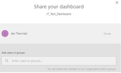
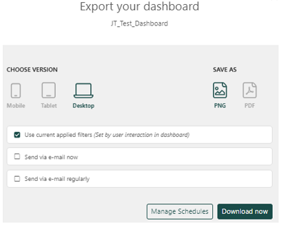
You can also share dashboards by exporting them as PDF or PNG, and define the format based on the device being used.
Preview: Allows you to preview your dashboard.
Version history: Dashboards often undergo a continuous process of change based on feedback or new requirements. To visualize the changes over time, a version history is available, providing a chronological overview of the changes made. Clicking on a version displays the dashboard in the state corresponding to that version.
Use Case: KPI Dashboard
As an example of a common custom dashboard that customers often use, consider a KPI dashboard. Below is an example of how to set up a KPI dashboard end to end, where the total number of members is displayed as well as the evolution of new members over time.
1. Ensure the setup of the Edit Mode is enabled so that your access is that of an Admin and that the dashboard is able to be customized.
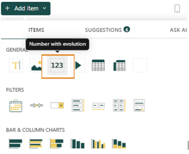
2. Under Analytics > Dashboard > + New dashboard, click on the +Add item button. Click on the 123 button under the Items tab.
3. Click on the KPI component selected, then click on the Data icon.
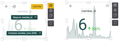
4. From the dataset on the right, click on NA Stage Common - Member. Then from the resulting column of items, drag and drop member_id over into the dashed box labeled Measure. Be sure to line up the selected item with the dashed box such that the color turns green.
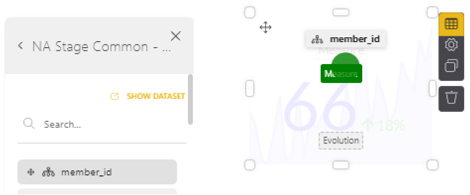
This gives you the total count of members by member_id. Add another element to the Evolution dashed square, such as member_since by month (found in Member > member_since, then select time period, as pictured on left). When you click out of the chart, it renders the metrics, as shown on the right (there were 6 new members over the past month which was a 500% increase).
Note: Evolution is the measurement of how a metric is trending over a time period.
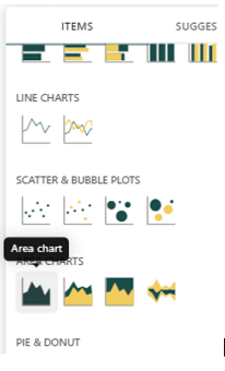
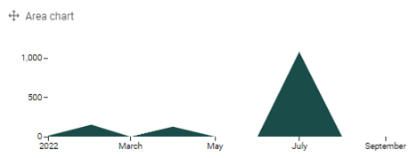
5. Another useful metric are charts in KPI dashboards. Select, for example, the Area chart by clicking on the +Add item button and clicking on an area chart under the Items tab.
- For Measure, select gross_sales (click on Activity in the right, then scroll down to find gross_sales or search for it in the search bar), and drag and drop it into the Measure box.
- For the X axis, select activity_ts (click on Activity on the right, then scroll down or search for it), then drag and drop it into the X axis box. You can leave Group by blank (it’s optional), or add another element under Activity to the Group by box to further group your results.
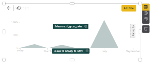
When you click out of the chart, it renders the metrics as below.
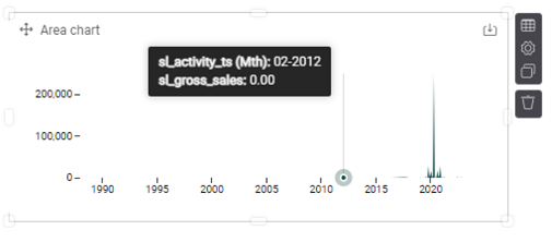
If the data presented isn’t within the time range you want, you can either add a filter (click on the Data button and the Add Filter option appears in the upper-right of your element), or select an element from the right to define your time range.
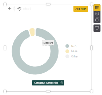
Note: To select a datetime that applies to all elements you’ve chosen for your dashboard, simply click on the desired element, such as activity_ts, then drag it to the top of your dashboard. Click on the datetime field to enter the desired date range.
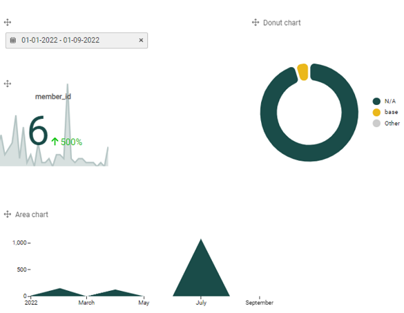
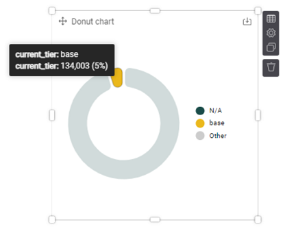
6. Another useful metric in KPIs might be to assess members by tier. Select a chart, such as a Donut chart (+ Add item button, scroll down and click on Donut chart under Items tab). For the Category, select from the right Members > current_tier to see all members in the current tier. You could either select an element for your Measure, or you can leave this blank. When blank, the Measure displays the total count of records within a dataset.