
Getting Started with the People Explorer
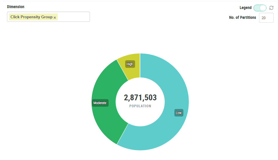
The People Explorer screen allows you to visualize and understand your Member population along one or two dimensions represented by Member Attributes, Member Preferences, or Member Functions. When you select one of these dimensions, the platform generates a donut chart. Each distinct value in the selected dimension is displayed as an arc within the overall circle. By comparing the lengths of these arcs, you can quickly see the proportional sizes of the different populations.
For example, let's say you want to view a breakdown of your Member population based on their propensity to click a link in an email message. You would begin by selecting the Click Propensity Group Member Attribute as the dimension. The platform generates a donut chart showing the relatives sizes of the Low, Moderate, and High Click Propensity Groups.
The People Explorer allows you to optionally select a second asset, which is then displayed as a second ring in the donut chart, allowing you to see the intersection of values between the two selected assets.
Continuing the above example, let's say you want to further explore your Member data by showing Member ages for each Click Propensity Group. You would add a second dimension: the Age Group Member Function. This Function assigns Members to one of a handful of age groups. The platform adds a second ring to the donut chart, showing how the Age Group breaks down for each Click Propensity Group.
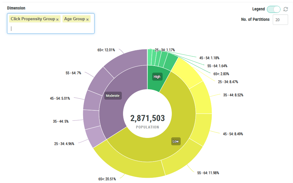
After you generate the chart, you can quickly drill into a specific arc to view the record quantity, and to create a Segment from it for targeting purposes.
Access
To access the People Explorer screen, select Audiences from the top navigation bar, then select Members > People Explorer from the side navigation menu.
