
Overview
The Member Dashboard shows key performance indicators (KPIs) related to the number of Member Profiles in your loyalty program, and how many Profiles are being added over time. The Dashboard is designed to provide insights on how well your loyalty program is performing, if the program reflects steady growth or decline in new Members, and what months are the most productive.
Access
To access the Member Dashboard, select Analytics from the top navigation bar, then select Member Dashboard from the side navigation menu.
Set Time Zone
The drop-down menu in the bottom-right corner of the Dashboard allows you to set the time zone used for all date-related reporting within the Dashboard. From this menu, select either a specific time zone, or Dashboard default, or As defined by browser.
Dashboard Details
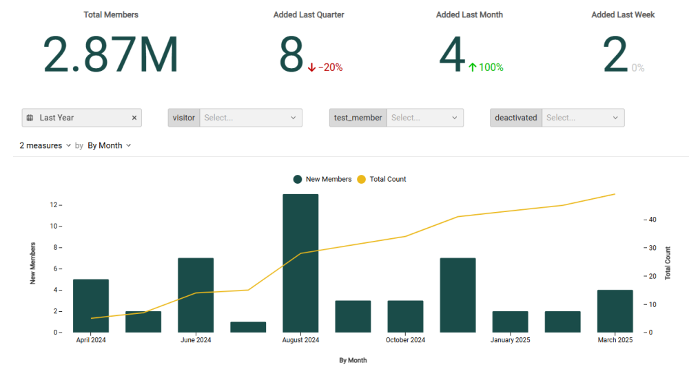
The following KPIs are displayed as a series of Tiles across the top of the Member Dashboard:
-
Total Members: The total number of Member Profiles in your loyalty program.
-
Added Last Quarter: The number of Member Profiles added in the last three months from the current date. Also included is the percentage of change in the number of profiles added, as compared to the previous three-month period.
-
Added Last Month: The number of Member Profiles added in the last 30 days from the current date. Also included is the percentage of change in the number of profiles added, as compared to the previous 30-day period.
-
Added Last Week: The number of Member Profiles added in the last seven days up to the current date. Also included is the percentage of change in the number of profiles added, as compared to the previous seven-day period.
Beneath the KPI Tiles, the Member Dashboard displays a combination bar / line chart. This chart shows the count of new Member Profiles added over the selected time period as bars, and the cumulative number of Profiles added in the reporting period as a line. If you hover your mouse over a bar, the platform displays a pop-up with the exact count for that time period.
Filter the Dashboard
The Member Dashboard provides a series of optional filters that can be used to focus the Dashboard on a time period, or on a particular segment of your loyalty member program.
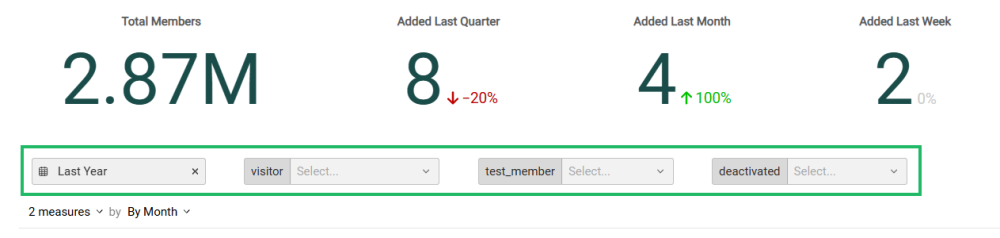
Optionally select one or more of the following filters:
-
Date Range: Select Last Week, Last Month, Last Quarter, Last Year, or enter a custom date range by defining the start date and end date. The default filter selection is Last Year.
-
Visitor: This filter allows you to determine if you want to include Visitors within the Member Dashboard metrics. A Visitor refers to a customer who is logged into your loyalty program via tracking information, but who has not yet signed up for your loyalty program. The default filter selection is Null (that is, the Visitor flag is not evaluated, so both Members and Visitors are included). Setting this flag to True will show ONLY Visitors; setting this flag to False will show ONLY Members.
-
Test Member: This filter allows you to determine if you want to include Test Members within the Member Dashboard metrics. Test Members are used to validate the content and personalization of content objects, such as Offers. The default filter selection is Null (that is, the Test Member flag is not evaluated, so both Test Members and regular Members are included). Setting this flag to True will show ONLY Test Members; setting this flag to False will show ONLY regular Members.
-
Deactivated: This filter allows you to determine if you want to include deactivated Member Profiles within the Member Dashboard metrics. The default filter selection is Null (that is, the Deactivated flag is not evaluated, so both Active and Deactivated Members are included). Setting this flag to True will show ONLY Deactivated Members; setting this flag to False will show ONLY Active Members.
Note: For the True option of a given filter to be available for selection, at least one Member with that particular setting must exist in your Member database. For example, you can’t set “Test Member = True” if you have no Test Members defined in your database.
Configure the Combination Chart
Beneath the KPI Tiles, the Member Dashboard displays a combination bar / line chart that visually charts your membership program growth over time.
You can adjust the metrics that are included on the combination chart, and change the time period used to group data on the chart. Please note that any filter options selected above are also applied to the chart.
-
Measures: By default, the chart shows the count of new Members added within a selected time period as bars, and the total count of Members as a line. Using the Measures menu above the chart, you can toggle either of these Measures off, which removes it from the chart.
-
Group by: By default, the chart displays counts By Month, with each bar representing a month. To change how data is grouped, select a different reporting frequency from the drop-down menu above the chart: By Quarter, By Month, or By Week.
