

Overview
The Sales Summary Dashboard shows Key Performance Indicators (KPIs) related to the number of orders placed by your loyalty program Members, along with the value of those orders. The Sales Summary Dashboard provides insights into how many of your Members are actually buying, how much revenue this is generating, and any cycles when sales boost or slow down.
Access
To access the Sales Summary Dashboard, select Analytics from the top navigation bar, then select Sales Summary Dashboard from the side navigation menu.
Dashboard Details
The following KPIs are displayed as a series of Tiles across the top of the Sales Summary Dashboard:
-
Total Members: The total number of Member Profiles in your loyalty program.
-
Members with Order: The number of Members with at least one order during the specified reporting period.
-
Order Count: The number of orders processed during the specified reporting period.
-
Revenue: The sum of order subtotals processed during the specified reporting period.
-
AOV (Average Order Value): Revenue divided by Order Count.
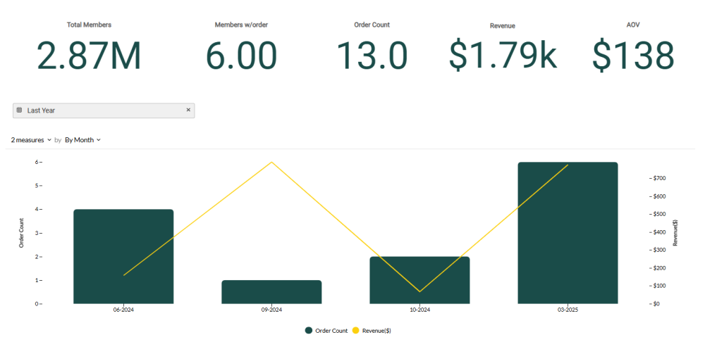
Beneath the KPI Tiles, the Sales Summary Dashboard displays a combination bar / line chart. This chart shows the count of orders placed over the selected time period as bars, and revenue as a line. If you hover your mouse over a bar, the platform displays a pop-up with the exact order count for that time period.
Beneath the combination chart, the Sales Summary Dashboard shows a pivot table. This pivot table displays the list of store locations in your loyalty program by Name and Store ID, and their associated order count, revenue, and Average Order Value by location.
Filter the Dashboard
The Sales Summary Dashboard provides a date range filter used to define the Dashboard’s reporting period. Optionally configure the following filter:
-
Date Range: Select Last Week, Last Month, Last Quarter, Last Year, or enter a custom date range by defining the start date and end date. The default filter selection is Last Year.
Configure the Combination Chart
Beneath the KPI Tiles, the Sales Summary Dashboard displays a combination bar / line chart that visually charts your revenue growth over time.
You can adjust the metrics that are included on the combination chart, and change the time period used to group data on the chart. Please note that the date range filter selected above is also applied to the chart.
-
Measures: By default, the chart shows the count of new orders placed within a selected time period as bars, and revenue as a line. Using the Measures menu above the chart, you can toggle either of these Measures off, which removes it from the chart.
-
Group by: By default, the chart displays counts By Month, with each bar representing a month. To change how data is grouped, select a different reporting frequency from the drop-down menu above the chart: By Month or By Week.
Configure the Pivot Table
The pivot table at the bottom of the Sales Summary Dashboard provides order details by store location.
To change the sort order for the data in the pivot table, click the name of the column by which you want to sort. The platform sorts the table by that column in ascending order; click the column name again to toggle to descending order.
