

The Offer Lift Analysis Dashboard is designed to provide insights into the engagement, activation, and redemption rates associated with a single Coupon Offer, as well as the level of purchase behavior (i.e., “lift”) driven by that Offer.
Note: The Offer Lift Analysis Dashboard was implemented in Loyalty Release 25.9.2 (October 2025). If you have an Offer that was published prior to the Dashboard’s implementation, it will show data only from the implementation date going forward; the Dashboard will not show historical data prior to its implementation.
To access the Offer Lift Analysis Dashboard:
-
Select Campaigns from the top navigation bar, then select Offers > Offers from the side navigation menu. The Offers screen is displayed.
-
Search for and select the desired Offer (see Search for an Offer for more information on the available search options). The Offer Details screen is displayed, with the Definition tab selected by default.
Note: The Offer Lift Analysis Dashboard is available only for Coupon Offers.
-
Select the Dashboard tab.
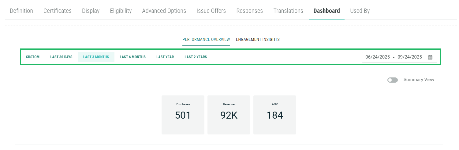
By default, the reporting period for the Offer Lift Analysis Dashboard is “Last 3 Months,” but you can adjust this reporting period by clicking any of the standard date range options near the top of the report. In addition, you can define a custom reporting period; click into the date field and use the calendar pop-up to define the desired custom date range.
Note: The Offer Lift Analysis Dashboard does not display historical data from prior to the Dashboard’s implementation.
The Offer Lift Analysis Dashboard is separated into two main reports: Performance Overview and Engagement Insights. These reports are accessible by clicking the desired option near the top of the Dashboard tab.
Performance Overview
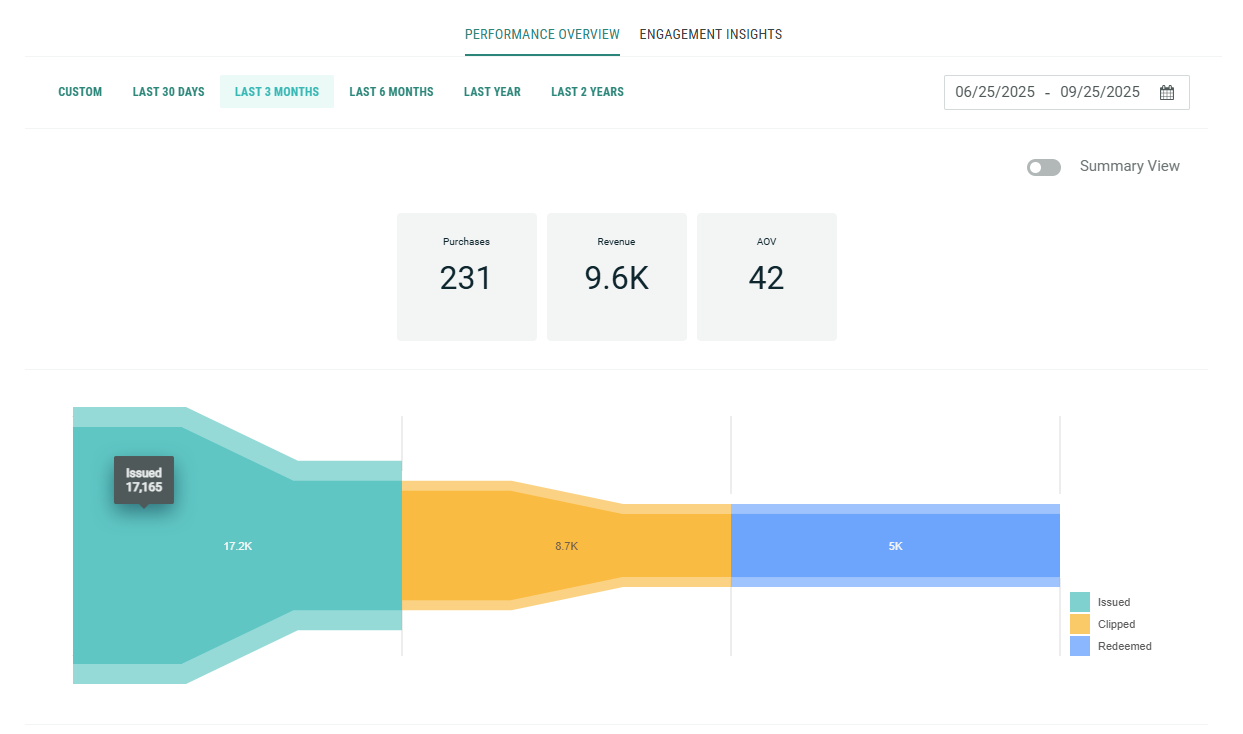
The Performance Overview report is designed to depict Offer performance over time. Near the top of the report, the platform displays three Key Performance Indicators (KPIs):
-
Purchases: The number of purchases linked to Offer Responses from this Offer.
-
Revenue: The sum amount of all purchases linked to Offer Responses from this Offer.
-
Average Order Value: The average order amount across all purchases linked to Offer Responses from this Offer.
Beneath the KPIs, the Performance Overview uses a funnel graph to depict how Offer Responses are progressing through each status in the Offer Response life cycle. Starting on the left, the graph shows the count of Issued Offers. If your loyalty program uses the “clipped” concept, the middle section shows the count of Clipped Offers. On the right, the graph shows the count of Redeemed Offers.
If you hover your mouse over a section of the graph, a pop-up shows the exact count of Offer Responses that reached that status.
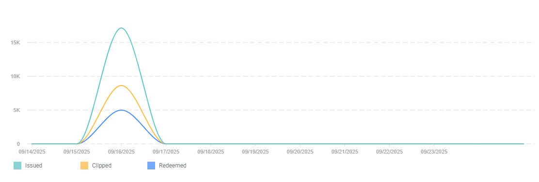
Beneath the funnel graph, the Performance Overview uses a line graph to depict the number of Issued, Clipped (if used), and Redeemed Offers over the course of the selected reporting period. This report is designed to show Offer usage trends over time.
If you hover your mouse over a point on this graph, a pop-up shows the exact count for that date.
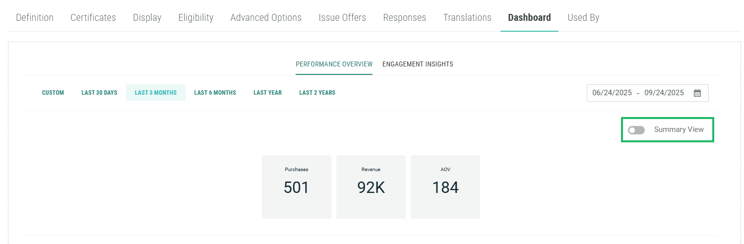
Optionally, instead of the line graph, you can view a table showing the raw counts of Issued, Clipped, and Redeemed Offer Responses for each date in the reporting period. To view the table, toggle Summary View to Off.
Engagement Insights
The Engagement Insights report calculates the behavioral change associated with the Offer by means of a cohort comparison.
At the top of the report, the platform displays a table showing counts for various KPIs (Purchases, Revenue, and Average Order Value) associated with the following cohort:
-
Redeemers: People who redeemed the Offer as part of a purchase within the reporting period.
To serve as a comparison against the Redeemers cohort, the report also displays those same KPI counts for one of the following two other cohorts:
-
Holdout: If your Offer uses a Segment that has a Holdout Group, the report compares Redeemers to the people assigned to the Holdout Group.
-
Non-Redeemers: If your Offer does not use a Segment that has a Holdout Group, the report compares Redeemers to people who made purchases within the reporting period, but did not use the Offer.
This table also calculates a Lift metric which shows the incremental revenue generated by the Redeemers cohort as compared to either the Holdout cohort (if used), or the Non-Redeemers cohort (if this Offer didn’t have a Segment with a Holdout Group).
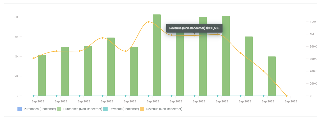
Beneath the table, the report displays a combination graph. The lines in the graph depict Revenue for Redeemers and Non-Redeemers over the reporting period. The bars in the graph depict Purchases for Redeemers and Non-Redeemers over the reporting period.
If you hover your mouse over a line or a bar on this graph, a pop-up shows the exact count for that date.
Beneath the combination graph, the report displays a Segment-level comparison table. This component of the Engagement Insights report is relevant only if this Offer had more than one Segment selected on the Eligibility tab. This table is designed to evaluate the performance of the different audience Segments, and to show the lift achieved by each Segment as compared to its Holdout Group (if used).
This table shows counts for various KPIs (Purchases, Revenue, and Average Order Value) for each Segment used in the Offer. If a Segment had a Holdout Group defined, the table lists the counts for the Holdout Group separately.
The table also calculates a Lift metric which shows the incremental revenue generated by each Segment as compared to its Holdout Group (if used).
