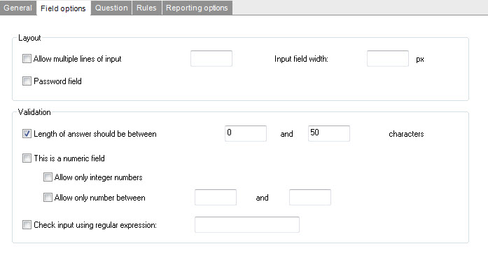
Use: open questions. Answers can be typed in freely.
Options:
- Allow multiple lines of input: text can be inserted on multiple lines, creates a text area on the rendered html page
- Password field: the field will have a “Password” look. (Value hidden by dot or asterisk). Generates an input field with type password.
- Input field width: width of the field on the page
- Length of answer between: validation rule, enter the minimum and maximum allowed characters (related error label : FIELD_TOO_SHORT, FIELD_TOO_LONG)
- This is a numeric field: only numeric values are allowed (related label : FIELD_NOT_NUMERIC)
- Allow only integer: only integers are allowed
- Allow only number between: validation rule, enter the minimum and maximum allowed numeric values (related label: FIELD_TO_LOW / FIELD_TO_HIGH)
- Check input using regular expression: regular expression validating the field content (e.g. for email addresses)
In form, when validation fails, there a number of predefined error messages . These error messages are stored in labels and have a default description. It is however possible to provide an alternative error message per question. Do this on the 'question' tab of each component.
NOTE: Error message labels are displayed when the content of the answer does not match the validation rules.

