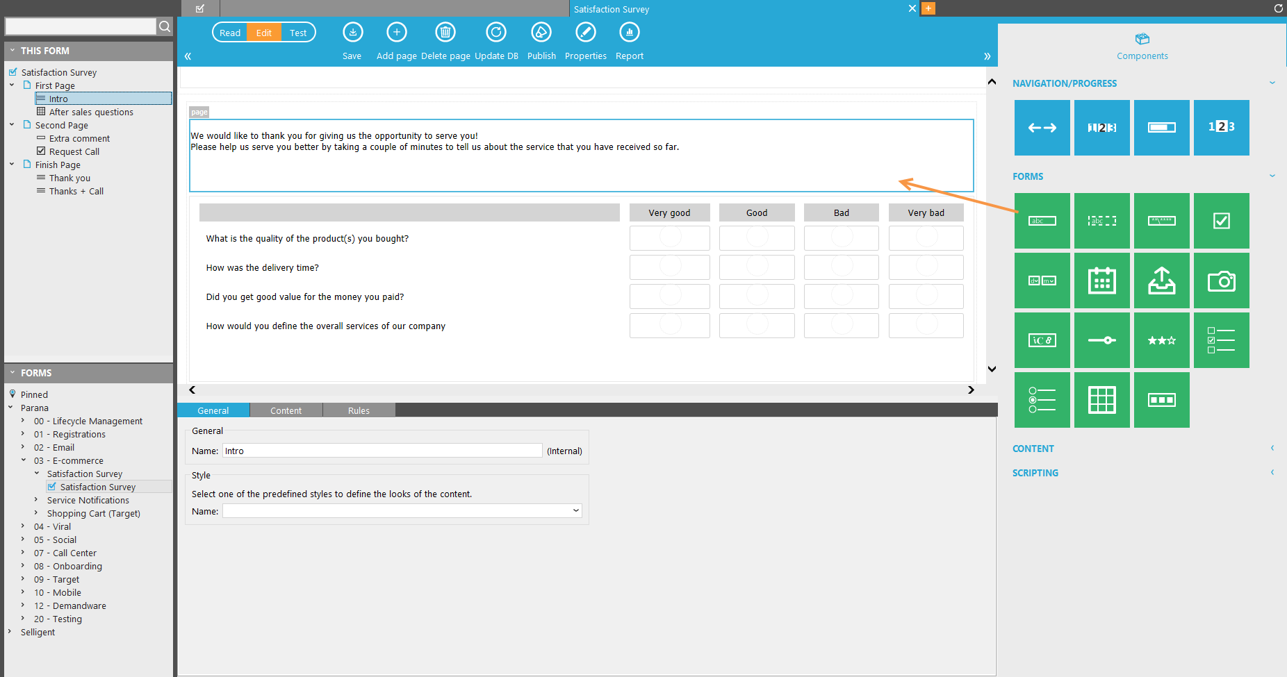
Selligent provides numerous components to design your form. These components are available through the 'Component panel' at the right of the main window, when a page is selected.
Form components are added to a page via drag and drop. When a component is added to the page, it will be listed in the 'Page overview' on the left. Clicking the added component in this tree view displays the properties of the in the lower part. Components added to the 'Header' or 'Footer' part of the page will not be listed here, because they appear on all pages.
Some of the component properties are common to all:
General:
- Name: this value is used in the design of the form. Choose it well to quickly find questions on a page
- CSS-class: a custom class can be assigned to the component. This allows setting a specific layout for this component. The custom class must be defined in the css file linked to the style used in the form. If no class is defined the default layout is applied.
- The question can be set mandatory to answer. Failing to answer results in an error message when submitting the page.
- The question can be set to 'disabled'. This adds the attribute "disabled" to the input field in the resulting HTML. The input field will be unusable and unclickable, only displaying a selected value
- Storage: Define a form field name. This field is added to the form table and will hold the answers given to the question. Use a short descriptive name, the default field name Q001 will likely not be easily identified in the database. You can also use audience list fields or a field of one of its profile extensions to store the answers. Use the ...-button to select a field.
- Re-issuing: allows showing questions again in specific situations
If “store date and time per question” in the form properties is checked, this can be used. When checking this option in the form properties, a table holds the date and time when the question was answered
- If there’s no answer (empty) and/or the answer is older than the time specified (valid), the question is shown.
- If there is a recent answer, the question is hidden
Question
The question itself and an optional description.
It is possible to define an in-line help for questions. A button appears next to the question in the final form. When someone clicks it, they will see a box with the explanation provided here.
Add an alternative error message to override the default one. You can also change the default error message texts under 'Translations'
Some component types can be assigned a default value for the input field. This is the case for text, Lists, Date, structured input, slider, rater and calendar components.
An HTML editor is available to define the question content. Click the ...-button to access it.
NOTE: when multiple languages have been selected in the form properties, it is possible to toggle between the different languages and configure the inline help and error messages in the different languages. If you don't do it here, it can always be done in the Translations table itself.
Rules
Possibility to define when the component should be visible or if it is hidden all the time. With 'Visible when' show the component depending on stored values. These can be form values, audience list values or its profile extension values. Or show and hide questions based on a certain date. To show questions based on answers given on the same page (not yet stored) use 'Rules'. With Rules you can also show or hide questions depending on stored values.
The two boxes at the bottom provide a view on all the rules applied to the component as well as rules that are using this component.
Reporting options
Here, the chart type (line, bar, pie, funnel) and chart options (horizontal, vertical, stacked) for reporting charts (Analysis) are defined.
Following is an overview of all available components. Note that when configuring a component that some options might not be accessible when designing a responsive form (e.g. options to display content in multiple columns).
Navigation & progress components
Progress controls (Progress bar, page indicator)
Navigation controls (Back/Next, Page navigation)
Form components
Text field
List controls (Radios, checkboxes, drop-downs)
matrix controls (Radio matrix, Checkbox matrix, text field matrix)
Content components
Content (universal and language specific)
Scripting components
Scripting onLoad and onSubmit scripts)

