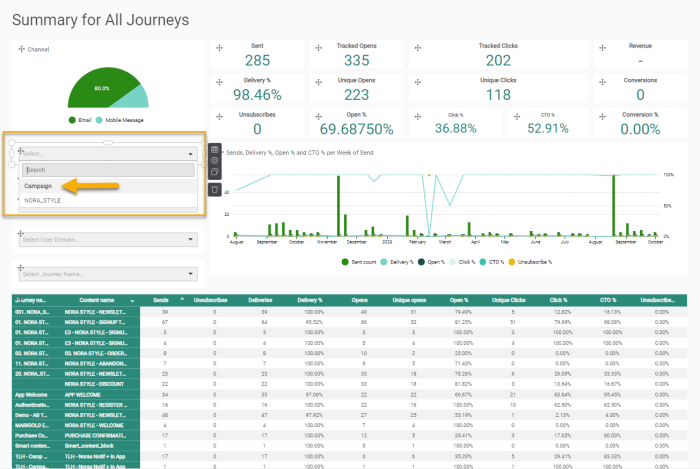
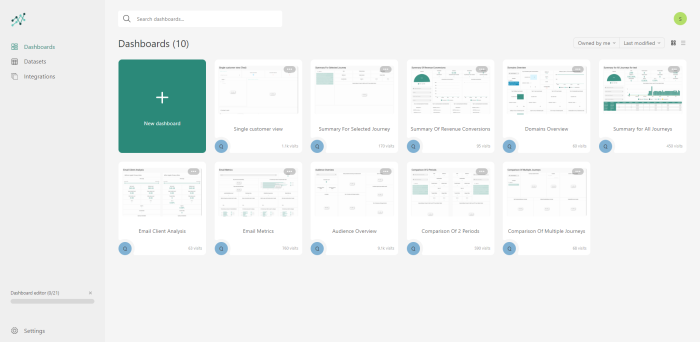
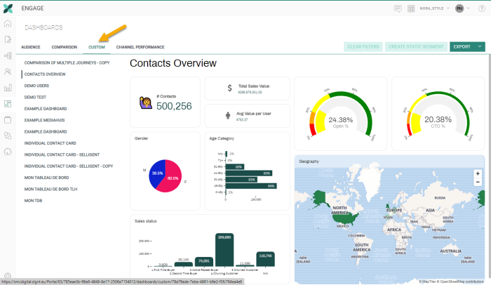
When opening the Engage Data Studio, you’ll see that there are 2 major components:
Datasets
Datasets is the data on which you build your dashboards. You can see a dataset as one table on which you start building your dashboard. Engage Data Studio provides currently 3 standard datasets.
Dashboards
DASHBOARDS are a visualization of your data. It allows you to investigate the data and draw conclusions. When creating, modifying removing a dashboard, you do not make any changes to the data itself.
From the dashboards overview, it is possible to
- edit or delete an existing dashboard - Standard dashboards delivered by Engage Data Studio cannot be deleted or edited.
- copy an existing dashboard - You can copy a standard dashboard and make changes to the copy. The duplicated dashboard has by default the same name as the original, extended with -copy.
- create a new dashboard
Important note: When duplicating a dashboard, the renaming of the new dashboard and the widgets in the dashboard needs to be done in all languages.
In this topic:
- Creating a dashboard from scratch
- Dashboard Components
- Data
- Settings
- Filters
- Creating a Static segment in Engage from a Dashboard (Data Studio Pro only)
- Sharing a Dashboard
- Viewing the History
- Making a dashboard available in Engage
Creating a dashboard from scratch
Dashboards are created by drag and drop of visual components onto the dashboard and defining the settings for these components.
1. To create a new dashboard, click New on the Dashboard tab of the Engage Data Studio:
2. A popup is shown giving you access to a tour of the Engage Data Studio. We suggest you follow the tour so you can skip this section on the use of the interface.
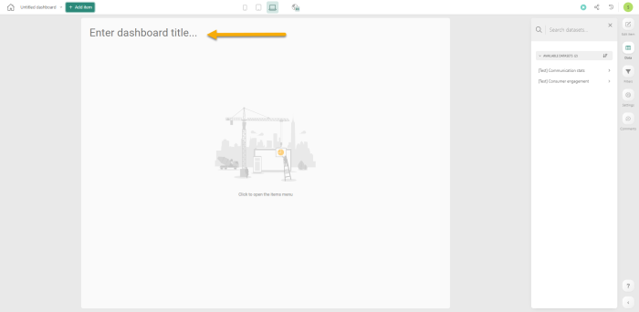
3. Start by giving a name to the dashboard. Enter the title at the top.
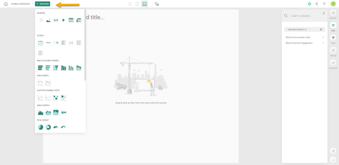
4. At the top, click the Add Item to access the components available for use in the dashboard. Select one from the overview to add it to the dashboard.
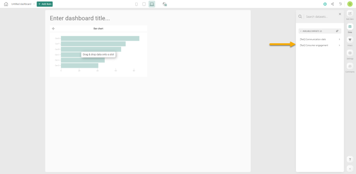
5. Next, data is required. Select the dataset to use for this dashboard from the datasets available to you on the right of the screen
Note: If you prefer a different layout, you can change the layout and move the datasets to the left. Click the arrow under the Question mark: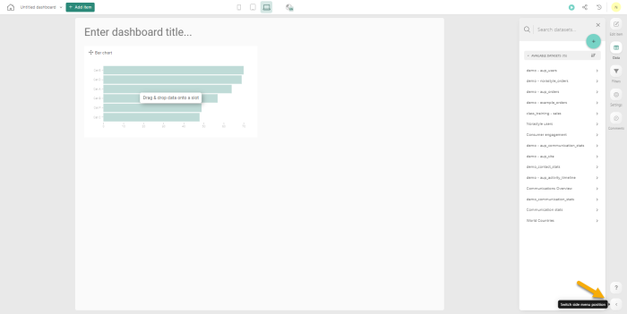
This will move everything to the left.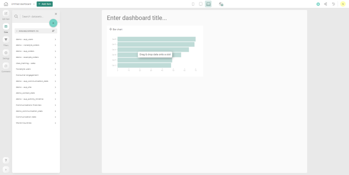
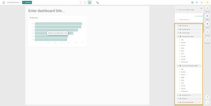
All the columns for the selected dataset are listed:
The selected dataset is used to define the measures, categories and grouping on the dashboard components.
Note: A maximum of 100 dashboards can be created by default.
For performance reasons it is recommended to not create more than 100 dashboards. Anything above this amount might impact performance.
Note: When designing a dashboard, check the layout of the dashboard in the different layout views (mobile, tablet, desktop, large screen) and ensure the composition is as wanted. Use the layout buttons at the top to switch from one layout view to another.
Creating a dashboard using AI
Data Studio allows the dashboard creator to use AI-suggested graphs in their dashboards. There are 2 ways in which this can be done: using suggestions, or ask AI for help.
Suggestions:
1. Under Add Item, the tab Suggestions is shown.
2. Marigold AI will generate examples of graphs that can be integrated in a dashboard.
This suggested graphs are based on a specific dataset, shown on top of the window.
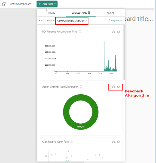
3. The source dataset can be changed to any other dataset to which the user has view-rights.
4. In order to use the suggested graph in your dashboard, you just need to drag & drop the graph onto your dashboard. After the graph is placed on the dashboard, you can still modify the data and/or the setup.
Note: In the backend, AI is learning which graphs could be interesting to you or other clients. In order to increase this knowledge, it is recommended to provide feedback through selecting the thumbs up/down in the suggested graph.
Ask AI
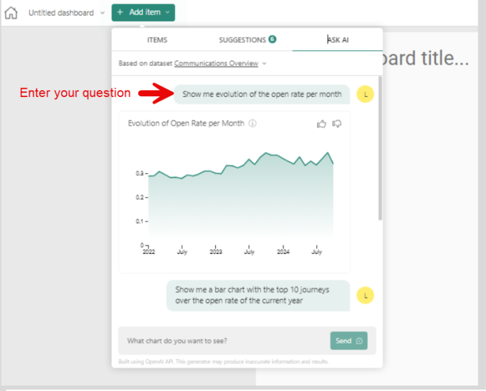
1. Under Add Item, the tab Ask AI is shown
2. The Ask AI feature enables you to create graphs based on common language, such as Show me the evolution of the open rate per month or Show me a bar chart with the top 10 journeys over the open rate of the current year. The resulting graph will be displayed.
3. This generated graph is based on a specific dataset, shown on top of the window.
4. The source dataset can be changed to any other dataset to which the user has view-rights.
5. In order to use the proposed graph in your dashboard, you just need to drag & drop the graph onto your dashboard. After the graph is placed on the dashboard, you can still modify the data and/or the setup.
Note:
Both standard datasets Communication Stats and Communication Overview, now contain new formulas for calculating:
Delivery rate
Open rate
Click rate
Click-to-open rate
Unsubscribe rate
These can be used as metrics within the AI functionalities.
Dashboard Components
We will explain the general configuration and options for these components.
Every component gives access to
-
 data - allows to drag and drop measures, categories and create grouping on graphs
 -
 component settings - allows to change the specific settings for a component
 -
 copy option - copies the component
 -
 delete option - deletes the component
 -
 Add filter - allows to add a filter that will only apply to this specific component. The Add filter button is only displayed after clicking the Data icon.
Data
To gain access to the data to be used for a given component, click the Data icon in the component. The list of available datasets is displayed on the right. Select one to access the columns in the dataset.
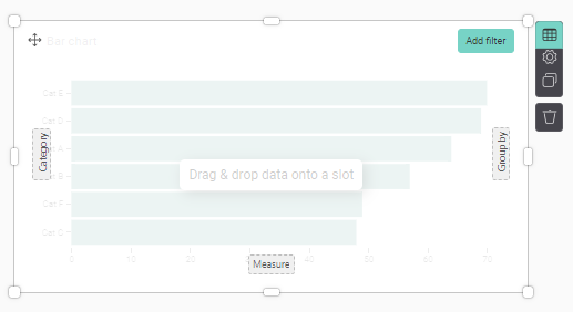
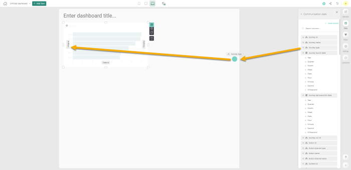
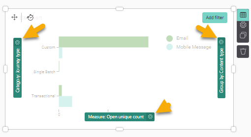
To start, you’ll need to drag & drop a data-field in the graphical component, on the dotted squares. The component clearly indicates where a category, group by or measure is expected:
Category (mandatory) - can contain any hierarchy-field or date(time) field in this area. For a bar chart, this will create a new bar for every value of the hierarchy-field.
Note: For fields with lots of values, this can become very large. If so, you can use filtering by only selecting the top/bottom x values.
Example:
Add journey type as category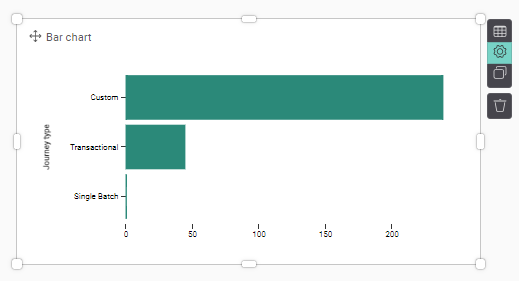
Measure (not mandatory) - can contain any measure-field of the same dataset as the category-source or of a linked dataset.
Note: By default (when no measure is placed), the measure is a count of the number of records within the dataset.
Example:
Use the number of emails opened as measure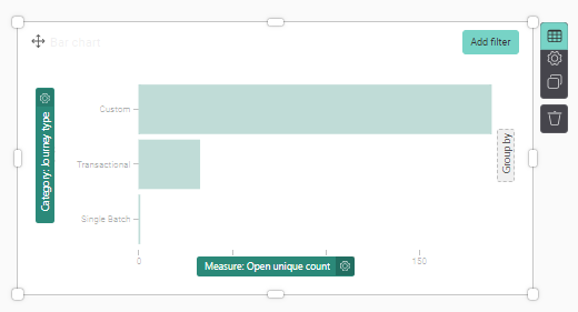
Please be aware of the granularity of your dataset to understand the absolute value of your measure.
Example:
Does the dataset contain all interactions (views & clicks) and have multiple records per sent e-mail or does the data only contain 1 record per sent e-mail?
Grouped by (not mandatory) - can contain any hierarchy-field or date(time) field of the same dataset as the category-source or of a linked dataset. This will allow you to split results in different subcategories by splitting in different lines, bars, or coloring.
Example: Use the Content type field as the group by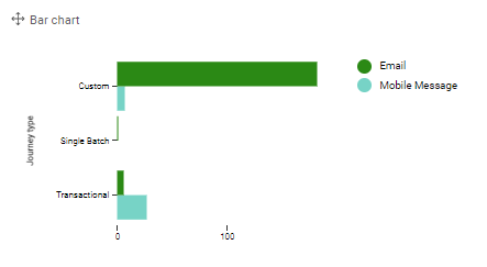
The measures and categories used in a component, each give access to a Settings panel as well.
For a category and Group by field, the label of the category or grouping can be changed.
For measures, there are additional options. Click the Settings icon associated to the measure, category or Group by field. (Note: this settings icon is only displayed when the Data icon in the upper right corner is selected.)
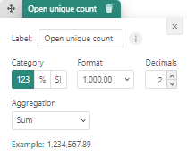
- Label - the label of the measure as displayed on the component
- Format - you can choose from a detailed numerical value (123), a percentage or a SI notion (e.g. K for thousands, M for millions)
- Decimals - the number of decimals to be displayed
- Thousands - if a separator needs to be used to indicate thousands
- Aggregation - the aggregation to be used on the measure (e.g. sum, average, median, etc)
Settings
The settings of a component allow you to define the properties for the current component, such as the title, the theme, etc. Which settings can be defined depends on the type of component.
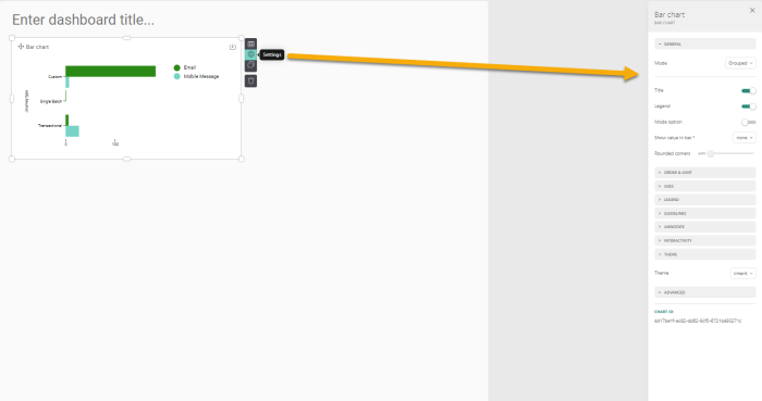
After selecting the Settings-icon, the right-hand side of the screen will switch towards the possible settings of the selected visual component.
Sometimes you may have too many values to be displayed in the component. If that is the case, you can limit the values here . For a Bar chart, you can limit the number of bars displayed. For a Line chart, you can limit the number of observations. For a Pivot table, you can limit the number of rows or columns for example.
For example, for a Bar or Column chart, you have the option to limit the values to the top or bottom x values: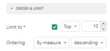
Filters
Filtering is useful to set your focus. This can be done in advance or on the fly when viewing the dashboard.
There are 2 types of filtering:
- Static filtering — always applied in the background. This can be set by the creator of the dashboard at dashboard-level or at the level of a visual component.
- Dynamic filtering — applied by the user while working on the dashboard.
Static filtering
Filters can be placed on the level of a visual component (in the data-tab) or on the level of a dashboard. When a filter is applied on the level of a dashboard, the filter is by default applied on ALL visual components of the dashboard. When the filter is set on a specific visual component, it only applies to that component.
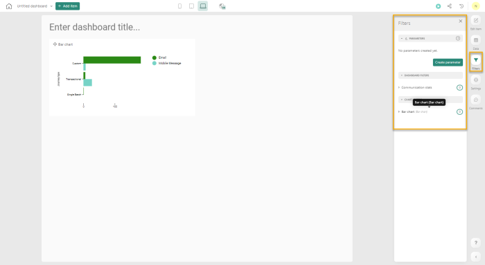
On the right-hand side, on the FILTERS-tab, you can find an overview of all static filters applied per chart or overall, over the dashboard. The number next to the dashboard or the chart component indicates how many filters are applied.
Expand the component to add a new filter or edit an existing one:
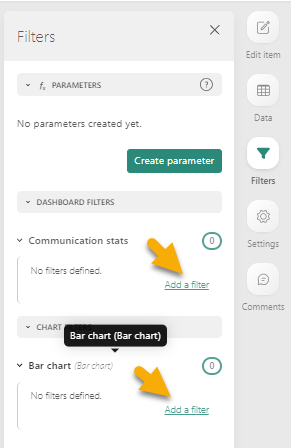
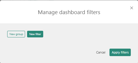
To add a new filter, click the Add a filter button. You can filter both your dashboard and any individual chart using an OR condition. To do that, simply add a filter to your dashboard via the Filters menu. If you don’t want to apply the filter across all your charts, in the same menu, you can choose a specific chart to filter on. You can also do it by going to the data settings of your chart and clicking Add filter. The following Filter dialog is displayed:
You are presented with 2 choices; creating a filter or a group. A group, is any combination of one or more filters. If you add an individual filter and then add another one, the two will be immediately turned into a group. Click New filter and start entering the criteria:
Note: You can choose between the AND or OR operators. Note that OR conditions can only be applied within the context of a group, via the drop-down menu that chains all filters within the group.
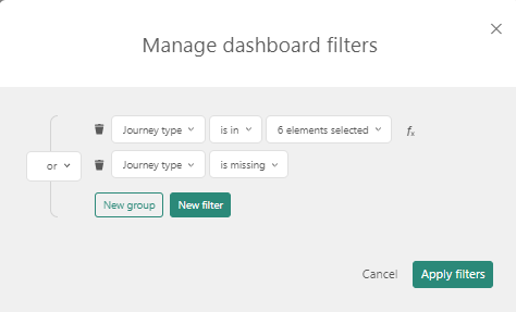
Example of OR conditions:
I want filter out certain journey types in my Summary for all Journeys, and only include the following:
* Single Batch, Recurring Batch, AB and Custom Journeys that were launched after May first 2023
* Journeys that have no type and no launch date specified
When either one of the conditions is met, the journeys are included in the dashboard. This means that the OR operator is applied as following between the 2 groups of filters: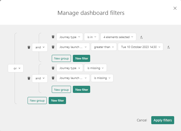
Note: The filter-overview is only available when having admin-rights on the dashboard. Therefore it is best practice to limit the number of (different) filters and apply the principle of: what you see is what you get.
Technical note: Parameters can be created and used for filtering over multiple components at the same time.
To create a parameter, go to the Filter tab and click the Create parameter button: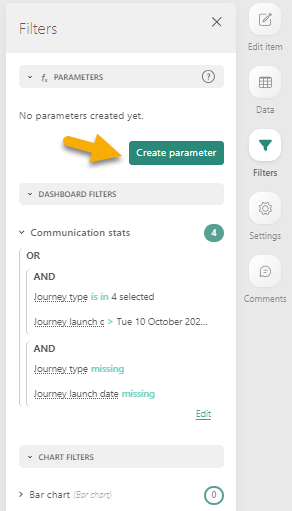
This displays a dialog where one or more parameters can be defined of type Hierarchy, Numeric or Date: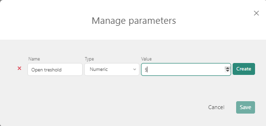
These parameters can then be used when defining a filter.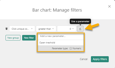
Which results in: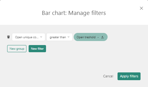
Static filtering on date-fields has some special options:
- Last (x) (periods) (days or other) —takes the last x periods (today’s period included).
- Last (x) available (periods) (days or other) — only takes the last x periods for which data was available.
- Last completed (period) — takes the last sequence (period) of data for which the period was fully completed.
- Week/Month/Year to date — takes the last data for the ongoing period. This if starting the moment AFTER the last completed (period)
Example:
Today is 22/10/2020 (EU notation dd/mm/yyyy), and the last data uploaded is from 21/10/2020.
* Last 1 periods (weeks) = data from 16/10 to 22/10
* Last 1 available period (weeks) = data from 15/10 to 21/10
* Last completed (week) = data from 12/10 to 18/10 as this week is not complete yet
* Week to date = data from 19/10 to 22/10 (from the beginning of this week till today)
Dynamic filtering
Dynamic filters are applied on the fly by the viewer of the dashboard. Imagine that the viewer sees an interesting graph. The first thing that pops into their mind is to drill deeper to analyze even more information about this finding.
Note: Dynamic filters are only usable online. If the dashboard is distributed in PDF or PNG, or printed on tv, dynamic filters cannot be executed and therefore cannot be used.
Note 2: When the marketer applies a dynamic filter to a dashboard, the filter is saved automatically within the session and cross-session. Saving the filter gives them the ability to navigate away from the dashboard and when returning have the filter automatically applied to the dashboard. Each dashboard can have its own set of filters. A Clear all filters button allows to clear the current dashboard filter and start from scratch.
There are 2 types of dynamic filters:
- Explicit filter components such as date filters, search and select, slicers or sliders.
- Visual components can also be used as a filter by selecting 1 or more items on the graphical component.
Which filter to use best, depends on the hierarchy, field, or measure that you would like to filter.
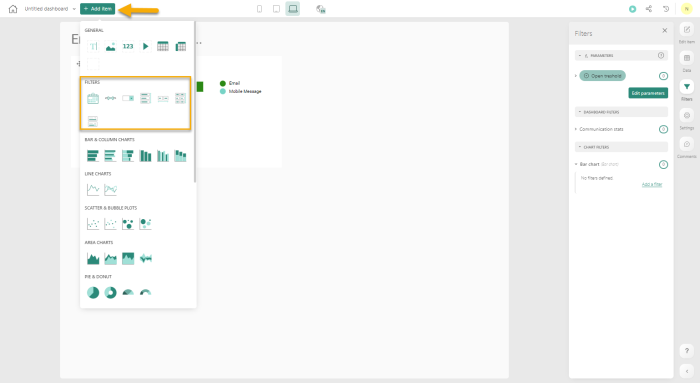
These explicit filter components can be added to a dashboard from the Filters available from the Add item menu at the top:
Besides the above filters, also (pivot) tables can be set interactively. A click on a cell would lead to filtering of that value on the table.
Note that when multiple items are selected in a single filter, the filter will treat the different items as a list of items. (= an IN/OR statement between the items.)
Example:
A table contains all communication-activities with a communication date. When you select 2019 and 2020 for communication_year: you will receive all communication-records that are made in 2019 OR 2020 or you will receive all communication-records where communication_year is IN [2019,2020].
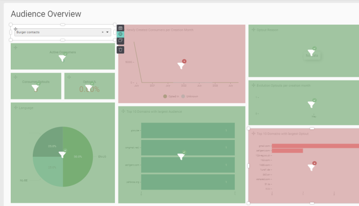
When a dynamic filter is added to a dashboard, by default it will be applied to all widgets on the dashboard. However, it is possible to only have a selection of widgets on the dashboard on which the filter should be applied.
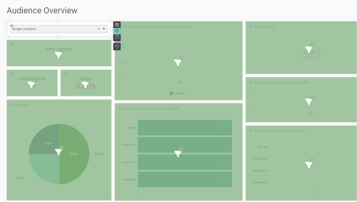
When clicking the Settings icon for a filter, all widgets impacted by the filter are displayed in green:
Clicking the filter icon on a widget, will exclude it from the filter. The widget is then displayed in red:
You can undo this by clicking the filter icon again on a red component.
Creating a Static segment in Engage from a Dashboard (Data Studio Pro only)
Currently, static segments can be created for Engage Data Studio dashboards using standard datasets as well as custom datasets. By analyzing all the filters used on a dashboard, a static segment with contacts answering the filter criteria can be created. All filters are taken into account, on dashboard level and widget level. Static segments can be created from dashboards based on one or more datasets.
Note: When using a custom dataset for the dashboard, the column names in the external datasource referencing the Audience List and contacts must be configured as following: user_ID or consumer_ID as the contact reference and list_id or audience_id as the Audience List reference. This is required to identify the correct Audience List and contact records in Engage when creating the static segment.
Example: You have a Date filter field on the dashboard, filtering the data for the selected time frame, together with a filter in a bar diagram widget where only Single Batch Journeys are selected. Both filters are taken into account to retrieve the contact records and create a static segment.
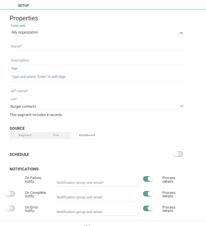
When creating a static segment from a dashboard in Engage, the user is presented with a dialog:
- Select the folder where the segment needs to be created
- Specify a name and description. Ensure the description is explicit.
- Specify a API name.
- Select the Audience List for which the segment is created. Depending on the situation, this list is already filled out or can be selected from the drop-down. When no Audience List can be retrieved, a warning is displayed.
- The source of the segment is set to Dashboard.
- If required, configure the schedule of the static segment updates. This performs an automatic update of the static segment at regular time intervals. When saving the configuration, the static segment is created immediately and data is loaded. The schedule details and update history is visible from the Segments overview in the Lists chapter.
- Set the mandatory notification emails to which a message must be sent in case of failure. Other notifications in case of success or error are optional.
Note: When the segment creation is launched from a Communication stats dashboard, a setup dialog is displayed where the Audience List can be selected. Dashboard as source of the segment is automatically selected)
When the segment creation is launched from a Consumer stats dashboard, we must make sure that aggregation type default/consumer is selected for the dashboard. The Audience List is in this case known and the segment will be created for that audience.
Note that is some cases the Audience List cannot be retrieved for archived or deleted audiences or for Campaign audiences that haven't been migrated to Engage yet. In this case, the user is alerted.
Creating a static segment is done from the Engage application and not from within Data Studio. For more information please check out this topic.
Sharing a Dashboard
Dashboards can be shared in different ways:
- Within Data Studio: Give access to your dashboards to other users of Data Studio, with different access levels ranging from view, edit, use to own.
- Via export: Export dashboards as PDF or PNG, and define the format based on the device being used
Note: Sharing a dashboard is only possible if all datasets used for that dashboard have been shared as well.
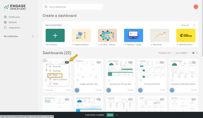
The different sharing options are accessible from the share icon. Dashboards that you created can be shared with other users, with different levels of access (view, edit, use, own).
Note: When you share a dashboard with other Data Studio users, you can easily select them one by one or the whole group at once. This user group is generated using the tenant and the organization where the users are created.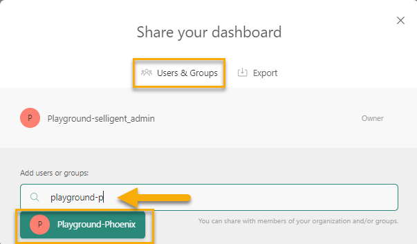
Note that when changes are made to the Engage users having access to Data Studio for an organization, this is automatically reflected in Data Studio as well.
Viewing the History
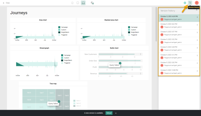
Dashboards are often a continuous process, where changes are made along the way, based on feedback or new requirements. To visualize the changes over time, a version history is available, providing a chronological overview of the changes made. Clicking on a version displays the dashboard in the state corresponding to that version:
Making dashboards available in Engage
When creating new dashboards in Data Studio, you also want to make these available in Engage.
This can easily be achieved by sharing a dashboard with your own organization.
From the Dashboard overview or after opening a specific dashboard, click the Share icon in the upper right corner.
A dialog is displayed where you can share the dashboard with other users and groups:
Select your organization from the drop-down.
When done, the dashboard will be available from the Custom tab in the Dashboard chapter.
Note: When an organization is set as Global organization in the Admin config tool, dashboards created in Data Studio for this organization can also be shared with any of the other organizations.
When a dashboard is launched from the Global organization, the data shown in the dashboard is the accumulated data for all organizations. When a dashboard is launched from any other organization, only data for that organization is shown.
Note 2: To allow marketers who are accessing a dashboard in the global organization to view data for their own organization or one specific other organization, a filter widget using the organization name can be added to the dashboard. They can then select one specific organization from the drop-down. 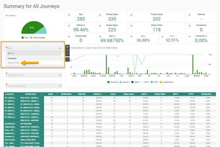
This filter field will also be visible when accessing the dashboard from another organization but will only contain one organization name in the drop down.
Note 3: Hybrid customers using Campaign and Engage will see an additional option in the Organization filter drop-down: Campaign. In hybrid environments it is also possible to filter on Campaign execution data in a dashboard.