Push Multi-Campaign Dashboard
Real time analytics provide marketers with the ability to measure and review what is currently happening with their mobile push campaigns. Data is shown in real time and the multi-campaign dashboard provide statistics across all push notification campaigns. Meanwhile, can also use the links in these dashboard reports for a more detailed view per individual campaign.
Our Real time analytics user guide outlines the general functionality that is available within these screens, such as applying filters, sharing, and exporting your data.
Reports
Each dashboard provides insights on engagement, delivery, location based stats and link activity, depending on the reports available.
The reports are divided into sections, which group related metrics, and charts, to allow you to visualize performance data.
The Push dashboard includes the following three types of reports:
- Engagement
- Audience
- Realtime
Note: These reports include metrics on clicks and opens, and so it is important to know the difference:
- Clicks are measured when the user taps on a notification which leads to a CTA, web page, or any other content that does not open the app
- Opens are measured when the user taps on a notification which leads to the app being opened.
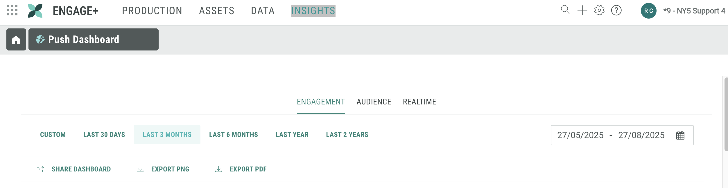
Engagement report
The Engagement report provides marketers with insights on how well their campaigns are doing and if they are creating engagement; are your campaigns reaching the intended audience, are customers opening your campaigns, and are they engaged with your content? Are they clicking through?
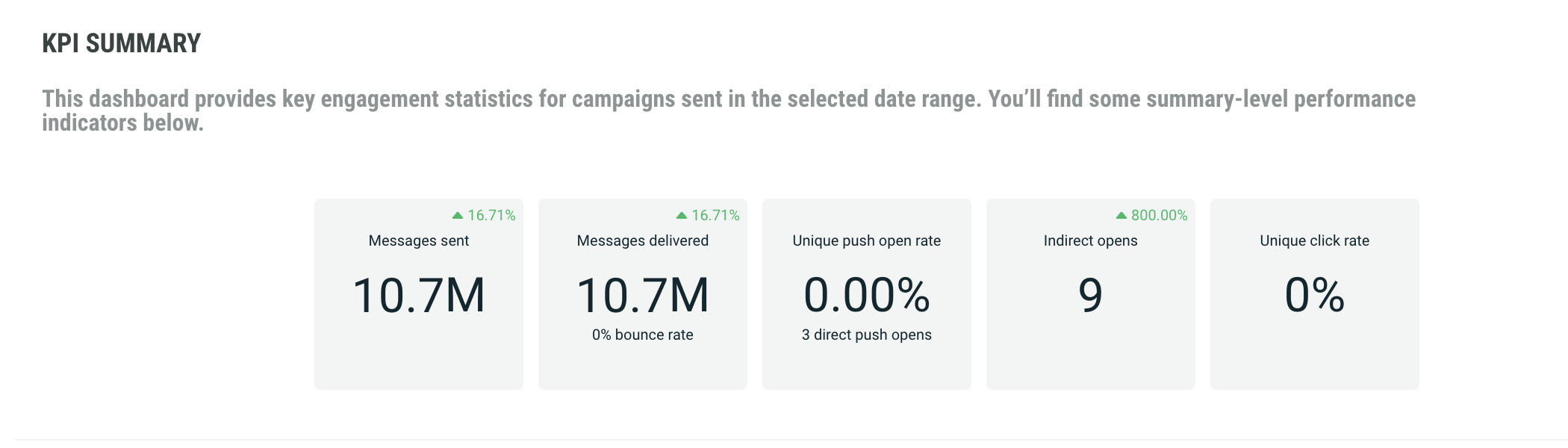
The KPI Summary report provides general KPI over all campaigns, such as:
- Messages sent — how many messages were sent out
- Messages delivered — how many of the messages sent, have actually been delivered.
- Percentage of messages opened — how many of the delivered messages have been opened. This is the unique human open rate as a percentage of recipients whose opens or non-opens would be visible. This means recipients using Apple MPP are excluded from the open rate.
- Percentage of messages clicked — The number of people who have tapped on a call to action from a push notification. Non-human clicks are not included.
- Percentage of opt-outs — how many of the delivered messages resulted in an opt-out
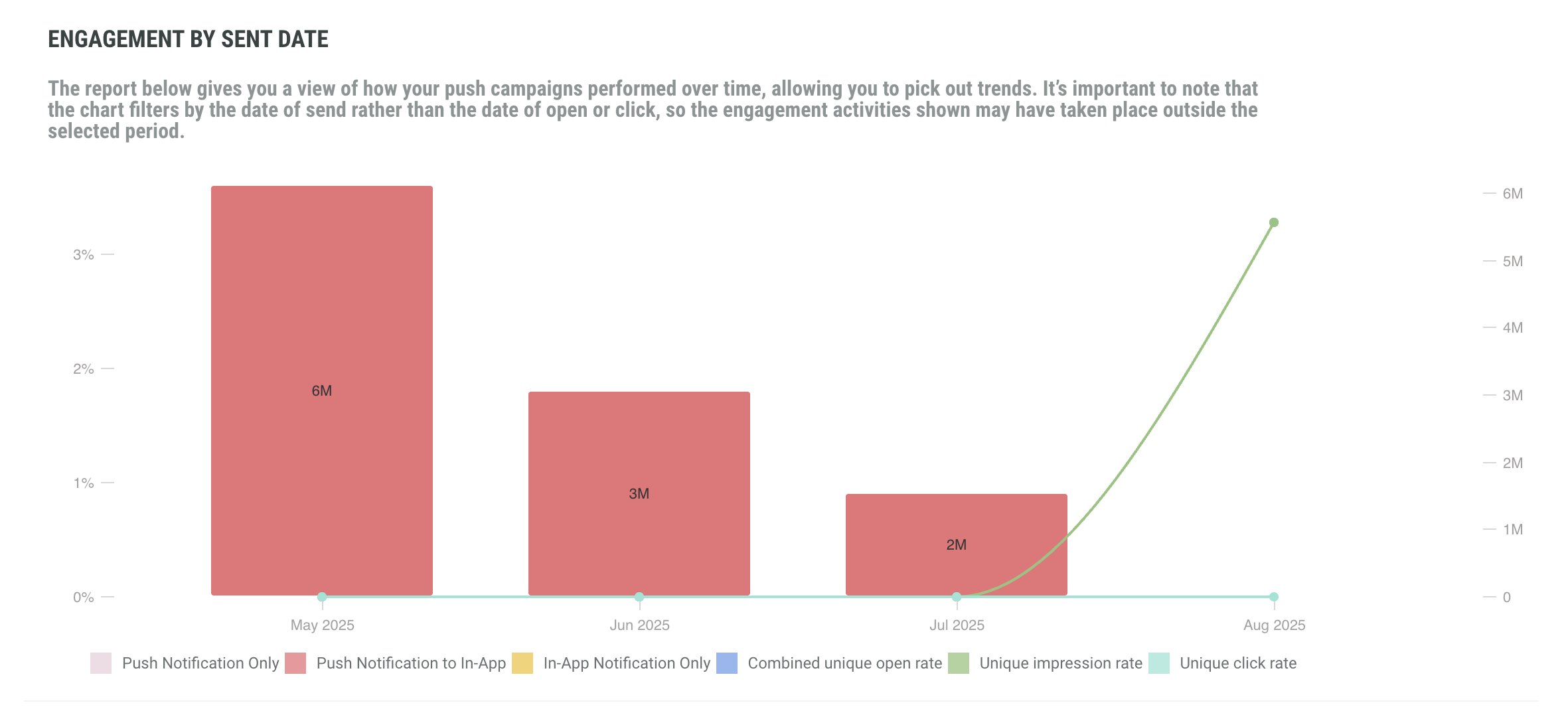
The Engagement dashboard also provides engagement by sent date, showing push notifications received as well as the open, click, and impression rates; it gives you a view of how your push campaigns performed over time, allowing you to pick out trends. The time line is based on the selected filter.
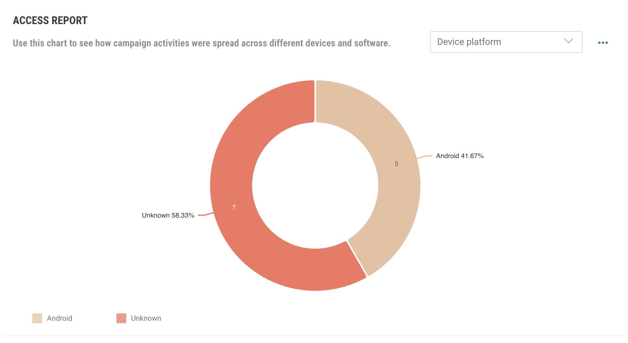
The access report shows how opens and clicks were spread across different devices. Select the data you wish to view using the drop down menu and the clicks/opens toggle on the right hand side.
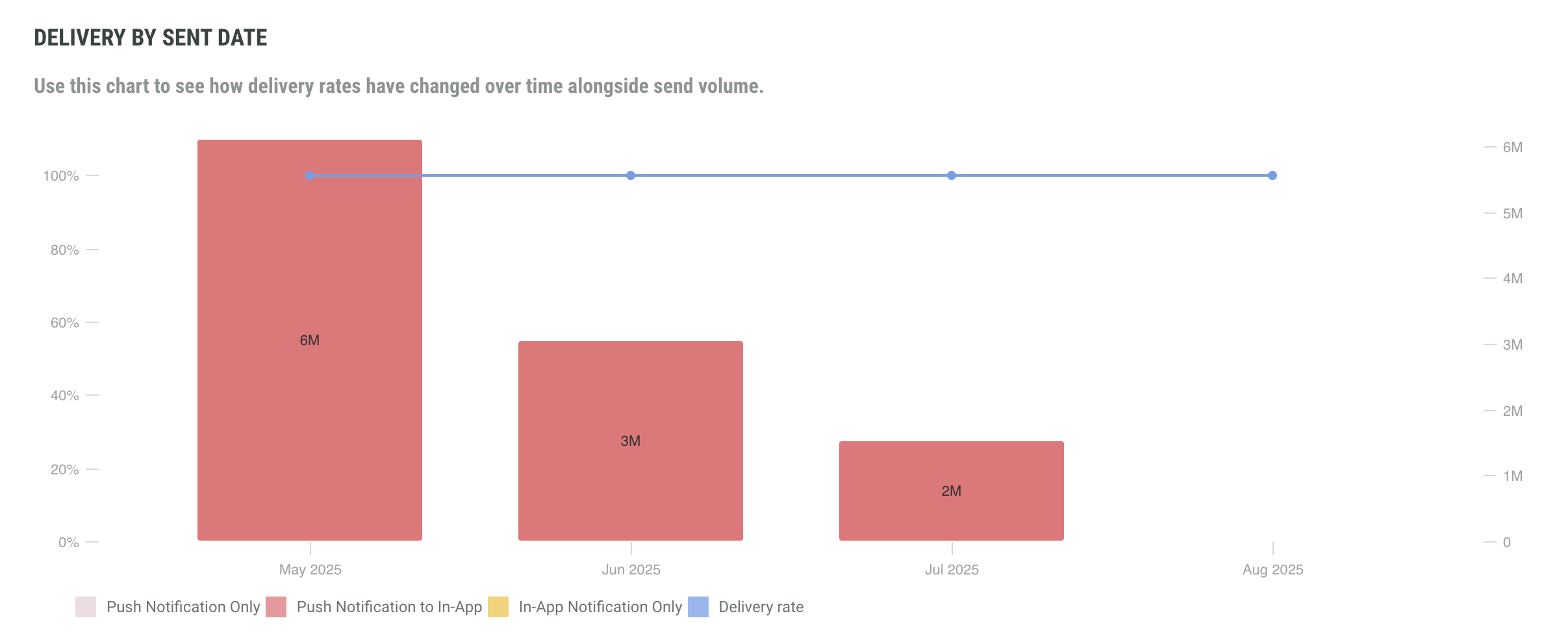
The delivery by sent date shows how delivery rates have changed over time alongside send volume.
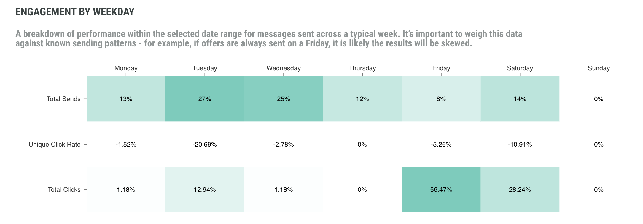
The Engagement by Weekday report shows breakdown of performance within the selected date range for messages sent across a typical week. This heatmap shows data for each day of the week and contains the following metrics:
- Total sends: the proportion of total sends across the week as a percentage
- Unique click rate: unique click rate for messages sent within the selected period after filtering out bots
- Total clicks: the proportion of total clicks across the selected period
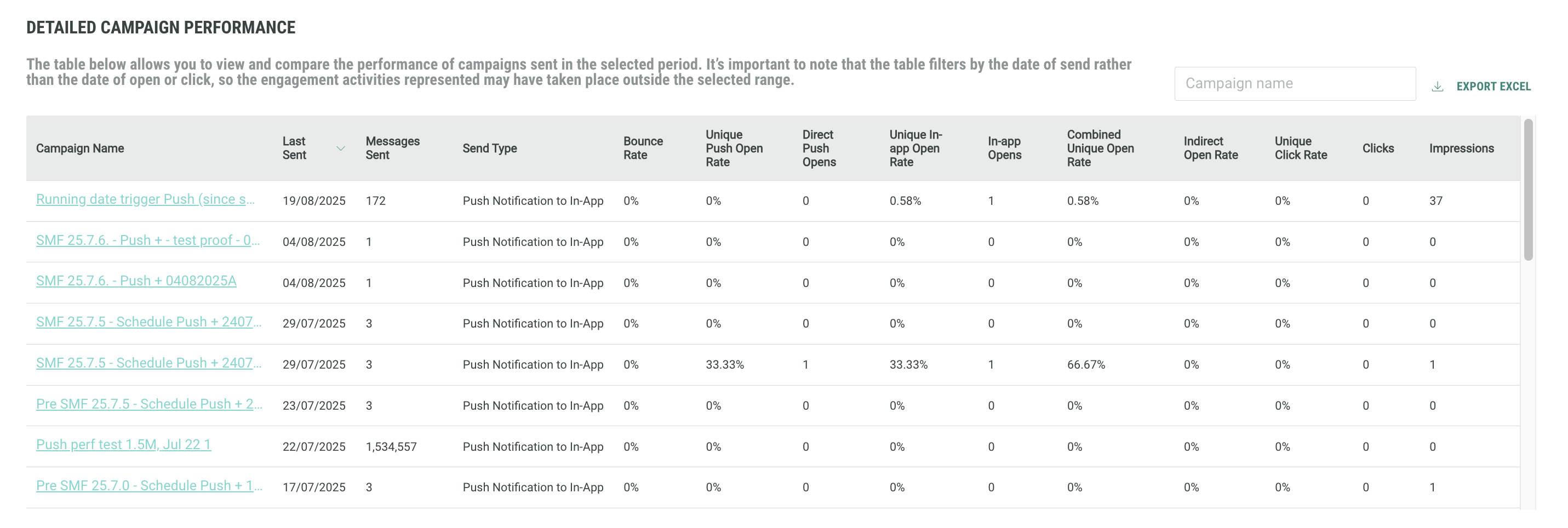
Lastly, you can also find an overview of performance statistics per individual campaign. From there, you can click through to all Real-Time Analytics for the selected campaign. Details available are:
- Last Sent: Last sent date
- Messages Sent: Total number of messages sent
- Send Type: Method used to send messages
- Bounce Rate: Percentage of sent messages that bounced
- Unique Push Open Rate: Percentage of unique push open rate
- Direct Push Opens: Number of direct push opens
- Unique In-app Open Rate: Percentage of delivered messages that were opened in-app
- In-app Opens: Number of delivered messages that were opened in-app
- Combined Unique Open Rate: Percentage combined unique open rate
- Indirect Open Rate: Percentage of indirect opens
- Unique Click Rate: Number of contacts who clicked on a campaign from a push notification
- Clicks: Number of taps on a CTA for a push notification
- Impressions: Number of impressions
Audience report
This report provides an insight to how your audience responds to your campaigns to help inform your marketing strategy.
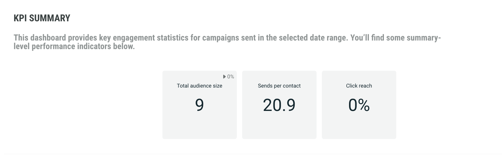
The KPI Summary report provides general KPI over all campaigns, such as:
- Total audience size
- Sends per contact
- Click reach
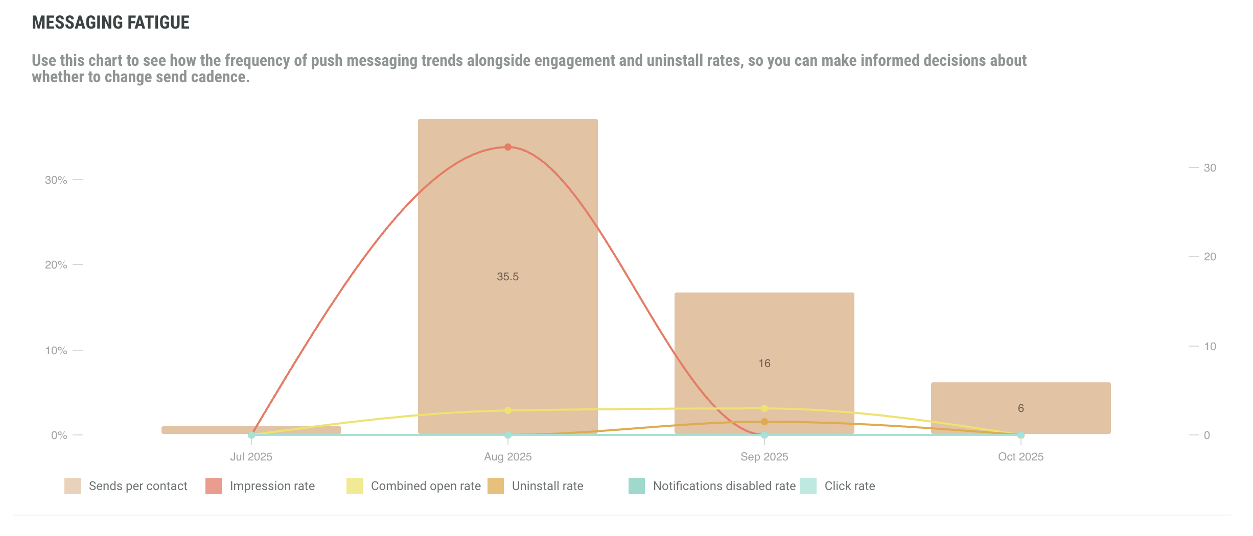
The messaging fatigue graph shows the frequency of push messaging trends alongside engagement, uninstall, and click rates.
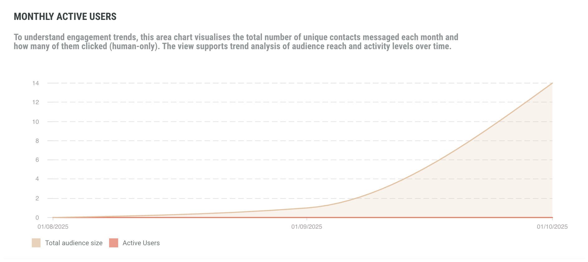
Use the Monthly Active Users graph to understand engagement trends. This area chart visualizes the total number of unique contacts messaged each month and how many of them clicked (human-only).
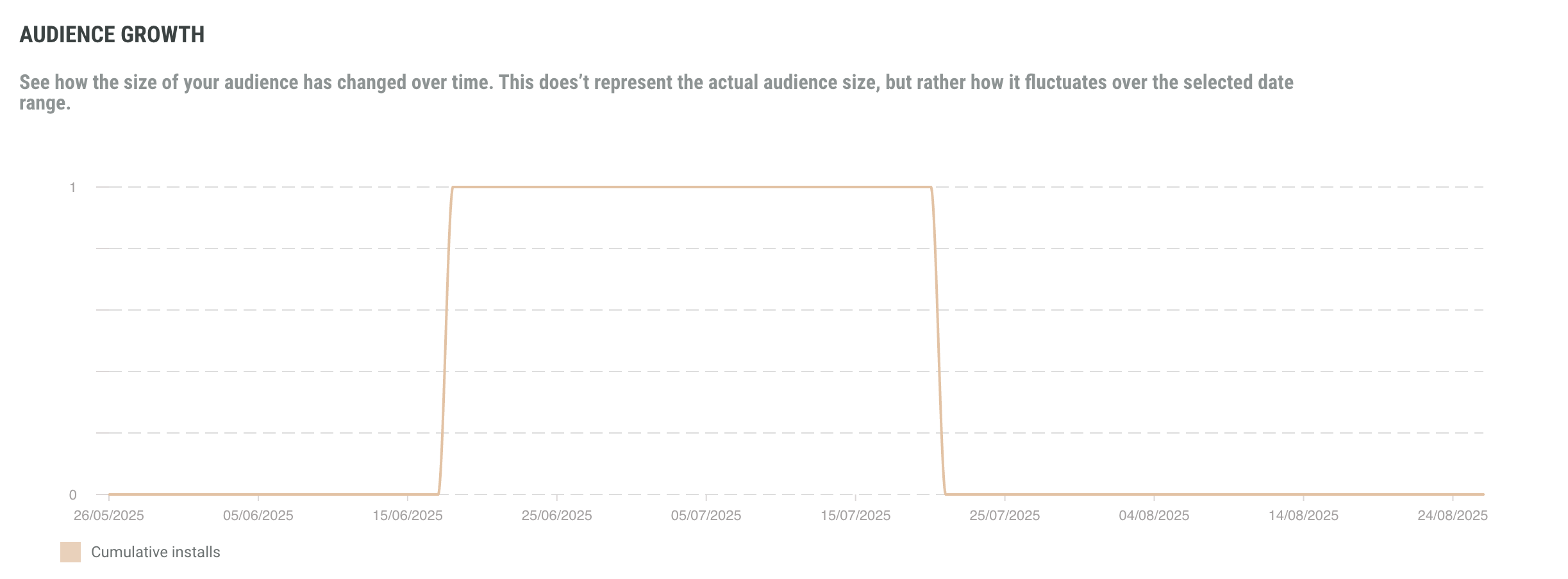
The audience growth graph shows how the size of your audience has changed over time. This doesn’t represent the actual audience size, but rather how it fluctuates over the selected date range.
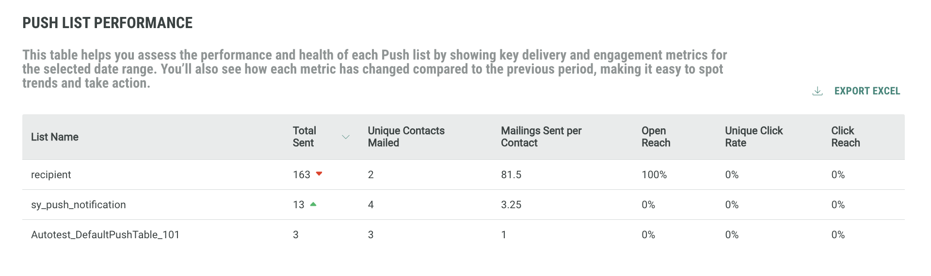
The push list performance table helps you assess the performance and health of each Push list by showing key delivery and engagement metrics for the selected date range.
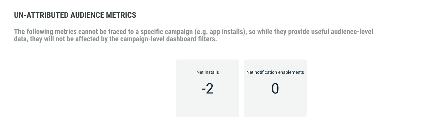
The un-attributed audience metrics include the metrics that cannot be traced to a specific campaign (e.g. app installs). Therefore, while they provide useful audience-level data, they will not be affected by the campaign-level dashboard filters.
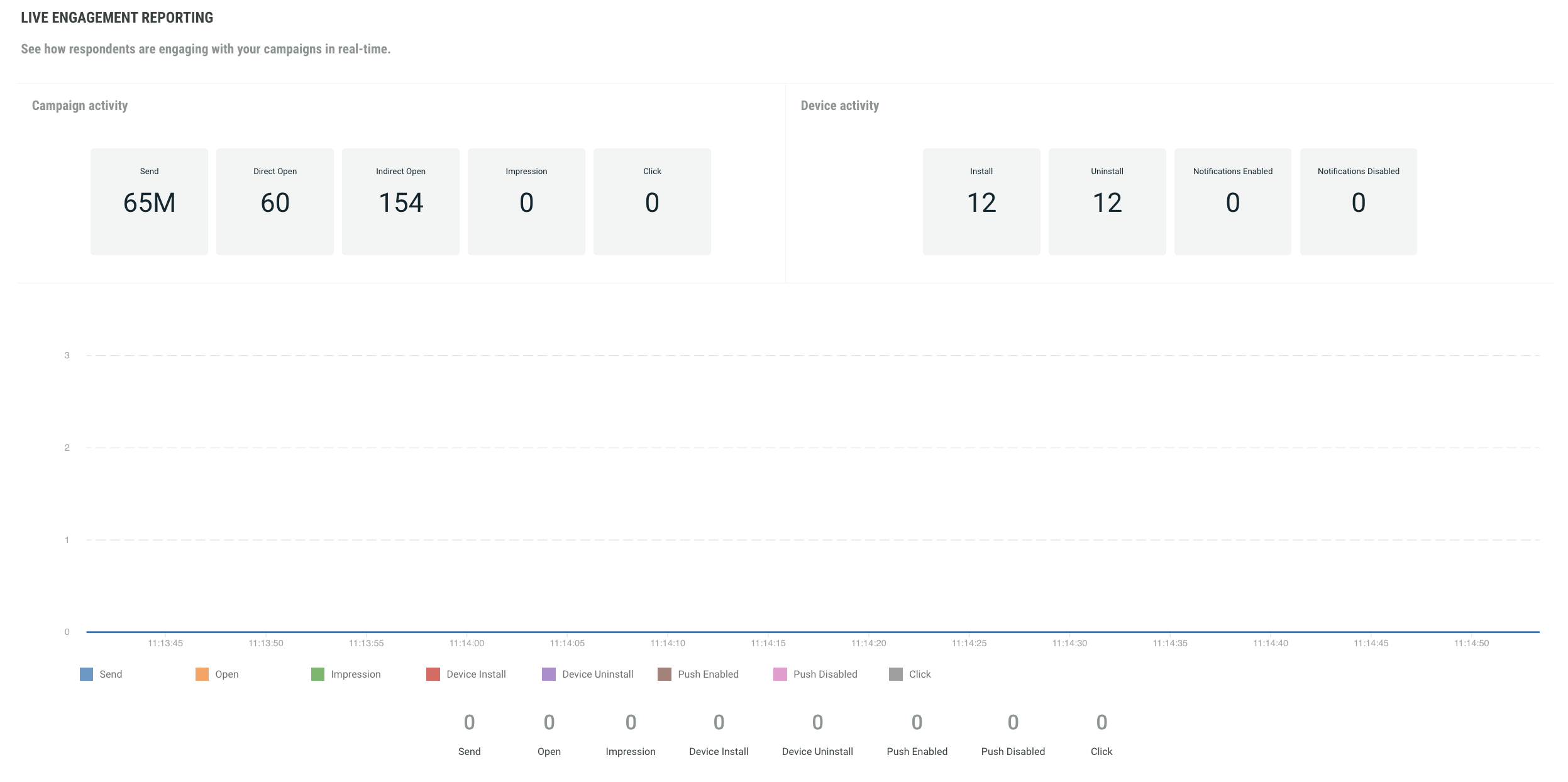
Realtime report
This report provides live engagement reporting (messages sent, opened, clicked, hard and soft bounced, unsubscribed) and show how respondents are engaging with your campaigns in real time.
The graph will continuously evolve within a time frame of less than a minute.