Email Single-Campaign Dashboard
Real time analytics provide marketers with the ability to measure and review what is currently happening with their email campaigns. Data is shown in real time and the single-campaign dashboards allow you to drill down into individual Campaigns
Our Real time analytics user guide outlines the general functionality that is available within these screens, such as applying filters, sharing, and exporting your data.
Reports
Each dashboard provides insights on engagement, delivery, location based stats and link activity, depending on the reports available.
The reports are divided into sections, which group related metrics, and charts, to allow you to visualize performance data.
The Single Campaign Email dashboard includes the following five reports:
- Engagement
- Delivery
- Links
- Geography
- Realtime
Engagement report
The Engagement report provides marketers with insights on how well their campaigns are doing and if they are creating engagement; are your emails reaching the intended audience, are customers opening your emails, and are they engaged with your content? Are they clicking through?
Use the different data sets within this dashboard to discover how your audience are engaging with your campaigns.
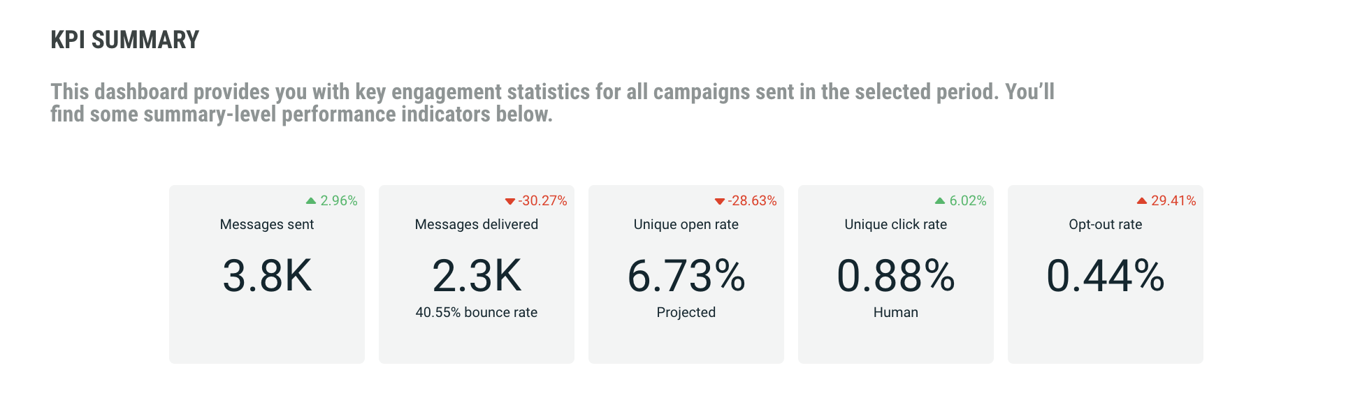
The KPI Summary report provides general KPI over all campaigns, such as:
- Messages sent — how many messages were sent out
- Messages delivered — how many of the messages sent, have actually been delivered.
- Projected percentage of messages opened — how many of the delivered messages have been opened. This is the unique human open rate as a percentage of recipients whose opens or non-opens would be visible. This means recipients using Apple MPP are excluded from the open rate.
- Percentage of messages clicked — how many of the delivered messages have been clicked by unique humans. Non-human clicks are not included.
- Percentage of opt-outs — how many of the delivered messages resulted in an opt-out
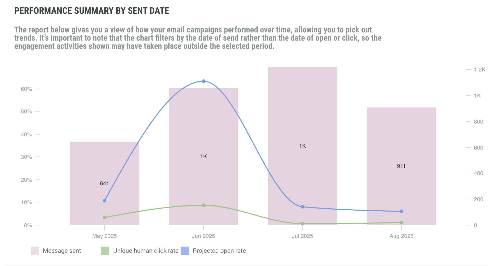
The Engagement dashboard also provides performance summary by sent date, highlighting number of human clicks and comparing it to your projected open rate. The time line is based on the selected filter.
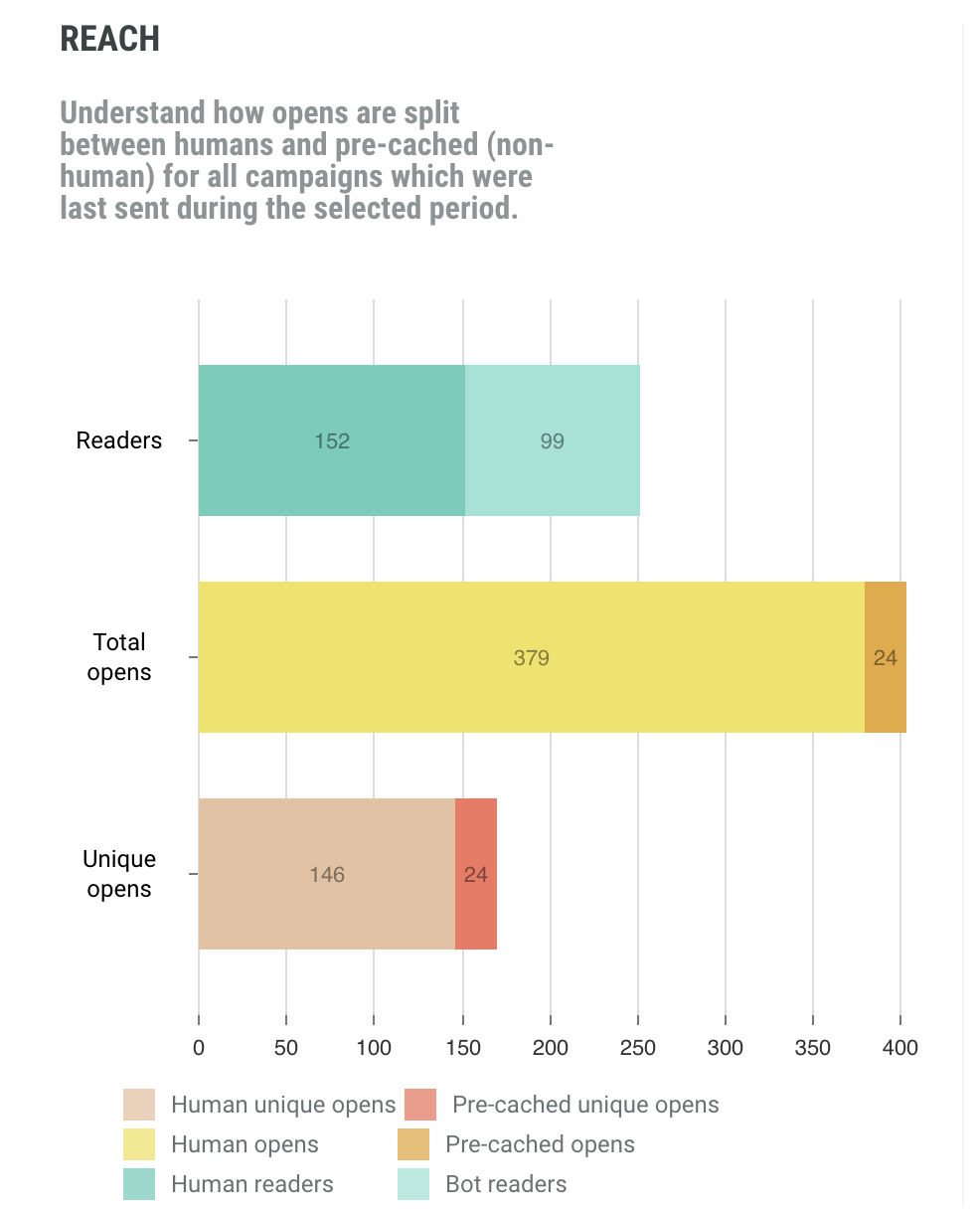
The Reach report is a comparison between total opens vs unique opens, as well as human vs pre-cached opens. A pre-cached open is a false open by Apple MPP.
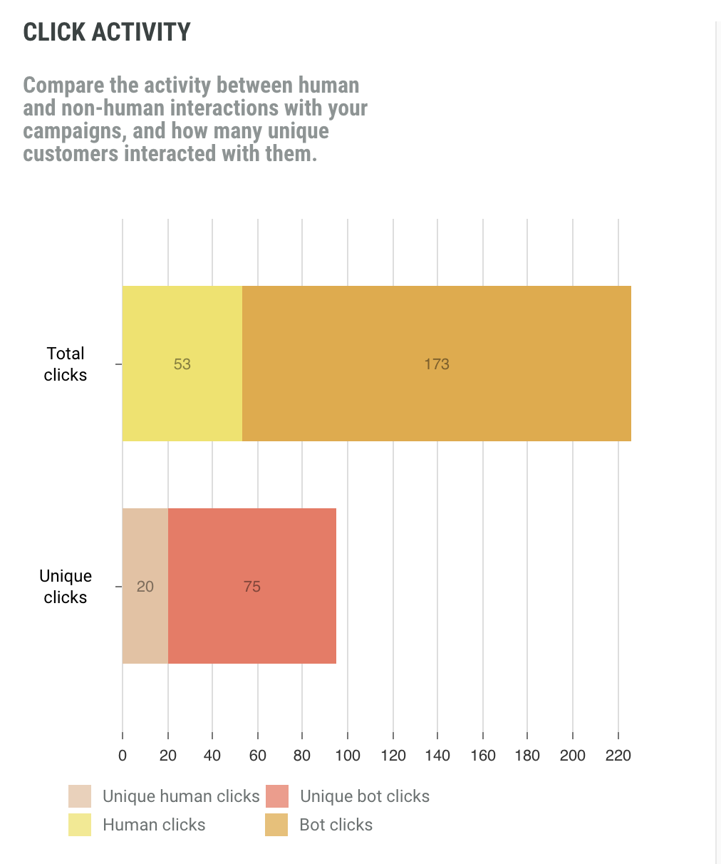
The Click Activity report compares human and non-human interactions (clicks) as well as unique vs total clicks.
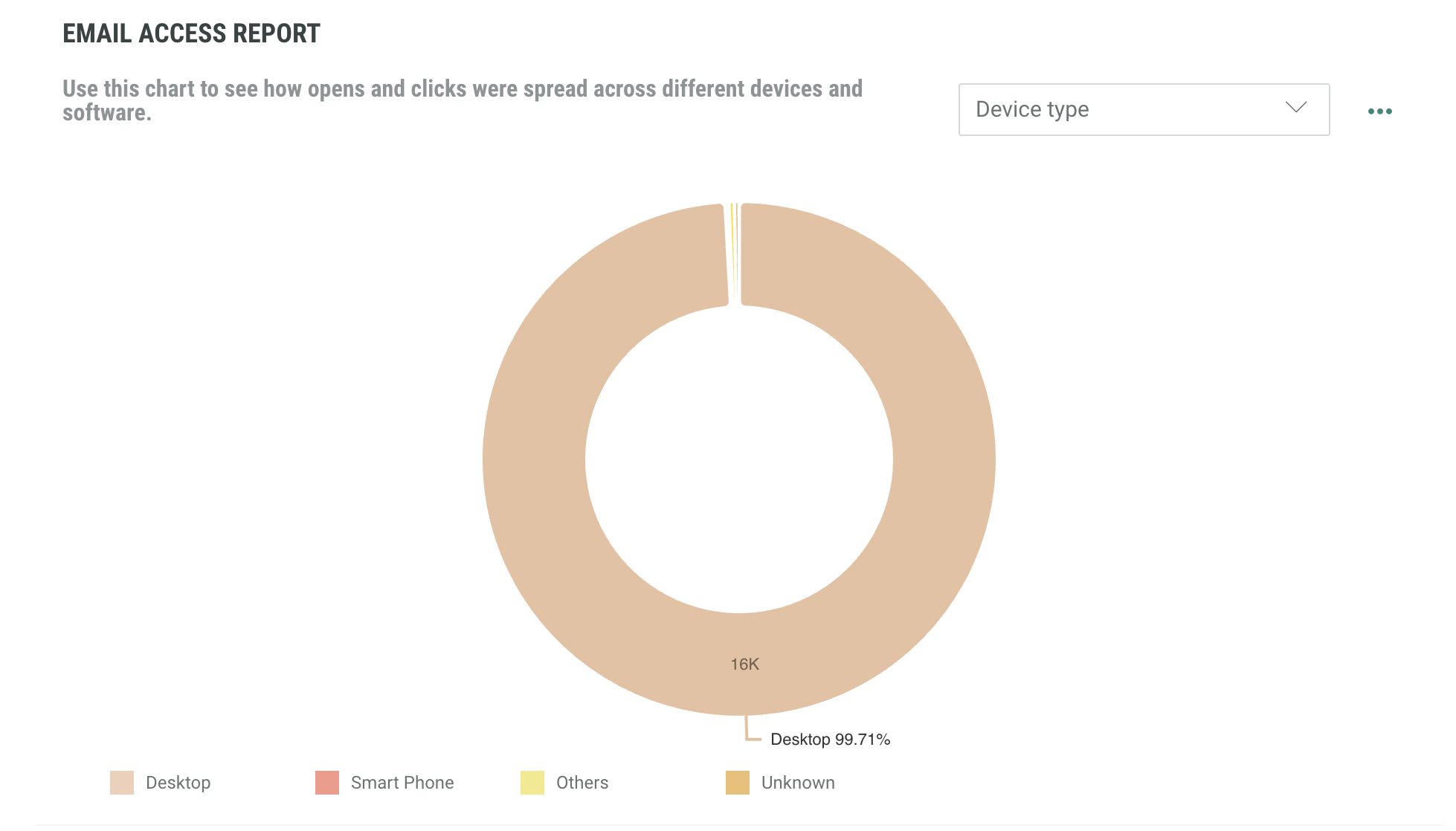
The Email Access Report shows how opens and clicks were spread across different devices and software. Select the data you wish to view using the drop down menu and the toggle on the right hand side.
Delivery report
The Delivery report tells marketers if their messages are reaching the inbox and how many don't get delivered because of spam complaints, opt-outs or other bounce reasons (such as bad email addresses).
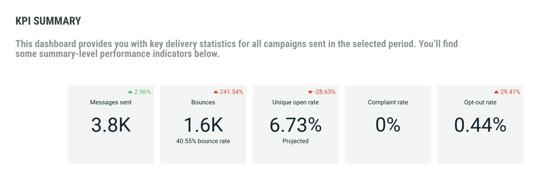
The KPI Summary report shows key delivery statistics for all campaigns sent in the selected time period. It includes:
- Number of messages sent
- Percentage of messages that bounced
- Percentage of projected opens. This is the unique human open rate as a percentage of recipients whose opens or non-opens would be visible. This means recipients using Apple MPP are excluded from the projected open rate
- Percentage of messages that generated a complaint by the recipient
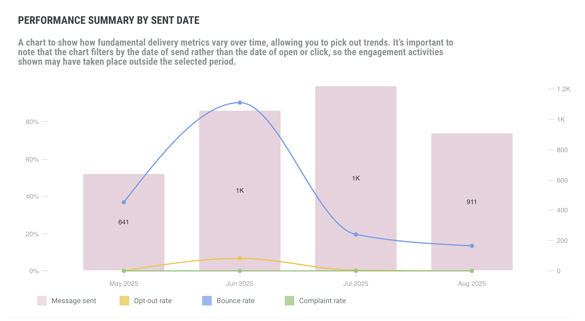
In addition, in the Performance Summary By Sent Date report, you can consult delivery details over the selected time period, and easily follow the evolution of bounce rates, opt-out rates and complaint rates.
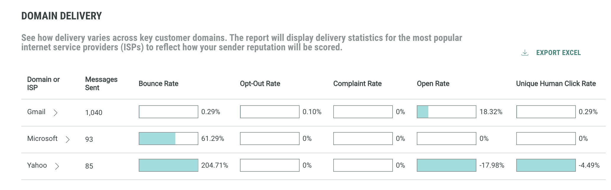
Next, the Domain Delivery report shows delivery numbers for individual ISPs. This allows comparing delivery numbers for key customer domains.
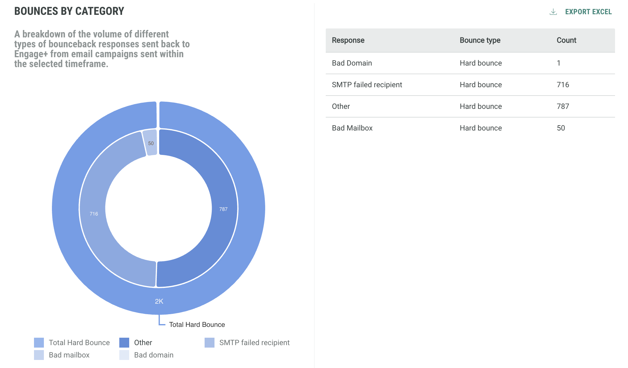
Also, it is good to know what the main reasons are for bounced emails. A dedicated graph Bounces By Category splits up the bounce information per type of bounce (bad domain, inactive mailbox, spam related, routing errors, etc.)
Links report
The Links report focuses on human and non-human click interaction, providing totals for the selected time period as well as an evolution over time. For marketers, it is important to know how much interest is generated through their emails. They can obtain this information by looking at click interactions but filtering out the non-human interactions. Also, insights on how these interactions evolve over time can provide valuable information for future campaign planning.
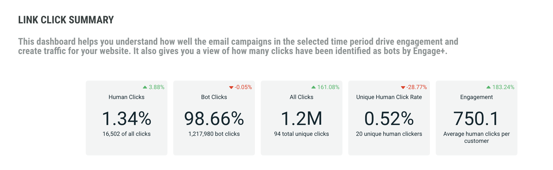
The Link Click Summary report provides insights on how much engagement and traffic your campaigns are generating over the selected time period. The following KPI are provided:
- Percentage of human clicks
- Percentage of bot clicks
- Total number of clicks, including human and bot clicks
- Percentage of unique human clicks
- Average number of human clicks per customer
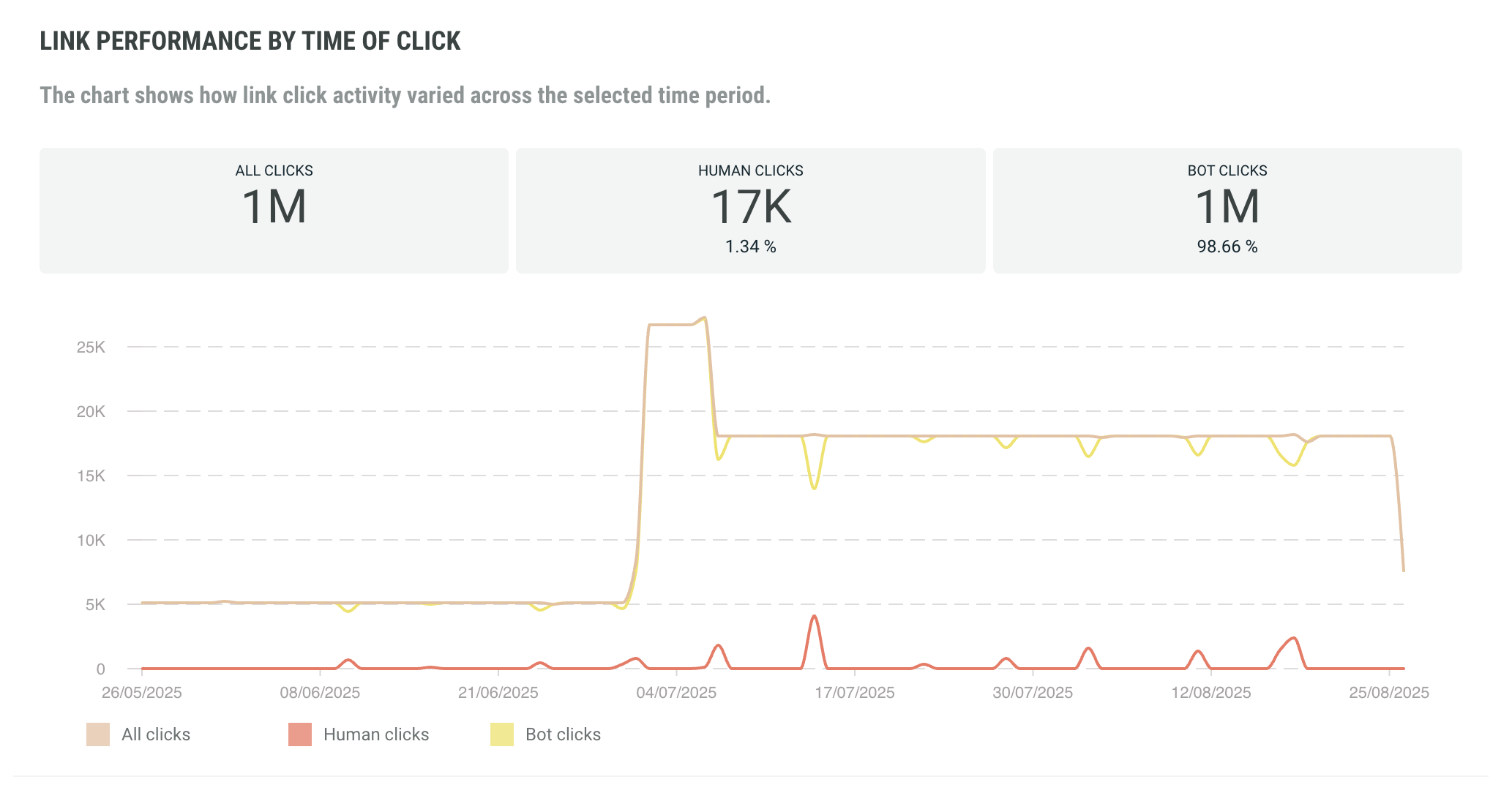
The Link Performance By Time of Click is a time line of click activity, showing how click activity varies over the selected time period. Human clicks, bot clicks as well as the total number of clicks are included.
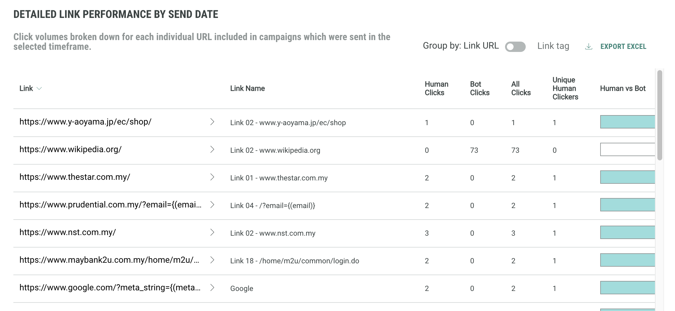
If you are interested in click behavior for individual links, the table view Detailed Link Performance By Send Date is provided, showing per individual link the number of human clicks, non-human clicks, total clicks, unique clicks, as well as the human vs bot ratio. You can click on the arrow to view further details on individual links when the links are grouped by link URL or tag.
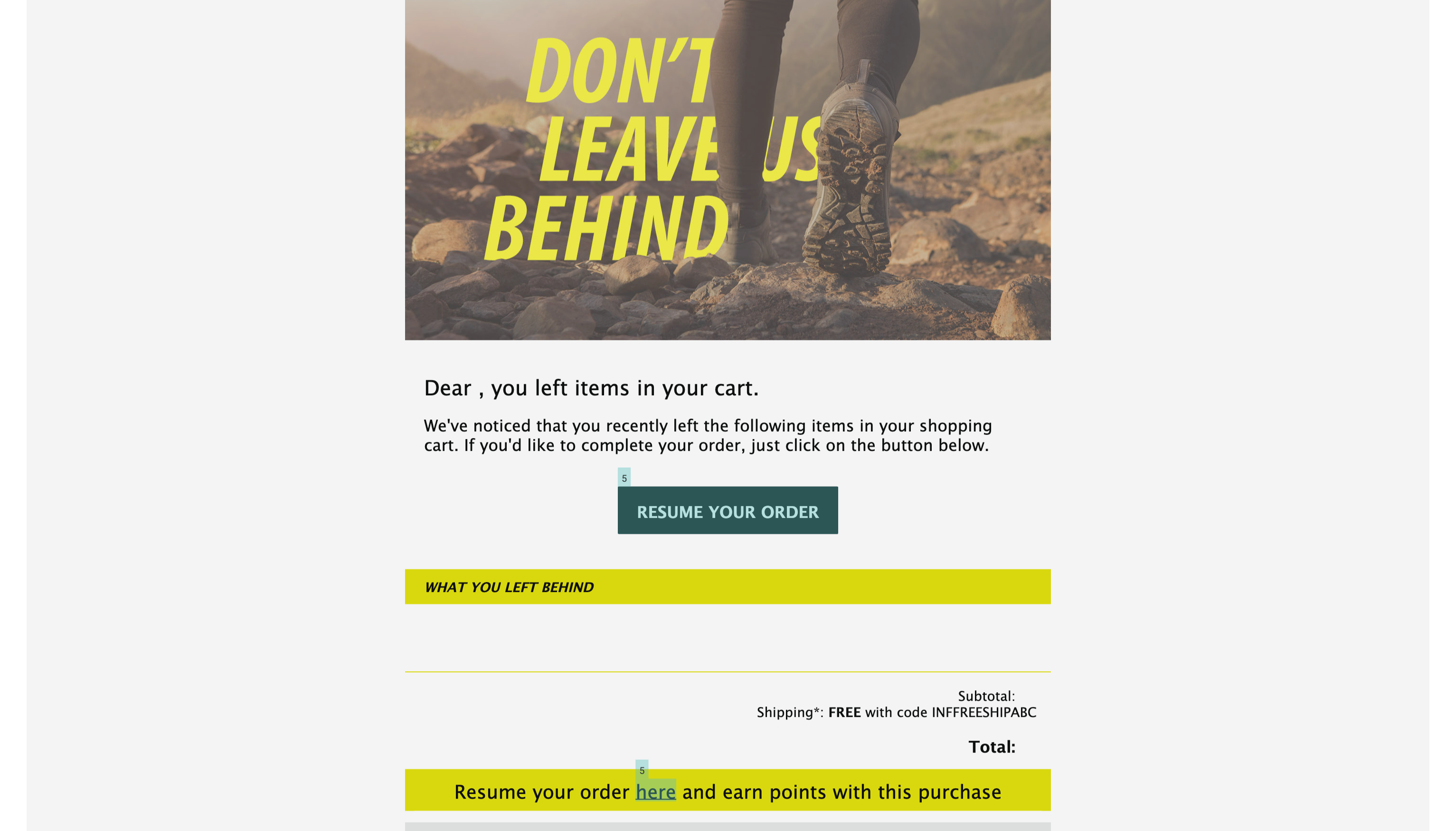
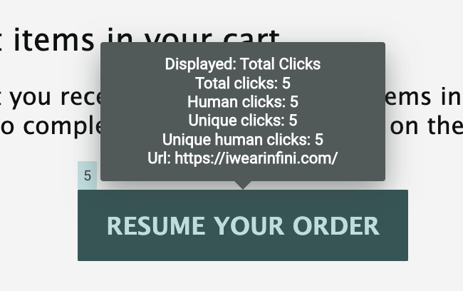
The Link Click Heatmap allows you to visualize where recipients interacted most within an email, highlighting click activity across links and images. Hotspots indicate areas of high engagement, helping marketers quickly see what captured attention and optimize future content.
This widget displays the content from your Campaign, with a heatmap overlay showing which links customers have clicked.
Hover over a highlighted section to display additional details, including:
-
Total clicks
-
Human clicks
-
Unique clicks
-
Unique human clicks
-
The URL
Note: This report is not included when exporting or sharing the dashboard.
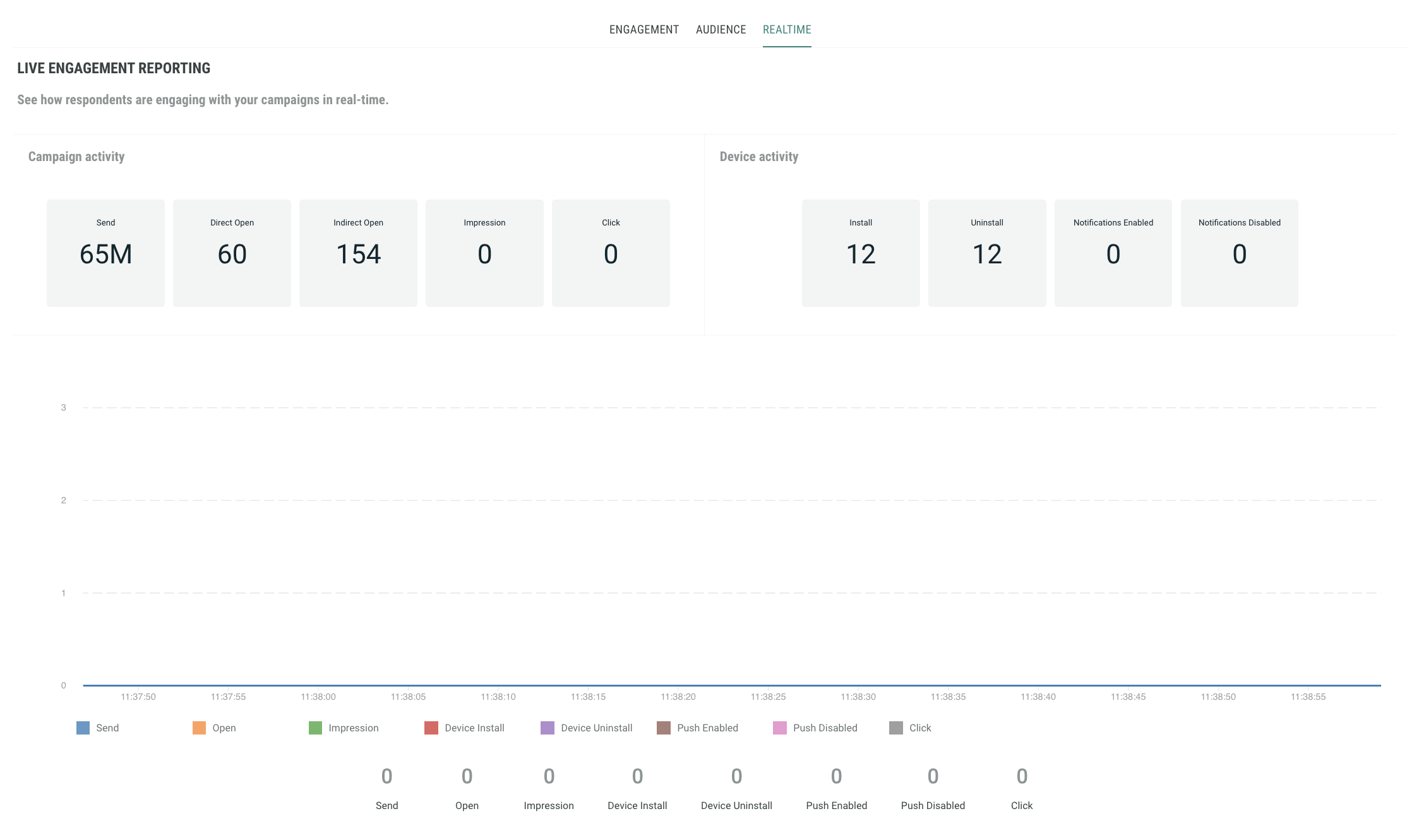
Realtime report
This report provides live engagement reporting (emails sent, opened, clicked, impressions, unsubscribed) and shows how respondents are engaging with your campaigns in real time.
The graph is continuously evolving within a time frame of less than a minute.
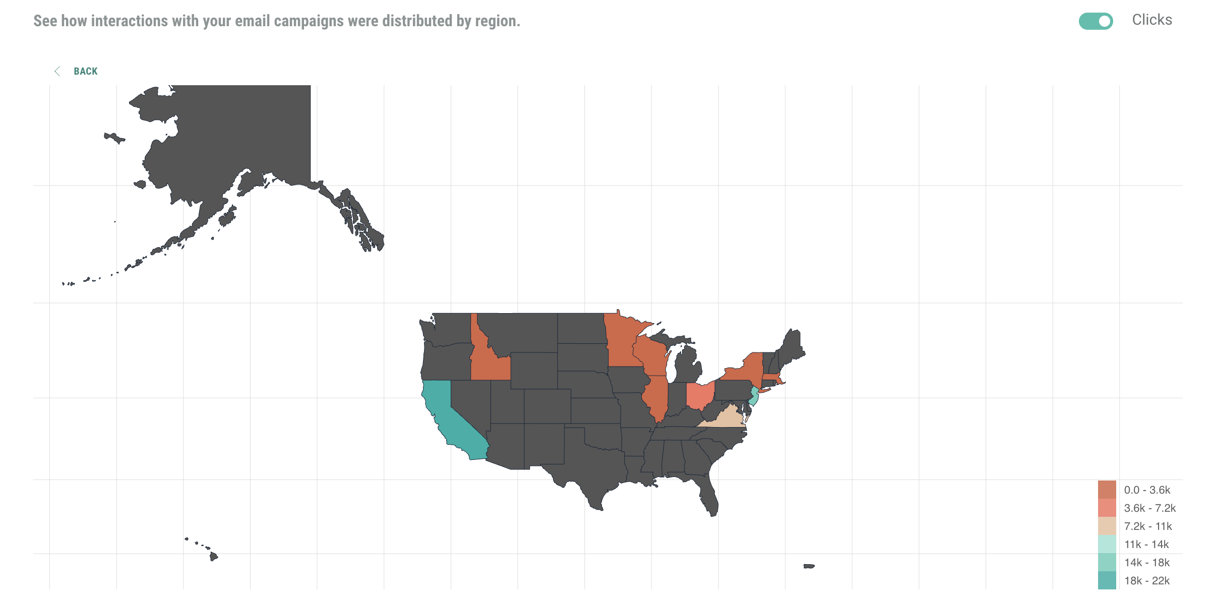
Geography report
Are your campaigns doing well in one region and not in another? Should you change your approach for specific regions where engagement is low compared to others? The Geography report allows you to compare engagement over the different countries.
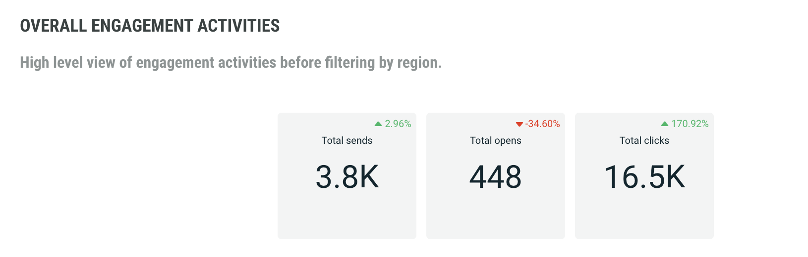
Overall Engagement Activities is a high level view of key performance indicators across all regions. It includes total sends, total opens and total clicks.
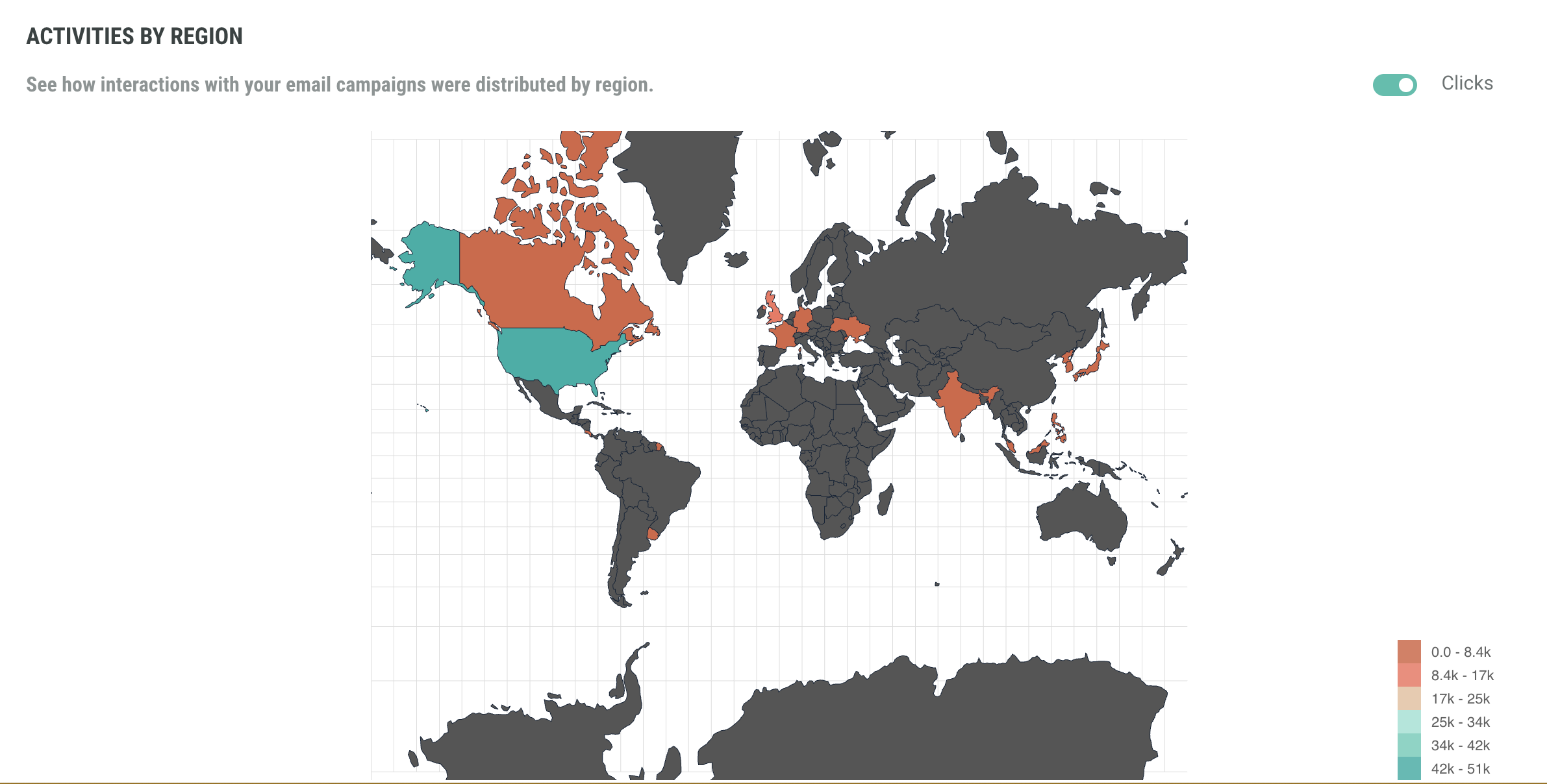
Activities per region shows a color-coded map with the distribution of engagement statistics over the different regions. This provides quick insights on what regions are performing better than others.
The table Detailed Activities By Region provides key performance indicators split up per region.
For example, click on the United States entry to see the numbers for the individual states within the US.
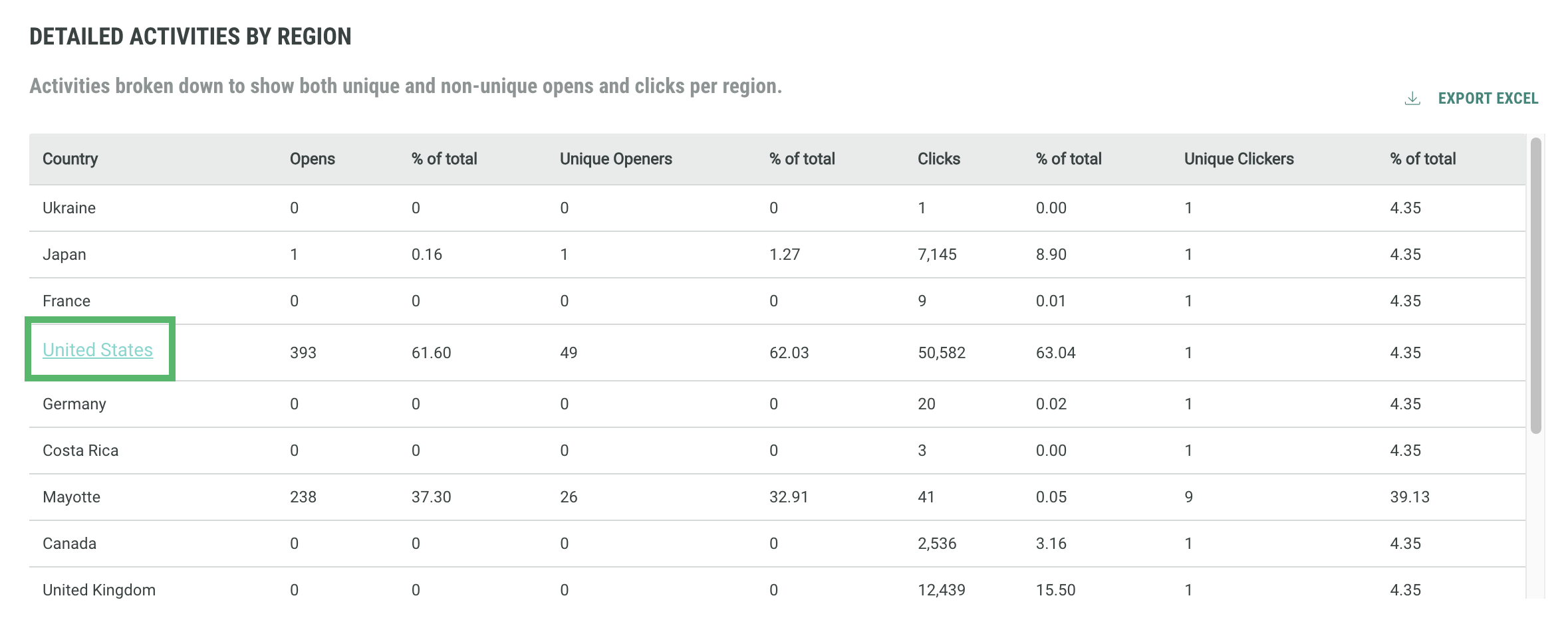
This loads more detailed map of the United States in the space above.