How to: Publish your Experience — Lightbox
Before you begin
Start the wizard to publish an Experience (explained in this topic).
Publish to Lightbox destination
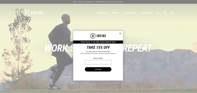
A Lightbox displays the Experience in a pop-up overlay on a website.
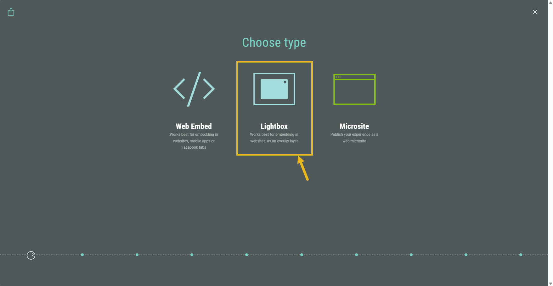
Select Lightbox type
In the Publishing wizard, select Lightbox.
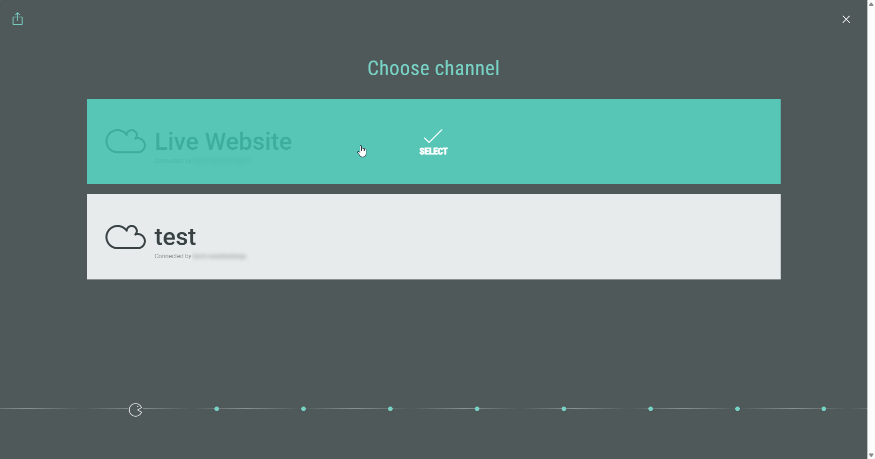
Channel selection (optional)
Choose a channel.
Note: This step only shows up if you are using a custom domain.
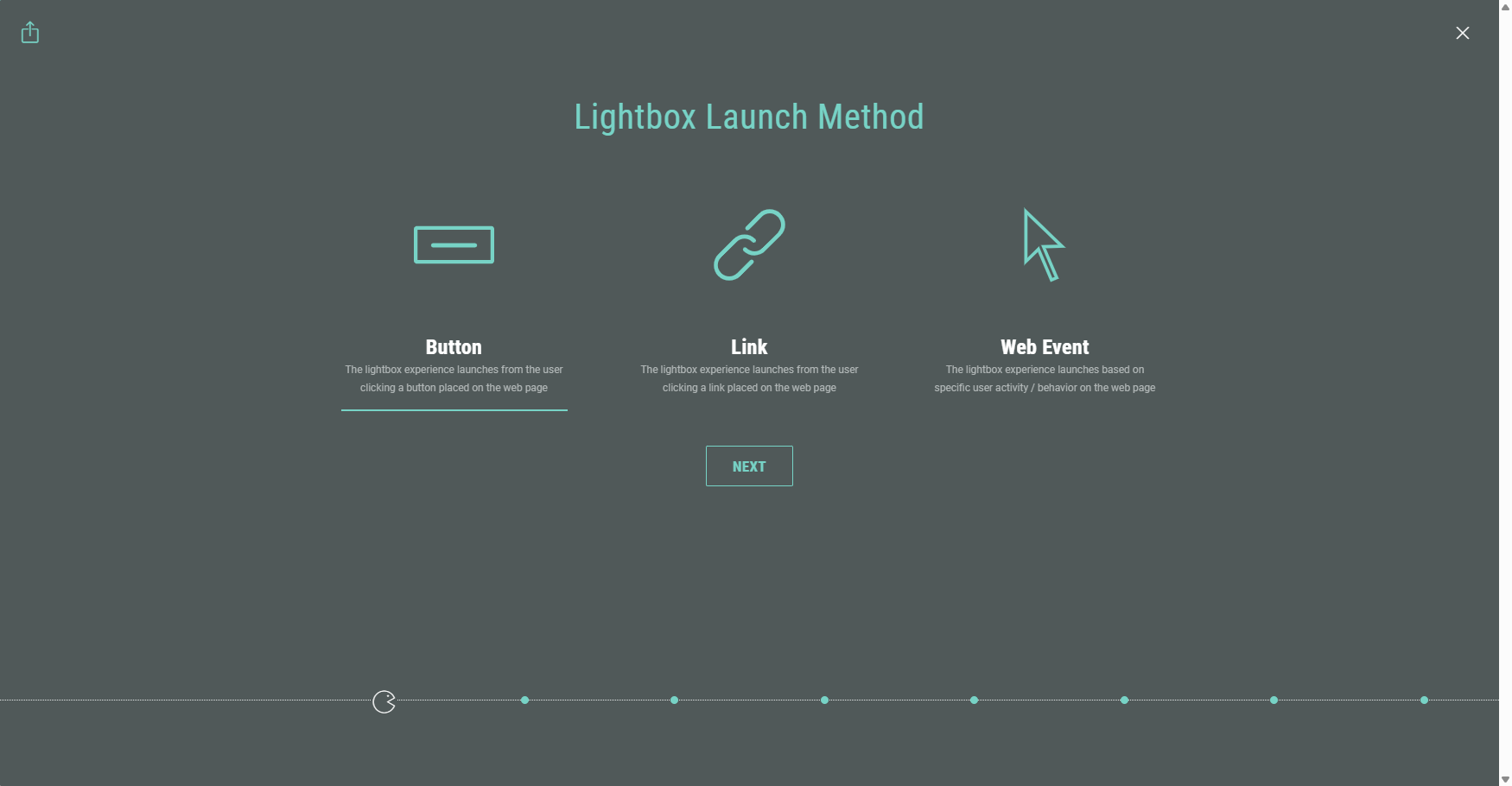
Lightbox Launch Method
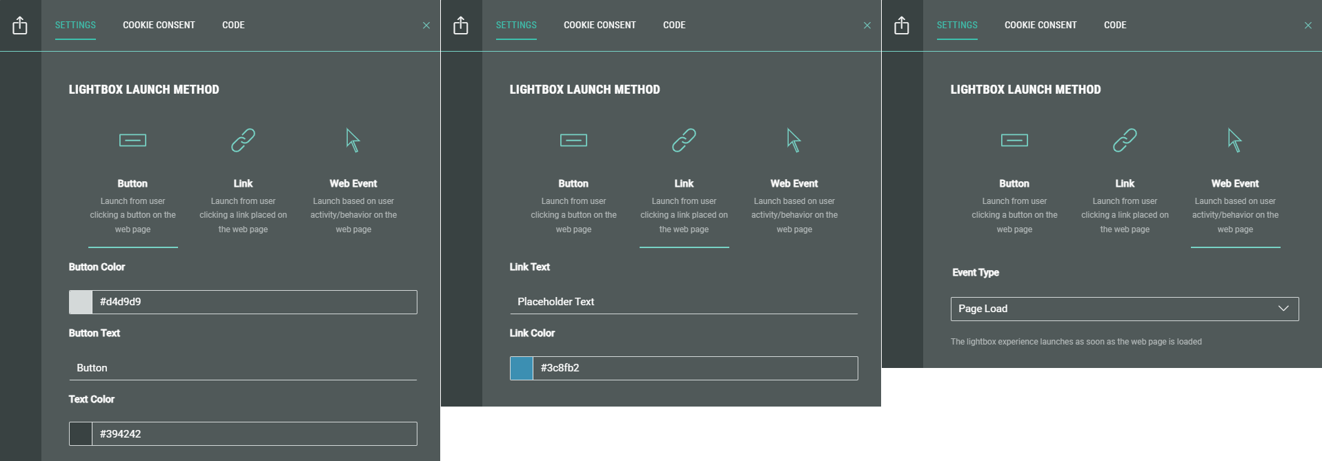
Select the lightbox launch method:
- Button — The Experience launches in a lightbox after clicking on a button on the web page.
- Link — The Experience launches in a lightbox after clicking on a link on the web page.
- Web Event — The Experience launches in a lightbox based on a specificuser action or behavior on the web page.
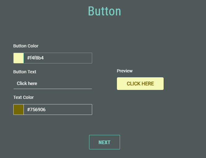
Button click launch
After choosing Button as lightbox launch method, select the button color, enter the button text (limited to 20 characters, spaces included) and select the text color. Colors can be selected through a visual color picker or by entering a hexadecimal color code.
A button preview is shown on the right.
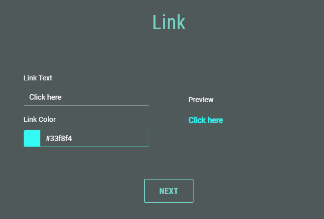
Link click launch
After choosing Link as lightbox launch method, enter the link text (limited to 20 characters, spaces included) and select the link color (through the visual color picker or by entering a hexadecimal color code).
A link preview is shown on the right.
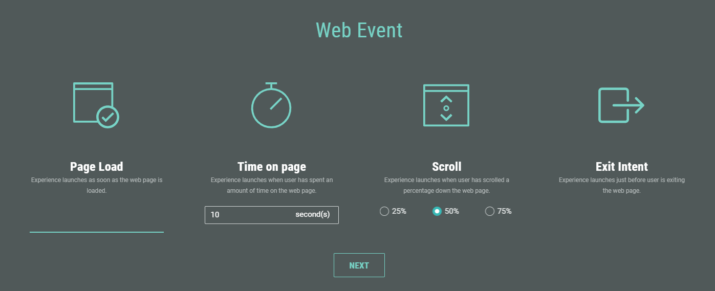
Web event launch
When you select Web Event as lightbox launch method, the following options are available:
-
Page load — Launches the Experience as soon as the web page loads.
-
Time on page — Launches the Experience after the visitor spends a specific amount of time on the page. Enter the duration in seconds (for example, 10, 20, or 30 seconds).
-
Scroll — Launches the Experience when the visitor scrolls to a certain point on the page. Choose 25%, 50%, or 75%.
-
Exit intent — Launches the Experience just before the visitor leaves the web page.
After selecting a lightbox launch method and defining the specifics, click Next to go to the next step.
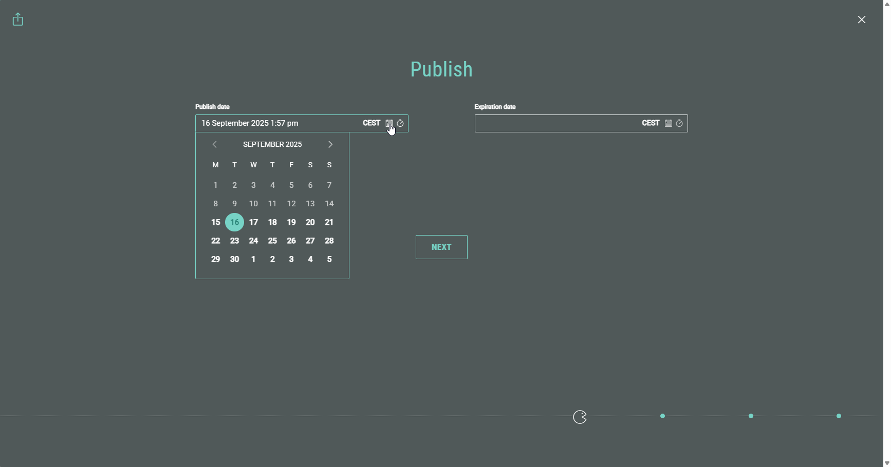
Publication time
Note: This step only appears the first time you schedule/publish the Experience.
Once the Experience is in scheduled/live state, adding more publishing destinations will automatically take on the Experience state for that destination.
On the Publish step, you can decide to schedule the publishing action (making it available online for Experience participants on a later date and time), or to publish now (making it available immediately).
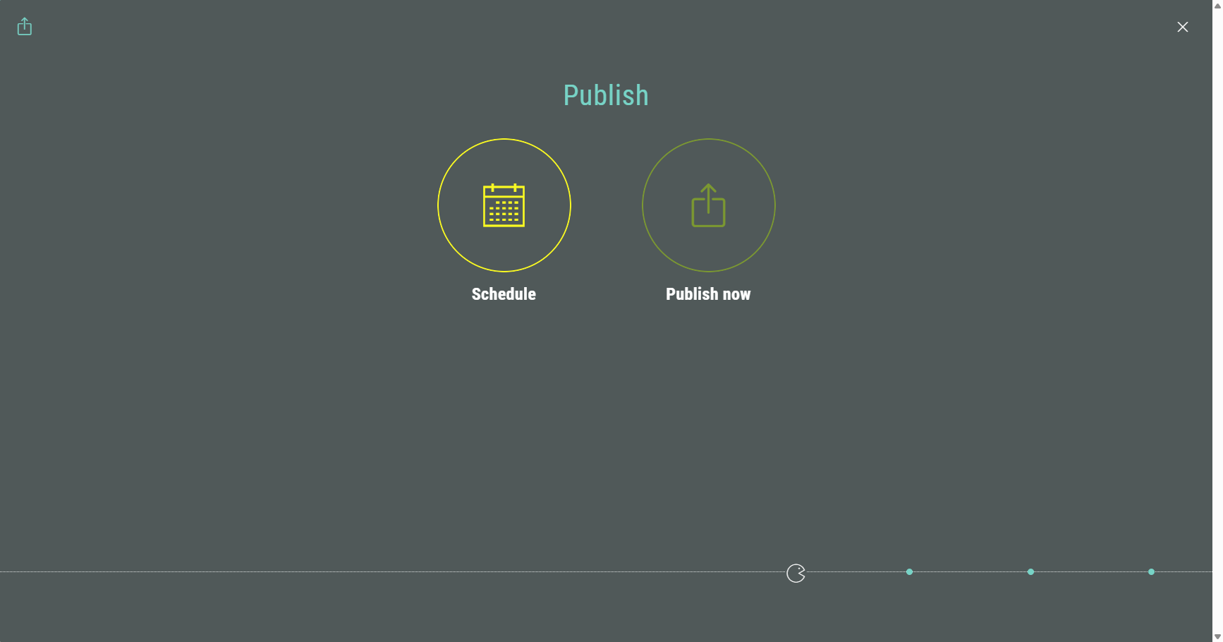
- When selecting Schedule, you can set:
- Publish date — You can choose the date and time on which the Experience becomes available for participants.
- Expiration date — Setting a date and time will take the Experience offline at that given date and time. When you leave this field empty, the Experience won't expire and remains available.
- When selecting Publish now, you can set:
- Expiration date — Setting a date and time will take the Experience offline at that given date and time. When you leave this field empty, the Experience won't expire and remains available.
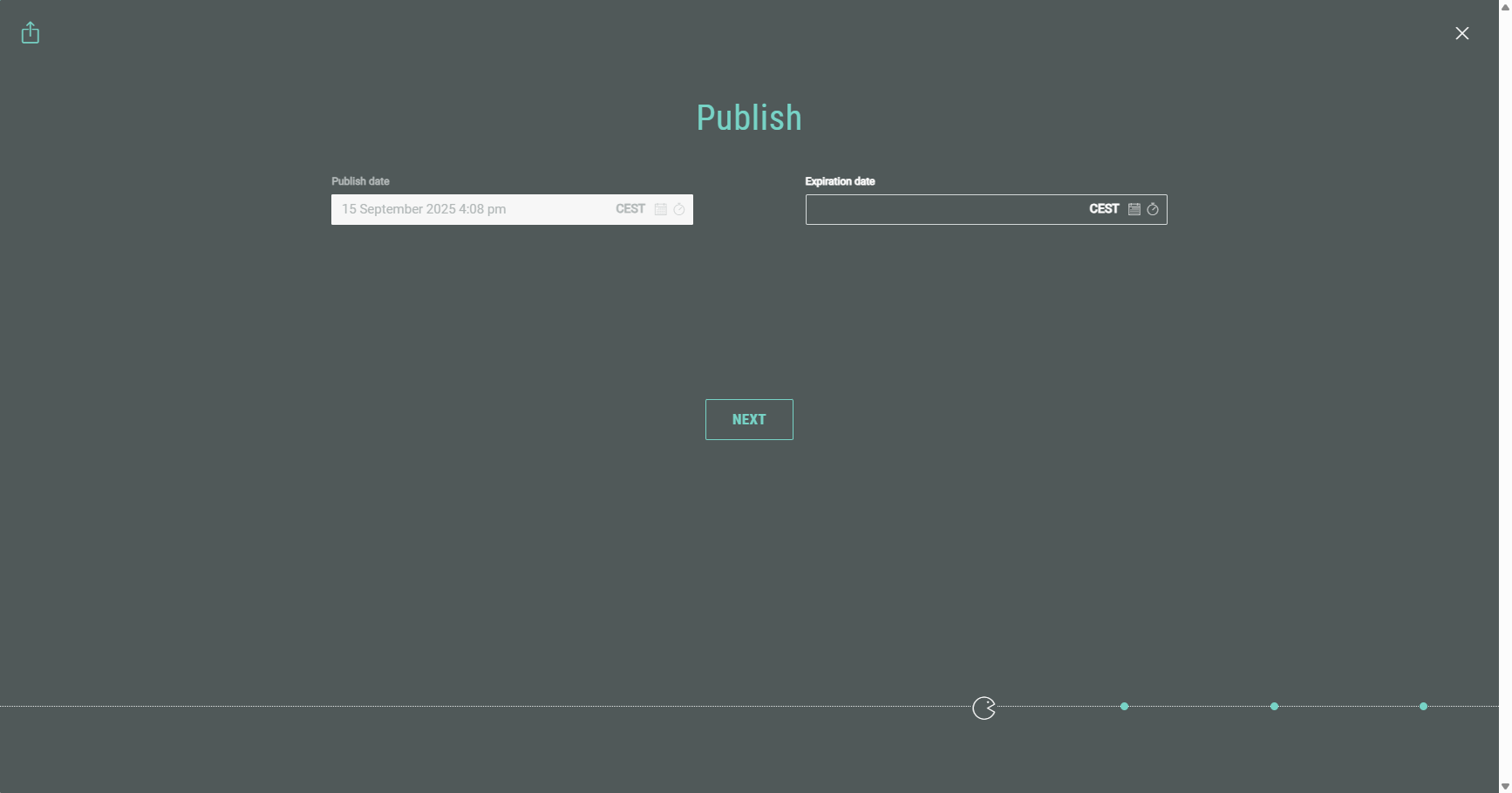
Note: The Publish date is a read-only field when selecting Publish now, as it's available immediately after completing all the publication steps.
After setting the desired date(s), click Next to go to the next step.
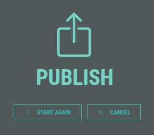
Publication summary
A summary screen is shown with all your settings.
Example: An Experience to be immediately published as Lightbox to a Live Website channel, which launches (= shows the lightbox) on exit intent of the web page visitor.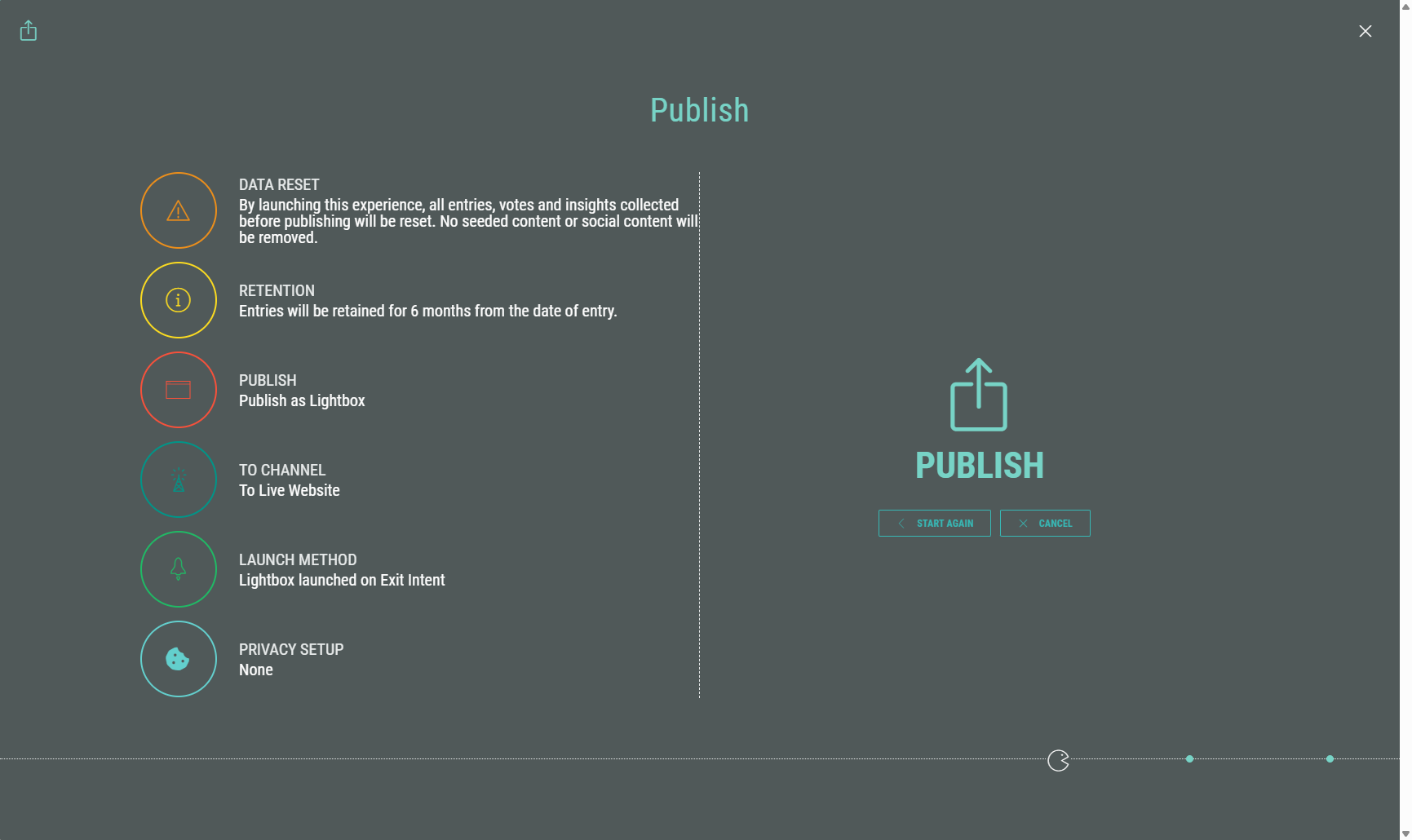
On the summary screen, at the right, you can click:
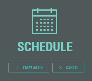
- Start Again — To run through the Publishing wizard from the start.
- Cancel — To discard your publishing settings and go back to your main Experience screen.
- Schedule or Publish your Experience — Depending on your publication time selection earlier on.
Manage the publish configurations
After clicking Schedule or Publish, the Experience gets scheduled or published, and you return to the Publish section within your Experience, where you can see the details below.
General Lightbox Experience settings
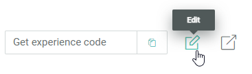
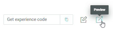
LightboxExperiences that are either published or scheduled, both display the following options in the publishing destinations section at the bottom:
- Copy button — To copy the Experience code to your clipboard.
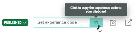
The copied Experience code looks like this:
<script src="https://x.wayin.com/lightbox/2dbc6f36-b718-4422-9674-646965cabd54?mode=adaptive&launchMethod=button&text=Button&textColor=394242&buttonColor=d4d9d9&transparency=50&size=medium&position=center"></script>- Pencil icon — To Edit a Publishing Destination.
- Preview icon — You can click it to open and run through the Experience in your browser for testing purposes.
Scheduled Experience settings
Scheduled Experiences show the following details:
- The text: Experience is scheduled to go live on [publish date and time].
- Status: Scheduled
- A Publish now option is available to publish the Experience immediately. When clicked, the Experience and all of its scheduled destinations below get published immediately.
- A Reschedule option is available to change the schedule dates.
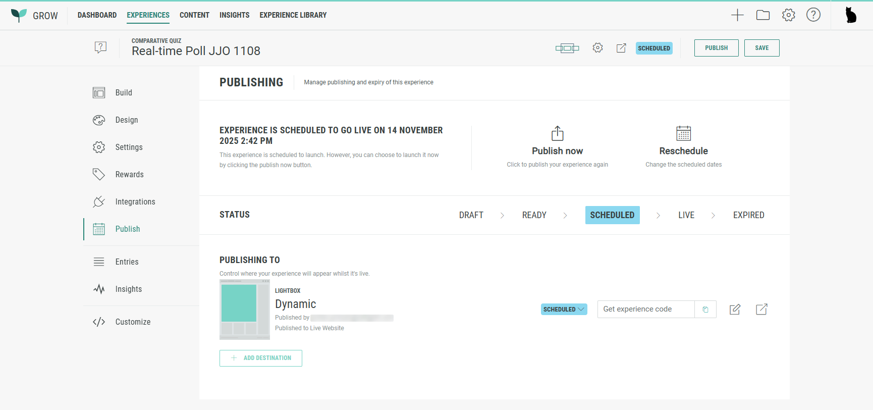
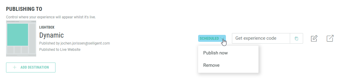
At the bottom, each publishing destination has a drop-down with two options:
- Publish now — To immediately publish the Experience. When clicked, the specific destination gets published immediately. The first time you publish a destination, it also publishes the Experience.
- Remove — To delete the scheduled publishing destination configuration.
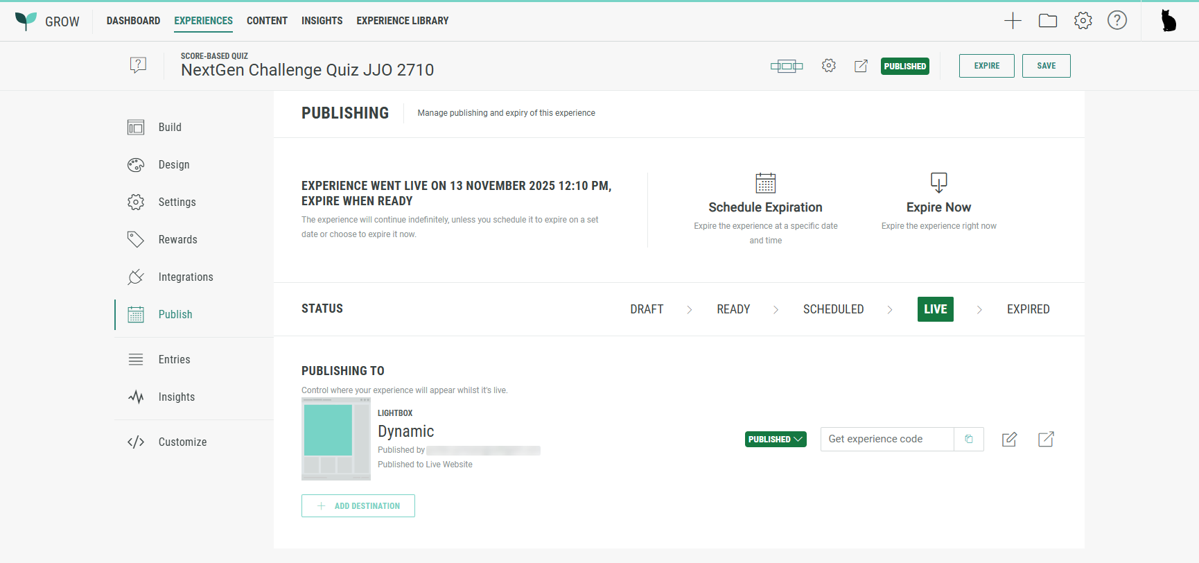
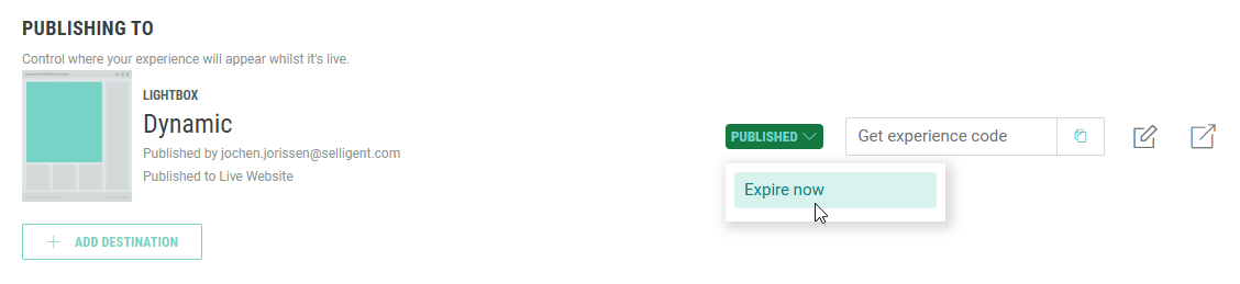
Published Experience settings
Published Experiences show the following details:
- The text: Experience went live on [launch date and time], expire when ready.
- Status: Live
- A Schedule Expiration option is available to take the Experience offline at a specific date and time.
- An Expire Now option is available to take the Experience offline immediately.
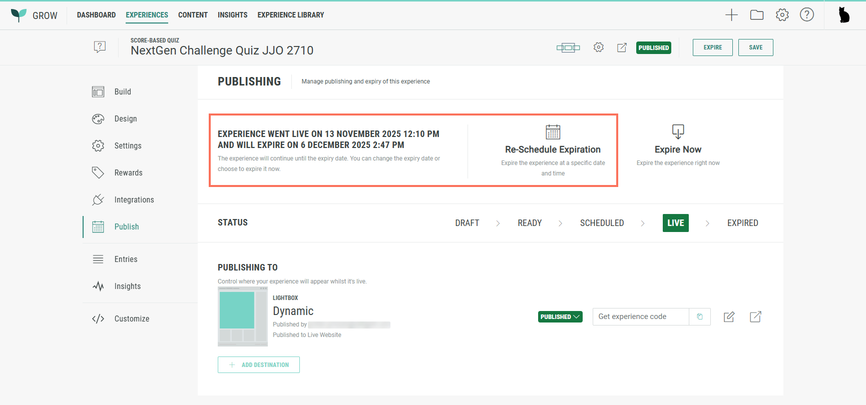
- When an expiration date has been set, the published Experience shows the text: Experience went live on [launch date/time], and will expire on [expiration date/time].
Also, a Re-Schedule Expiration option is available.
At the bottom, each publishing destination has the option:
- Expire now — To immediately take the Experience offline.
Note: For a single Experience, you can add multiple publishing destinations.
Once the Experience has been scheduled or published, adding a new destination automatically receives the same state as the Experience state. (No schedule/publish choice is offered in the wizard.)
Edit publishing destinations
To edit a publishing destination, click on the pencil icon at the right of that destination.
When editing a Lightbox publishing destination, the following screen is shown:
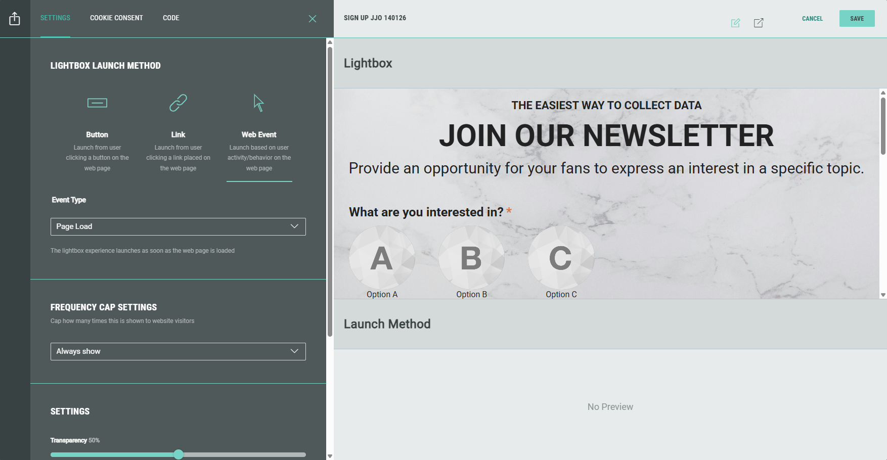
It contains the tabs: Settings, Cookie Consent and Code.
Settings
On the Settings tab, you can adapt the Lightbox launch method (Button, Link or Web Event) and the chosen method settings.
More info on these can be found here.
Underneath, the following settings can be edited:
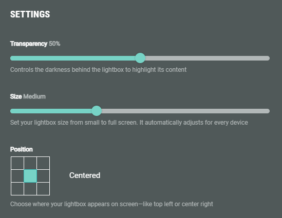
- Transparency — Controls the darkness behind the lightbox to highlight its content.
- Size — Set your lightbox size from small to full screen. It automatically adjusts for every device.
- Position — Choose where your lightbox appears on screen—like top left or center right. (This option is not available when selecting the full screen size above.)
Web Event frequency capping
For Web Event launch methods, there's an additional section, named Frequency Cap Settings.
By selecting a value from the drop-down you can control how often a participant will see the Lightbox Experience.
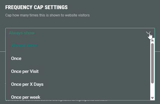
The available options are:
-
Always show — The Lightbox will show each time the participant refreshes their page or revisits the website.
-
Once — The Lightbox will only be displayed to the participant once (=the first time).
Technical note: A cookie (lightbox_<id>_seen=true) will be stored with a long expiry. As long as the cookie is present, the Lightbox won't be displayed again.
-
Once per visit — The Lightbox will be displayed once per browser session.
Technical note: A session cookie is stored upon displaying the Lightbox.
As long as the cookie is present, the Lightbox won't be displayed (until a new browser session starts).
When the browser session ends (usually on closing the browser) or after 30 minutes of inactivity, the cookie will be cleared. -
Once per X days — The Lightbox will be displayed once per x number of days.
When this option is selected in the drop-down, an extra input field is shown in which you can enter the number of days.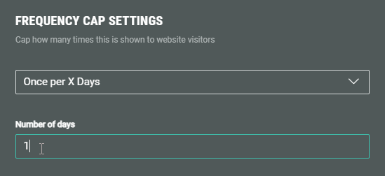
Technical note: The last shown timestamp is stored in a cookie.
The Lightbox won't be displayed when the timestamp < X days old.
It will be shown again once the set number of days have passed. -
Once per week — The Lightbox will be displayed once per week.
Technical note: The last shown timestamp is stored in a cookie.
The Lightbox won't be displayed when the timestamp < 7 days since last shown.
It will be shown again once the 7 days have passed. -
Once per month — The Lightbox will be displayed once per month.
Technical note: The last shown timestamp is stored in a cookie.
The Lightbox will not display again until the next monthly interval has been reached.
Cookie Consent
On the Cookie Consent tab, you can define how cookie consent management is handled by Grow.
Find more info on cookie consent here.
Code
On the Code tab, you can see the default code to be added to your web page for this Experience, as well as a more advanced code.
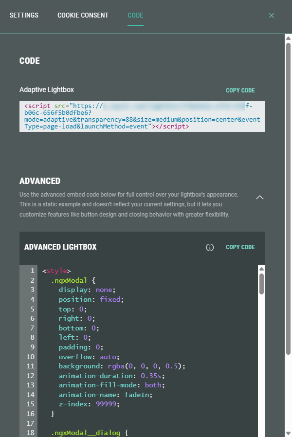
- Default code — A single-line <script> tag with the Experience URL with ID as source, and additional parameters such as the size and launch method.
- Advanced code — For more control over the lightbox appearance, use the advanced code. You can control styling (CSS code), HTML elements (such as <section> and <div> tags), JavaScript code (<script> tags), and set additional parameters in the src attribute of the ngxModal div element. Do not modify the Experience ID.
Example of Advanced Lightbox code:
<style>
  .ngxModal {
    display: none;
    position: fixed;
    top: 0;
    right: 0;
    bottom: 0;
    left: 0;
    padding: 0;
    overflow: auto;
    background: rgba(0, 0, 0, 0.5);
    animation-duration: 0.35s;
    animation-fill-mode: both;
    animation-name: fadeIn;
    z-index: 99999;
  }

  .ngxModal__dialog {
    position: relative;
    margin: auto;
    border-radius: 4px;
    background-color: #fff;
    width: 80vw;
    max-height: 80vh;
    overflow: auto;
  }

  .ngxModal__dialog--init {
    min-height: 80vh;
  }

  .ngxModal iframe {
    display: block;
  }

  .ngxModal__header {
    position: -webkit-sticky;
    position: sticky;
    top: 0;
    background-color: white;
    z-index: 10;
    display: flex;
    justify-content: flex-end;
  }

  .ngxModal__close {
    top: 5px;
    right: 5px;
    position: absolute;
    width: 30px;
    height: 30px;
    background-color: rgba(0, 0, 0, 0.3);
    color: white;
    font-size: 22px;
    font-weight: bold;
    border-radius: 50%;
    cursor: pointer;
    padding: 2px 6px 4px;
    border: none;
  }

  .ngxModal__close:hover {
    background-color: rgba(0, 0, 0, 0.6);
  }

  .ngxModal__close:focus {
    outline: 0;
  }

  .ngxModal--active {
    display: flex;
  }

  .ngxButtonTrigger {
    border: none;
    border-radius: 10px;
    padding: 10px;
    text-transform: uppercase;
  }

  @keyframes fadeIn {
    0% {
      opacity: 0;
    }

    100% {
      opacity: 1;
    }
  }

  @media (max-width: 374px) {
    .ngxModal__dialog {
      max-height: 95vh;
      overflow: auto;
      width: 95vw;
    }
  }
</style>

<section class="demo">
  <div class="demo__card">
    <h2 class="demo__title">Click a button to trigger the overlay</h2>
      <button class="ngxButtonTrigger" onclick="showModal('ngxModal')">Sample Overlay</button>
  </div>
</section>

<div class="ngxModal" data-modal-name="ngxModal" data-modal-dismiss>
    <div class="ngxModal__dialog">
        <div class="ngxModal__header">
            <button class="ngxModal__close" onclick="hideModal()">×</button>
        </div>
        <script src="https://x.wayin.com/embed/139abc1f-b75d-47df-b16c-556f5b0dfc5d?mode=adaptive&transparency=88&size=medium&position=center&eventType=page-load&launchMethod=event"></script>
    </div>
</div>

<script>
var _targettedModal,
_dismiss = document.querySelector('[data-modal-dismiss]'),
modalActiveClass = "ngxModal--active";

function showModal(el) {
_targettedModal = document.querySelector('[data-modal-name="' + el + '"]');
_targettedModal.classList.add(modalActiveClass);
setTimeout( () => {
  const modalContainerEl = _targettedModal.querySelector('.ngxModal__dialog');
  const iframeEl = _targettedModal.querySelector('iframe');

  // Need this to notify campaign about the scrolling (to move nav arrows if needed)
  modalContainerEl.addEventListener('scroll', (e) => {
    window.NGX.api('embed:send:message', { type: 'lightbox:scroll', lightboxHeight: modalContainerEl.clientHeight, scrollTop: e.target.scrollTop }, iframeEl.id);
  });

  window.NGX.api(
        'embed:send:message',
        {
          type:           'lightbox:shown',
          lightboxHeight: modalContainerEl.clientHeight,
        },
        iframeEl.id
      );
}, 100);
}

function hideModal(event) {
if (event === undefined || event.target.hasAttribute('data-modal-dismiss')) {
    _targettedModal.classList.remove(modalActiveClass);
}
}

// function to close the overlay on a backdrop click.
// feel free to remove all the next code, if you don't need it
function triggerDismiss() {
if (_dismiss) {
    _dismiss.addEventListener('click', function (event) {
        hideModal(event);
    });
}
}
triggerDismiss();
</script>
Note: Some changes to settings, like dimensions, won't appear automatically. We recommend updating the embed code on your web page after editing, to display the latest version. Otherwise, the latest changes might not be reflected.