Poll Module
The Poll module can be used to gather votes from Experience participants.
It can be used as a content module and as a form module.
Note: Using Poll modules in the content section of your Experience will only record anonymous votes.
To record votes to participant profiles, use Poll modules in the Form Section.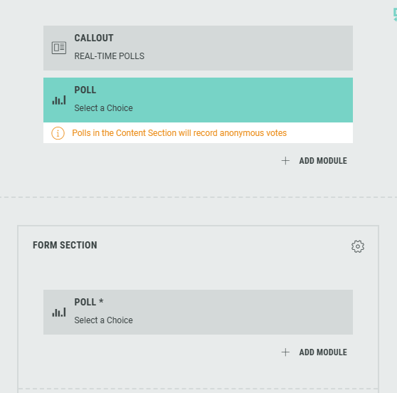
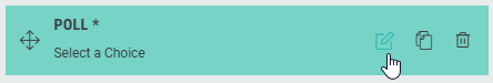
You can access and edit the Poll module in the Page Builder by clicking it, or by clicking on the Pencil icon.
The following sections are available which can be edited (from the tabs at the top): Content, Design, Logic.
Content
On the Content tab, you can configure:
Text copy
You can specify text content and apply styling for tagline, headline, byline, description and help text.
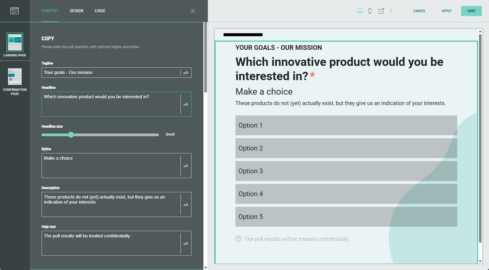
Image & icon image
You can accompany the poll with images by selecting existing images or uploading new ones; this can be done for both the top (banner) image as for the icon image.
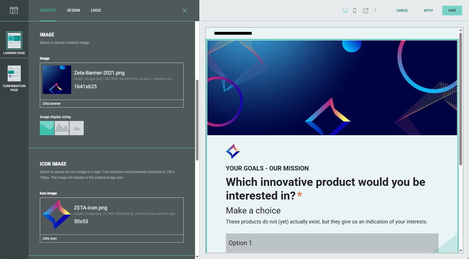
Note: Selecting existing images can be done from your asset library (which contains your uploaded assets) , from Pexels or from images uploaded earlier on within the Experience. Or you can upload new images.
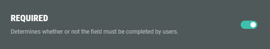
Required toggle
Enable the toggle to make this a required field for the Experience participant to complete.
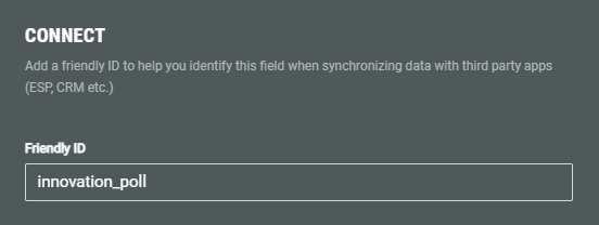
Connect (Friendly ID)
You can add a Friendly ID to help you identify this field when synchronizing data with third party apps (ESP, CRM etc.)
Values (poll options)
Specify the possible poll options participants can choose from.
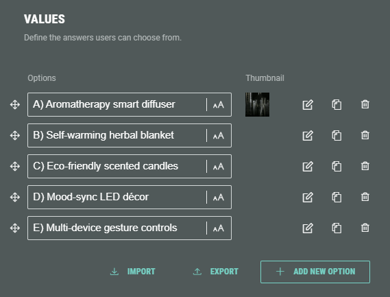
You can add new options by clicking on the + Add New Option button.
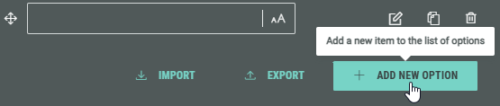
Additionally, you can import a list of options (which must be a comma-separated list of values) or export the current list of options to a comma-separated list of values that can be copied to your clipboard.
 Tip for importing a list: Click export to see the used format that is also expected for importing a list.
The options can be ordered the way you want by holding down the mouse cursor onto one of the 4-directional arrow icons, and dragging and dropping that option to the desired location.
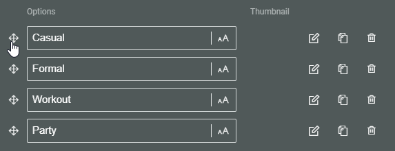
Each option shows the following clickable icons on the right:
 Edit choice — To edit the option.
 Clone choice — To duplicate the option, with identical label, data and image.
 Remove choice — To delete the option.
Edit choice
Click the pencil icon at the right of an option to see the Edit choice screen.
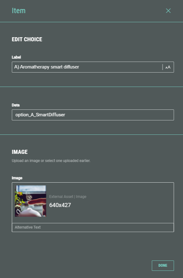
The following fields are displayed:
-
Label — The answer label. This field gets auto-populated after adding an option label in the Values section on the main screen. If desired, you can change it here.
-
Data — The data value gets stored in a third party app (ESP, CRM, etc.) when synchronizing the data. (comparable to the Friendly ID).
-
Image — If desired, you can add an image that will be set as a thumbnail for the answer.
Select an existing one from your asset library (which contains your uploaded assets) , from Pexels or from images uploaded within the Experience. Or upload a new one within the Experience.
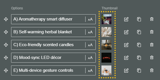
See the Design section below to see how they will be displayed, depending on the layout selection.
Example of selected images for poll answers:
Design
On the Design tab, you can define:
- Layout
- Results display options
- Slide transition speed
- Background
- Text alignment
- Image size
- Advanced options
Layout
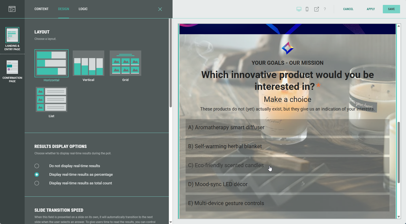
Choose one of these layouts for the poll options to be displayed in: Horizontal, Vertical, Grid, List.
Horizontal
Each poll option is shown as a horizontal bar.
When hovering an option, the background displays the thumbnail image belonging to that option.
Vertical
Each poll option is shown as a vertical bar.
The background of each bar displays the thumbnail image belonging to that option.
Grid
Show the poll options in a grid.
Select the number of columns (2, 3 or 4), and apply a tile style (card or circle).
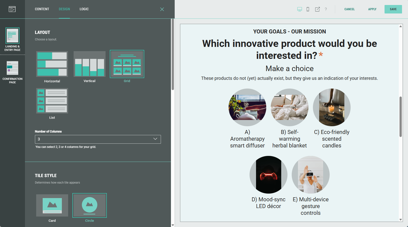
Note: You can also define if the full image should be shown within each tile (with borders), or that each tile should be covered so it's filled with part of the image.
See image size below.
List
Show the poll options in a list (underneath each other).
Apply a tile style (card or circle).
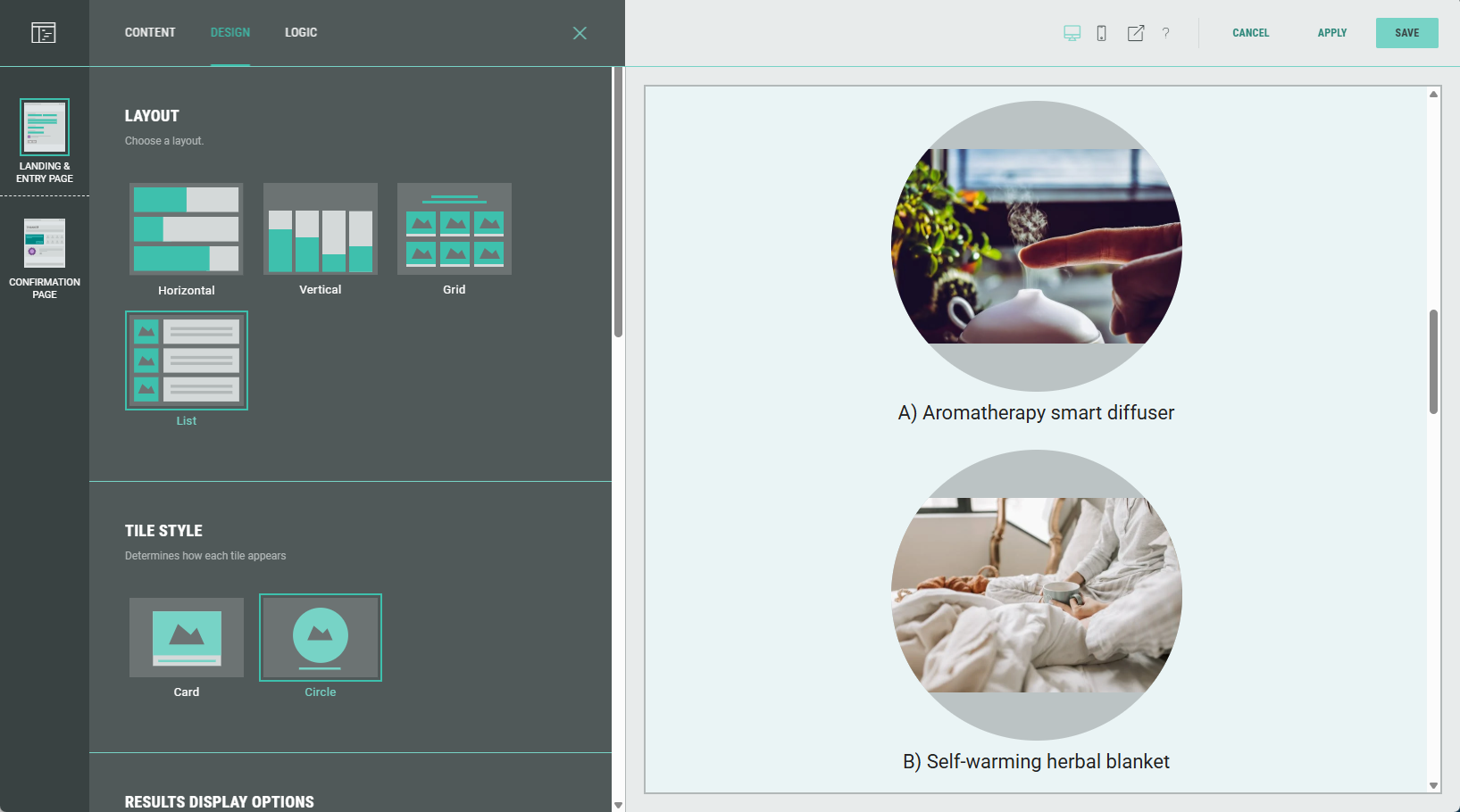
Note: You can also define if the full image should be shown within each tile (with borders), or that each tile should be covered so it's filled with part of the image.
See image size below.
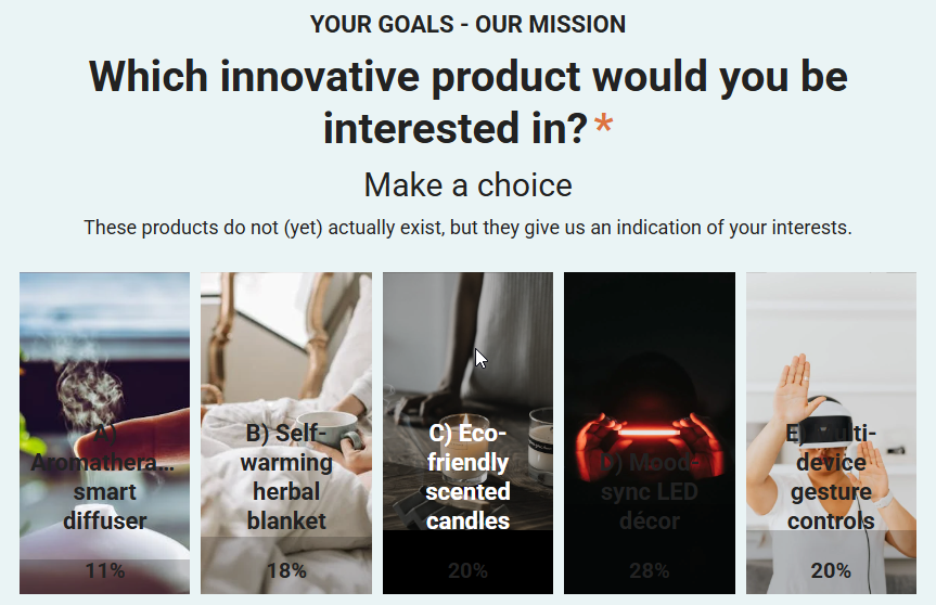
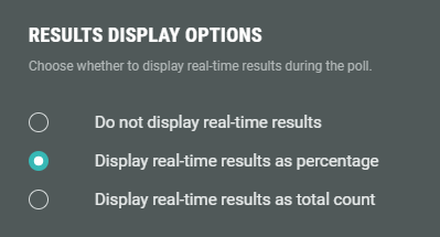
Results display options
Choose to display real-time results as percentages or as total count, or to hide results.
Example: Display real-time results as percentage has been set in the display options.
Selecting a poll option in the Experience then displays the poll percentages.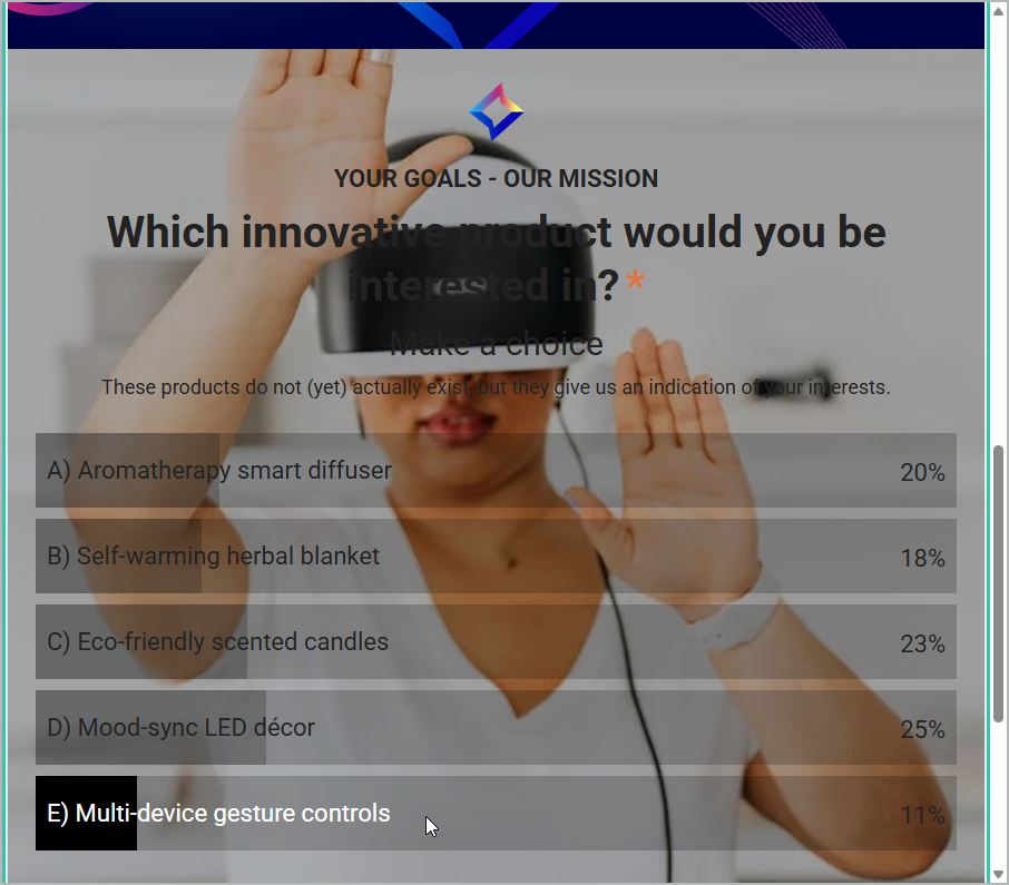
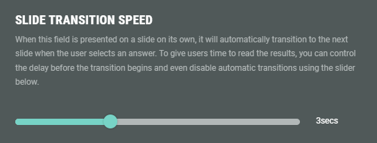
Slide transition speed
When multiple slides/pages are used in the Experience, the Experience automatically moves to the next slide/page as soon as an answer is selected.
To give participants more time to review the results, the delay time can be set before the transition starts.
The delay time can be set to: off, 3 sec, 5 sec or 7 sec.
Background
Use this to override the background for this module.
Example: of a background color being set.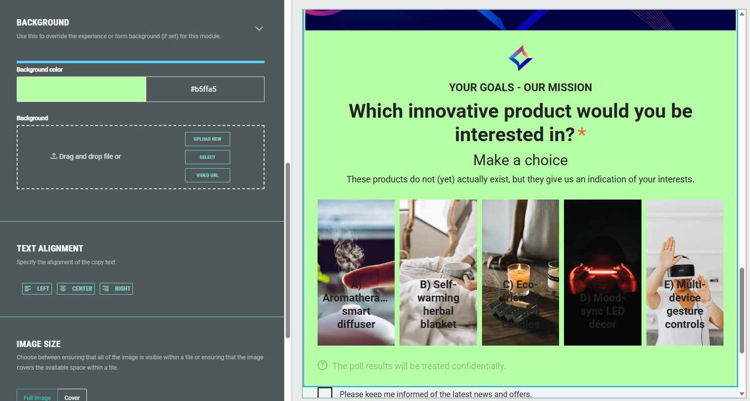
Note: More info on how to add a background to an Experience can be found in this article.
Text alignment
Specify the alignment of the text copy: Left, center or right aligned.
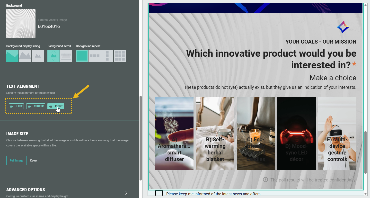
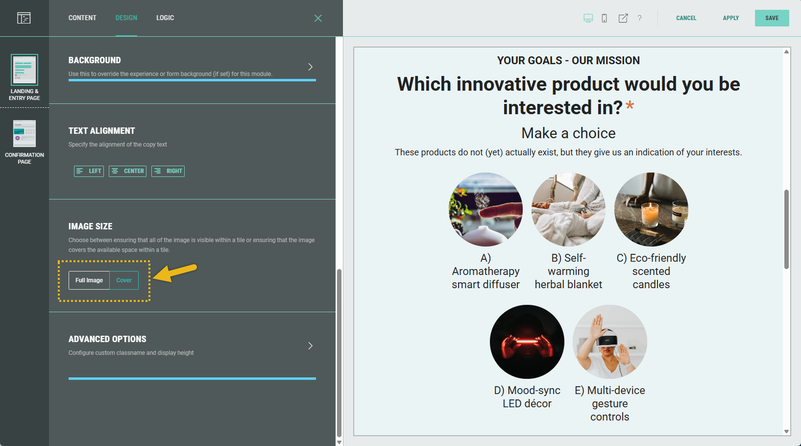
Image size
When the Grid or List layout is chosen above, the image size section gives you the option to show either the full image on each tile (with borders), or to completely cover the available space within each tile (with part of the image).
Example: Grid layout with the full image size versus cover option.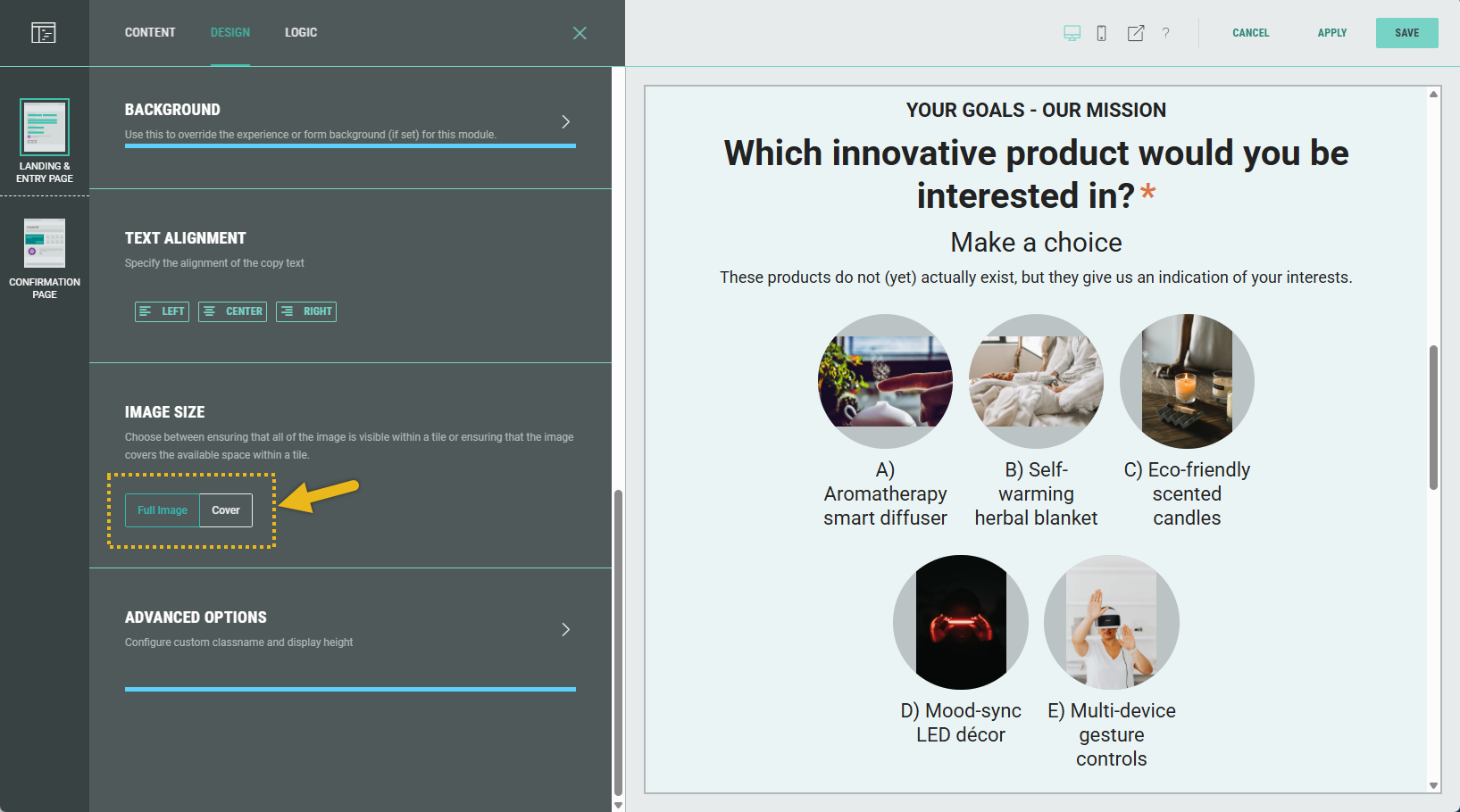
Advanced options
With the Advanced options, you can configure the display height of the module and set a custom class name (to use custom CSS).
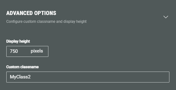
- Display height — Defines the fixed pixel height for this module.
Note: This overrides any heights set in the theme or stylesheet.
Warning: Only touch this section if you are a developer, as this may impact your Experience hugely.
- Custom classname — Will be output as xCustomModule-[Your-CSS-Classname] in the module when it is rendered on the page. Use this to give your module a unique style. You can also target CSS classes in a theme using the custom CSS classname.
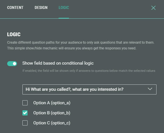
Logic
On the Logic tab, you can create different question paths for your audience to only ask questions that are relevant to them. This is based on conditional logic determined by answers given to previous polls in this Experience.