
Working with Text Fields
This article describes how to work with text fields within the Content Editor.
The Content Editor supports the use of the following text fields in the Master Content, and optionally also within individual Layouts:
-
Message Subject
-
Header
-
Subheader
-
Body (or Main Body)
-
Details
-
Button Label (Call to Action)
Add Text to the Master Content
To edit any of the text fields in the Master Content:
-
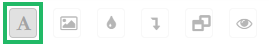
In the tool bar beneath the Master Content, click the Edit Text icon to toggle into Edit Mode. All of the text fields are made editable.
Note: You can also toggle into Edit Mode simply by clicking into a text field.
-
In the desired field, enter a new text value.
-
Optionally apply text formatting, or insert other text elements, using the tools displayed within the text tool bar. These tools are listed below.
Note: As soon as you pause typing for a moment, or you apply formatting to text, the platform automatically pushes this change down to all Layouts that use this field.
-
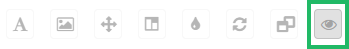
In the tool bar beneath the Master Content, click the Preview icon to toggle back to Preview Mode.

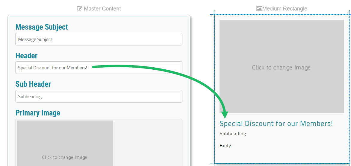
In the below example, the user has entered a new Header value in the Master Content. The platform automatically populates the Header field in the Medium Rectangle Layout.
Add Text to a Layout
If you add text to a text field within the Master Content (see above), that text value (and any formatting) is pushed down to all Layouts that use that text field. Optionally you can override the Master Content, and edit a text field directly within a Layout. If you do, the platform “unlinks” that text field from the Master Content. Future changes to that text field in the Master Content will not be pushed down to that Layout.
To edit any of the text fields in a Layout:
-
In the tool bar beneath the Layout, click the Edit Text icon to toggle into Edit Mode. All of the text fields are made editable.
Note: You can also toggle into Edit Mode simply by clicking into a text field.
-
In the desired field, enter a new text value.
-
Optionally apply text formatting, or insert other text elements, using the tools displayed within the text tool bar. These tools are listed below.
-
In the tool bar beneath the Layout, click the Preview button to toggle back to Preview Mode.
Text Editing Tools
When working with a text field, the following tools are displayed within a contextual tool bar.
| Name | Description | |
|---|---|---|

|
Content Token |
Insert a |

|
Emoticon |
Display a list of emoticons; select an emoticon to insert it at the current cursor position. |

|
Bold |
Boldface the currently selected text. |

|
Italicize |
Italicize the currently selected text. |

|
Font Family |
Display a list of fonts; select a font to apply it to the currently selected text. |

|
Font Size |
Display a list of font sizes; select a font size to apply it to the currently selected text |

|
Paragraph Format |
Select a paragraph style to apply to the currently selected paragraph. |

|
Color Palette |
Change the color or background of the currently selected text. You can enter a hex value or select a color. For the text color, the platform automatically displays all the colors utilized within the currently selected Color Palette. For more information, please see |

|
Alignment |
Select the paragraph alignment (left-justified, right-justified, full-justified, or centered) to apply to the currently selected paragraph. |

|
Select All |
Select all of the text in the current text field. |

|
Hyperlink |
Assign a link to the currently selected text. For more information, please see |

|
Image |
Insert an image within this text field. For more information, please see |
|
Clear Formatting |
Remove user-defined formatting (such as boldface or font size) from the currently selected text, and revert back to the default formatting. |

|
Code View |
Toggle on the HTML code editor, and manually enter the desired HTML code to format the selected text. |
Note: If the Body field has been configured as “Main Body” within the Template Set, an expanded tool bar is displayed with the following additional text tools.
| Name | Description | |
|---|---|---|

|
Paragraph Style |
Add a border around the selected paragraph. |

|
Ordered List |
Create a numbered list in the selected style. |

|
Unordered List |
Create a bullet list in the selected style. |

|
Decrease / Increase Indent |
Increase or decrease the indent of the currently selected paragraph. |

|
Table |
Insert a table. For more information, see Add a Table to a Text Field below. |

|
Undo / Redo |
Undo / Redo the last action. |
Add a Table to a Text Field
The option to insert a table into a text field is available only from the expanded tool bar (described above). The expanded tool bar is available within the Body field, only if the Body field has been configured as “Main Body” within the Template Set.
The process of inserting a table into the Body text field is the same regardless of the Body field location (Master Content or a Layout).
To insert a table into the Body text field:
-
In the tool bar beneath the Master Content or a Layout, click the Edit Text icon to toggle into Edit Mode. All of the text fields are made editable.
Note: You can also toggle into Edit Mode simply by clicking into a text field.
-
Position your cursor within the Body text field where you want to insert the table.
-
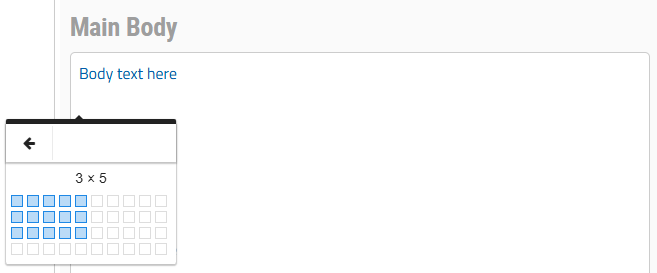
In the contextual tool bar, click the Table icon. From the pop-up window, determine the table size (rows x columns).
-
Enter the table content.
Note: By default, column widths are evenly distributed across the entire width of the text field. To manually adjust a column width, position your cursor along the column border, then click-and-drag to change the column width.
When working with a table, the following tools are displayed within a contextual tool bar.
| Name | Description | |
|---|---|---|

|
Header |
Add a header row to the table. |

|
Delete |
Delete the table. |

|
Row Options |
Choose an option related to the selected row:
|

|
Column Options |
Choose an option related to the selected column:
|

|
Table Style |
Select one or both of the following table styles:
|

|
Cell Options |
Choose an option related to the selected cell(s):
|

|
Cell Background |
Add a background color to the selected cell, either by selecting a color from the default palette, or by entering the hex value for the desired color. |

|
Vertical Align |
Select the vertical alignment (top, middle, or bottom) to apply to the text in the currently selected cell. |

|
Horizontal Align |
Select the horizontal alignment (left-justified, right-justified, full-justified, or centered) to apply to the text in the currently selected cell. |

|
Cell Style |
Select one or both of the following cell styles:
|
Note: If you highlight text with a table cell, the contextual tool bar shows the text editing tools (described above) instead of the table editing tools. Click anywhere within the table to toggle back to the table editing tools.
