Configure Apple Coupon Properties
Overview
The Apple tab of the Wallet Pass Details screen allows you to configure the Wallet Pass properties for Members using Apple devices. As you make changes to the configuration, the platform displays a preview render of the Wallet Pass as it will appear on Apple devices.
The Apple tab is organized into the following sections, each of which is described below in more detail:
-
Barcode: Configure the barcode settings of the Wallet Pass.
-
Color & Images: Customize the visual elements of the Wallet Pass.
-
Front Content: Design the primary view that displays essential information to Members.
-
Back Content: Set up additional details, terms, conditions, and resources.
-
Settings: Optionally enable Wallet Pass sharing.
-
Test Preview: Preview the Wallet Pass functionality for Apple devices using a specified Test Member.
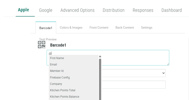
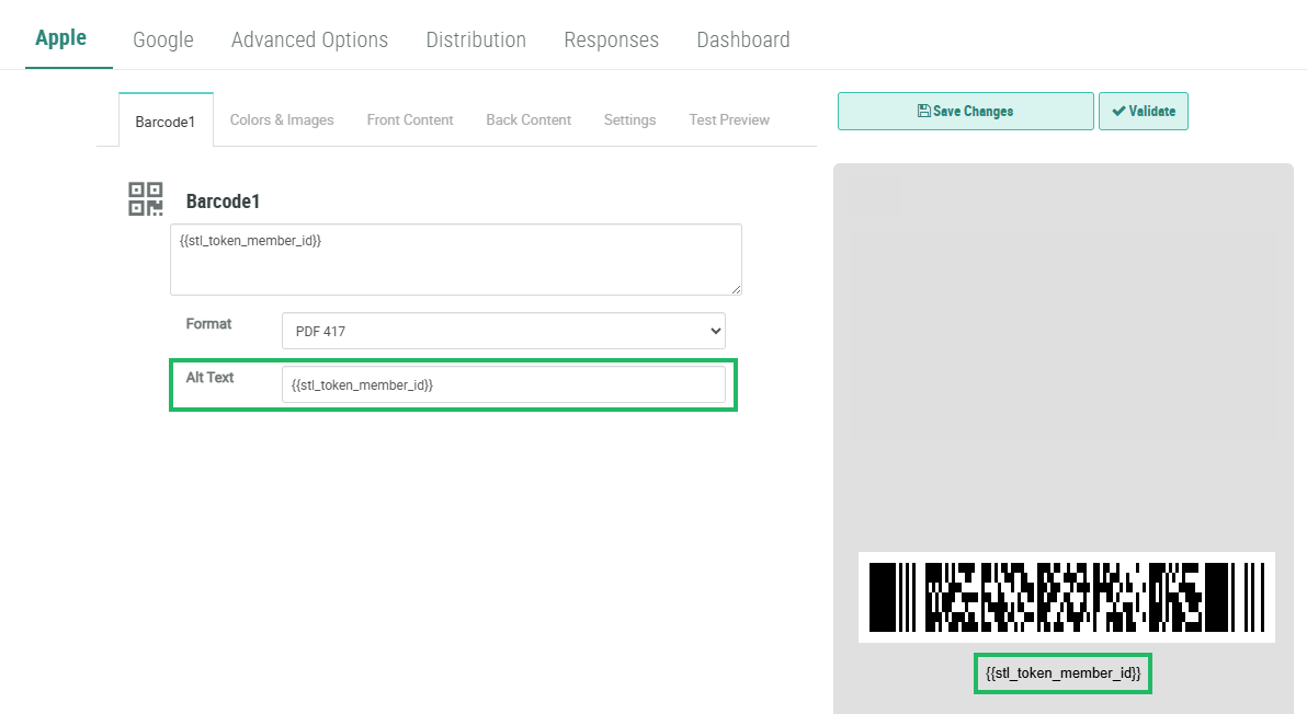
Barcode
The Barcode section is used to configure the barcode that appears on the Mobile Wallet Pass. The preview rendering on the right updates automatically as you make configuration changes.
-
Select the
-
Set the barcode value using one of the following methods:
-
For a fixed number (like a coupon code), type the number directly in the Barcode Value field.
-
For personalized values, enter "@" to bring up a menu of available Content Tokens; select the desired Content Token.
-
Utilize Liquid templating to display Offer or Offer Response information. A common use case is to use Liquid templating within the Barcode value to display the unique certificate code assigned to a Member. For example:
-
{%- for offer_response in offer_responses -%}
{%- if offer_response.processing_status == 'pending' -%}
{{ offer_response.certificate_codes -}}
{%- break -%}
{%- endif -%}
{%- endfor -%}-
From the Format drop-down menu, select a barcode format:
-
QR Code: Best for storing more information
-
PDF 417: Common for boarding passes
-
Aztec: Efficient space usage
-
Code 128: Ideal for numeric data
-
-
Optionally, in the Alt Text field, enter alternate text using one of the following methods:
-
For a fixed value, type the value directly in the Alt Text field.
-
For personalized values, enter "@" to bring up a menu of available Content Tokens; select the desired Content Token.
-
Utilize Liquid templating to display Offer or Offer Response information.
-
-
Click Save Changes.
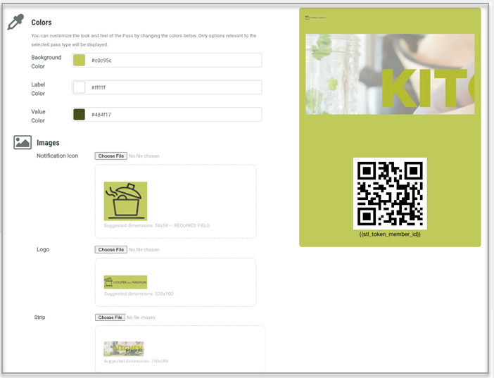
Color & Images
The Color & Images section is used to customize the visual elements of the pass.
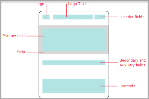
The layout of a Wallet Pass on an Apple device is as follows:
-
Select the Apple tab, then select the Color & Images tab.
The platform allows you to customize the Background, Label, and Value colors. The Background color is applied to the entire Wallet Pass. The Label and Value colors are applied to the text in the Front Content fields (see below for details).
-
For each option in the Colors sub-section, choose a color using one of the following methods:
-
Enter the desired hex code value.
-
Click the color swatch, then select the desired color from the color picker.
The platform allows you to customize the images used for the Notification Icon, Logo, and Strip. For each image, note the following recommendations:
-
Notification Icon: Recommended size of 58x58 pixels. This icon appears in notifications that appear on the Member’s device. Use of a Notification Icon image is required.
-
Logo: Recommended size of 320x100 pixels. Use of a Logo image is optional.
-
Strip: Recommended size of 750x288 pixels. When choosing this image, consider that the Primary Field text that gets displayed in the Strip area will appear in white. Therefore, be sure to select an image that will make the Primary Field text legible. Use of a Strip image is optional.
-
For each option in the Images sub-section, click Choose File, then browse to and select the desired image file. The platform displays a thumbnail image. Click Upload.
-
Click Save Changes.
The preview rendering on the right updates automatically as you make configuration changes.
Note: The preview may not always render images to size; in particular the Logo may appear smaller and the Strip may appear larger in the preview panel. Always use the
Front Content
An Apple Wallet Pass features a two-sided design, consisting of distinct front and back views. The front view serves as the primary display area, showcasing essential information to your Members. For optimal presentation, ensure your content adheres to the standard layout specifications.
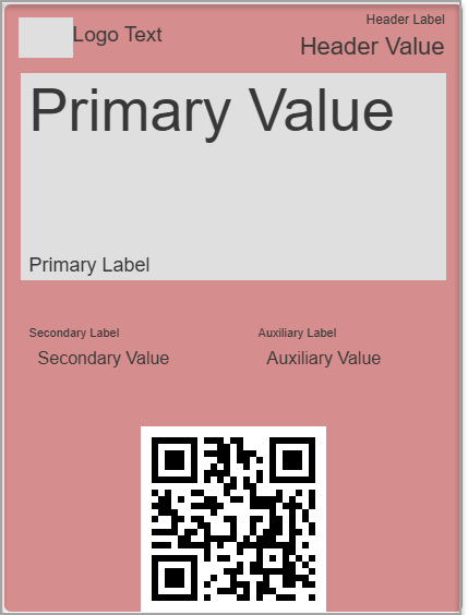
The Front Content comprises the following four fields. Each of these fields includes a Label and a Value. Typically the Label is smaller, and contains static text. The Value is larger, and will often contain a dynamic value populated by means of a Content Token or Liquid templating.
-
Header: This field appears in the top-right corner of the Wallet Pass. This field also includes a unique text field called Logo Text, which is displayed next to the logo. The colors you selected in the Color & Images section for Label and Value will be applied to this text.
-
Primary: This field displays within the Strip area and overlays the Strip image. The primary field text color is not configurable, and will always display as white text. If more control is required for color variation and font for the Primary fields, the best practice recommendation is to embed the text within the Strip image.
-
Auxiliary: This field displays beneath the Strip area, to the right. The colors you selected in the Color & Images section for Label and Value will be applied to this text.
-
Secondary: This field displays beneath the Strip area, to the left. The colors you selected in the Color & Images section for Label and Value will be applied to this text.
The following example shows the basic positions and appearances of the Labels and Values for each field.
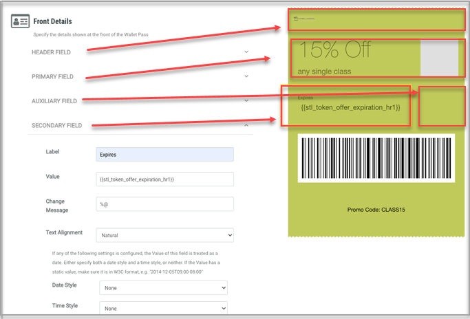
To configure the Front Content:
-
Under the Apple tab, select the Front Content tab.
-
For each of the available four fields, optionally enter the following details.
-
Logo Text (Header field only): Enter your brand name if not included in your logo. The color you selected in the Color & Images section for Value will be applied to this text.
-
Label: Enter either a static value or type “@” to pull up a list of Content Tokens, and select a Content Token. This value appears in a smaller font size than the Value.
-
Value: Enter either a static value or type “@” to pull up a list of Content Tokens, and select a Content Token. This value represents the main text for this field, and is displayed in a larger font size than the Label.
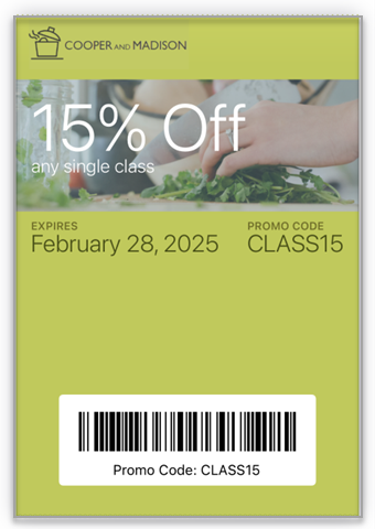
A common use case for a Coupon Wallet Pass is to utilize Liquid templating to populate one of the Front Content Value fields with the Offer Response expiration date. In the below example, the platform will display the expiration date for an Offer Response that has a Pending Status.
{%- for offer_response in offer_responses -%}
{%- if offer_response.processing_status == 'pending' -%}
{{ offer_response.usage_end | date: '%b %d, %Y %I:%M %p' -}}
{%- break -%}
{%- endif -%}
{%- endfor -%}
The above example will display the expiration date in UTC. The platform does not support the ability to display a date / time value dynamically based on the user’s device. Optionally, you can specify the date / time be displayed in your loyalty program’s main time zone by adding the “timezone” attribute:
{%- for offer_response in offer_responses -%}
{%- if offer_response.processing_status == 'pending' -%}
{{ offer_response.usage_end | timezone: "America/New_York" | date: '%b %d, %Y %I:%M %p'-}}
{%- break -%}
{%- endif -%}
{%- endfor -%}-
Change Message: A Change Message is a push-style notification that Mobile Wallet Pass holders will receive when the platform detects a change in the Value set above. In the Change Message field, optionally enter the content of this notification. For example, if you’re using a Content Token to display the Member’s Metric balance, you could enter: "Loyalty card balance changed to %@." The "%@" will be populated with the current value of the Content Token in the Value field. Text must be entered in the Change Message field for a change notification to transmit.
-
Text Alignment: Optionally, you can override the default text alignment by selecting an option from this drop-down menu. Select Natural to use the default setting.
-
Date / Time Style: If the Value contains a date / time, use the Date Style and Time Style properties to configure how the date / time is formatted.
Note: Refrain from using the Date/Time Style fields until you receive specific instructions from your Zeta team.
-
Click Save Changes.
The preview rendering on the right updates automatically as you make configuration changes.
In the example Coupon below, the Wallet Pass expiration is displayed in the Secondary Field by means of a Content Token called “stl_token_offer_expiration_hr1”.
Below is the final render of this Coupon Wallet Pass.
Back Content
The front of your Apple Wallet Pass serves as a quick-reference display with limited space, requiring concise, high-impact content. The back of the pass offers expanded capabilities, allowing you to include comprehensive information such as detailed terms and conditions, contact information, and web resources for your Members. The back content can't be previewed within the Loyalty interface.
Note: See Apple Back Content Examples for examples of different types of information that can be displayed as back content on an Apple Wallet Pass.
To configure the back content:
-
Select the Apple tab, then select the Back Content tab.
-
Optionally, in the Description field, enter a Wallet Pass description, such as a summary of its purpose or benefits.
-
To add a new section to the Wallet Pass back content, click Add New Section.
-
From the Type drop-down menu, select the content type:
-
Fixed Text: Used for static content like terms and conditions or privacy policies. This content type supports HTML formatting for clickable links and text styling.
-
Latest Message: Creates a dynamic section that automatically displays your most recent customer communication.
-
Stores / Locations: Help your customers find your nearest stores by showing location-based information.
-
Custom: Create personalized content using Content Sources. These Content Sources must be pre-configured in the Advanced Options tab (see
-
In the Header field, enter a descriptive title for this section.
-
In the Template field, enter either simple text content, or define advanced dynamic content, like special offers or account balances using Liquid syntax.
Note: For additional help on creating Liquid templates, a Templating Guide link is displayed within the Back Content tab. This guide provides code samples to support several different use cases, such as listing valid Offers, or displaying the balance of a Gift Card. If using Liquid templating, be sure your Content Sources and Content Tokens are defined, and all Content Sources have been added in the Advanced Options tab of the Wallet Pass.
-
Optionally, in the Change Message field, enter the text of a push-style notification that Mobile Wallet Pass holders will receive when the platform detects a change in the Template field above. Text must be entered in the Change Message field for a change notification to transmit.
-
Repeat the above steps as needed to add more sections to the Wallet Pass back content.
-
Click Save Changes.
Settings
The Settings section allows you to control whether Members can share Wallet Passes between devices. This important security feature helps maintain the integrity of your Wallet Pass distribution.
Pass sharing is controlled through a flag that was introduced with iOS 11. When configured, this setting determines the visibility of the Share button on the back of the Wallet Pass. To configure sharing:
-
Select the Apple tab, then select the Setting tab.
-
From the Sharing Prohibited drop-down menu, select either:
-
True: Removes the Share button, restricting pass sharing
-
False: Displays the Share button (default setting)
-
-
Click Save Changes.
Note: This setting impacts only iOS 11 and later versions. For earlier iOS versions, the Share button will remain visible regardless of this configuration. Additionally, while this setting can hide the Share button, it can not prevent users from sharing Wallet Passes through other methods available on their devices.
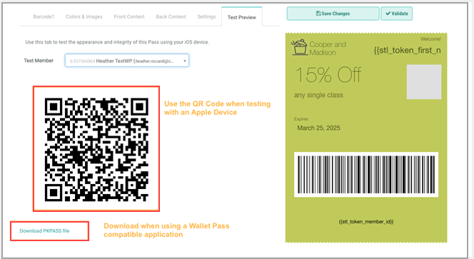
Test Preview
To properly test your Apple Wallet Pass, you need access to an Apple device. This method provides the most authentic testing experience.
Prior to testing, you must ensure that you have at least one Test Member available in your Loyalty instance. Designating a Member as a Test Member is available on the Member Profile screen (see Edit Member Attributes for more information).
To test an Apple Wallet Pass:
-
Select the Apple tab, then select the Test Preview tab.
-
From the Test Member drop-down menu, select a Test Member. The platform generates a unique QR code specifically associated with this Test Member’s data and configuration settings.
-
Using your Apple device's camera, scan the displayed QR code. Your device will automatically recognize the Wallet Pass format and prompt you to add it to your Apple Wallet.
Alternative Testing Method
If you need to test an Apple Wallet Pass without immediate access to an Apple device, follow these steps:
-
Install a Wallet Pass-compatible application on your mobile device.
-
From the Test Member drop-down menu, select a Test Member. The platform generates a unique QR code specifically associated with this Test Member’s data and configuration settings.
-
Click the Download PKPASS file link beneath the QR code.
-
Transfer the downloaded .pkpass file to your testing device.
-
Open the file to view and test the Wallet Pass in your chosen application.
Note: For the most accurate testing results, the best practice recommendation is to utilize an Apple device, as third-party applications may not perfectly replicate the Apple Wallet experience.