Journey: Emails
When emails are included in a journey, you'll find an entry per email in the tree.
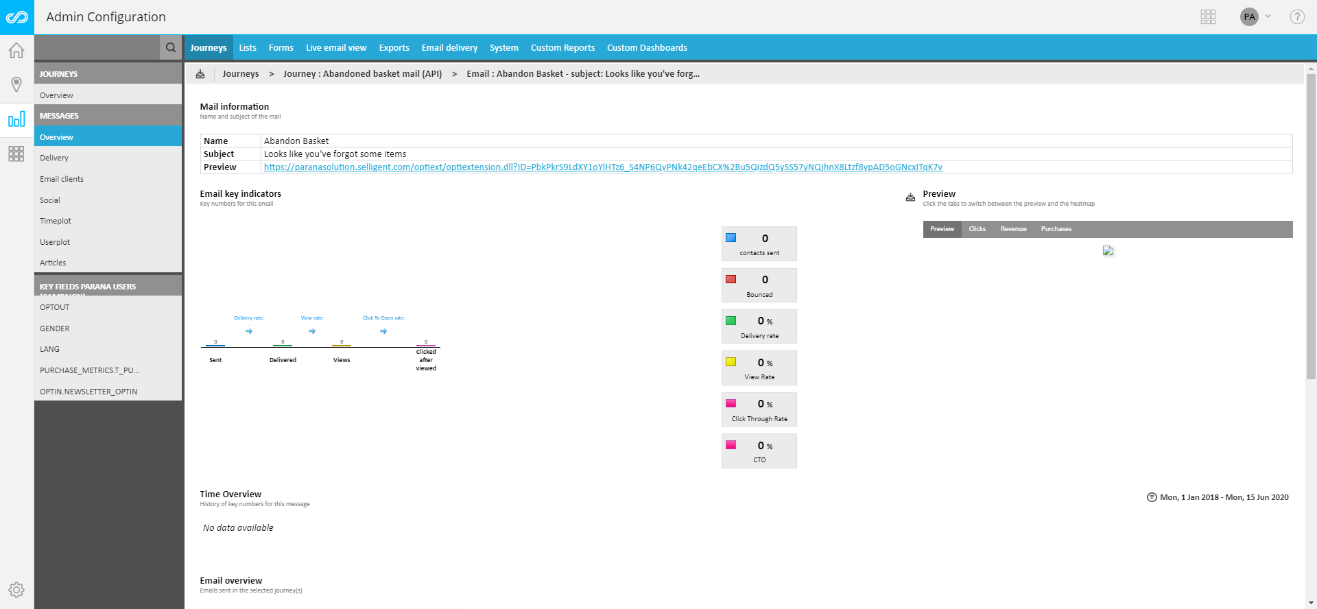
Selecting an email returns the statistics for that particular email. The tree view is automatically adapted and displays email-related entries:
- Overview — Key indicators (mails sent, bounces, delivered, viewed, clicked), preview of the email with a heat map, and detailed delivery and interaction numbers. The heat map is a visual representation of the most clicked areas in the email. Click the heat map to display a larger version. Reporting also includes a history chart on the different kpi's.
- Delivery — Delivery stats on the selected email. The information corresponds to what you can see on the Delivery entry for the complete journey, but applied to only one email
- Email clients: Different email clients targeted and devices used. Same information as on journey level, but applied to the selected email only.
- Social — Social stats for the selected email.
- Time plot
- User plot
- Key fields
- Custom reports — Holds all custom reports created with type 'Single email'.
- MVT Details — Only displayed when the email contains MVT components
Social
This section provides social statistics for the selected email in the journey.
This report is based on social links, added to the messages broadcast to a target audience.
Data gathered via social links (defined in Campaign) is shown in this part. The'Social'section displays:
- A list of all Social Sensors involved in the journey. Sensors are grouped per type (shares and counters, logins). For social share and counter links, information is provided on the number of times the social link was clicked, how many followers there are, how many viewed the link, and what the efficiency level of the link is. Social login links return the number of logins made. A history graph on social logins is provided as well.
- Two charts display the number of clicks on social links and the number of detected social networks.
Time Plot
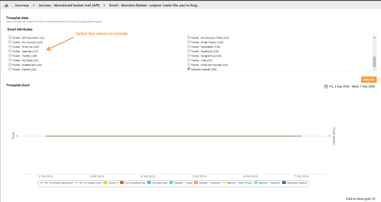
A Time Plot report allows the user to select the email attributes that must be included in the history graph. This report can display the number of ‘emails sent’, ‘emails delivered’ and ‘emails viewed’ along with the links in the email.
Example: Check the attributes to include and press the‘Execute’button. (This button remains grayed out if no attributes are selected.) The following chart is generated:
User Plot
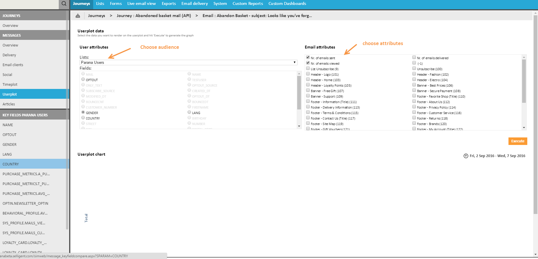
A User Plot report allows selecting an audience or profile extension and a corresponding attribute. Note however that only fields that are configured as key field can be selected. The selected attribute is used to group measures together.
1. Select first the audience t or profile extension.
2. Next, select the attribute that should be used to group data. Only attributes that are set as key field are available for selection.
3. Last, select the email attributes that must be included in the graph.
4. Press the Execute button to display the result:
1.
Key Fields
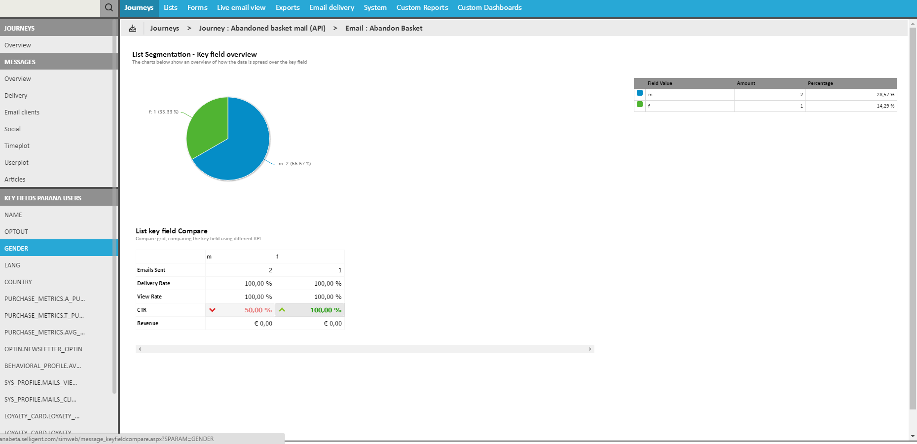
All fields defined as 'drill down' in the settings of the audience are listed. For example, the audience list Parana contacts has four key fields: opt-out, gender, lang and optin. Distribution graphs are available per key field.
Thanks to these key fields, it is possible to drill down in some of the reports and get numbers and charts for the different values of the selected key field in the audience list.
This entry is only displayed when MVT components have been detected in the email. The reports provide details on the number of possible combinations, the sample size and best version.
It also includes interactions with the different combinations and a preview of all possible combinations, delivery data per combination, and details on the different links used in the different combinations.


