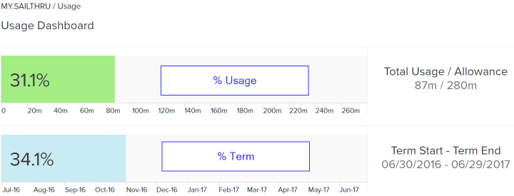
Understanding your account usage is easy with the Usage Dashboard.
This report gives you insight into your email send volume and how it compares against your contract terms, giving you visibility into how you are pacing against your allotment and whether your contracted volume is likely to last you through the current billing cycle.
Note: The Send Volume Usage page updates once daily to reflect the most recent sends. Test sends and Triggered messages contribute to your usage rates. Triggered messages are shown in the Usage Dashboard.
Who Has Access
For customers with only one account, you must have Account Admin permissions in order to view the Usage Dashboard. If you have multiple accounts, you must be an Account Admin in the parent account to see the roll-up volume reporting.
If you do not have access to the dashboard and would like to be added to an account as an Account Admin, you must have a current Account Admin change your role to Account Admin within the UI.
Access the Dashboard
- In the UI, under Analytics, select Usage Dashboard.
Use the Dashboard
The dashboard displays a pair of bar graphs.
- The top graph displays your send volume usage for the current term, as compared to your total allowance for the term. A usage percentage is displayed on the bar. For example, when 50% is displayed, you have used half of your allowance for the term.
- This graph is color-coded as green, yellow, or red, depending on your current pace. (See Trend Color Codes, below.)
- The bottom graph represents your current position in time within the term. A position percentage is displayed on the bar. For example, when 50% is displayed, you are halfway through the term date range.

For multiple-account owners, all accounts and their corresponding volumes are placed in table format so that you can monitor all accounts and easily understand which of your brands are driving the highest send volumes.

Trend Ccolor Codes
Note: All trends are linear and do not take into account any seasonality. They are meant to be used only as a guide and do not guarantee that your account will surpass or fall under your allotment. Please use your own judgment and understanding of your business cycles to determine whether you are likely to outpace your contractual allotment.
The usage bar will be highlighted in one of three different colors (red/yellow/green) depending on what percentage of your volume allocation has been used to date and how much time remains in your contract term.
Based on the current ratio of your usage percentage to where you are within your term, we calculate what percentage of your allowance you are on pace to use across the entire term, if your average usage through the term were to remain constant.
- If you are on pace to use <110% of your allowance, the bar is green.
- If you are on pace to use 110-125% of your allowance, the bar is yellow.
- If you are on pace to exceed 125% of your allowance or have actually used 75%+ of your allowance, the bar is red.

For example:
31.1% / 34.1% = 91.2%.
In the example above you are on pace to use 91.2% of your allowance over a 12-month contract. Since you have sent a smaller percentage of your email allowance than the percentage of the term time that has passed, you would not exceed your limit if you were to continue sending at the same rate.
Green

If you're on pace to finish the term below 110%, your usage bar will show as green. This means that if youwere to continue on the same linear trend, you are not likely to surpass your contractual allowance. This color code takes into account the possibility that the initial portion of your contract term may have a higher send volume than the latter portion. Continue to monitor your usage to ensure you are not on pace to exceed your allowance by the end of the term.
Yellow

If you're pacing anywhere between 10% and 25% faster than your allotted send volume, your usage bar will show as yellow. This means that you are at risk to use up your allotment prior to the end of your contract term; you would likely exhaust your volume allotment 1-3 months ahead of schedule on a one-year contract. Please reach out to your Customer Success Manager with questions if you would like to discuss options for increasing your volume commitment to ensure you are not charged a premium for any messages sent over your allowance.
Red

The usage bar will turn red in one of two situations. The first scenario occurs once you cross 75% of your allotment, regardless of how far along you are in your contract; this is to remind you that you will soon use up your allotment. The second scenario occurs if are sending at a pace that is more than 25% faster than your allotted send volume and are at risk to use up your entire allotment prior to the end of your contract term (in the case of an annual contract, you would use up your volume ~3 months early). Please reach out to your Customer Success Manager with questions if you would like to discuss options for increasing your volume commitment to ensure you are not charged a premium for any messages sent over your allowance.

