Customize a Theme
When you're editing a theme in the Theme Designer, you can see these left navigation items:


Each of these is explained below.
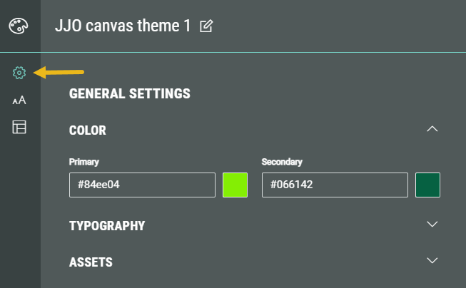
General settings
The General Settings section is designed to be your starting point for creating a theme that reflects your brand. By updating just a few key settings—such as your primary and secondary colors or font styles—you’ll see these changes cascade across the entire theme. For example, updating your brand colors here will automatically update button styles and other key elements to match.
Think of General Settings as the foundation of your theme. If you're aiming for a look and feel that's closely aligned with your brand, these options may be all you need.
If you want your theme to match your brand guidelines exactly, you can always fine-tune it further by exploring the other customization areas.
In the General Settings, the following sections can be seen: Color, Typography and Assets.
Color
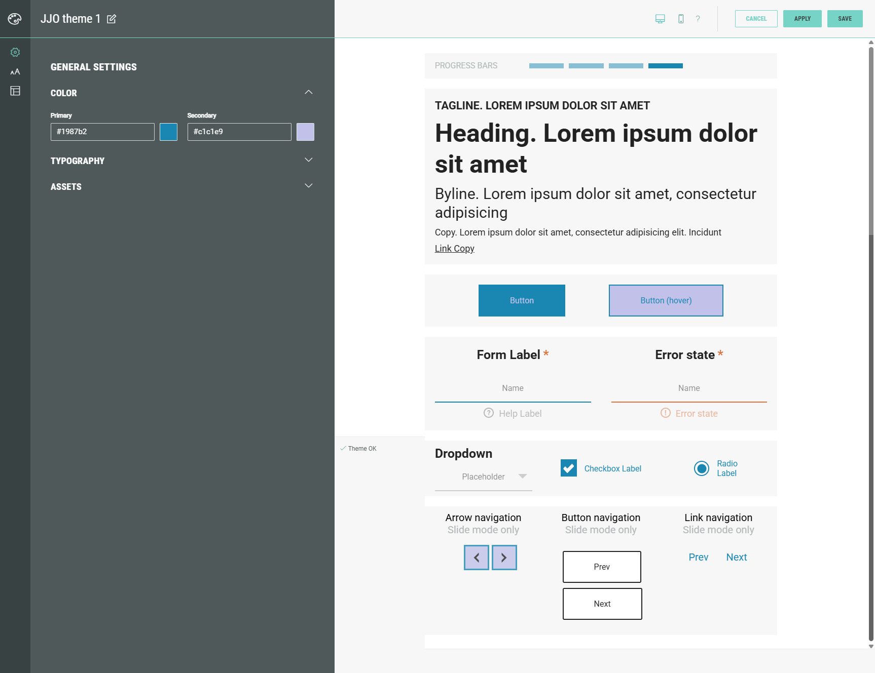
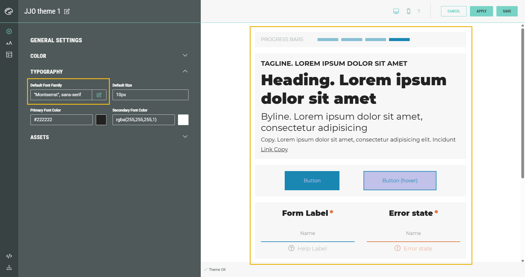
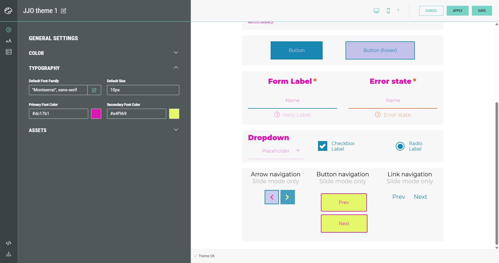
You can set the primary and secondary colors used in the theme.
As these are general settings, in the preview on the right you can see that these colors impact different design elements (such as buttons, forms, etc).
Note: The general settings can be overridden in the other customization areas (Typography, Key Elements, Advanced) which are explained further on in this topic.
Typography
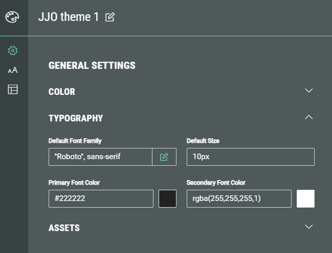
In typography you can set the default font family, default size, primary font color and secondary font color.
- Default Font Family — You can see the default font family value(s) set for all elements, which you can edit by manually typing in the field or by clicking on the Pencil icon next to the field.
Clicking the pencil icon shows this screen:
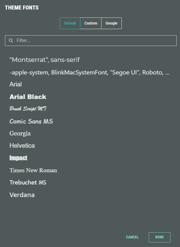
In here, you can select a font from:
- Default — Contains a list of default fonts available in Grow.
- Custom — Contains custom uploaded fonts. You can upload new fonts here. (*)
- Google — Contains a list of Google fonts.
* Note: Also see Guidelines to using Custom Fonts in a Theme.
The default font family value applies to all text elements:
- Default Size — Enter a value (plain, em, rem, px, %), browser constant, @variable or formula.(note 1).
The default font size is the root font size, applied to the root HTML element (<html>) of the web page. It determines the default font size for the entire page.
It's the reference point for rem units in CSS — 1rem equals the root font size. Rem stands for "root em" and is used to set font sizes or other sizes relative to the root font size.
(By default, most browsers set the root font size to 16px, which then means 1rem = 16px)
Note 1:
- Variables= "This value is inherited from your theme’s main settings. You can update the original variable or override it here."
- Formulas= "This is a formula, meaning its value is automatically calculated based on your theme settings. You can keep it dynamic, set a fixed value, or change it to another formula or variable."
- Browser constant= "Your browser applies a default style here. You can leave it as is or customize it to better fit your design."
- Primary Font Color — The primary font color applies to all texts and labels.
- Secondary Font Color — The secondary font color is an optional setting which can be used if you need an additional color (for example: when you’re using a darker background color, you could define a lighter one here).
Both font colors can be set through the visual color picker or by entering a manual value in one of the following formats: #hex, rgb(), rgba(), browser constant, @variable, (formula).(note 1)
Assets
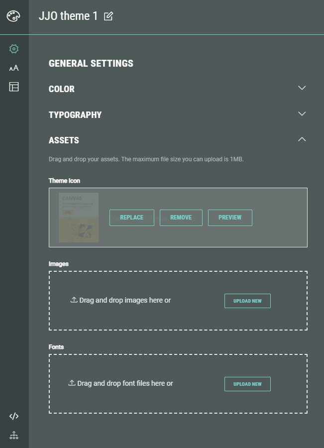
In Assets, you can set the following:
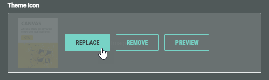
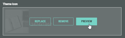
- Theme Icon — This is the icon shown within Grow to easily identify the theme (e.g. a theme based on the Canvas template by default has a Canvas theme icon).
You can set a different theme icon by clicking on the Replace button.
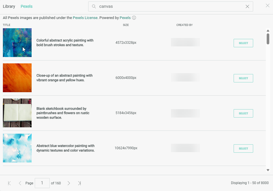
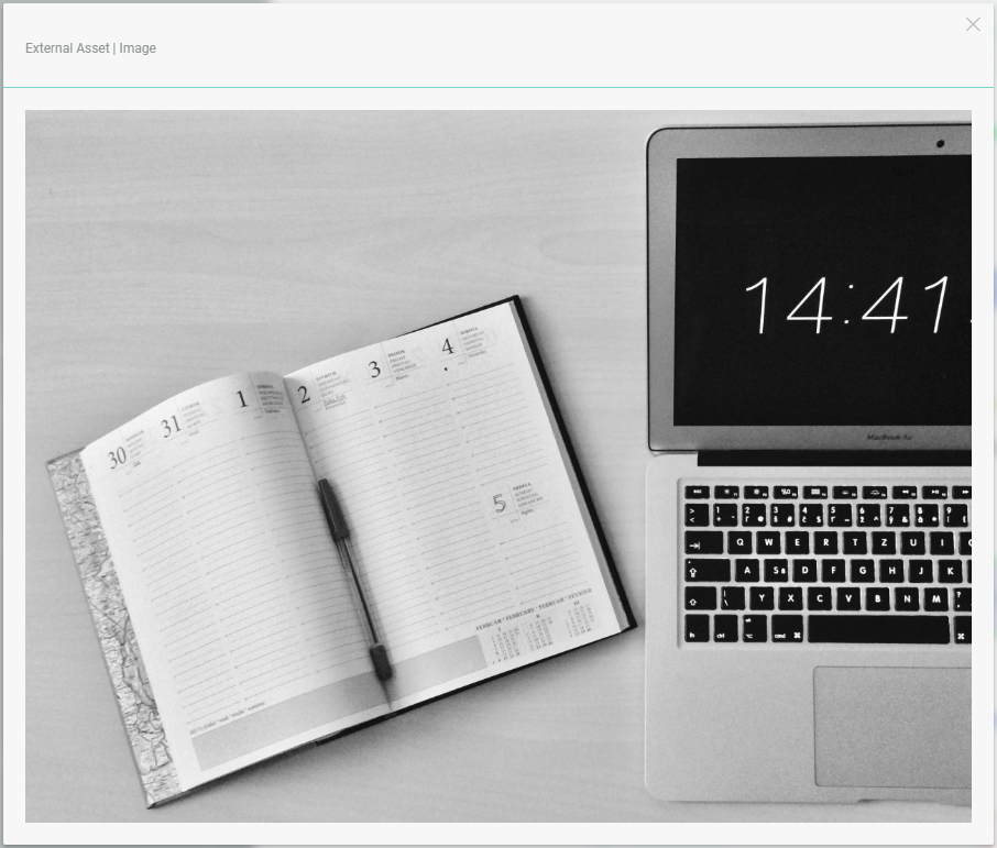
This will open a pop-up in which you can select an image from either your asset library (which contains your uploaded assets) or from Pexels.
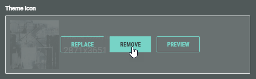
It's also possible to remove the theme icon.
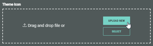
When no theme icon is defined, you can select an image from either your asset library (which contains your uploaded assets) or from Pexels, or upload a new image from your computer (that will then also be added to your asset library for future use) through the Upload New button or by dragging and dropping a file into the foreseen area.
The Preview button lets you view a larger version of the theme icon in a pop-up window.
- Images — You can upload images from your computer through the Upload New button or by dragging and dropping image files into the area.
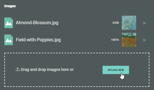
These images can then for example be used in the LESS overrides and CSS overrides below.
- Fonts — Custom fonts can be uploaded from your computer through the Upload New button or by dragging and dropping font files into the area.
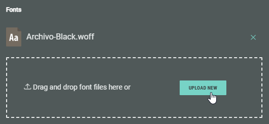
Note: Also see Guidelines to using Custom Fonts in a Theme.
Typography
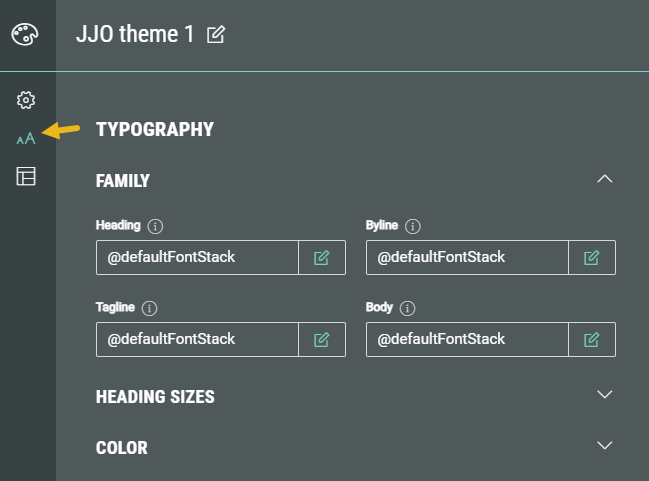
In Typography, the following sections can be seen: Family, Heading Sizes and Color.
Family
You can see the font family values set by default (inherited by the main theme's settings), which you can edit by manually typing in the field or by clicking on the Pencil icon next to each field.
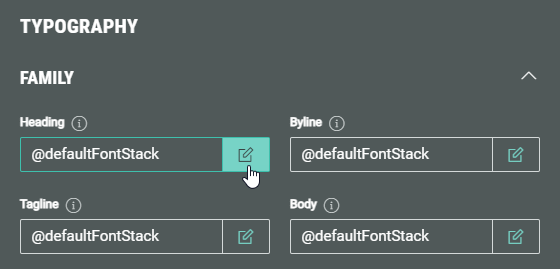
Clicking the Pencil icon shows this Fonts screen:
In here, you can select a font from:
- Default — Contains a list of default fonts available in Grow.
- Custom — Contains custom uploaded fonts. You can upload new fonts here. (*)
- Google — Contains a list of Google fonts.
* Note: Also see Guidelines to using Custom Fonts in a Theme.
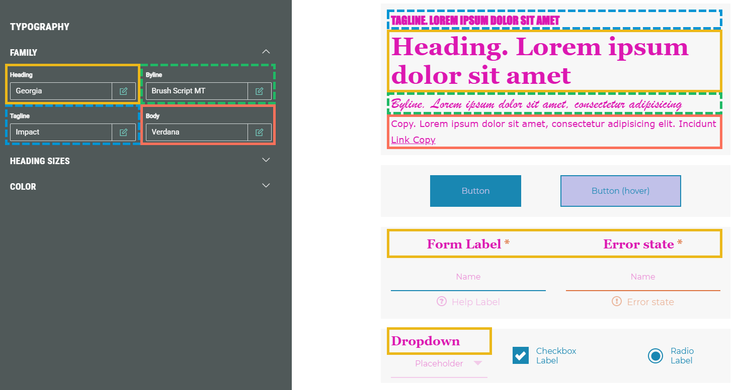
The font family can be set for the following elements:
- Heading — Applies to h1, and labels in form and quiz modules.
- Byline — Applies to h2 headings.
- Tagline — Applies to h3 headings.
- Description — Applies to paragraph texts and (a href) links.
Heading Sizes
Enter a value (plain, em, rem, px, %), browser constant, @variable or formula (note 1) for the font size for the following heading sizes: Extra small, Small, Standard, Large, Extra large.
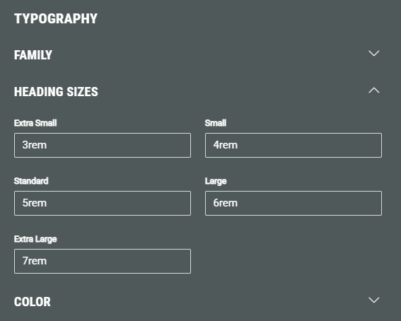
Note: The heading size can be selected when using certain modules in your Experience (such as callout, headline, countdown, etc).
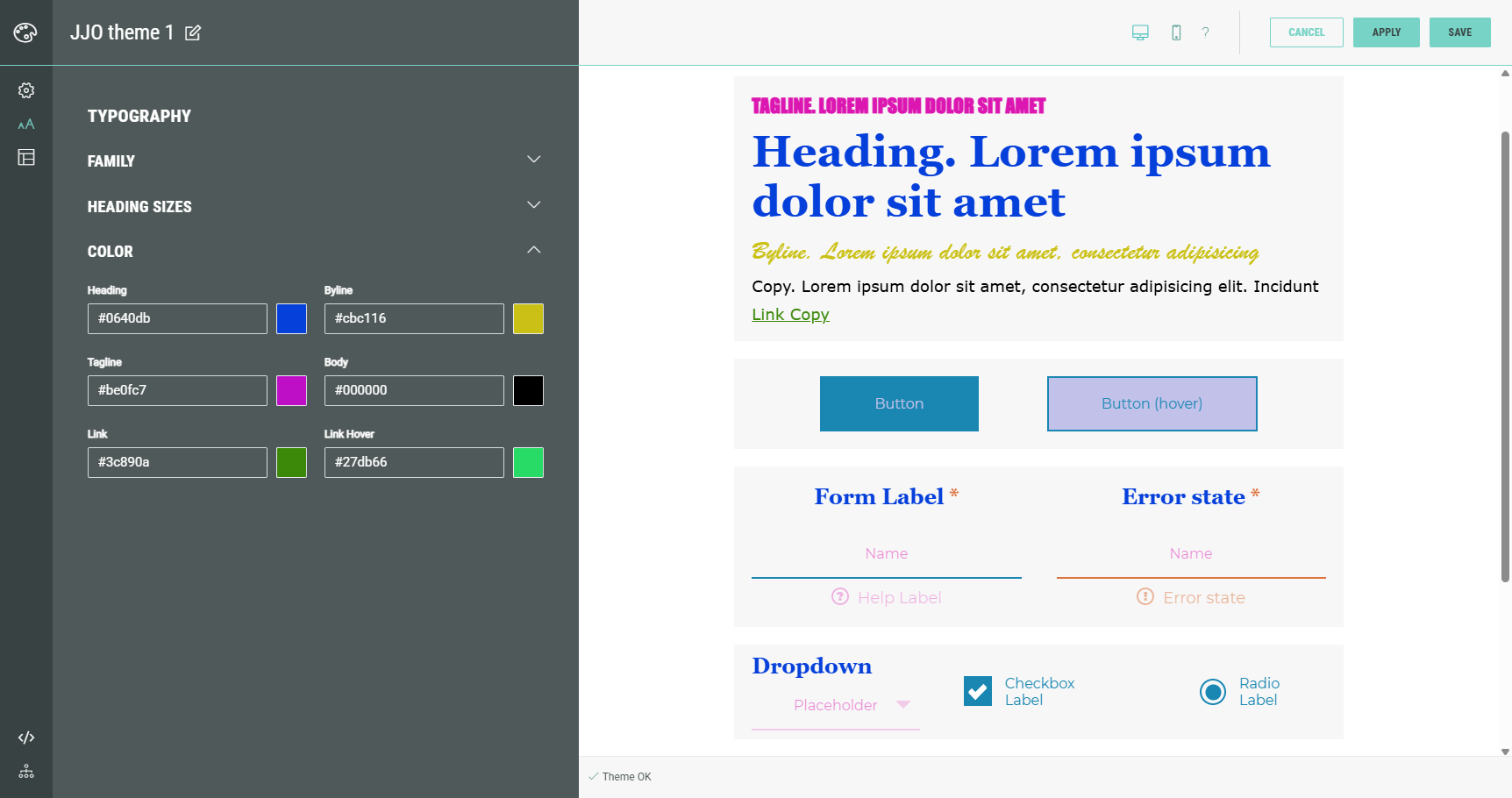
Color
The font color can be set for the following elements:
- Heading — Applies to h1, and labels in form and quiz modules.
- Byline — Applies to h2 headings.
- Tagline — Applies to h3 headings.
- Body — Applies to paragraph texts.
- Link — Applies to (a href) links. Does not apply to the Scaffold theme.
- Link Hover — Applies to the hover state of (a href) links. Does not apply to the Scaffold theme.
Key Elements
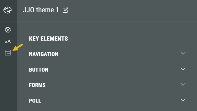
In Key Elements, the following sections are available: Navigation, Button, Forms and Poll.
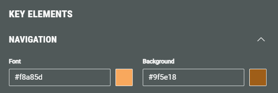
Navigation
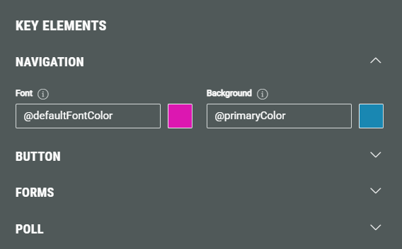
In the Navigation section, you can set the font color and background color.
These apply to the navigation arrows and progress bars.
Note: If you don’t see your styles being applied, it’s likely that some CSS/LESS styles are overriding it. Please get in touch with your contact for any assistance.
Both colors are by default inherited from the main theme's settings. You can customize them through the visual color picker or by entering a manual value in one of the following formats: #hex, rgb(), rgba(), browser constant, @variable, (formula).(note 1)
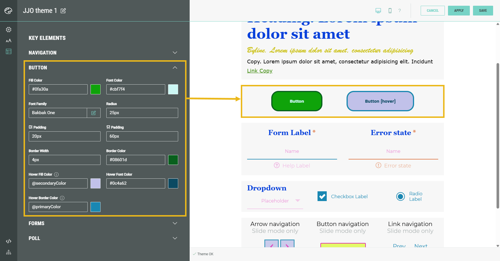
Button
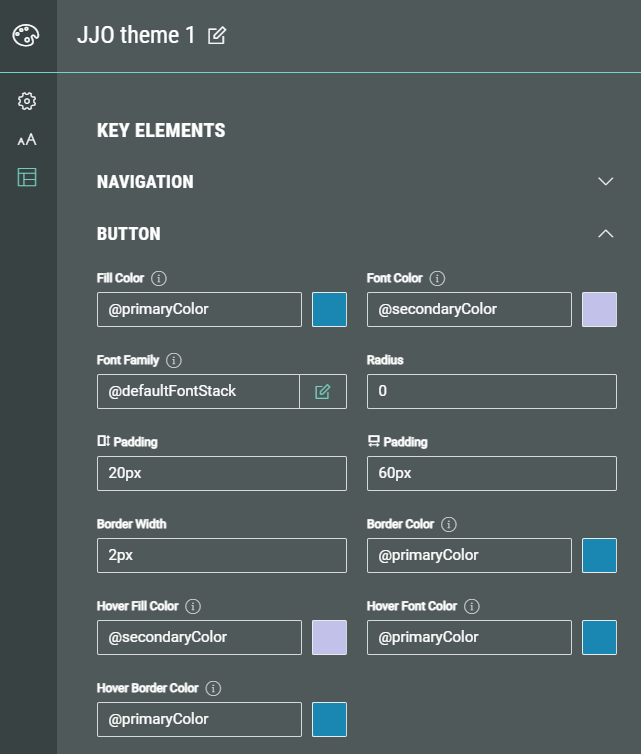
In the Button section, you can define colors, font family and other settings for buttons.
Colors and font family are by default inherited from the theme's main settings.
Other settings contain a default value as well.
You can customize colors through the visual color picker or by entering a manual value in one of the following formats: #hex, rgb(), rgba(), browser constant, @variable, (formula).(note 1)
Font family can contain a default, custom or Google font (as explained above).
Other values must be in one of these: plain, em, rem, px, %, browser constant, @variable or formula.(note 1)
- Fill Color — The color of the button (background).
- Font Color — The color of the button text, in its default button state (non-hovered).
- Font Family — The font family of the button text.
- Radius — The border radius controls how rounded the corners of a button are. The higher the value (in one of these formats: plain, em, rem, px, %), the more rounded the button is.
- Padding (vertical) — Vertical padding of a button refers to the space between the top and bottom edges of the button and its text. It affects the height of the button and how much breathing room the text has inside.
- Padding (horizontal) — Horizontal padding of a button refers to the space between the left and right edges of the button and its text. It controls how wide the button appears and how much room the text has on either side.
- Border Width — The border width defines how thick the outline of the button is.
- Border Color — Applies to the border color of the button in its default state (non-hovered).
- Hover Fill Color — Applies to the color of the button (background) when the button is hovered.
- Hover Font Color — Applies to the font color of the button text when the button is hovered.
- Hover Border Color — Applies to the border color of the button when it's hovered.
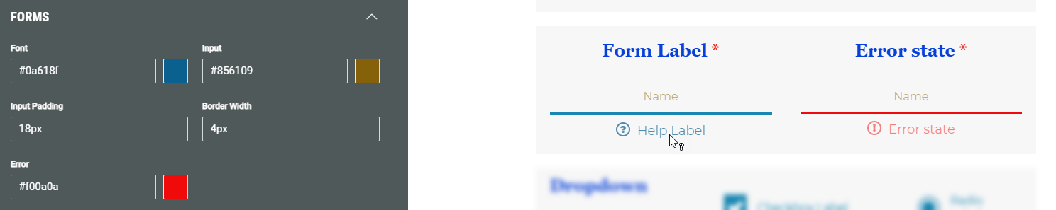
Forms
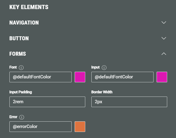
In the Forms section, you can define the following styling options:
- Labels Font Family - this value will impact the form labels, only
- Tagline Font Family - this value will impact the form field tagline, only
- Byline Font Family - this value will impact the form byline, only
- Form Fields Font Family - this value will impact placeholders, inputs, radio, checkbox, dropdown labels, the help text and the error text only
- Font — By default inherited from the theme's main settings. You can customize the font color used for form labels through the visual color picker or by entering a manual value in one of the following formats: #hex, rgb(), rgba(), browser constant, @variable, (formula).(note 1)
- Input — By default inherited from the theme's main settings. You can customize the font color used for input labels through the visual color picker or by entering a manual value in one of the following formats: #hex, rgb(), rgba(), browser constant, @variable, (formula).(note 1)
- Input Padding — Vertical padding of a form input field. This is the space between the top and bottom edges of the input field and its value (text). It affects the height of the input field and how much breathing room the text has inside.
- Border Width — The border width defines how thick the bottom border of the form input field is.
- Error — By default inherited from the theme's main settings. You can customize the font color used for error messages through the visual color picker or by entering a manual value in one of the following formats: #hex, rgb(), rgba(), browser constant, @variable, (formula).(note 1)
Poll
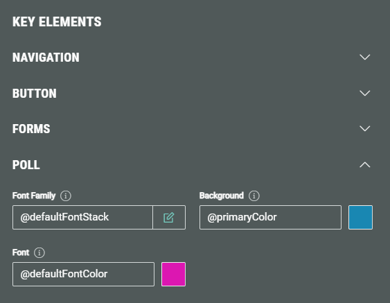
In the Poll section, you can define the following styling options, that are by default inherited from the theme's main settings :
- Font Family — The font family of texts in polls, which can be a default, custom or Google font (as explained above).
- Background — The background color of poll options. You can customize it through the visual color picker or by entering a manual value in one of the following formats: #hex, rgb(), rgba(), browser constant, @variable, (formula).(note 1) The selected option in a poll will use this color (at 100% opacity). Other options will use the background color at a lower opacity. (see the example screenshot below)
- Font — The font color of the non-winning poll options. You can customize it through the visual color picker or by entering a manual value in one of the following formats: #hex, rgb(), rgba(), browser constant, @variable, (formula).(note 1)
Note that the winning poll option uses the secondary font color from the General Settings (see the example screenshot below).
Note: The poll settings only have effect on Experiences using polls.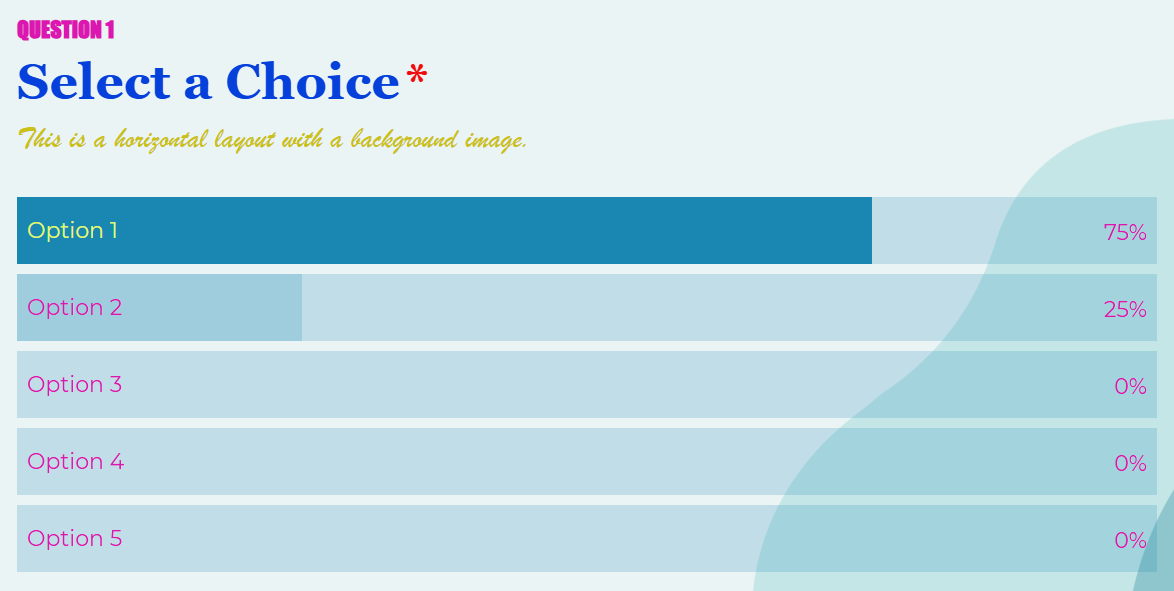
Advanced
In Advanced, the following sections are available: Foundation, LESS Overrides and CSS Overrides.
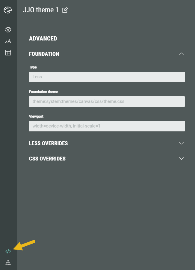
Foundation
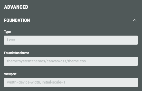
In the Foundation section, you can see the Type, Foundation theme, and Viewport.
Those are read-only fields, as they are just for information.
- Type — LESS stands for Leaner Style Sheets. It's a CSS pre-processor — basically, a tool that extends CSS with extra features to make writing stylesheets easier and more powerful.
- Key features of LESS are the use of variables, nesting, reusing groups of CSS rules across elements, using math/logic operators.
- Foundation theme — The theme template that has been used to create this theme from (for example: a canvas theme).
- Viewport — The viewport is important for responsive web design, especially on mobile devices.
- width=device-width sets the width of the viewport (the visible area of the web page) to match the actual width of the device screen.
- initial-scale=1 sets the initial zoom level when the page loads.
LESS Overrides
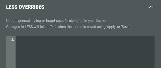
The LESS Overrides section allows you to update general styling or target specific elements in your theme, by manually writing LESS syntax in the field.
Changes to LESS will take effect when the theme is saved (after clicking the Apply or Save button).
Example:
- Without LESS overrides: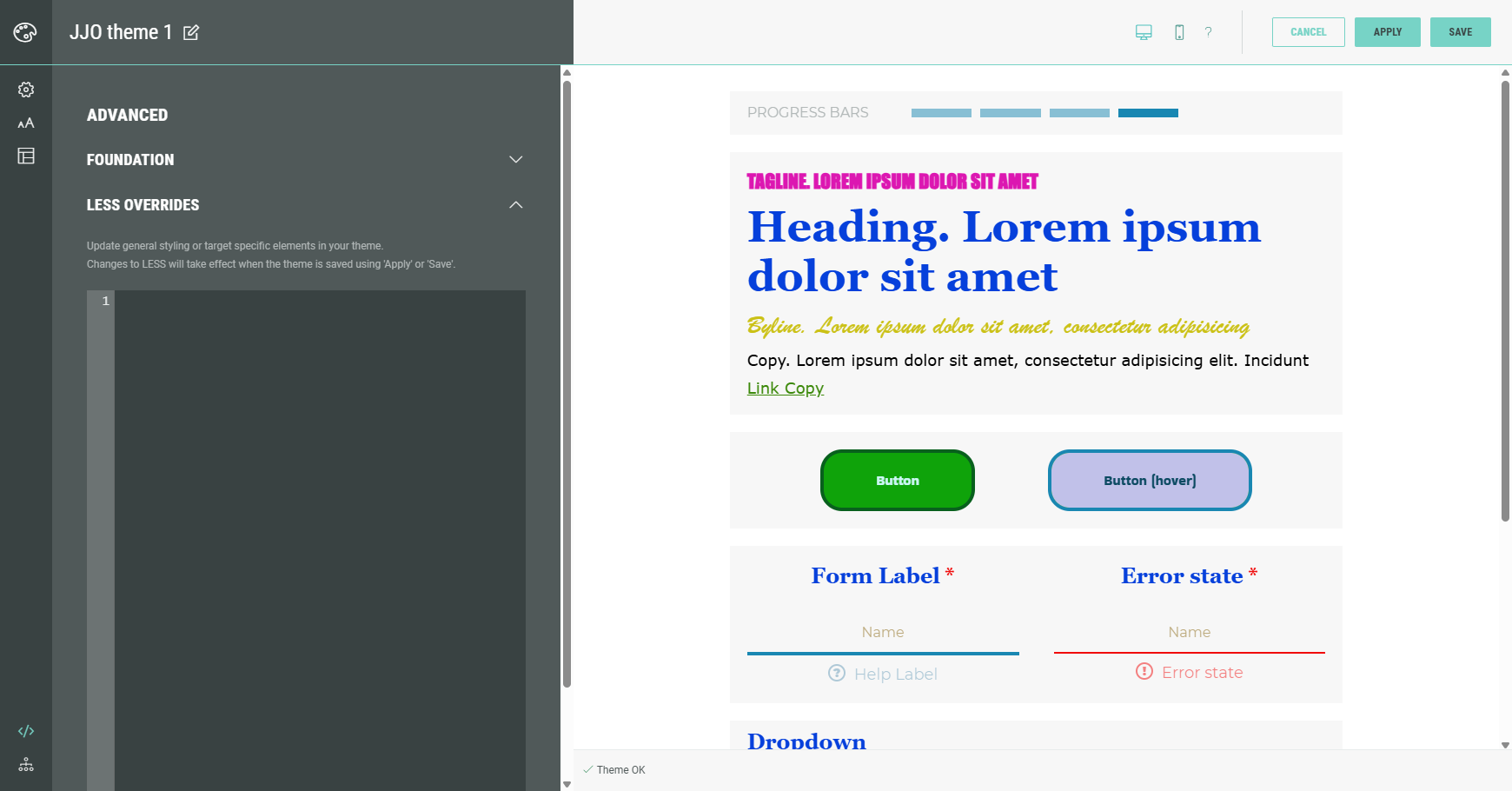
- With LESS overrides (after clicking Apply):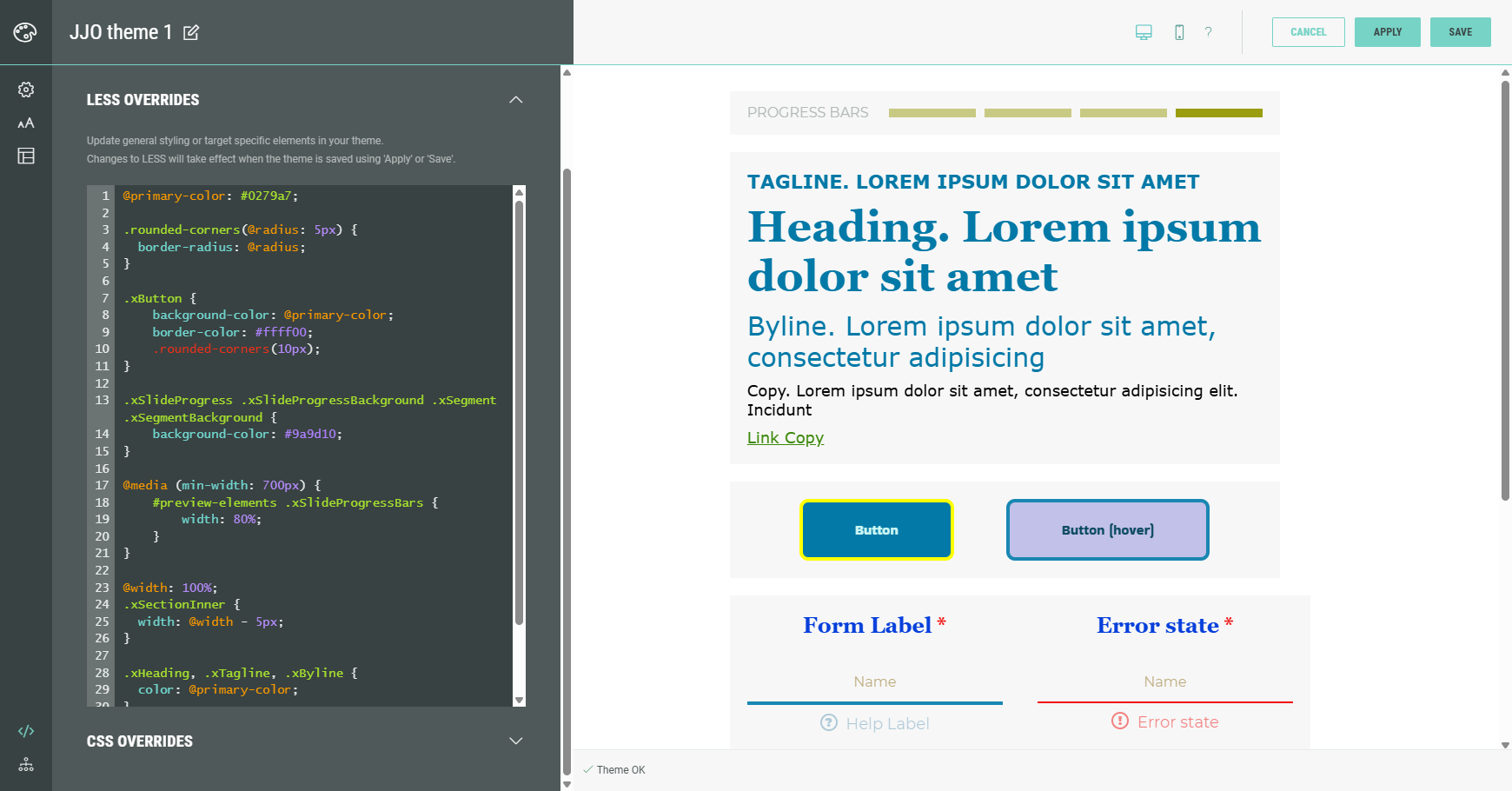
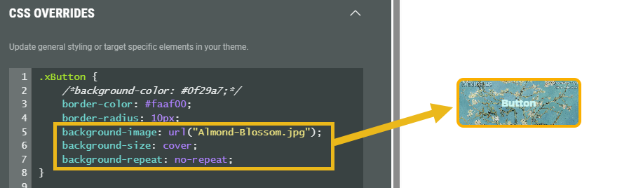
CSS Overrides
The CSS Overrides section allows you to update general styling or target specific elements in your theme, by manually writing CSS syntax in the field.
CSS overrides will immediately show in the preview on the right.
Example:
- Without CSS overrides:
- With CSS overrides: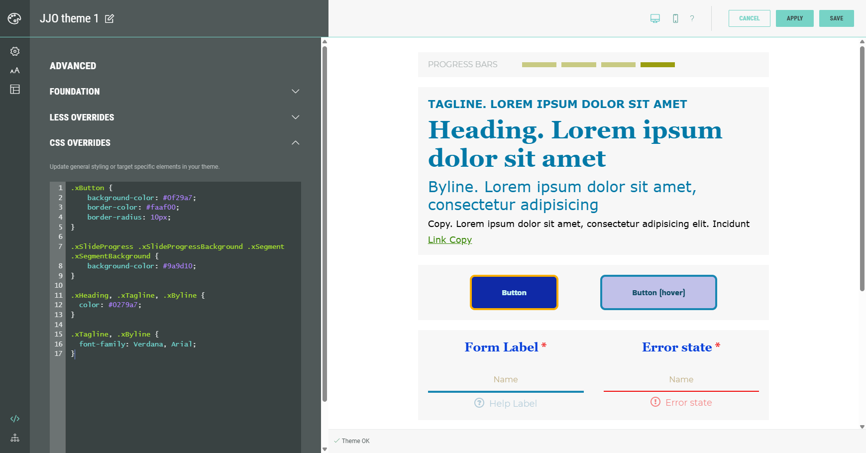
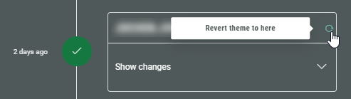
History
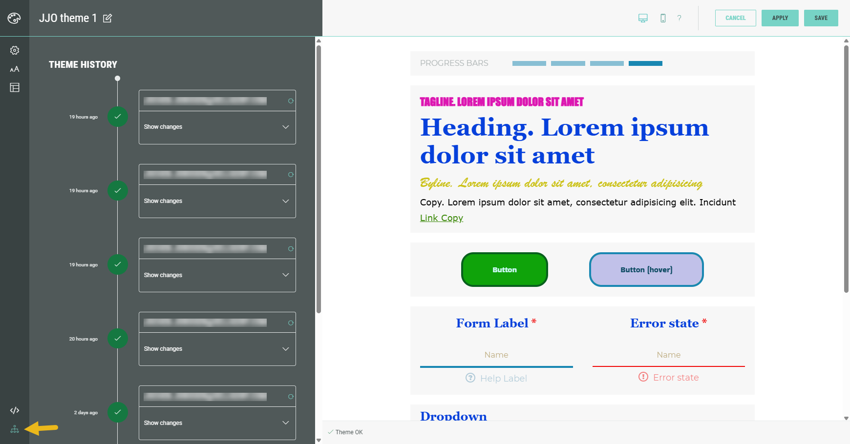
In the Theme History, you can see the updates being done to the Theme :
-
When — For example 19 days ago.
-
By whom — The email address of the user who did the changes.
For example john.doe@gmail.com. -
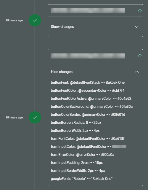
The actual changes that were done — You can show/hide changes by clicking the arrow on the right.
You can revert a theme to a previous point in time: