What's New
Please note that all new release notes and new/updated help topics are written in the context of NextGen Experiences.
 Highlights
 Available for all users
Available for all users
Available for all users
Release Notes
Available for all users
Available for all users
Available for all users
Available for all users
Release Notes
April 22, 2026 — 26.8
Lightbox Frequency Capping
AVAILABLE TO ALL CUSTOMERS
Background
When launching a Lightbox Experience, there was no built-in way to control how often the Lightbox appeared to the same visitor. This could result in repeated displays that impacted user experience and campaign performance.
Solution
You can now configure Frequency Cap Settings for Lightbox Experiences launched via Web Event. This allows you to control how often a participant sees the Lightbox, helping you balance visibility with a better on-site experience.
What it looks like in Grow
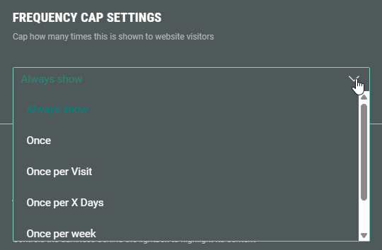
When publishing or editing a Lightbox destination using the Web Event launch method, a Frequency Cap Settings section is available.
-
Choose a frequency option — Select how often the Lightbox should display. Options include Always show, Once, Once per visit, Once per X days, Once per week, or Once per month.
-
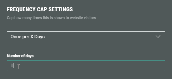
For Once per X days, enter the number of days.
-
For full setup details and technical behavior, see the updated Lightbox publishing article.
NextGen Headers
AVAILABLE TO ALL CUSTOMERS
Background
Previously, the Page Structure and Design section in NextGen Experiences allowed you to configure backgrounds and footers, but there was no dedicated header area that applied consistently across all pages. Users needed a structured way to add persistent top-of-page content, such as branding or key messaging.
Solution
You can now add a Header section within the Design tab under Page Structure and Design. The Header appears across all pages in a NextGen Experience, allowing you to include elements like logos, headlines, images, or modules that remain consistent throughout the participant journey.
What it looks like in Grow
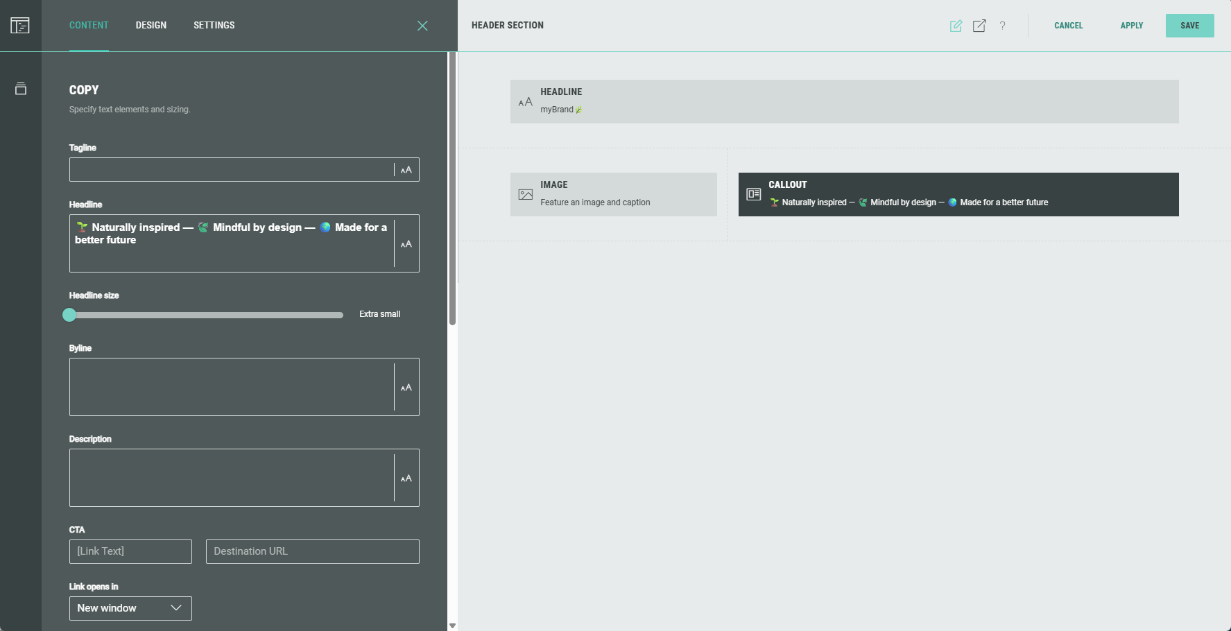
In your NextGen Experience, go to the Design tab and open Page Structure and Design.
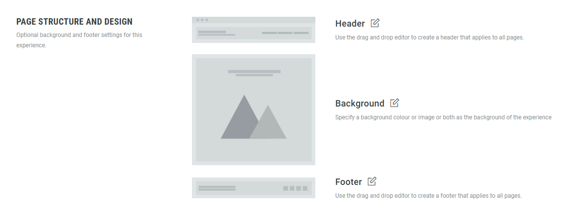
Edit the Header section, and add rows and modules such as images, headlines, or callouts.
The header automatically applies across the entire Experience.
For full setup details and examples, see the updated Experience Area article.
Copy to clipboard - Rewards
AVAILABLE TO ALL CUSTOMERS
Background
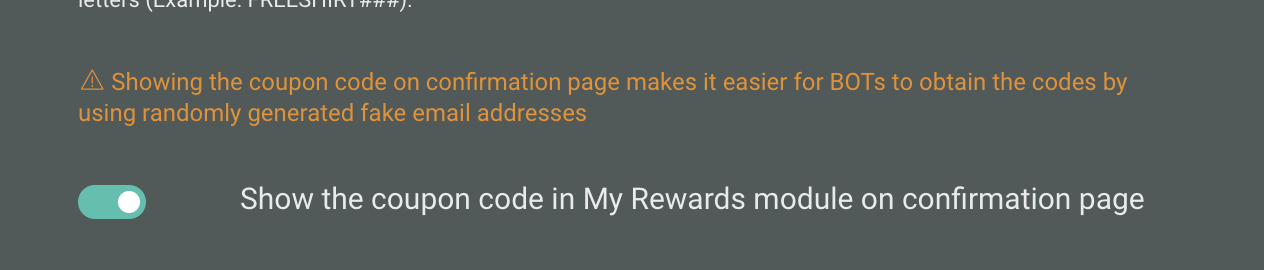
When presenting a coupon code to a participant, it was necessary for the end user to manually copy the coupon code to be able to apply it elsewhere.
Solution
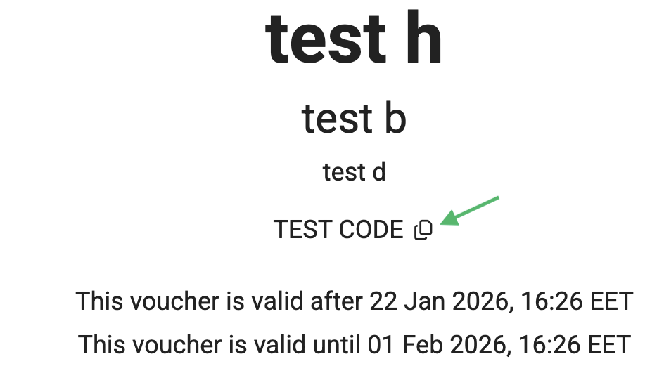
We have now added a "copy to clipboard" button that will display next to the coupon code. This allows the participant to easily copy the code for use on the target site.
What it looks like in Grow
To ensure the Experience will display the "copy to clipboard" button, you will need to apply the following settings when creating your Reward:
-
Must be a coupon code or uploaded codes reward type
-
Show the coupon code in My Rewards module on confirmation page setting must be toggled ON.
Once published, the copy to clipboard button will appear as shown below:
New field layout for form settings
AVAILABLE TO ALL CUSTOMERS
Background
Most guidelines generally discourage center-aligning labels and placeholder text because it reduces legibility, makes forms harder to scan, and can create inconsistency between placeholder and typed text.
Previously, we center-aligned all placeholder text, without the option to choose otherwise.
Solution
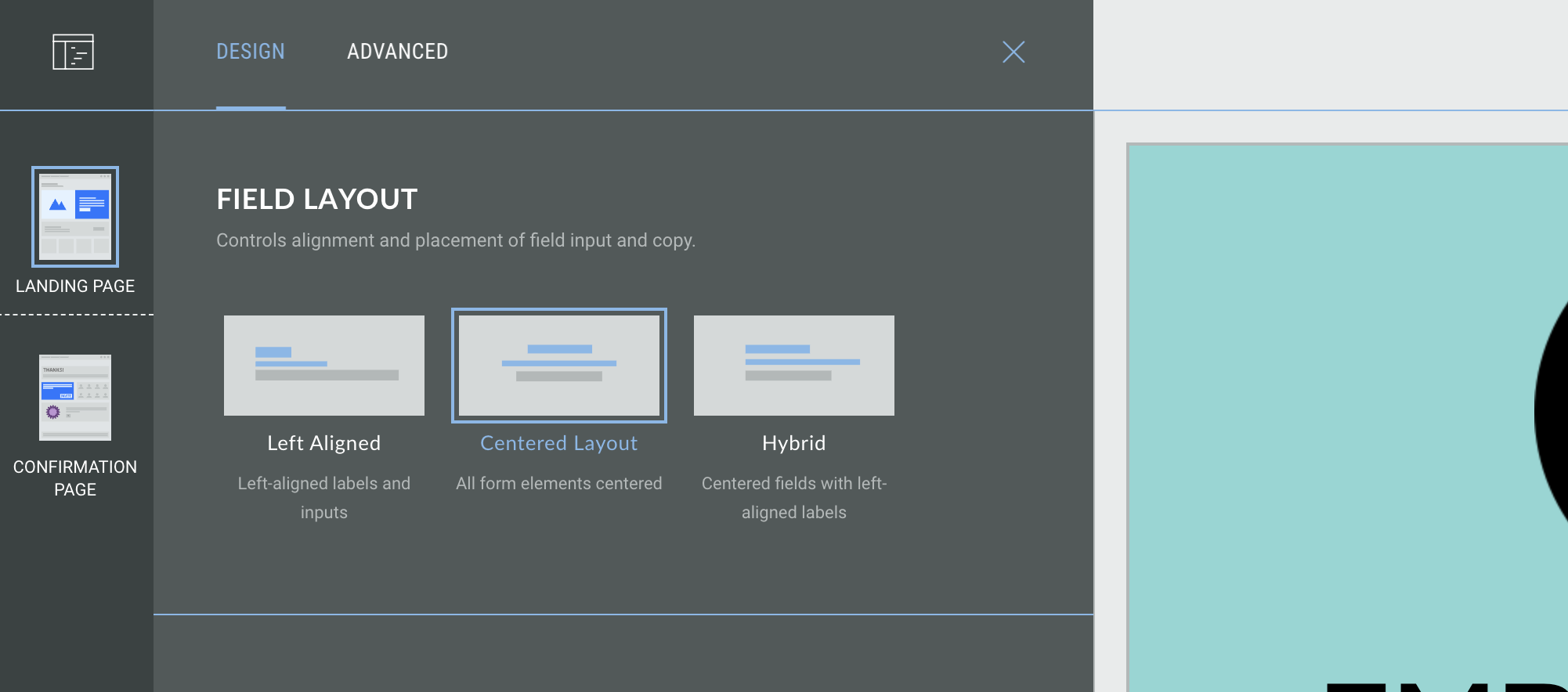
You can now choose the field layout for form settings; this controls the field alignment and placement of field input and copy.
You can choose from:
- Left-aligned - left-aligned labels and inputs
-
Centered layout - all form elements are centered
-
Hybrid - centered fields with left-aligned labels
What it looks like it inGrow
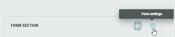
Within the Form Section, click on the Gear icon to access the Form Settings.
Within the settings, under Field Layout select the desired layout from the options available.
Note: Some content modules, such as Polls, will not be affected by the form alignment settings; you can use the alignment settings inside the individual module setup to define the alignment of specific modules.
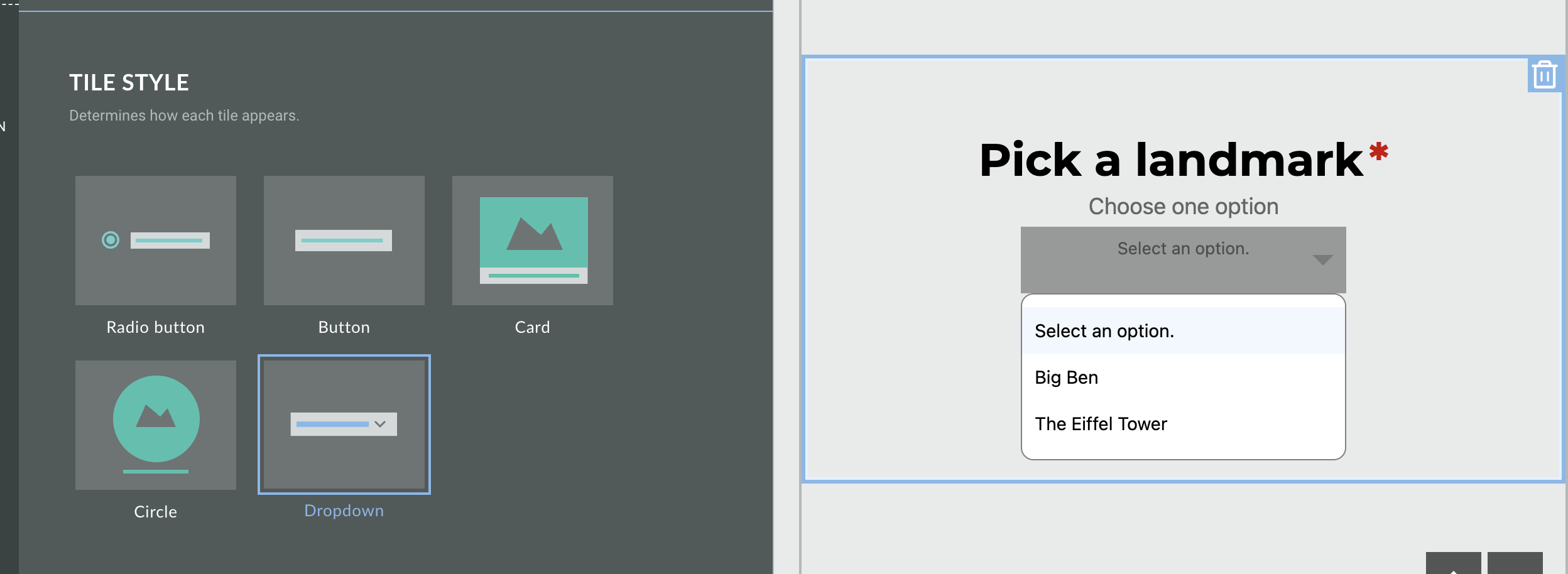
New dropdown tile style for Quiz and Form modules
AVAILABLE TO ALL CUSTOMERS
Background
Previously, when selecting the List template style, you could choose from Radio Button, Button, Card, or Circle. There was no option to condense the list options and display a long list of quiz answer options such as bra size or home State.
Solution
You can now choose the Dropdown option which places all of the list options in to a dropdown menu, providing a condensed and more compact form experience. Users can click on the field to expand the menu and select their answers.
This is available for single and multiple choice modules.
What it looks like in Grow
-
When editing the Form module within the Build tab, select the List template.
-
Under tile style, select Dropdown
-
You can try out the dropdown menu in the content panel to the right!
For more information on our Quiz modules, you can refer to our separate guides on Single- and Multiple Choice Quiz Modules.
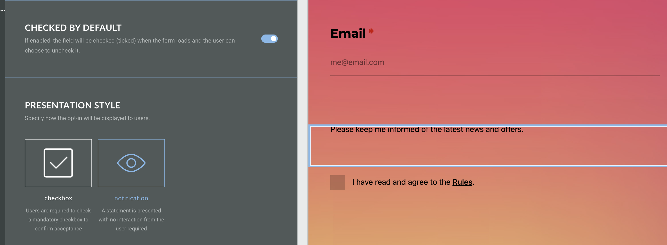
New presentation style for Opt-In modules
AVAILABLE TO ALL CUSTOMERS
Background
When adding an Opt-In module to your Experience, it was only possible to display this as checkbox. This required an extra step for users to manually opt in (or out) of your marketing content, with no option to automatically opt users in when supplying their email address.
Solution
Now, when you toggle on the Checked by Default setting, you can now choose the presentation style for your Opt-In module. Choose from:
-
Checkbox - users are required to check a mandatory checkbox to confirm acceptance
-
Notification - a statement is presented with no interaction required from the user
What it looks like in Grow
Add an Opt-In module to a form page and click on the module to open the settings. You can choose your presentation style in the Settings tab.
The option to select the presentation style is only available when you have toggled the Checked by Default setting on; you can then select from either checkbox or notification.
View each option in the preview window on the right hand side.
See more about it in our Opt-In Module guide.
Platform Status
The status page provides you with regular updates regarding the status of the Grow platform in the event of a major system incident in your region. In this article we’ll explain the information you will see and how to subscribe to the Grow notification system to receive regular updates on the platform status, which we highly recommend to all users.
Click here for the Platform Status page.
For more information on the Platform Status page, including signing up for notifications, see the Platform Status documentation.