Wallet Pass Details: Apple
Overview
The Apple tab is used to configure this Wallet Pass for use on Apple devices.
The layout of the content for a Wallet Pass on an Apple device varies depending on the Wallet Pass type. Click a Wallet Pass type below to see a mockup showing the different components for each Wallet Pass type.
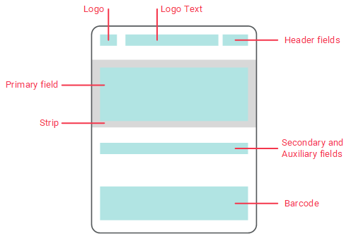
 Store Card
The layout of a Store Card on an Apple Device is as follows:
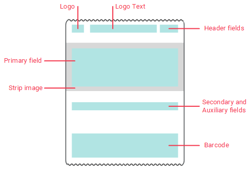
Coupon
The layout of a Coupon on an Apple Device is as follows:
As you configure the various options and sections of the Wallet Pass, the platform displays a preview rendering of the Wallet Pass contents. Due to the wide variety of devices and form factors, the preview is intended only to give you some sense of where a particular element will display, and is not meant to be an accurate visual representation.
Dynamic Content
Every element of the Wallet Pass, including labels and values, can be dynamically populated using Content Tokens. These Content Tokens can reference any Member Attribute, or pull in attributes from other Loyalty assets, such as Offers, Gift Cards, and Punch Cards. You can also use Lookup Tables to look up the value of a Content Token based on any Member Attribute.
Features
The features available on the Apple tab are described below.
Click here
To configure the Barcode component on an Apple Wallet Pass:
-
Select the Barcode tab.
-
In the "Barcode Value" field, enter either a fixed number (which could be applicable for a coupon), or use personalized values using a Content Token. To use a fixed number, simply type it in. To use a Content Token, type "@." The platform displays a list of the Content Tokens defined in your account. From this list, select the desired Content Token. The platform inserts the selected Content Token.
-
From the "Format" drop-down menu, select the Barcode format: QR Code, PDF 417, Aztec, or Code 128. The preview rendering on the right is refreshed.
-
In the "Alt Text" field, optionally enter the alt text value for the barcode image.
-
Click save changes.
|
Click here
The Colors & Images tab lets you configure the overall appearance of the Wallet Pass.
-
Select the Colors & Images tab.
-
The Colors section allows you to customize the look and feel of the Wallet Pass by the colors used. For each color listed, either enter the desired hexadecimal color value, or click into the field and select the desired color from the color picker. The rendering of the Wallet Pass on the right is refreshed.
-
The Images section allows you to select the images used for the different components of the Wallet Pass. For each image listed, click choose file, then navigate to and select the desired image file (recommended image dimensions are listed). Click upload. The rendering of the Wallet Pass on the right is refreshed.
-
Click save changes.
|
 Configure Front Content Configure Front Content
Click here
An Apple Wallet Pass uses a two-side concept, with a "front" and a "back." The front contains the main content you want to present to your Member. This content should be formatted to fit the standard display configuration for the selected Wallet Pass type, as depicted above.
To configure the content for the front of the Wallet Pass:
-
Click the Front Content tab.
-
In the Header Field section, enter the desired text values in the various text fields. Optionally, to personalize the value in a field with a Content Token, type "@." The platform displays a list of the Content Tokens defined in your account. From this list, select the desired Content Token. The platform inserts the selected Content Token. For example, let's say you want to display the Member's current point balance, and you have a Content Token called "Points Balance." You can insert this Content Token into the "Value" field as: {{stl_token_points_balance}}. The platform will personalize the Wallet Pass for a Member by displaying their current point balance.
-
A Change Message is a push-style notification that Wallet Pass holders will receive when the platform detects a change in the "Value" set above. In the "Change Message" field, type in the content of this notification. For example: "Loyalty card balance changed to %@." The "%@" will be populated with the current value of the Content Token in the "Value" field.
-
Optionally, you can override the default text alignment by selecting an option from the "Text Alignment" drop-down menu. Select "Natural" in this menu to use the default settings. The rendering of the Wallet Pass on the right is refreshed.
-
Optionally, select a date / time formatting style for the Value field.
-
Optionally, repeat the above steps for the Primary Field section. The rendering of the Wallet Pass on the right is refreshed.
-
Optionally, repeat the above steps for the Auxiliary Field and Secondary Field sections. The rendering of the Wallet Pass on the right is refreshed.
-
Click save changes.
|
Configure Back Content
Click here
An Apple Wallet Pass uses a two-side concept, with a "front" and a "back."
Space on the front of the pass is limited, so the contents of fields must be brief. In contrast, the back of the pass can have as many fields as needed and the contents of fields can be much longer. The back of the pass can be used to display information that is too long to fit on the front of the pass, or to include general information that may be helpful for your Members, such as legal terms and conditions, your customer service phone number, or the URL for your website.
To configure the content for the back of the Wallet Pass:
-
Click the Back Content tab.
-
Optionally, in the "Description" text field, enter a description of this Wallet Pass.
-
Optionally, to insert a new section, click add new section.
-
From the "Type" drop-down menu, select one of the following:
-
Fixed Text: Allows you to enter a static text string, such as legal terms and conditions. This text string can optionally contain hyperlinks using simple HTML.
-
Latest Message: Displays the text of the latest message.
-
Stores / Locations: Leverage the platform's geolocation features to dynamiclly populate this section.
-
Custom: Select a Content Source (the desired Content Source must first be added to this Wallet Pass on the Advanced Options tab).
-
In the "Header" field, enter the header name for this section.
-
The Template field allows you to either enter a text string, or to enter code using the Liquid coding syntax. For additional help on creating Liquid templates, a "Templating Guide" link is displayed within the Back Content section. This guide provides code samples to support several different use cases, such as listing valid Offers, or displaying the balance of a gift card.
-
A Change Message is a push-style notification that Wallet Pass holders will receive when the platform detects a change in the Template above. In the "Change Message" field, type in the content of this notification.
-
Click save changes.
|
 Test Wallet Pass Test Wallet Pass
Click here
To test an Apple Wallet Pass:
-
Click the Test Preview tab.
-
From the "Test Member" drop-down menu, select the desired test Member. A QR code for this Member is displayed.
-
If you have the correct device, scan the QR code with your camera to download and view the pass.
-
If you don't have the correct device -- on your mobile device, download an app which will allow you to access Wallet Passes. Then, in the Test Preview tab, click the "Download PKPASS file" link beneath the QR code. Send this file to your mobile device and open it to view it.
|
 Validate Configuration Validate Configuration
|
 Prohibit Sharing Capability in iOS and Apple Wallet Prohibit Sharing Capability in iOS and Apple Wallet
|
 Configure Barcode
 Configure Colors and Images
