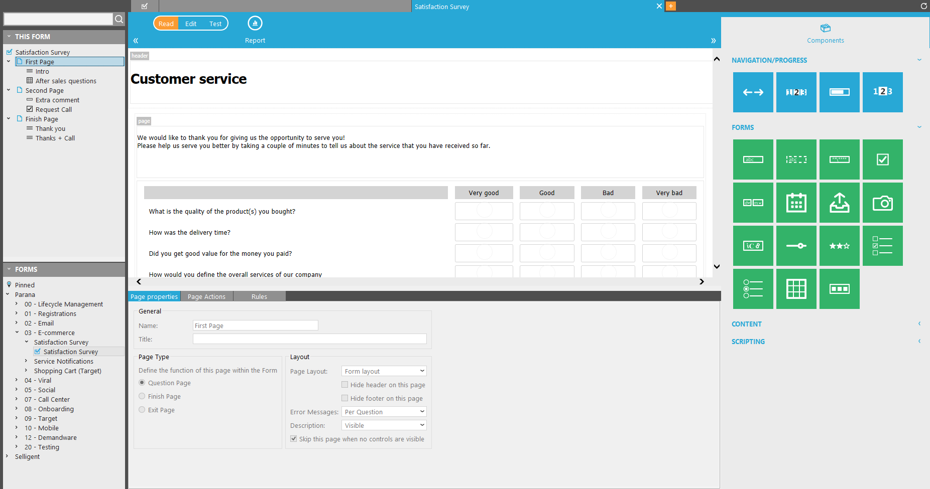
The Form section consists of
- a Home tab followed by a series of Form tabs, one per opened form.
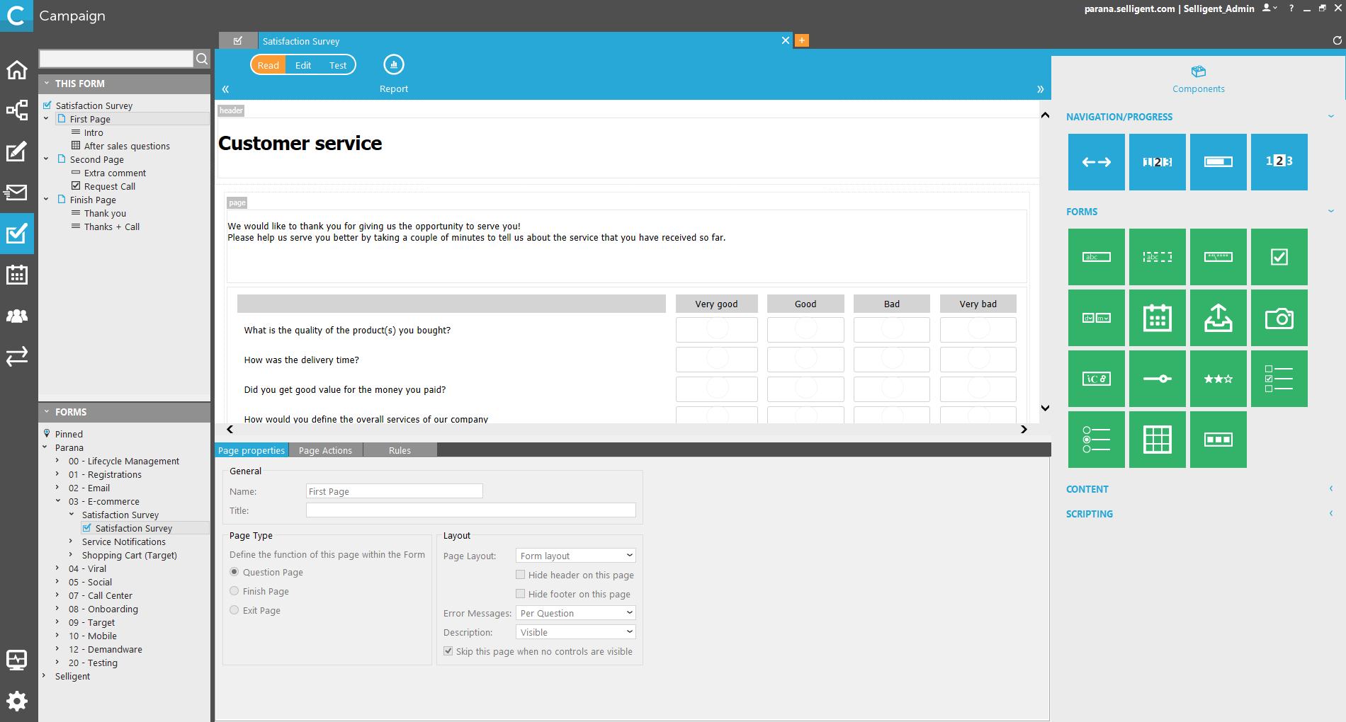
- a main window (called the canvas) where the form is built. It is a graphical drag and drop environment to design your form, access all page and form properties, rules, translations, etc.
- a tree view of forms on the left
- a components library on the right providing a series of form components to build the form.
Home tab & Form Tabs
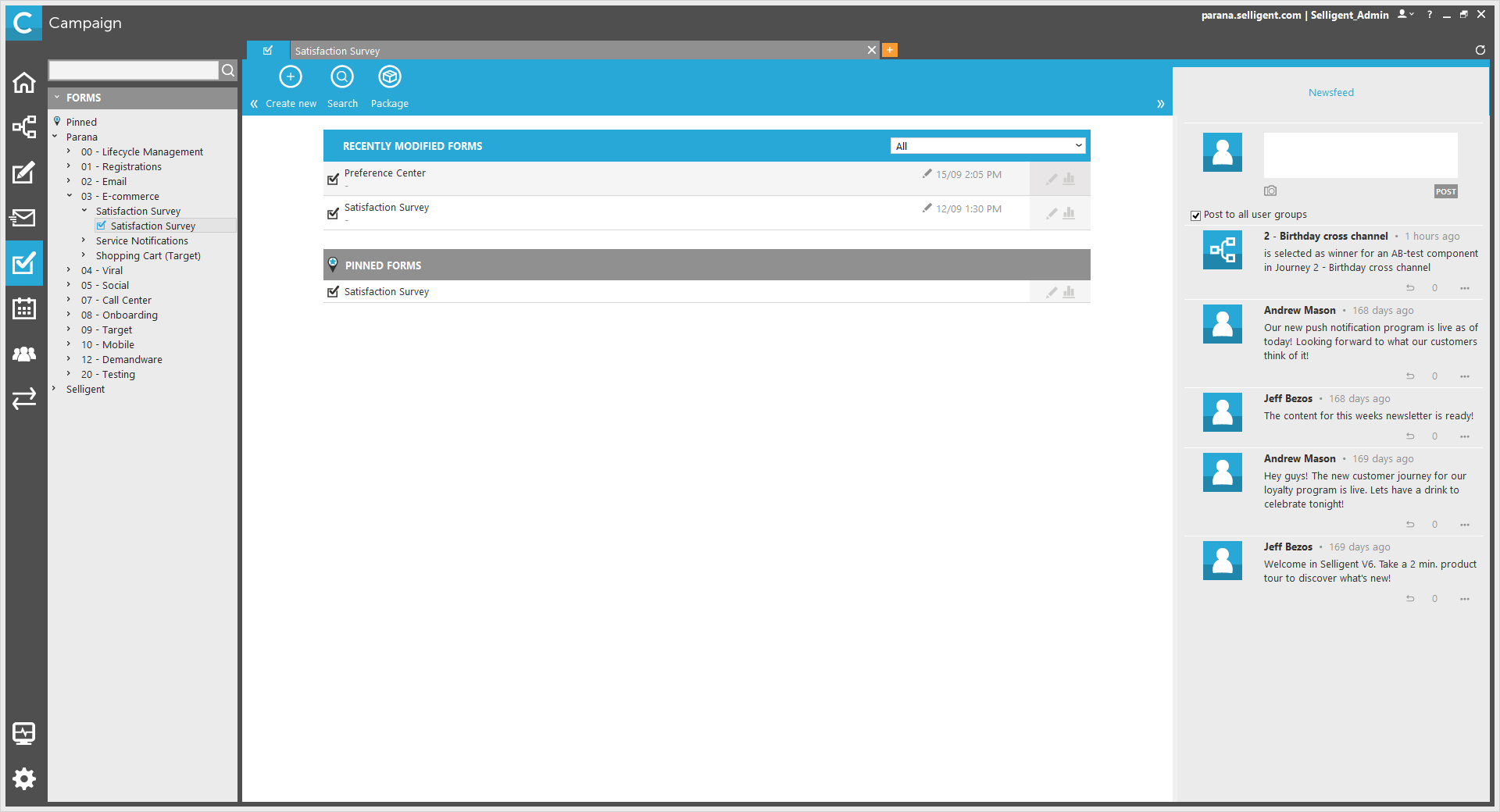
The 'Home' tab contains recently modified forms and pinned forms.
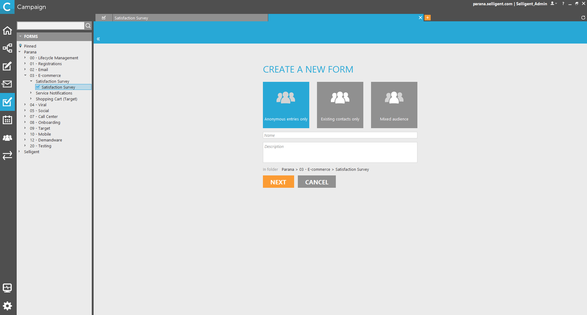
The + tab displayed to the right of the 'Home' tab, is used to create an new form. A new tab is added to enter a name and description
When clicking 'Next', a choice must be made on the type of audience for the form (see also creating a form):
-
Anonymous entries only: form contacts which aren’t related to an audience list and are therefore not known in the application
Example:
When publishing an online form directly on a website, any contact clicking the form hyperlink can fill out the survey. This means that no information about the contact is known in the Selligent database.
This implies that a person can submit the form more than once, as it’s impossible to identify the contact performing the action. So, the “Form participation for Existing Users” panel will be disabled.
- Existing contacts: contacts which are included in an audience list
Example:
Inviting hotel clients contained in an audience list to respond to a customer satisfaction form.
Site customers are known in the environment because they are included in an audience list, so their answers will be related to the audience list record based on the user Id field (matching keys: ID on USERID).
- Mixed: both known and unknown contacts.
If you are unsure what to select, select 'Mixed. Since an audience list is mandatory in a journey, even if only anonymous contacts can fill out the form, Selecting mixed and selecting the audience list in Form is usually the best option.
The folder where the form will be created is based on the current selected folder in the tree view on the left.
For each form currently open, a new tab is added. The body of a form tab contains a status menu and a series of buttons and menu options.
note: the content of the toolbar changes depending on the selected element.
Following status menu is displayed. Only one status at a time can be selected:
- Read: the form is displayed in'Read'mode, no changes can be made. This is the default status.
- Edit: the'Edit'state will lock the element for the current user. If the element was previously locked by another user, that user's name will be displayed just below the status menu. The form can now be modified.
- Test: sets the form in test mode allowing a preview of the current version and testing it against a test audience
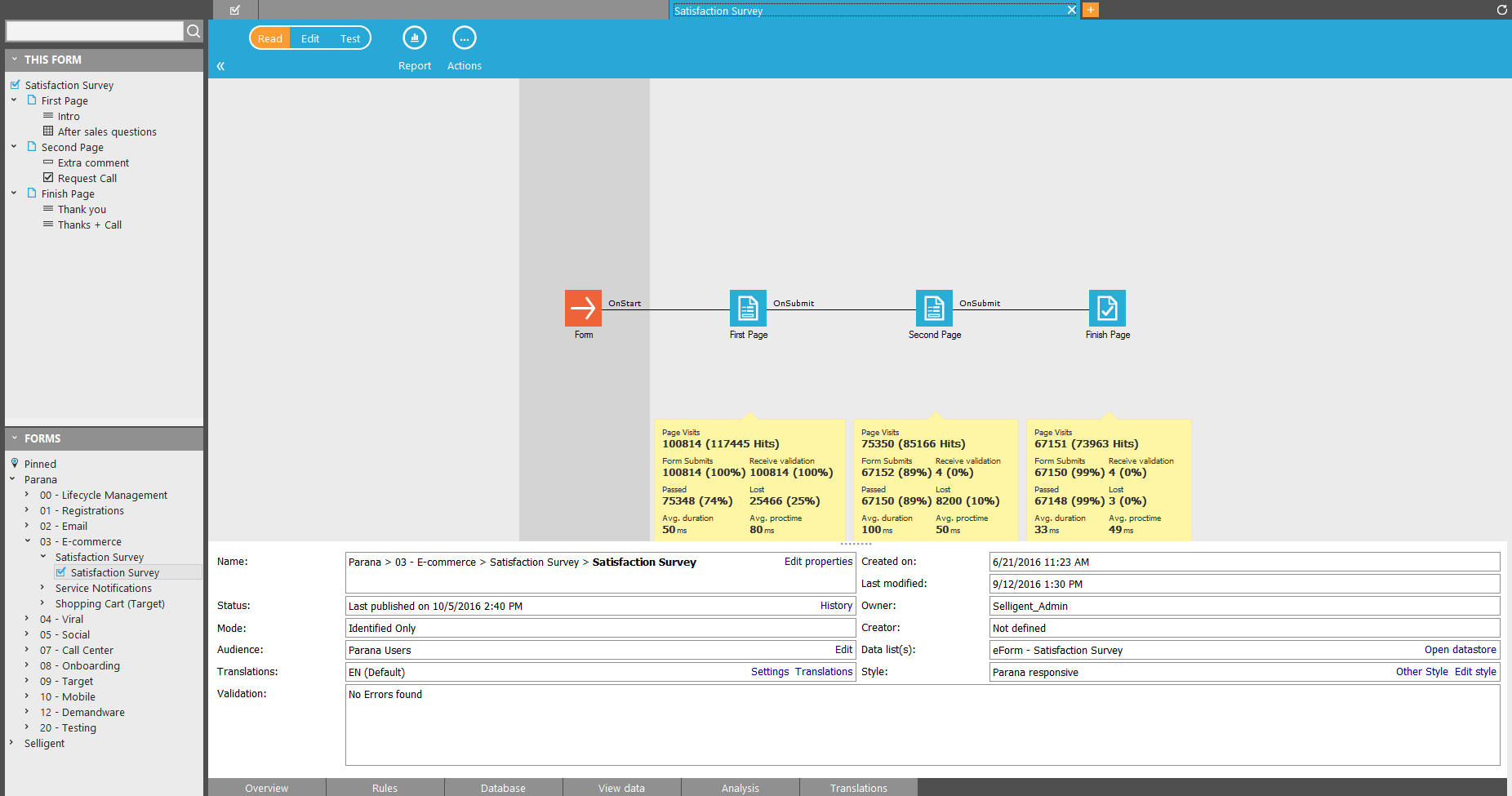
The following buttons are displayed when the Form overview page is selected. To select this page, click the form name in the top left corner.
- Save: saves the changes made to the current form
- Add page: adds an additional page to the form
- Delete page: deletes the selected page. This button is only displayed when a page is selected in n form
- Update DB: updates the survey list with the latest changes
- Publish: Publish the form as a new version and access the different versions
- Properties: access to the form properties
- Report: access to the form (analysis)
- Actions: a series of options are provided
-
- Pin this:adds the current form to the pinned forms on the 'Home'tab
- Rename: renames the current form
- Duplicate: duplicates the current form
- Manage styles: access the Style Manager
- Print: prints the form layout
- Export: creates an export package for deployment elsewhere
- Import: imports a package for deployment in the current environment
- Rollback: allows packaging rollback
- Export fields: create an export for a selection of fields
- Refresh statistics: refreshes all numbers and statistics for the current form
Main window (canvas)
By default the main window is the area where an overview of the current form is displayed. It provides global information about the number of pages, page preview, form publishing and testing, etc. The content of the main window depends on the selected item in the tree view of entries on the left of the main window.
- form overview
- Page overview: list all pages and components used in the form. It can be used to select, remove or order pages and components, on the pages or to insert existing pages or components. When selecting a specific page in the form, the main window displays the page set up and properties
When Form overview page is selected, tabs are displayed at the bottom of the main window
- Overview: a visual overview of the form is displayed in the main window, together with the properties
- Rules: access to all rules, create new rules or delete existing ones. Rules allow showing or hiding components based on answers given on previous questions.
- Database: list of all form fields stored in the database. Each field is linked to a component. These form fields must be updated whenever changes are made to the form.
- View Data: list of all answers given
- Translations: translations for the current form
The lower section of the main window displays details on the page properties, actions and rules.
A component library on the right is available to drag and drop Form components onto the page.
Tree view
The tree view completely on the left bottom displays folders and subfolders where forms are stored.
