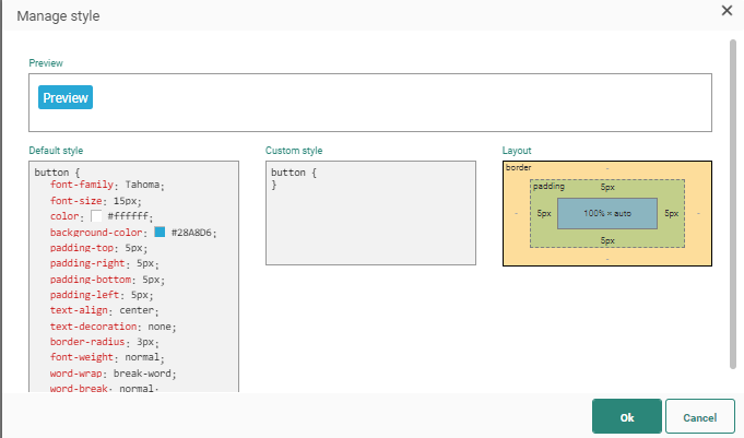
A message can be styled in several ways:
Global style — Defines in general how headings and other text are displayed as well as general spacing, width and background colors. The global style applies to the complete message but some style can be overridden on component level and/or on row/column level.
Component styling — Allows setting the background color for the component. Direct access to CSS styling options is available as well and when layout changes are made to the component, the global styling is overruled.
Row styling — Offers styling options on row-level. When at least two columns have been added, an additional column-width ratio is configurable.
Column styling — Offers styling and layout options on column-level.
Global style
Global style can be accessed directly from the message in Edit mode, through the panel on the right hand side, after clicking the Style link.
The following elements can be styled:
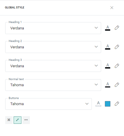
- Background color — Sets the color of the browser window background.
- Width — Sets the width of the message in which rows and columns can be dragged. The width is by default set to 600px.
- Headings, Normal text and Buttons — Sets the text font and color. For buttons, the background color can also be set.
- Rows — Sets the background color of the rows.
- Columns — Sets the background color of the columns.
- Spacing — Sets space between rows and columns. Use the slider to increase/decrease the spacing.
- Mobile margin — Automatically adds spacing around the message content when viewing on a mobile device.
It is possible to edit the styles for some of these elements directly in the Style editor. To access the Style editor, click the pencil icon. A preview is available.
Note: Variables can also be used to affect the style of the final message (for example to set different colors for different brands).
Note: The global style of templates can be locked/unlocked.
Example: We
have changed the font color of text in our template as well as the colors
used for the buttons. Some spacing between rows and columns has been set
as well. 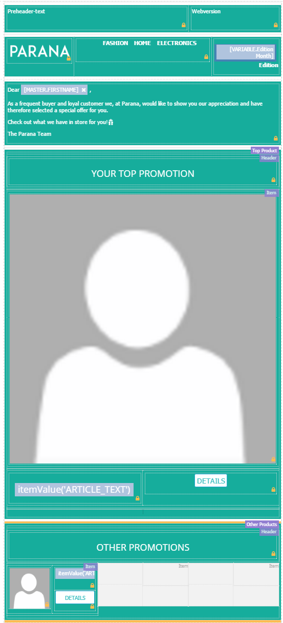
Component styling
Specific layout and styling options can be set for some individual components, by clicking the green pencil while hovering over a component.
For more info on the options for each component, check out the following sections:
Row styling
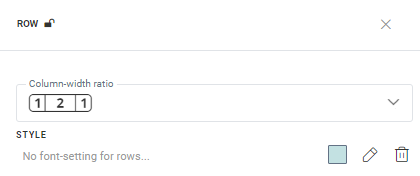
Row styling options can be set by clicking the blue pencil at the top-right, while hovering over a row.
This will display the Row properties at the right of the screen.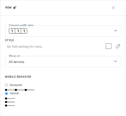
When at least two columns have been added to the row, the column-width ratio can be set.
Example:
We have a message containing a header row with 3 columns (image, links to different website sections, and copyright text) :
Set
the row style in the header to [1
| 2 | 1].
This way, the links to the specific sections on the website have some
more room in the message :
The background color, devices on which the row will be shown and mobile behavior can be set.
Mobile behavior defines how the content will be displayed when rendered
on a mobile device. You can choose to leave it at horizontal display or
change it to vertical.
You can also access the Style
editor (by clicking the pencil) and make changes directly in the CSS.
Example :
In the header example above, we set the row style as follows :
- background color : #c3e1e2
The result is the following:
To further refine the styling, we click the pencil icon, and set the following custom style :
- padding : 25 px ;
- border-bottom-width : 1 px ;
- border-bottom-style : solid ;
- border-bottom-color : #000000 ;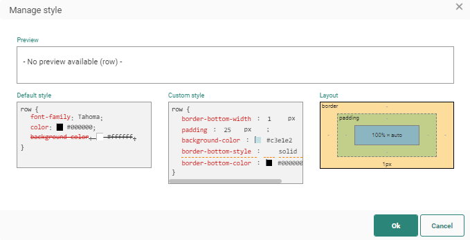
The result is the following:
Note: The row layout of templates can be locked/unlocked.
Column styling
Column styling can be accessed by clicking the yellow icon when hovering over a column.
The following options are shown: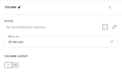
The background color and column layout (content alignment) can be set in here. You can also access the Style editor (by clicking the pencil) and make changes directly in the CSS.
Example:
In the header example mentioned earlier, we set the column style of the center column (containing links to the website sections) as follows:
- background color : #caf4d6
- column layout 'horizontal' with 'center' text alignment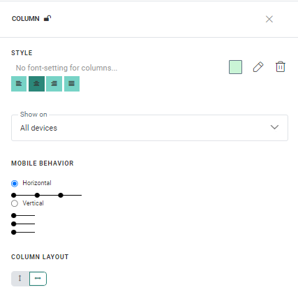
The result is the following :
To further refine the styling, we click the pencil icon, and set the following custom style :
- border-style : dashed ;
- border-color : #4258e8 ;
- border-width : 2 px;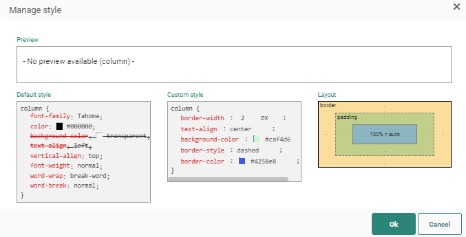
The result is the following:

