The Selligent Home page is accessible from the left navigation.
From here, two tabs are available :
-
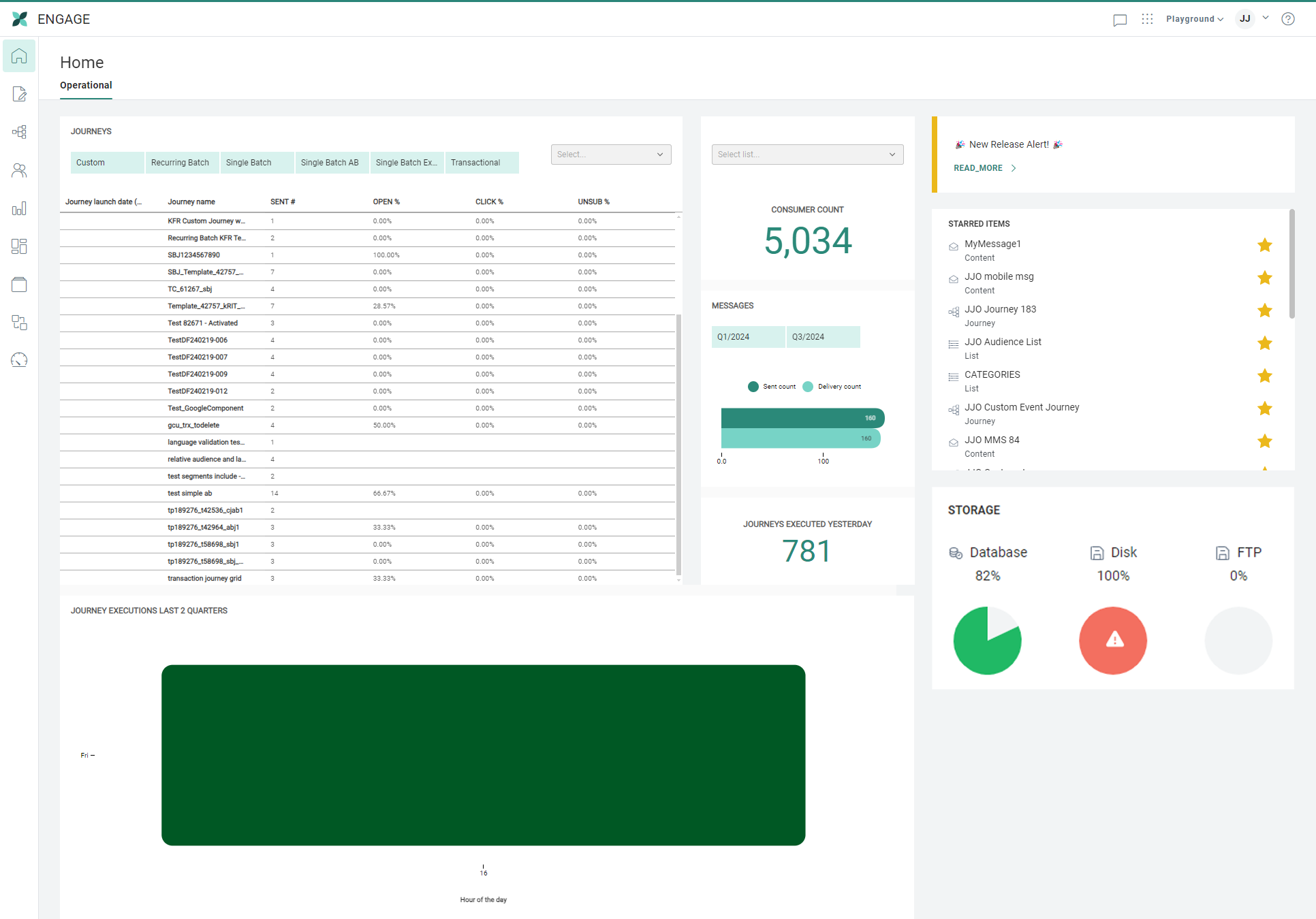
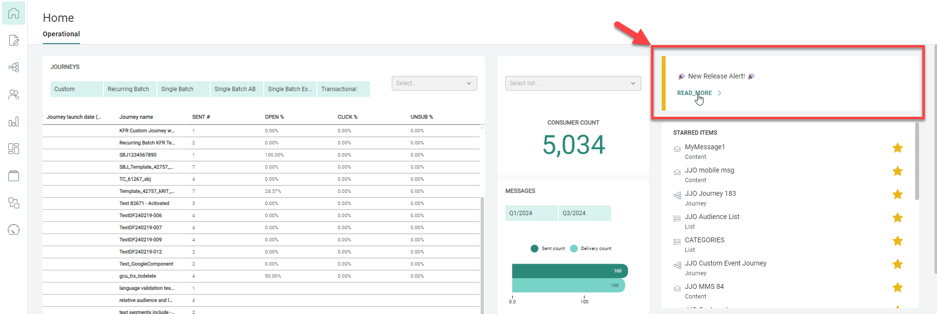
Operational tab — This screen provides insights on journey interactions, valuable information on audiences, quarterly messages and yesterdays' executed journeys, and a heatmap-like graph of journey executions of the last 2 quarters.
It also contains a list of starred items that you marked for quick access, and system storage info.
Additionally, if a notification was present on the Selligent login screen, it's also visible here. -
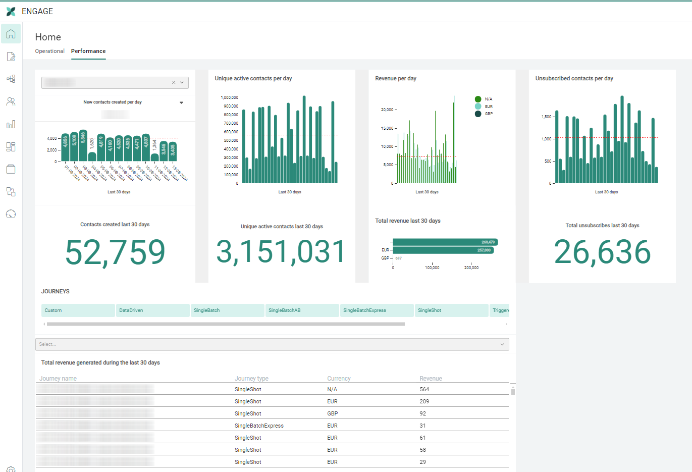
Performance tab — For a specific audience or overall aggregated data, you can get a daily and total view of insights over the last 30 days for new contacts, unique contact interactions, revenue and unsubscribes. Also, per journey, the total revenue generated during the last 30 days is shown.
Note: The information on the Home page is linked to the current Business unit. If however, your Business unit is flagged as a global Business unit, information will be displayed across all Business units.
Operational tab
The dashboard widgets on the left part of the Operational tab (with insights on journeys, messages and audiences) are only available to users with access rights to dashboards.
Users with no dashboard access rights will only see the right section of the Operational tab, containing notification info, starred items and system storage.
Dashboard widgets (only accessible to users with access rights to dashboards)
Insights on Journey interactions
Overview of journeys including the launch date and interaction metrics such as number of messages sent, open rate percentage, click rate percentage and unsubscribe rate percentage.
Click on a line (at the right of a journey name) to go straight to the corresponding journey in the Reports chapter.
The list can be filtered by type of journey (only filter types for the available journeys are shown):
- for Selligent journeys: Custom, Recurring Batch, Single Batch, Single Batch AB, Transactional
- for Campaign journeys: Campaign (including Single Shot, Data Driven, Triggered, Action Driven), Single Batch Express
It's a good indication of how a journey is performing.
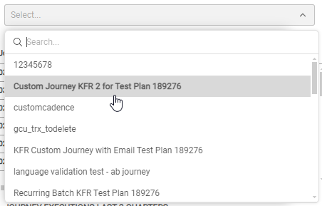
A search field allows searching by journey name. A drop-down of all available journeys is provided.
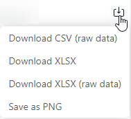
The overview can be downloaded in CSV (raw data), XLSX, XLSX (raw data) and PNG format.
Insights on audiences, quarterly messages and yesterdays' executed journeys
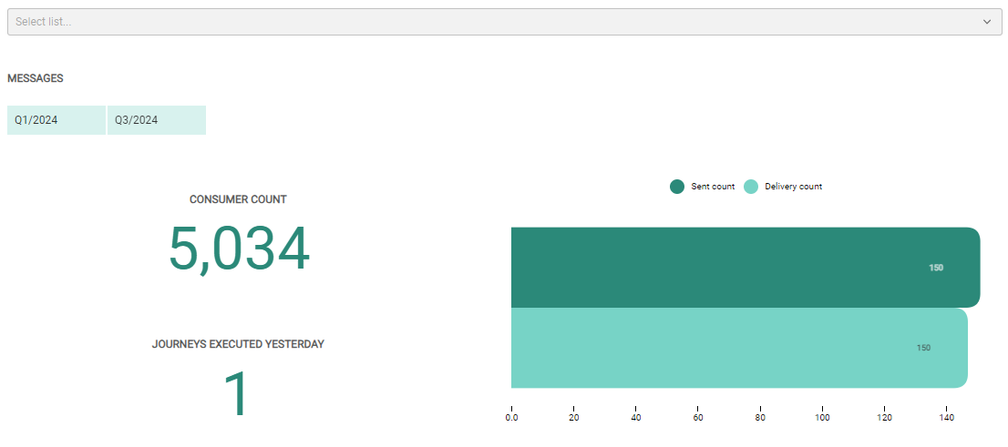
Number of contacts in the Audience List, with the possibility to select a different Audience List when more than one exists. By default the Audience List with the smallest ID is used (the oldest). Marketers can deduct from this if their audience is growing over time, stagnant or even declining.
Number of messages sent and delivered, per quarter. Marketers can compare different quarters by using the filter buttons.
Number of journeys executed yesterday.
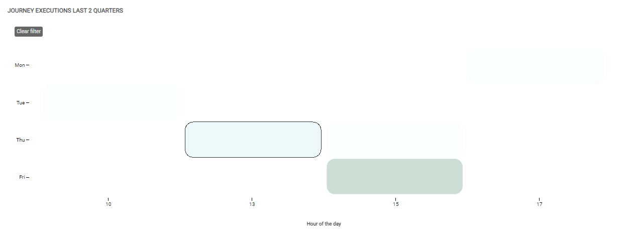
Journey executions of last 2 quarters
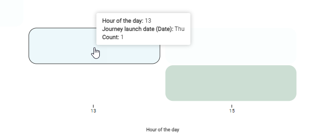
This shows a graph with the number of journeys executed per hour of the weekday, for the last 2 quarters. It tells marketers how journeys are spread over the days and time of day, if there is a concentration of journeys and if changes should be made for future scheduling.
You can hover over a block to see the count for that day and hour:
Clicking such a block activates it as a filter, resulting in all data shown on the Operational tab to be dynamically updated with the active filter applied.
You can remove the active filter by clicking on the 'Clear filter' button at the top-left (which again dynamically updates all data shown).
General available info (for all users)
Notification
A notification is visible when it's provided by Zeta to highlight important news and updates.
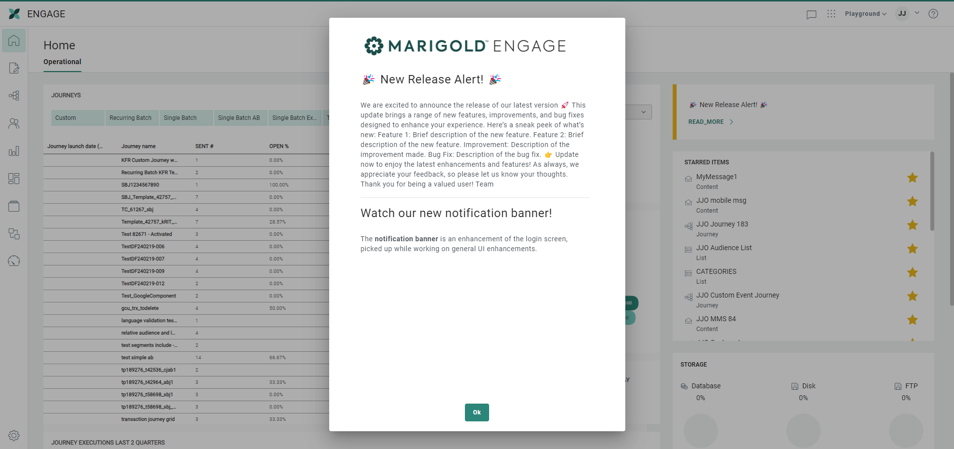
Clicking Read more opens a pop-up displaying the full notification:
Starred items
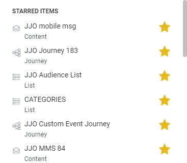
At the right, a list of starred items is shown.
This list contains content, lists and journeys that you marked as starred from within the corresponding chapters.
They're available on the operational tab for easy access.
Starred items can be removed from here too.

System storage
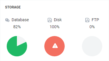
A storage section shows the health status of your system on three levels : Database, disk and FTP usage.
Performance tab
Note: The Performance tab is only available for users with access rights to dashboards.
The Performance tab reflects the performance of your journeys, active contacts, revenue and number of unsubscribes.
The following dashboard widgets are populated with aggregated data of all your audiences, within the current Business unit (or for a specific audience for 'New contacts created per day'/'Contacts created last 30 days'):
- New contacts created per day — The chart shows the number of newly created contacts per day over the last 30 days, for the selected audience. You can select an Audience List from the drop-down.
- Contacts created last 30 days — The total number of newly created contacts over the last 30 days.
- Unique active contacts per day — This chart shows the number of unique active(1) contacts per day over the last 30 days.
(1) Unique active contacts are based on interactions (opens & clicks).
If a contact made at least one registered open or click within a specific timespan, the contact is counted once as a unique active contact.
As the chart displays the amount of unique active contacts per day, the contact is counted only once for that day.
When visualizing multiple days, be aware that the contact can be counted several times over these different days, once for each day it was active. - Unique active contacts last 30 days — The total number of unique active(2) contacts over the last 30 days.
(2) When looking at the total of unique active contacts over the last 30 days, the contact is counted only once when the contact had at least one interaction (view or click) over a timespan of 30 days.
- Revenue per day — The chart shows the revenue per day over the last 30 days. The revenue is split per currency being used.
- Total revenue last 30 days — The total revenue over the last 30 days. The revenue is split per currency being used.
- Unsubscribed contacts per day — The chart shows the number of contacts that unsubscribed (clicked on unsubscribe links) per day over the last 30 days.
- Total unsubscribes last 30 days — The total number of contacts that unsubscribed (clicked on unsubscribe links) over the last 30 days.
Note: All charts show a red dotted line, indicating the average number of that chart (over the last 30 days).
Underneath the charts, there's an overview of the total revenue generated during the last 30 days, per journey. It's an indication of how specific journeys are performing in terms of revenue.
The overview includes the journey name, journey type, currency and revenue.
Filtering/searching
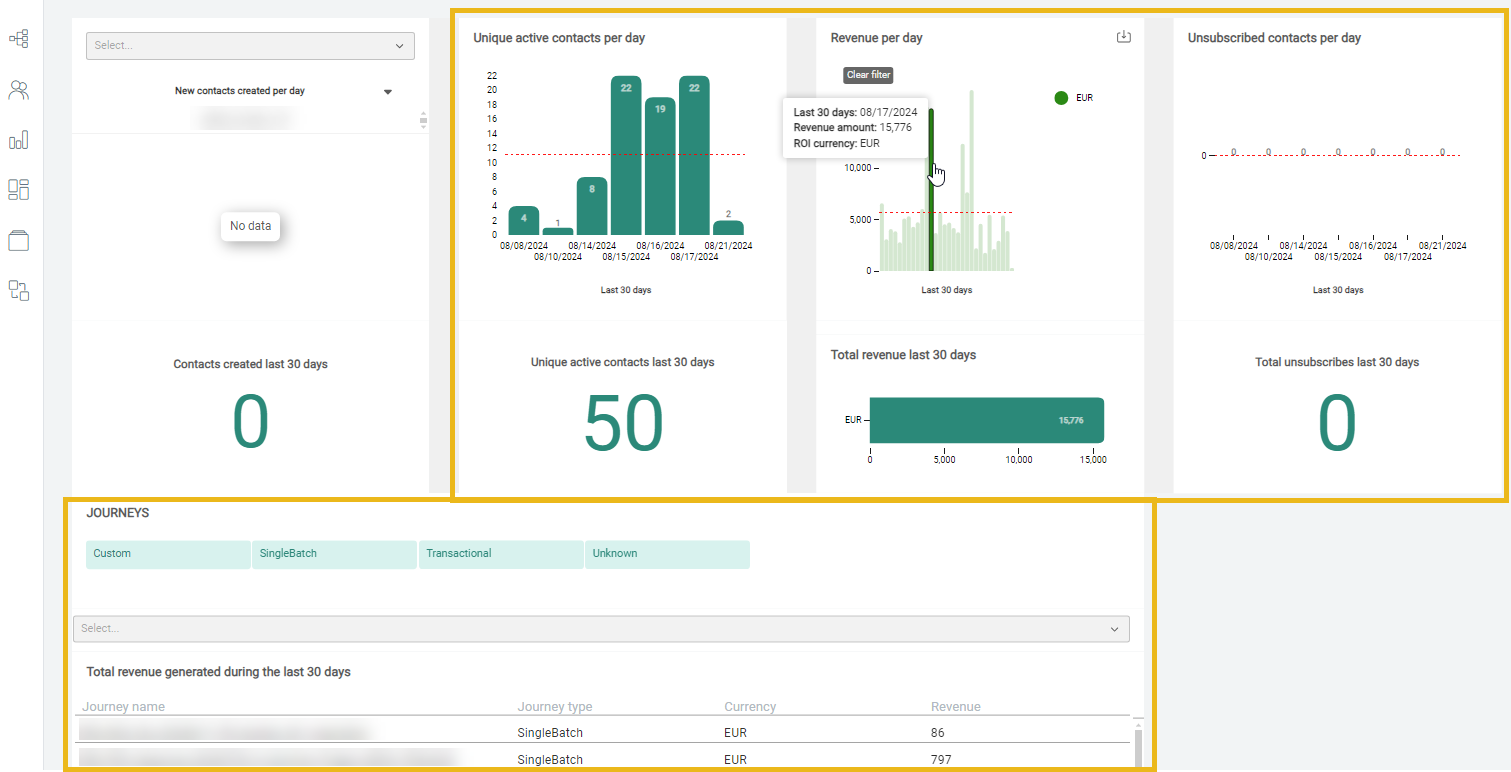
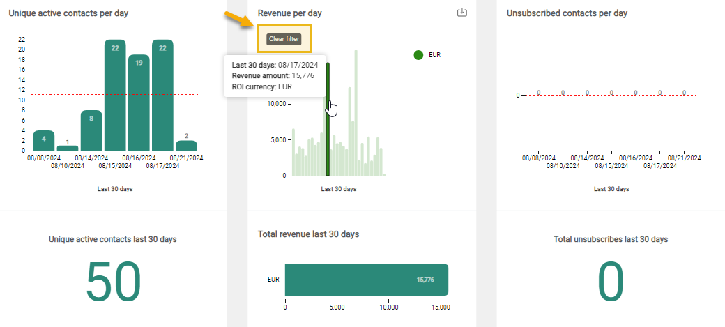
Selecting a bar in one of the charts, filters the data in all widgets (except for 'New contacts created per day'/'Contacts created last 30 days'):
You can reset the filter to show all unfiltered data again, by clicking on 'Clear filter':
In the total revenue generated during the last 30 days widget, you can :
-
filter the data by journey type (only filter types for the available journeys are shown):
-
for Selligent journeys: Custom, Recurring Batch, Single Batch, Single Batch AB, Transactional
-
for Campaign journeys: Campaign (including Single Shot, Data Driven, Triggered, Action Driven), Single Batch Express
-
- search by journey name. A drop-down of all available journeys is provided.
Exporting data
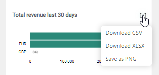
Data from each individual widget can be exported and downloaded in the following formats :
- CSV
- XLSX
- PNG (for data visualization)
