When the Page interface is displayed, there is a toolbar at the top, a design window below and a components/properties panel to the right.
Toolbar
If the content is locked by another user, the toolbar allows toggling to the Edit mode. Unlock the content to be able to edit it.
Once the toolbar is unlocked you have access to the different features.
Note: When the content is locked because you are currently working in it, you can unlock it for other users by selecting the option 'Allow others to edit' from the Actions drop-down:
The Save, Validate, 'Publish buttons are only available in Edit mode. The page can be saved at any time during the design. Validation will check the page for missing parts and Publish will make the page available for use, in Selligent as well as in Campaign.
Note: When Approval Management is active, the Publish button is replaced with a Request approval button. When an approval request is sent and the content is approved, the content is automatically published.
Note: When read-only is active for Pages, the actions buttons will not be displayed and a message is displayed that the content is in read-only mode.
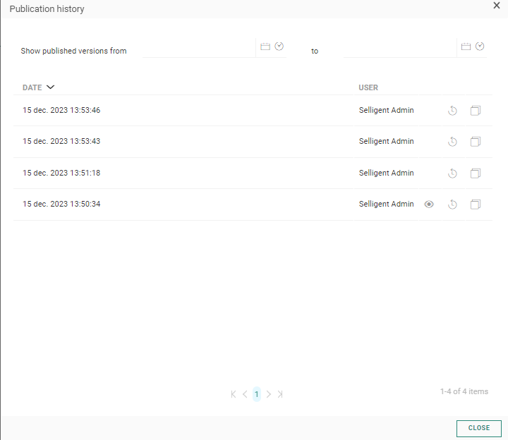
The Publication history option in the actions drop-down menu button provides a historical overview of when the page was published. You can filter the list by providing a start and end date.
In case, the page is used in a journey and edited from within the journey, an additional button is available Go to journey that allows going back to the journey and continue the process.
The navigation buttons displayed on the left let you go through the different steps in the creation of the page from setting the properties, to editing the page in Design or Source mode.
- Properties — Click to toggle to the page properties panel. The Design panel is hidden and the properties are displayed in overlay
- Design — In Design mode you can add content components and enter HTML
- Preview and Test — Gives access to the page preview.
Language section — Provides access to the different languages of the page. The list of languages depends on the languages selected during creation of the page and stored in the page properties. The language of the current user is by default displayed. Note that this field is only available when more than one language has been selected for the page.
Component panel
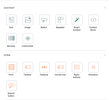
On the right side of the window, a component panel is displayed containing all possible content components that can be placed in the page. (For more details on these components check this topic.) It has the following toolbar:
- Styling — Provides access to the global styling properties, such as background, headings, spacing, etc.
- Variables — Provides access to the Variable panel where variables are created and configured for use by the journey creator.
- Links — Provides access to the Links management panel where links are created and configured. An overview of all links in the current content is available.
Note: Whenever one of the above options is clicked a new panel overlaps the current components panel.
Second level navigation
The Source window contains the design panel onto which components can be dropped and some icons that allow a series of actions. At the top you can switch from Design mode to Source mode.


