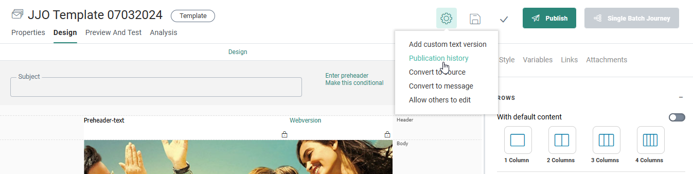
When the template design interface appears, there's a toolbar at the top, a design window below and a components/properties panel to the right.
Toolbar
The toolbar allows toggling between the Properties, Design, Preview And Test and Analysis modes. When the content is locked by another user, you need to specifically unlock it to be able to access the full toolbar and start editing the content.

When the toolbar is unlocked, it provides access to all the edit features.
Note: When the content is locked because you are currently working in it, you can unlock it for other users by selecting the option Allow others to edit from the Actions drop-down: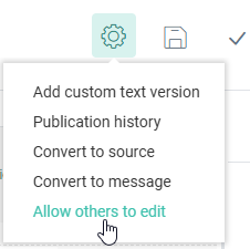

The Save, Validate and Publish buttons are only available in Edit mode. The template can be saved at any time. Validation will check the template for missing or incomplete parts and Publish will make the template available for use. There's also the possibility to make a Single Batch Journey from this template without going to the Journeys chapter first.
Note: When read-only is active for Content, the actions buttons will not be displayed and a message is displayed that the content is in read-only mode.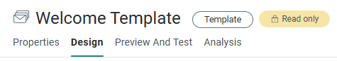
The Actions drop-down button contains several actions depending on the type of template (Design or Source mode)
- The Add Custom Text version option lets you manually create the initial Text version of the message, a mandatory action needed to be able to publish the template. (Note that the option 'Extract Text version' is shown when a manual text version already exists and you want to overwrite it. You can check this when a Text Version link is displayed above the design panel.) However, when you forget to extract the Text version and none exist upon publishing or previewing the message, automatically a Text version will be created. This automatically generated Text version will always reflect the latest changes in the message and no manual action from the marketer is required. Note that when an automatic Text version is created, no 'Text-version' link is displayed above the design panel. The user cannot make changes to this automatic Text version.
To revert back to the manual Text version, click the Menu option 'Add Custom Text version'. The marketer can then again make manual changes to the Text version if needed. (For more details on the Text version and how to generate it, please check out this topic.) - Convert to source converts the current template from Design mode to Source mode. A new 'Source' link is displayed above the Design panel, allowing the user to enter content elements in Source mode. (More information on using Source mode can be found here.)
- Convert to message converts the template to a message. The message has the same name as the initial template. The different content components in the template are created as content components in the message. You can then adapt the message to your wishes or leave it as it was. The message will be created with the same characteristics as the template, which means that if the template was published, the message will be automatically published as well.
Note: This option is hidden when you do not have access rights to emails. In this case it is not possible to convert a template to an email.
- Toggle gridlines on/off when in Source mode.
- Allow others to edit unlocks the content for other users to be able to edit the template straight away. A dialog is displayed where the marketer can choose between saving or discarding his own changes before unlocking it.
- The Publication history option in the Actions drop-down provides a historical overview of when the template has been published and who performed the action.
Note: When a
template is published and ready for use, the button to create a Single Batch Journey is available. This button is used to create
a journey using the current template. 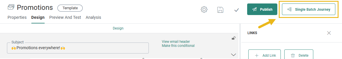
Note: When approval management is active, the Publish button is replaced with a Request approval button. When an approval request is sent and the content is approved, the content is automatically published.
The navigation buttons displayed on the left provide access to the different steps in the creation of the template.
- Properties —
Click the Properties tab to go to the Template Properties panel. Here you can find a secondary navigation to access the following properties:
- Basic — folder path, name and API name can be configured here.
- Advanced - here you can toggle a switch to Include List Unsubscribe and to send the recipient to a web page where they can unsubscribe. A default storage folder can be set as well.
- Audience, Languages & Data — here you find options to configure your audience and segment, the template language options and Data Selections.
- Info & History — a description and search tags can be added to the Template.
- Design — In the Design tab, you can create your template, by using the drag-and-drop interface or by designing the template in source code. The manual Text version can be edited here in which you can drop Text components or re-use components that have been used in Design mode.
- Preview and Test — When this is selected, you can preview the template or test the content by sending a test email.
- Analysis — This provides access to the analysis of the message in the different email clients.
Language — This field is only available if more than one language has been defined in the properties of the message. It allows to define and design the different language versions of the template. The list of languages in the drop-down depends on the languages selected during the creation of the template. The user can add or remove languages from the template at any time via the properties of the template. The language of the current user is by default displayed.
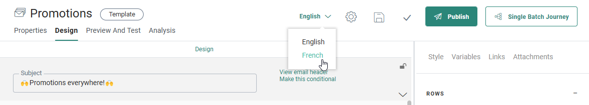
Note: There should always be at least one language configured in the Template. The language field will be displayed if at least two languages have been selected for the template.
Component panel
At the right side of the window, a component panel is displayed holding all possible layout and content components that can be placed in the template. For more details on these components check this topic.
It has the following toolbar:
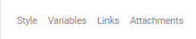
- Style — Access to the global template styling properties. (background, headings, spacing, etc.)
- Variables — Access to the Variable panel where template variables are created and configured for use by the journey creator.
- Links — Access to the Links management panel where links are created and configured. An overview of all links in the current template is available. By default, a webversion link is included.
- Attachments — Access to the Attachment panel where attachments of type contact card or appointment can be added to the message.
Also, when a component is clicked in the message itself, the properties of the component are displayed on the right and the components panel is hidden.
Second level toolbar
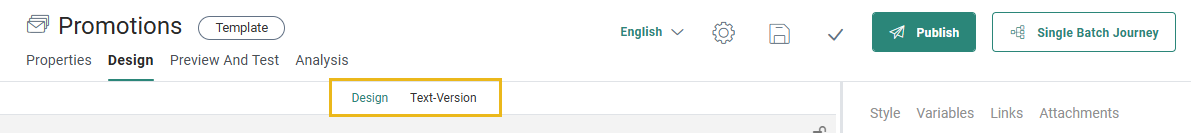
The Design window contains the design panel on which components can be dropped. Just above the Design panel several links are available that allow to toggle between the Design mode, the Source mode (only for Source code) and Text version.
Note:
A text-Version link is only available when a manual Text version is available.
The Source link is only available if the template was created in Source mode or when the template was converted from Design to Source mode.
The Design link is only available if the template was created in Design mode.
