When the message interface appears, there is a toolbar at the top, a design window below and a components/properties panel to the right.
Toolbar
If the content is locked by another user, the toolbar allows toggling to the Edit mode. Unlock the content to be able to edit it.
Once the toolbar is unlocked you have access to the different features.
Note: When the content is locked because you are currently working in it, you can unlock it for other users by selecting the option Allow others to edit from the Actions drop-down:
The Save, Validate, Publish and Create journey buttons are only available in Edit mode. The message can be saved at any time during the design. Validation will check the message for missing parts and Publish will make the message available for use, in Selligent as well as in Campaign. Create Journey will actually create a Single Batch Journey and send the message at the time indicated in the journey schedule.
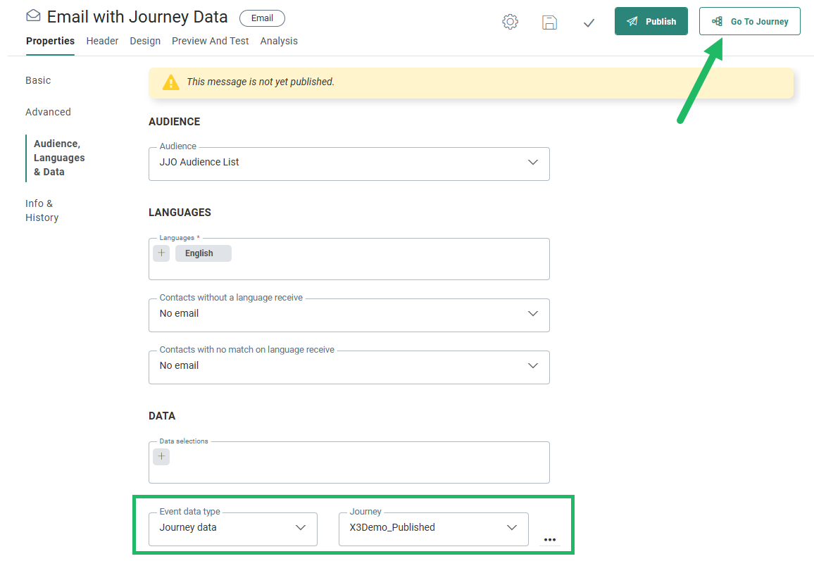
Note: When the message uses Journey Data and a specific journey has been selected in the properties, the Go to journey button will take you directly to the selected journey.
Note: When read-only is active for Content, the actions buttons will not be displayed and a message is displayed that the content is in read-only mode.
The Actions drop-down contains several actions depending on the type of template (Design or Source mode)
- The Extract Text version option lets you create the Text version of the template, a mandatory action to be able to publish the template
- Convert to source converts the current template from Design mode to Source mode
- Convert to template converts the email to a template. The template has the same name as the initial message. The different content components in the message are created as unlocked content components in the template. You can then adapt the template to your wishes or leave it as it was. The template will be created with the same characteristics as the email, which means that if the email was published, the template will be automatically published as well.
Note: This option is hidden when you do not have access rights to templates. In this case it is not possible to convert an email to a template.
- Toggle gridlines on/off when in Source mode
- Allow others to edit — This will unlock the content and other users will be able to edit the journey straight away. A dialog is displayed where the marketer can choose between saving or discarding his own changes when unlocking it.
- The Publication history option in the Actions drop-down provides a historical overview of when the template has been published and who performed the action.
Note: When Approval Management is active, the Publish button is replaced with a Request approval button. When an approval request is sent, and the content is approved, the content is automatically published.
The navigation buttons displayed on the left let you go through the different steps in the creation of the message from setting the properties, to editing the message in text or design mode, through testing and finally to validation.
- Properties — Click to toggle to the message properties panel. The Design panel is hidden and the properties are displayed in overlay
- Design — In Edit mode you can add layout and content components, define the email header, set constraints
- Preview and Test — Gives access to the preview of the message or send a test email. This button is disabled if the message uses journey data for personalization from an unpublished journey.
- Analysis — Gives you access to the message message analysis where the messages can be previewed in the different email clients. This button is disabled if the message uses journey data for personalization from an unpublished journey.
Language section — provides access to the different languages of the message. The list of languages depends on the languages selected during creation of the message and stored in the properties. The language of the current user is by default displayed. Note that this field is only available when more than one language has been selected for the message.
The Status
The current status of the message is displayed in the Properties panel of the message
Component panel
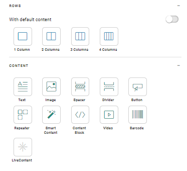
At the right hand side of the window a component
panel is displayed holding all possible layout and content components
that can be placed in the message. For
more details on these components check this topic.
- Style — Provides access to the global styling properties. (background, headings, spacing,..)
- Variables — Provides access to the Variable panel where variables are created and configured for use by the message creator
- Links — Provides access to the Links management panel where links are created and configured. An overview of all links in the current message is available. By default the Web version link is listed.
- Attachments — Access to the Attachments panel where attachments of type contact card or appointment can be attached to the message.
Note: Whenever one of the above options is clicked a new panel overlaps the current components panel.
Also, when a component is clicked in the design itself, the properties of the component are displayed on the right and the Components panel is hidden.
Design window
The Design window contains the email header, design panel on which components can be dropped and a second level toolbar from where you can toggle between Design mode, Source mode and Text version (when applicable).


